ReWash

Registration & Onboarding Flow (B2B SaaS)
Goal of the flow
The goal of this flow is to onboard car wash owners (FOPs) into the ReWash platform, verify their contact details, collect essential business information, and prepare the car wash for moderation and activation on the platform.
The flow is intentionally split into clear, manageable steps to reduce cognitive load and increase completion rate.
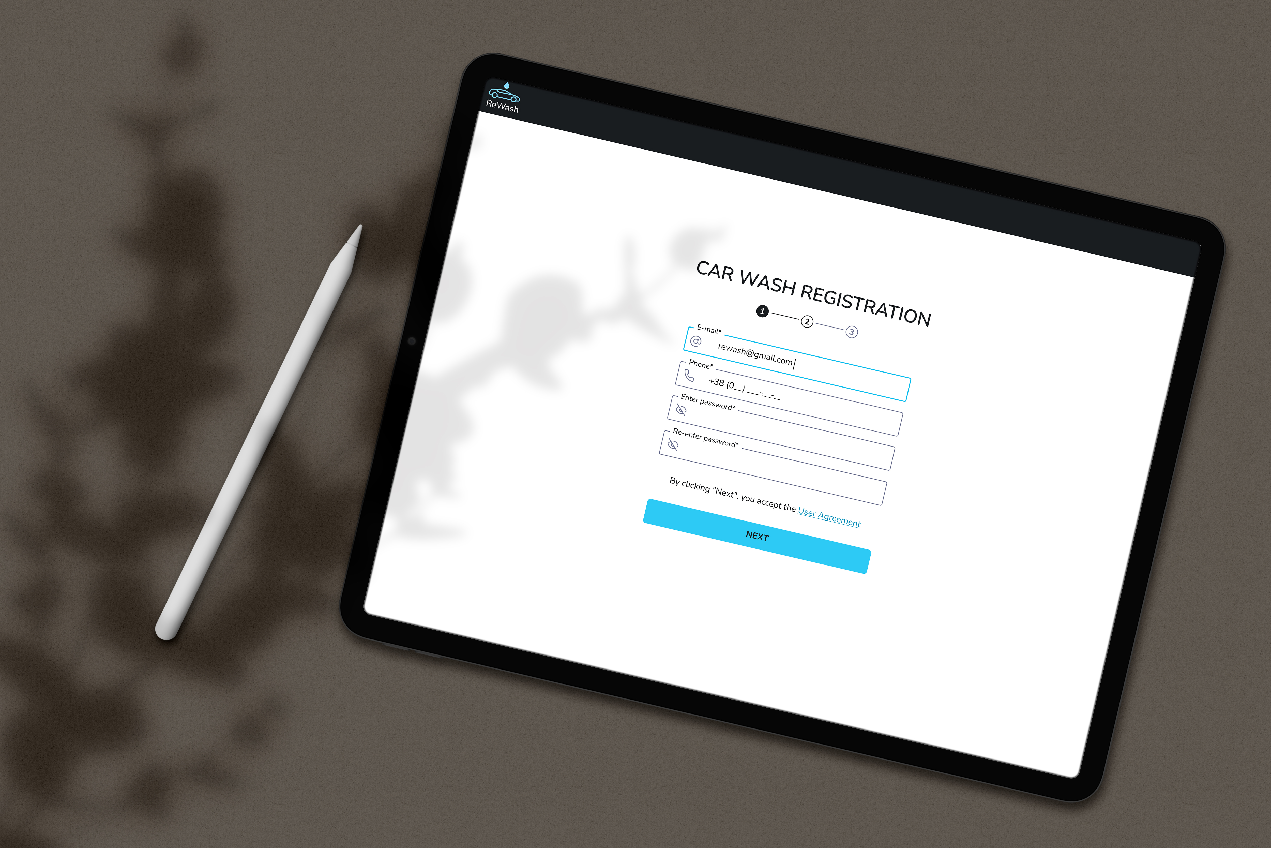
Step 1. Car Wash Registration (Account creation)
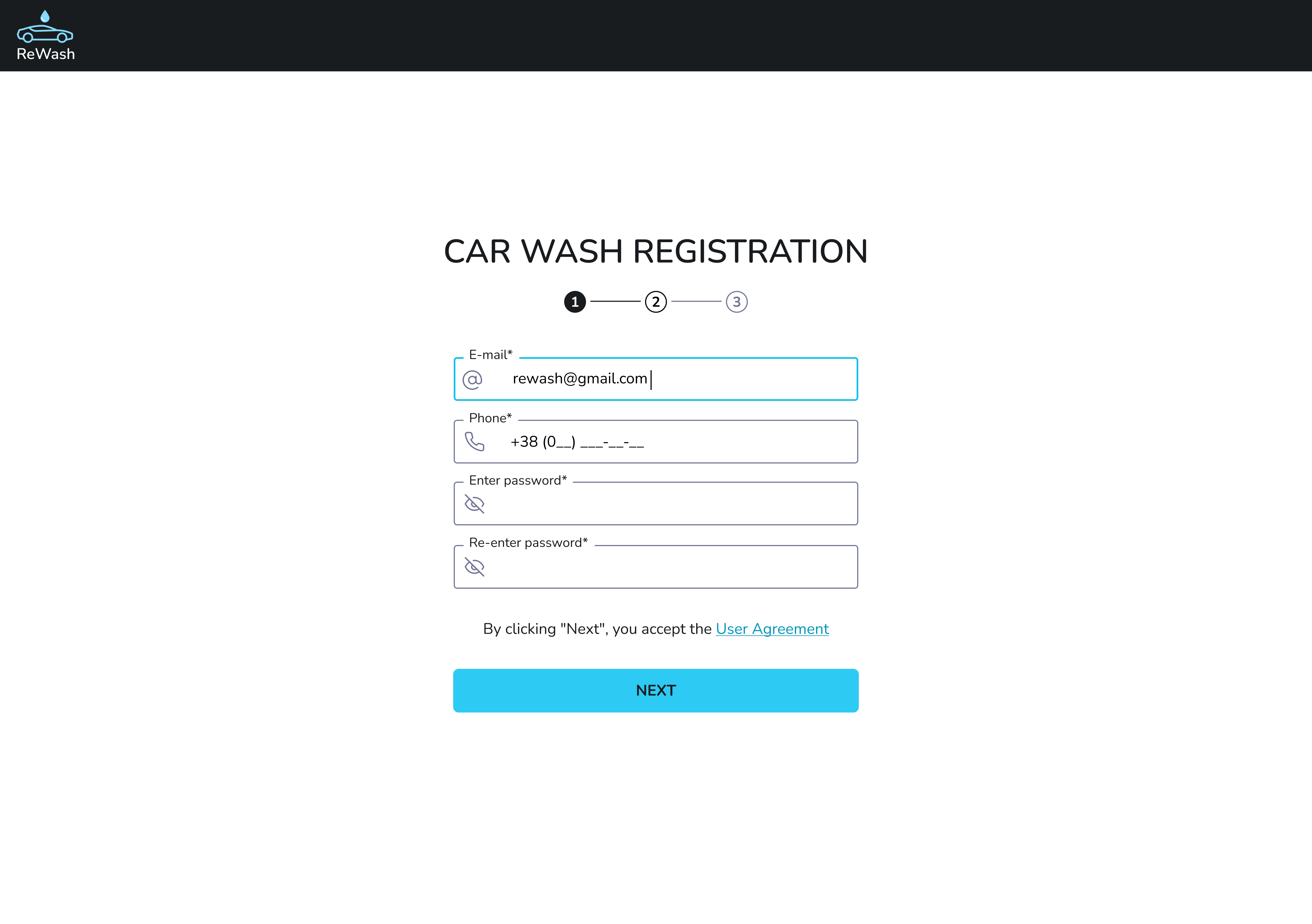
User action:
- Enters email
- Phone number
- Password
- Re-enter password
UX decisions & rationale:
- Registration starts with minimal required data, avoiding early overload.
- Email and phone are collected upfront because they are critical for verification and future communication.
- Step indicator (1–4) sets clear expectations and reduces uncertainty.
- Single primary CTA (“Next”) keeps focus and prevents decision paralysis.
Why this matters:
This step lowers the entry barrier and increases the likelihood that business owners complete the onboarding process.
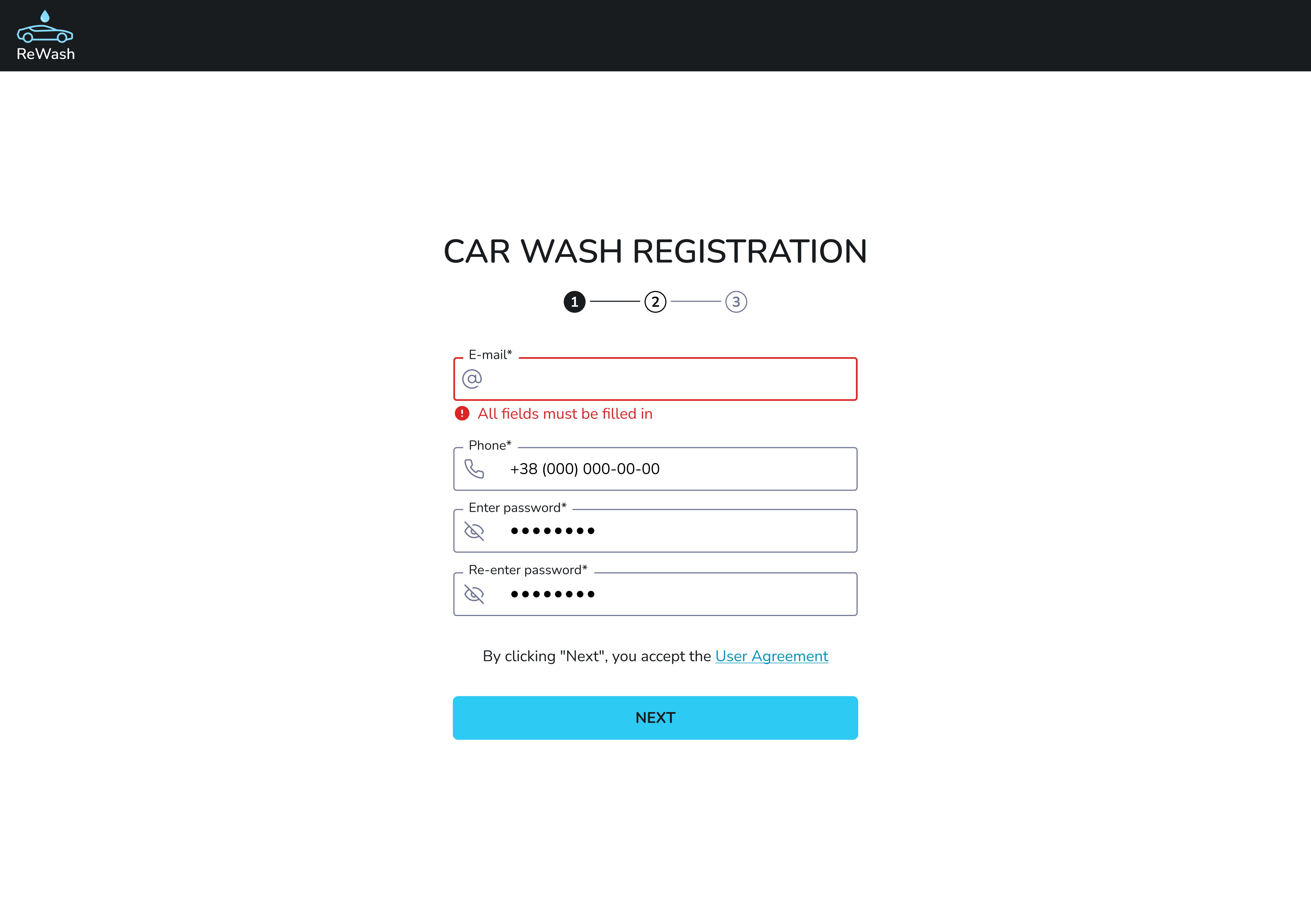
Car Wash Registration — Error State
This screen demonstrates the validation error state during the first step of the car wash registration process.
Context
The error appears when the user attempts to proceed without filling in all required fields.
Step 2. Email Verification (Security & trust)
User action:
- Enters a 6-digit verification code sent to email
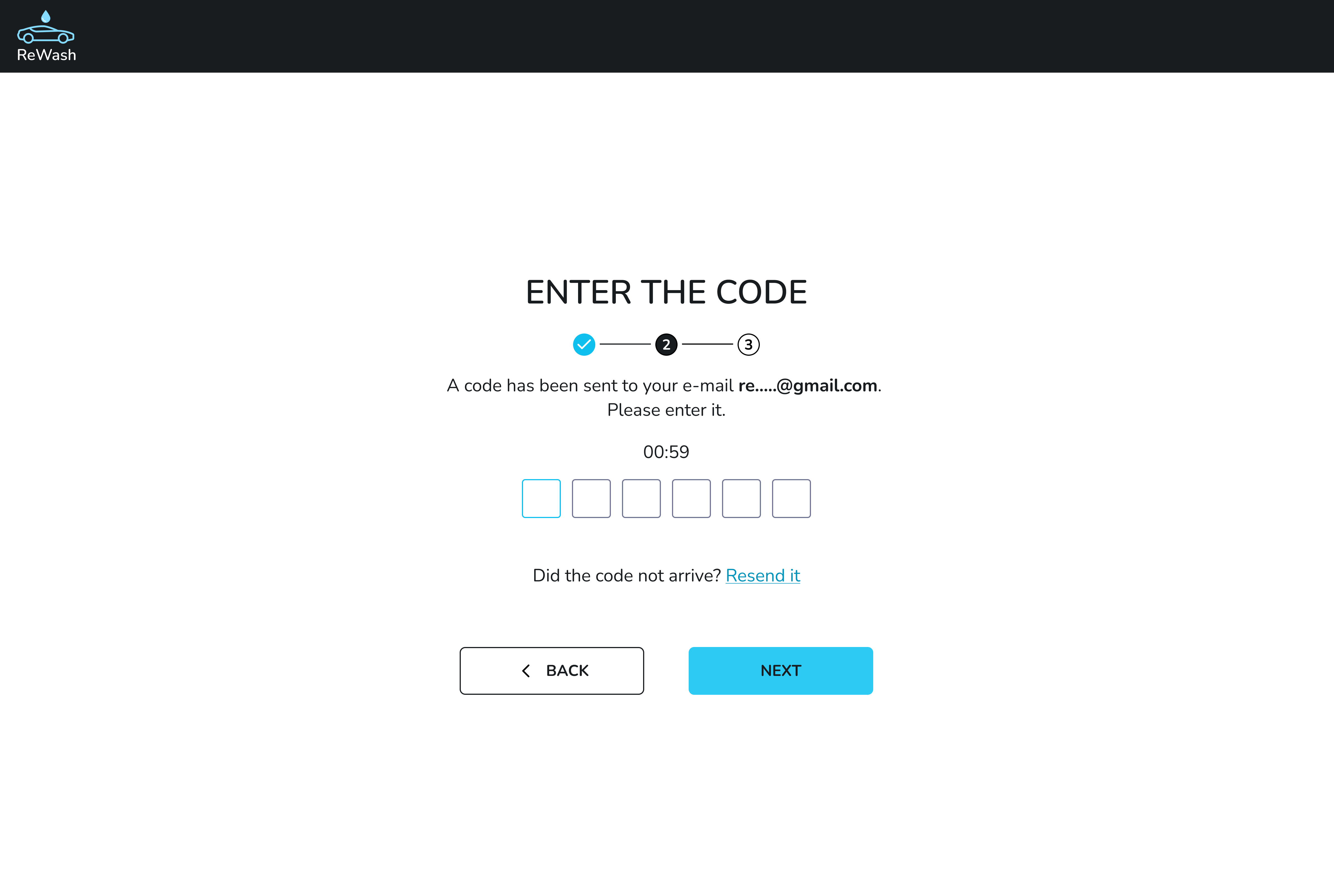
UX decisions & rationale:
- Email verification ensures data integrity and account security.
- Time limit + resend option balance security and usability.
- OTP input fields improve readability and reduce input errors.
- “Back” option allows recovery without frustration.
Why this matters:
Verified contact details are essential for a SaaS platform that handles bookings, payments, and business operations.
Step 3. Car Wash Details
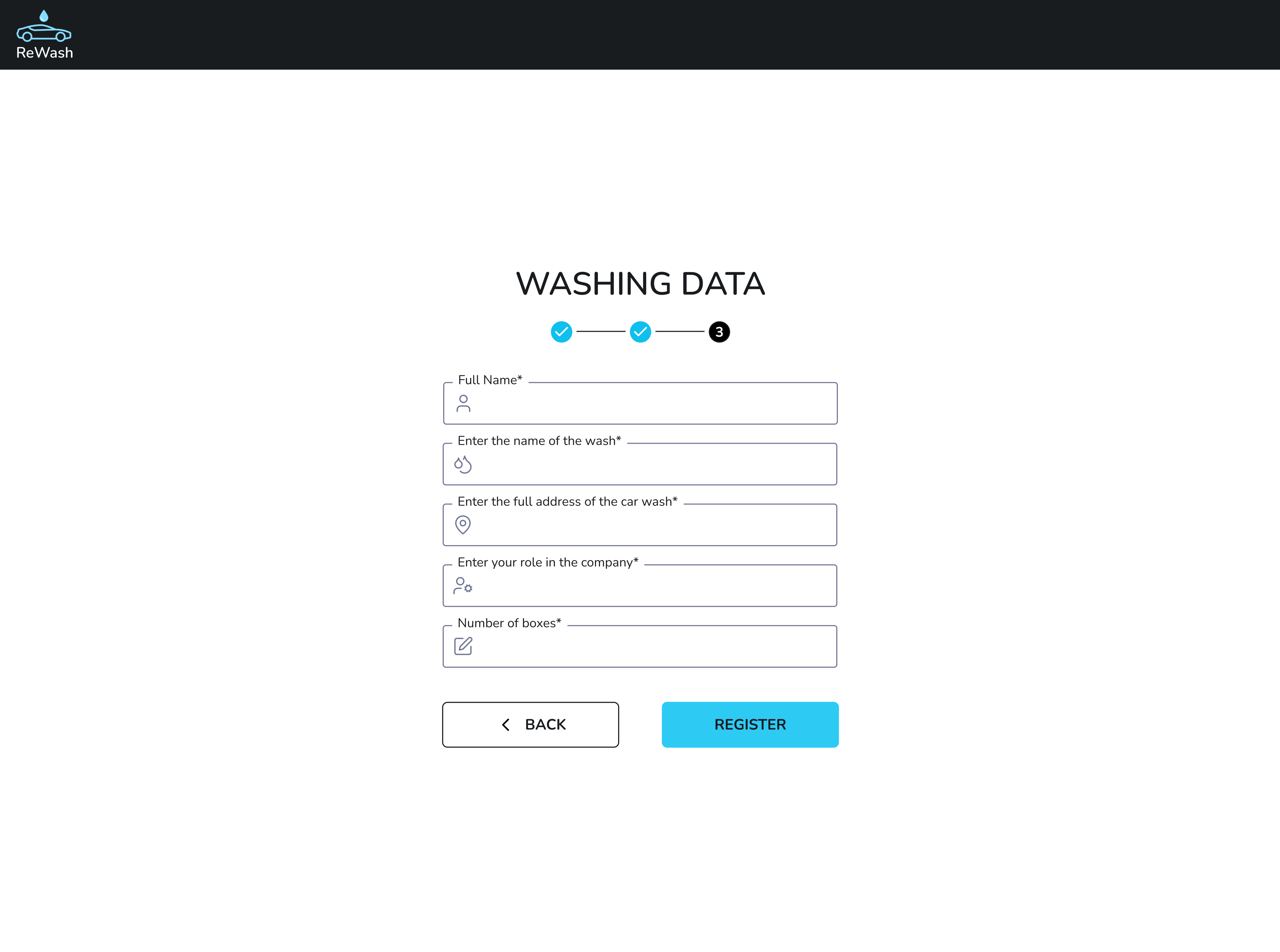
User action:
- Enters business-related information:
- Full name
- Car wash name
- Address
- Role of user in the company
- Number of boxes
UX decisions & rationale:
- Business data is collected after trust is established (account + verification).
- Grouping fields into one focused step supports faster completion.
- This data directly affects how the car wash will appear on the map and in search results, giving the user a clear motivation to fill it accurately.
Why this matters:
This step transforms the user from “registered account” into an active service provider on the platform.
Step 4. Application Submission & Review
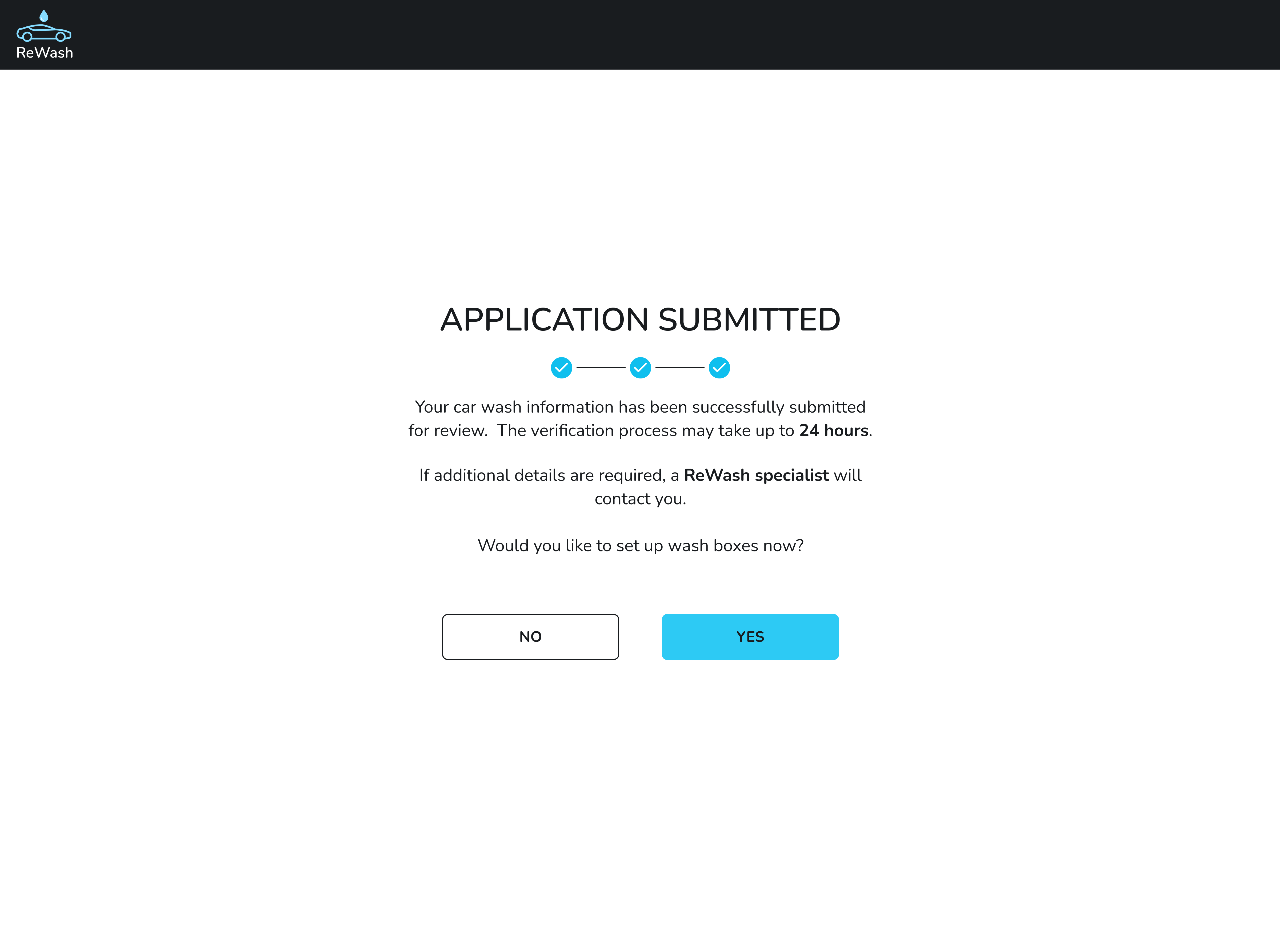
System feedback
- The application is successfully submitted for review
- The user is informed that the verification process may take up to 24 hours
- The system notifies the user that a ReWash specialist may contact them if additional details are required
UX decisions & rationale
- Using “Application submitted” instead of “Registration completed” avoids false expectations about immediate activation.
- A clear review timeline helps manage user expectations and reduces post-submission anxiety.
- Informing about possible contact builds trust and transparency in the moderation process.
- An optional next step (“Would you like to set up wash boxes now?”) allows proactive users to continue onboarding, while others can safely pause without pressure.
Why this matters
Clear communication about the application review process prevents confusion, reduces unnecessary support requests, and reinforces the platform’s credibility while maintaining service quality.
Product Type Conclusion
This flow clearly represents a B2B SaaS onboarding experience, not e-commerce, because:
- The user registers a business
- Gains access to a management system
- Uses the platform continuously to manage bookings and payments
Short version (if you need a compact one)
A multi-step onboarding flow designed to verify car wash owners, collect essential business data, and prepare the service for activation within a B2B SaaS platform.
Tools used
From brief

Topics
Share
Reviews
3 reviews

The flow is logical and well-divided into steps, but I have a few notes. In step 1 I see email, phone, and password, but the brief also mentions "Owner's name" - this field is missing from the screen. Either the brief doesn't match the design, or something was overlooked.
Error validation works oddly. The message "All fields must be filled in" appears under the email field, which is actually filled in. This could confuse users. It would be better to show errors directly next to the specific fields that need attention.
In step 3 the "Washing Data" heading could be clearer - "Car Wash Details" from the brief sounds better. Also, the label "Enter position" is unclear. Does it mean job title or something else?
On the success screen, the question "Do you want to fill the boxes?" appears without context. Users might not understand what "boxes" means if it wasn't explained earlier.
Visually it's clean and clear, the stepper works well. A few minor tweaks to copywriting and validation, and this will be a solid onboarding flow. ✌️🫡

Congratulations on the work, Anastasia Dudyk — your project is incredible. One point of attention I noticed was the difficulty in spotting the back button. A possible improvement could be adding a secondary button next to the “Next step” button, making it easier for users to recognize how to return to a previous step. Overall, the structure is excellent — congratulations!

Hey Anastasia!
I just reviewed your ReWash onboarding flow and I think you’ve built a very clean and structured experience. Starting with minimal fields and using a step indicator really helps reduce initial friction it feels approachable for busy business owners who may not want to spend time on a long form.
I also appreciate how you handle the post-submission state by clearly setting expectations that the account will be reviewed that transparency improves trust and helps manage user anxiety about waiting.
A couple of things to strengthen further: the error validation could benefit from more precise messaging tied to individual fields so users immediately know what to fix. Also, some labels like “number of boxes” might be confusing unless it’s clearly defined earlier in the flow. Those small clarity tweaks will help reduce friction and improve completion rates.
Overall, great job on structuring a logical B2B onboarding experience very solid foundation!
You might also like

SONZ - Entertainment platform


Camp & Travel Explorer - App Design


Solar system Dashboard Utility


Signup page for a SaaS website

Uxcel Halloween Icon Pack


PLANTIST

Visual Design Courses

UX Design Foundations


Introduction to Figma

Design Terminology
