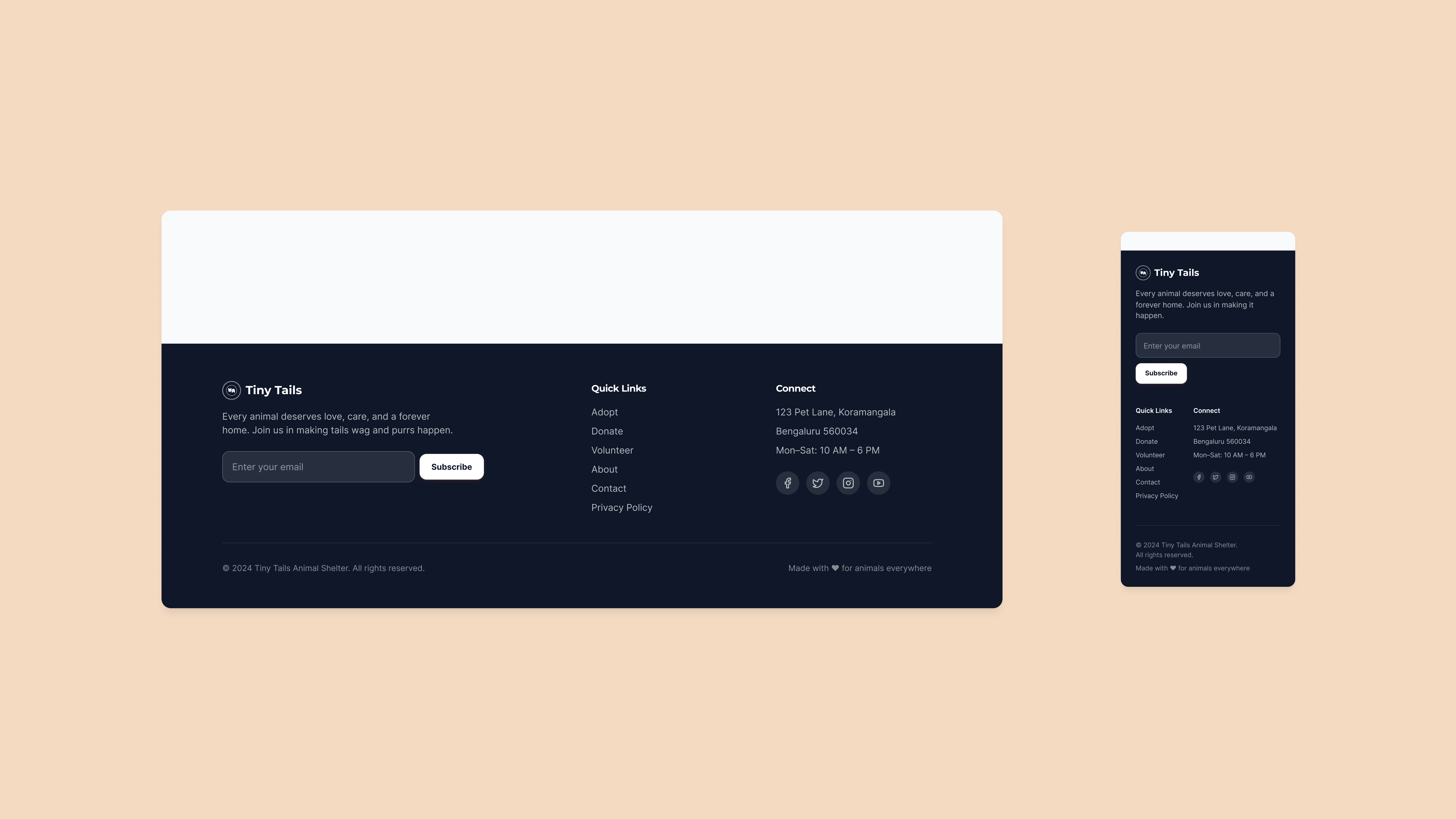
Tiny Tails - Animal Shelter Landing Page

Design Goals
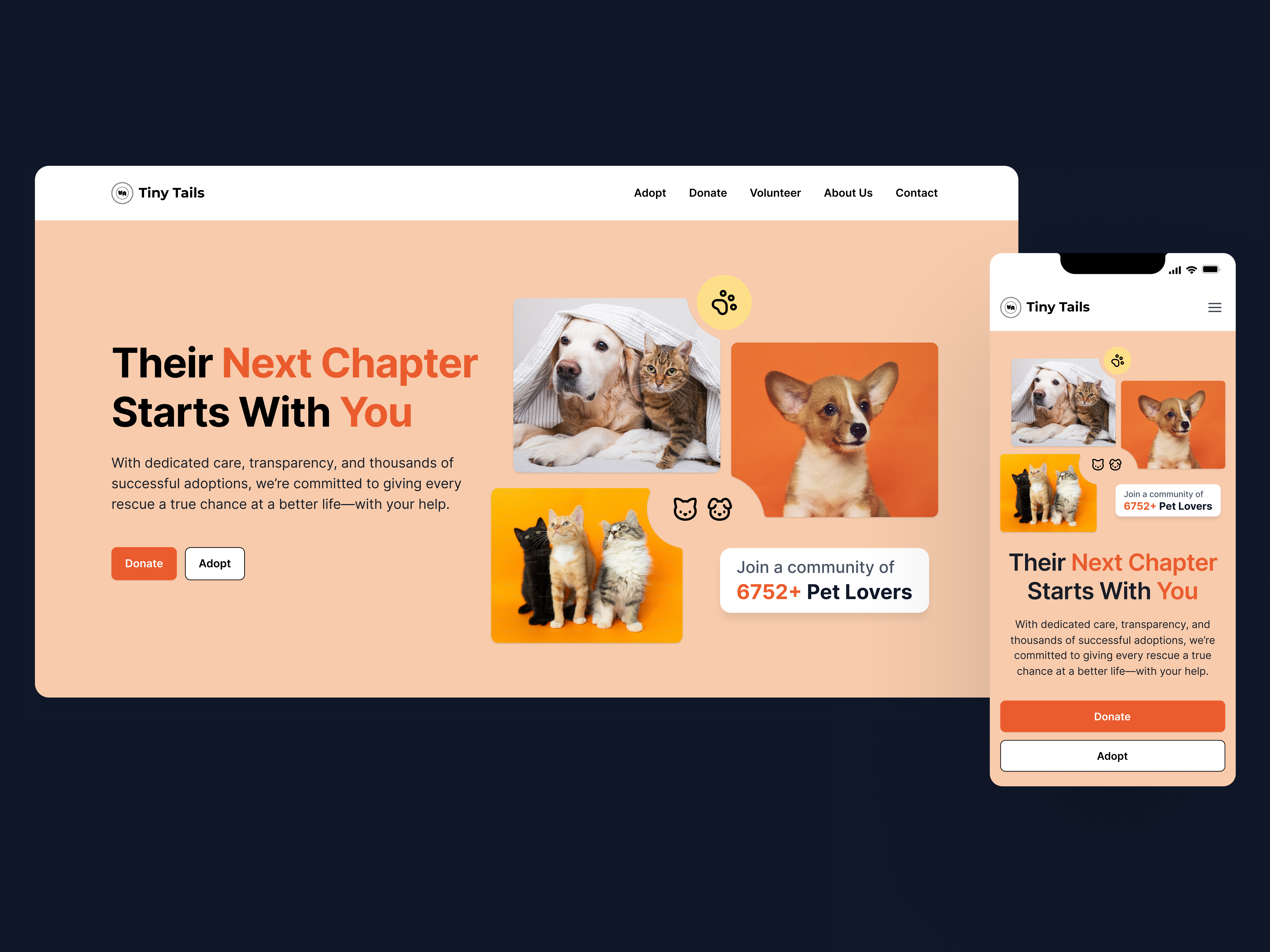
- Make adoption feel approachable, simple, and human
- Highlight real impact through numbers and stories
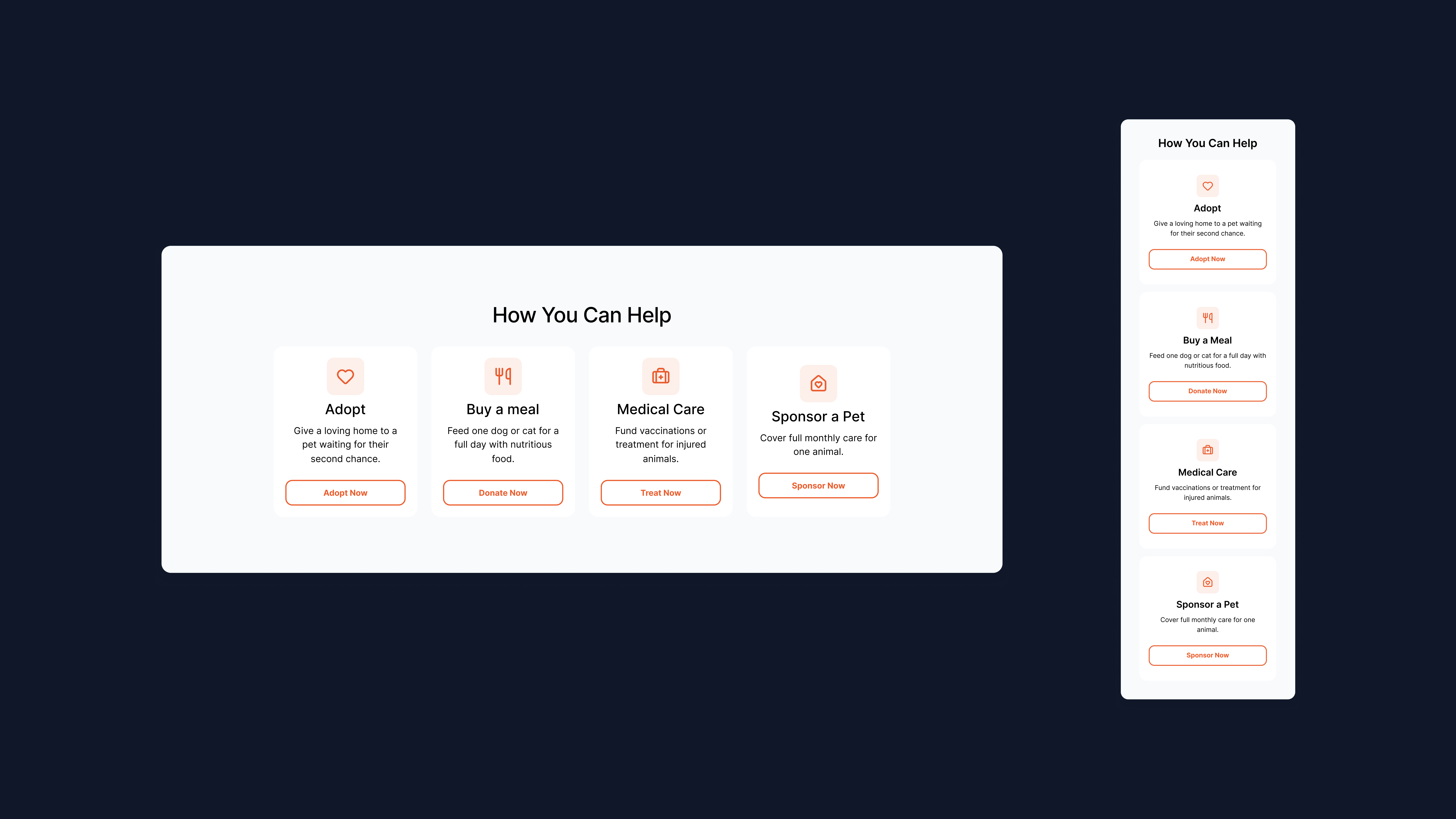
- Encourage multiple ways to help: adopt, donate, volunteer
- Create a warm, trustworthy first impression
- Ensure seamless experience across desktop and mobile
Tools used
From brief

Topics
Share
Reviews
4 reviews

Hello, Cleo, great job! And I love that you chose to create a Landing Page for animal welfare cause 💖
Here is my honest feedback:
The style is beautiful, clear, accessible, and friendly. Orange is an excellent choice of color because it's warm, energetic, and happy.
The copy is also great, and the content is complete. The user can quickly learn about the shelter, how to help, and the steps to adopt.
What I think can be improved:
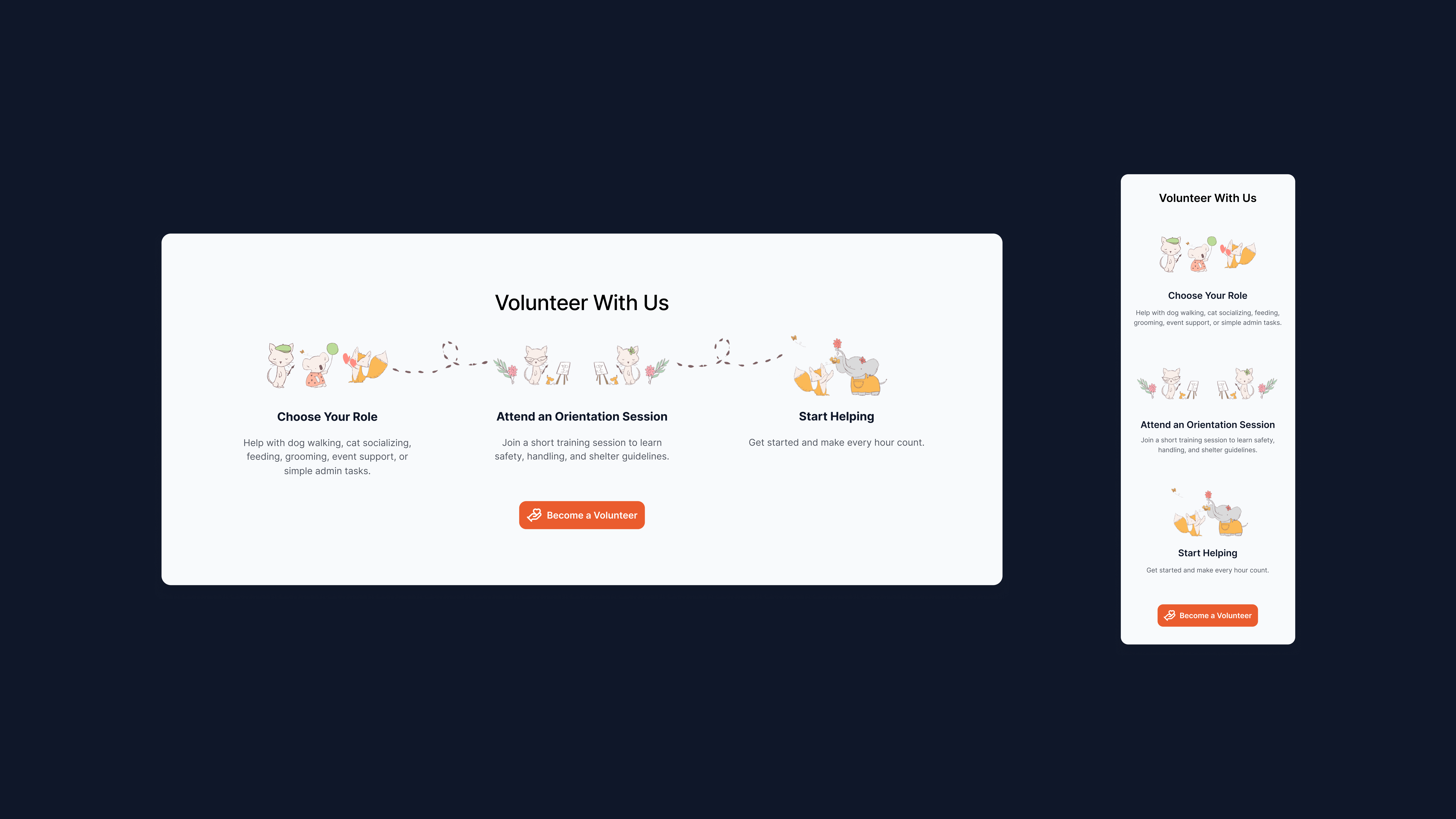
The general style and structure are beautiful, but have been overused, especially by people who use Lovable. So you need to add elements to differentiate from those pages and stand out. I really like those illustrations on the Volunteer with Us section. You could try using more of those and maybe replacing some icons with illustrations. The illustrations convey the Animal Shelter's personality more effectively than icons.
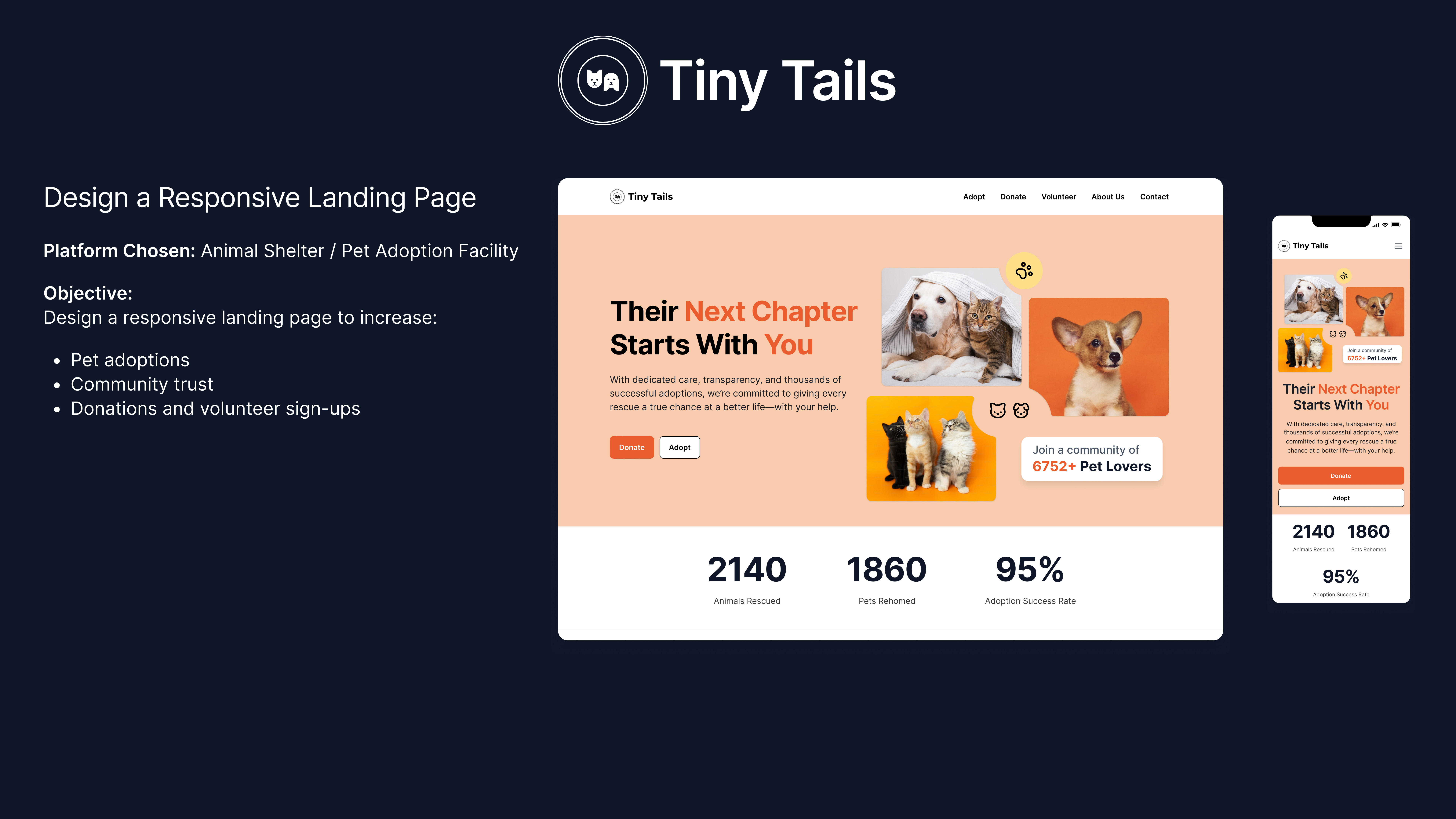
Perhaps adding an illustration near the numbers (2140 animals rescued...) will help make it look less commercial/markety, and more cozy. It's just a suggestion to think about.
Well done, congrats on the awesome job!

The overall design makes a great impression. The project is warm, friendly, and immediately builds trust. The hero section nicely combines emotional pet photos with a clear message and obvious CTAs. I like the use of social proof and the stats section below. It builds credibility without overdoing it.
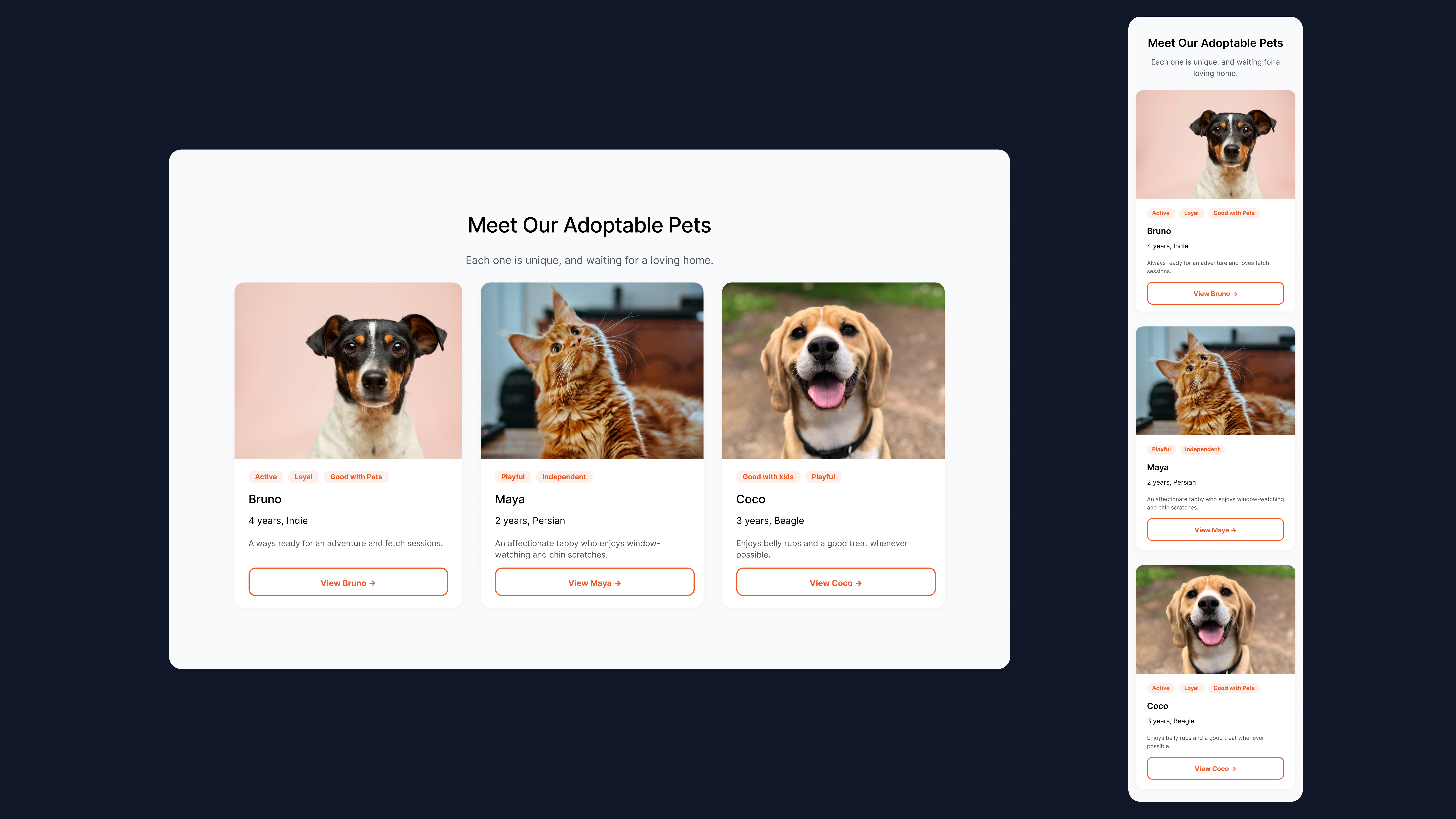
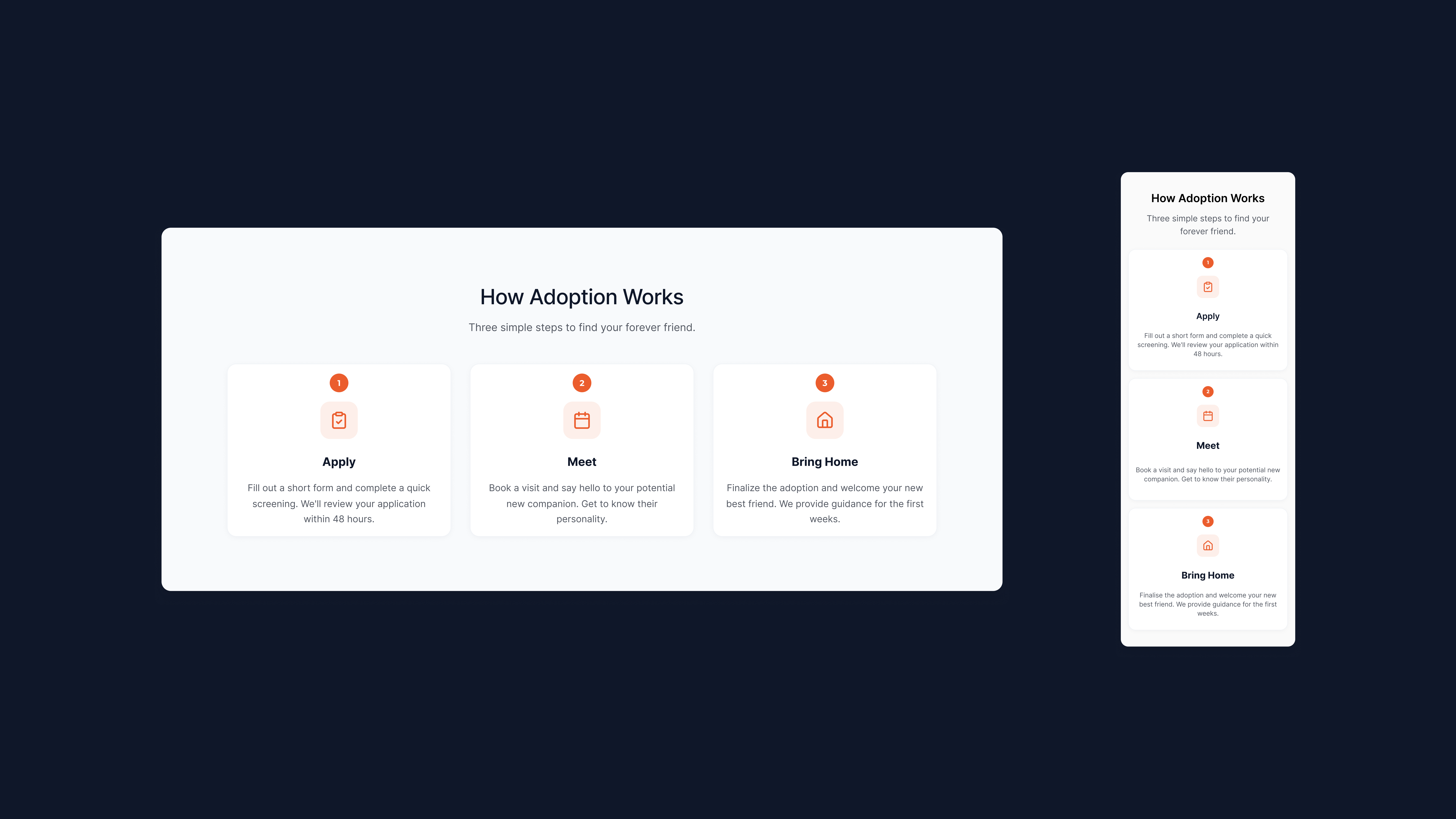
The pet cards are readable, and personality tags are a nice touch. The "How Adoption Works" section is simple and understandable, three steps is the perfect amount.
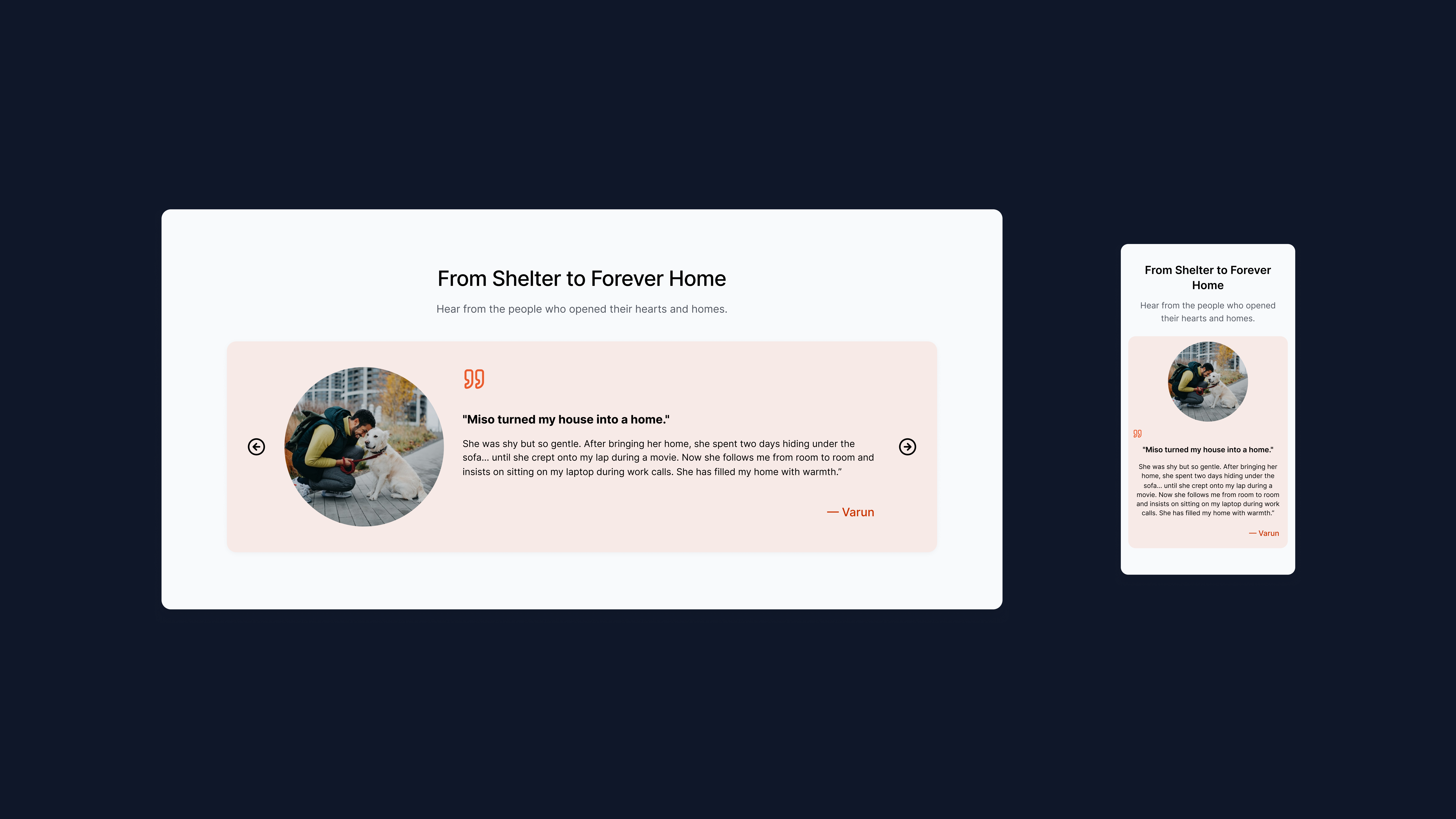
The testimonials section could show more than one story at once. The "How You Can Help" section offers various engagement paths, which is great.
Responsiveness looks solid, though on mobile some sections (like the footer) get quite cramped.
Overall, this is a thoughtful, cohesive project that delivers on the brief's goals. The flow is intuitive, and everything encourages action without being pushy. 😊❤️

Hi Cleo!
From a branding perspective, this landing page carries a warmth that feels appropriate for an animal shelter. There’s an emotional tone that aligns with the mission and that’s important. In cause-driven products, clarity and empathy often matter more than visual complexity.
Structurally, it appears approachable and easy to follow. A shelter landing page has to do two things well: communicate trust and guide action. The layout seems to support that without overwhelming the visitor, which is a good instinct.
If I were to elevate it further, I’d explore how to amplify emotional storytelling perhaps through stronger calls to adopt, donate, or engage. Making those moments more prominent could turn a good page into a powerful one. Overall, this feels thoughtful and purpose-aligned.

This is really warm and inviting 🐾
The message is clear, the visuals are charming, and the CTA feels emotional without being pushy. Nice balance between storytelling and action.
Great work.
You might also like

Notification microcopy - Project


El Mandoub-GovTech App


MalishaEdu Counselor Workspace


Goal Creation Flow


Portfolio website

MalishaEdu - Website Design
Visual Design Courses

UX Design Foundations


Introduction to Figma

Design Terminology
