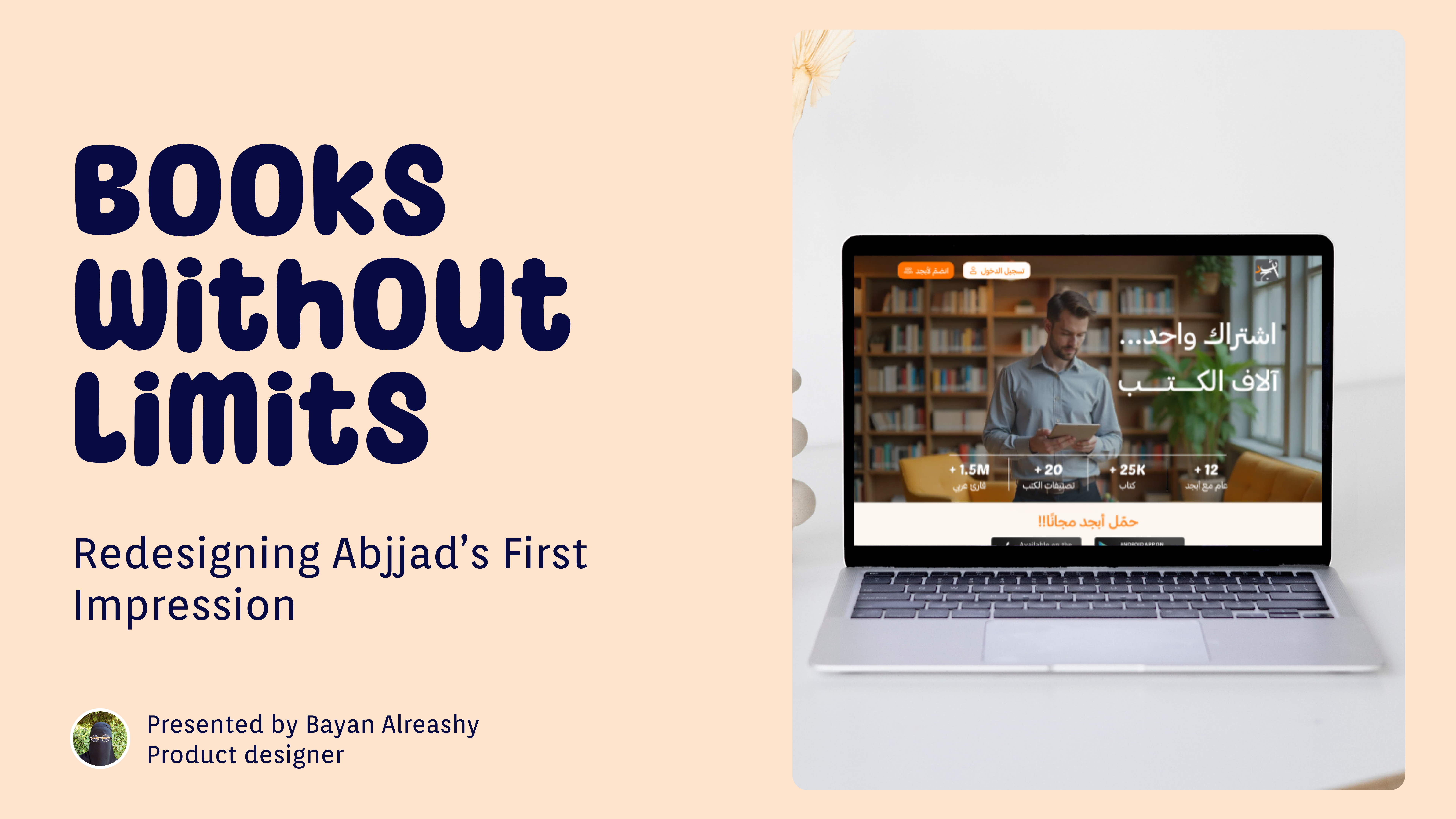
Books without limits:Abjjad's Landingpage redesigen


Reviews
2 reviews

First of all, you should be really proud of this project.
You didn’t just redesign a landing page — you solved real user and business problems.
That’s the mindset of a strong designer.
When I looked at your "problem" slide, I could instantly tell you understood the issue. Your writing is clear. To make it even stronger, imagine splitting the main points into two smaller parts. It’ll make your message hit even harder. You’re already close — just a tiny tweak could make it even sharper.
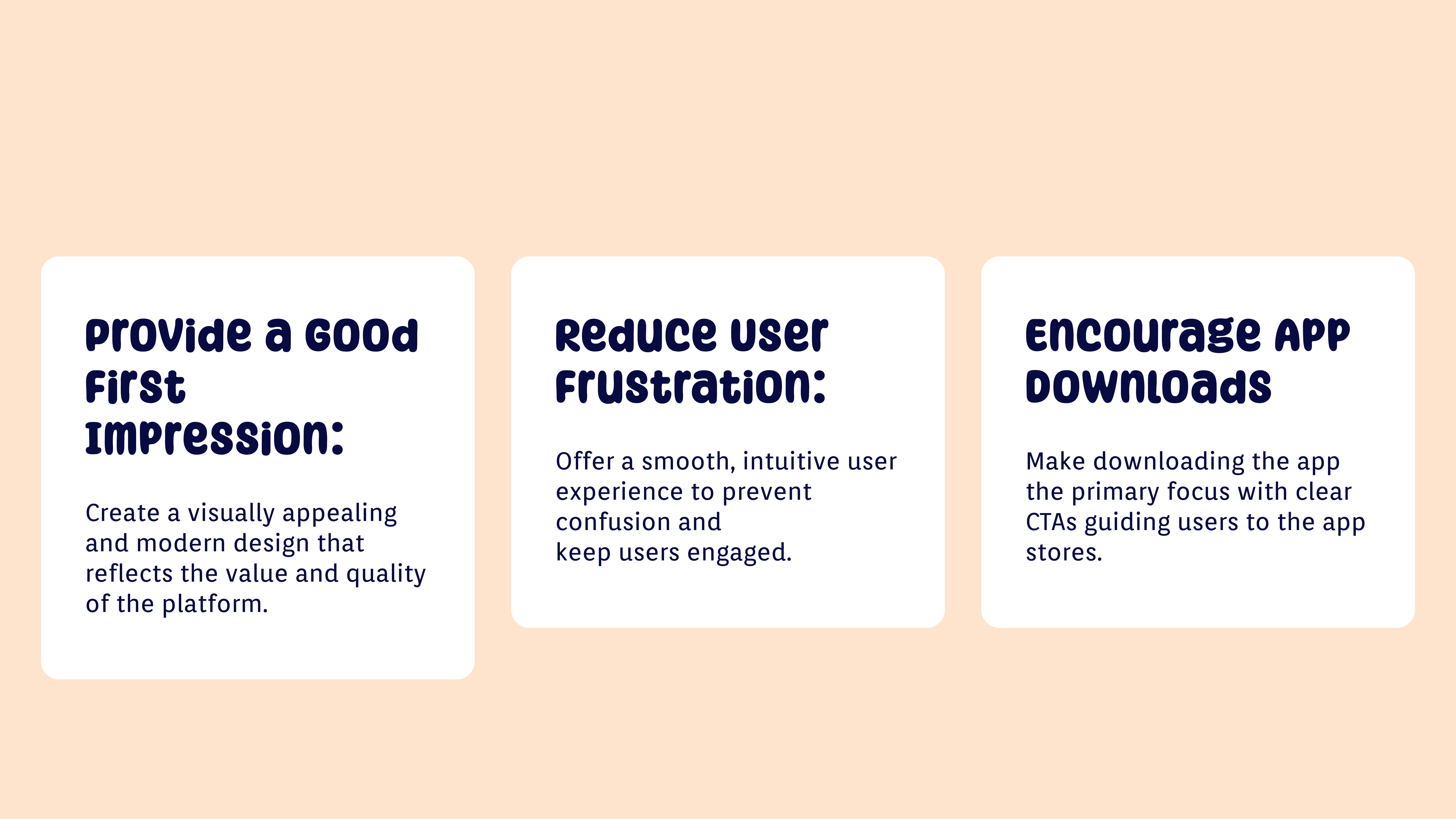
The "goals" slide is great. Each goal is clear and focused on action. One small idea to push it even further: adding a little icon above each goal. It would make each card pop even more and show your attention to small visual details, which senior designers love to see.
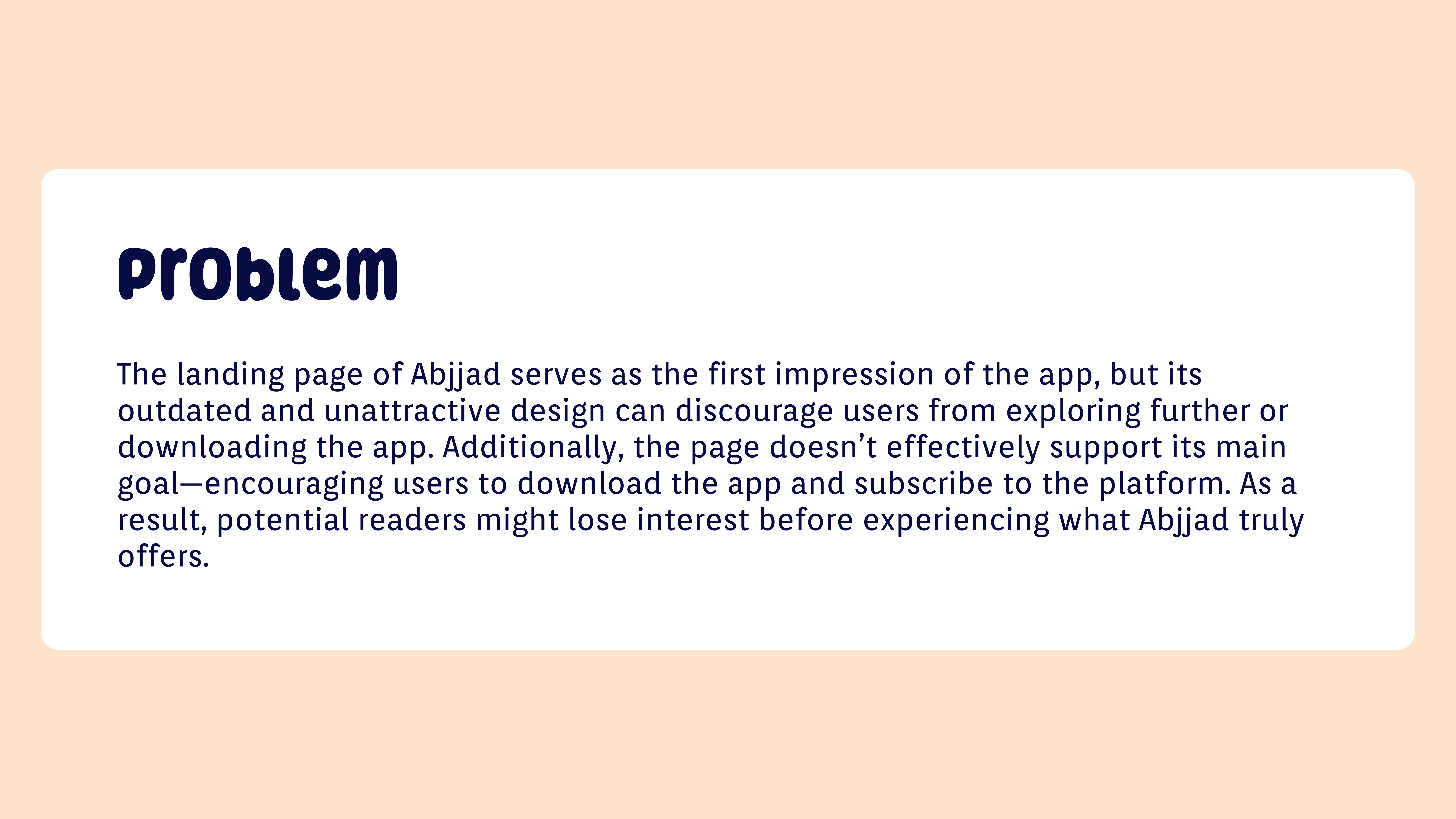
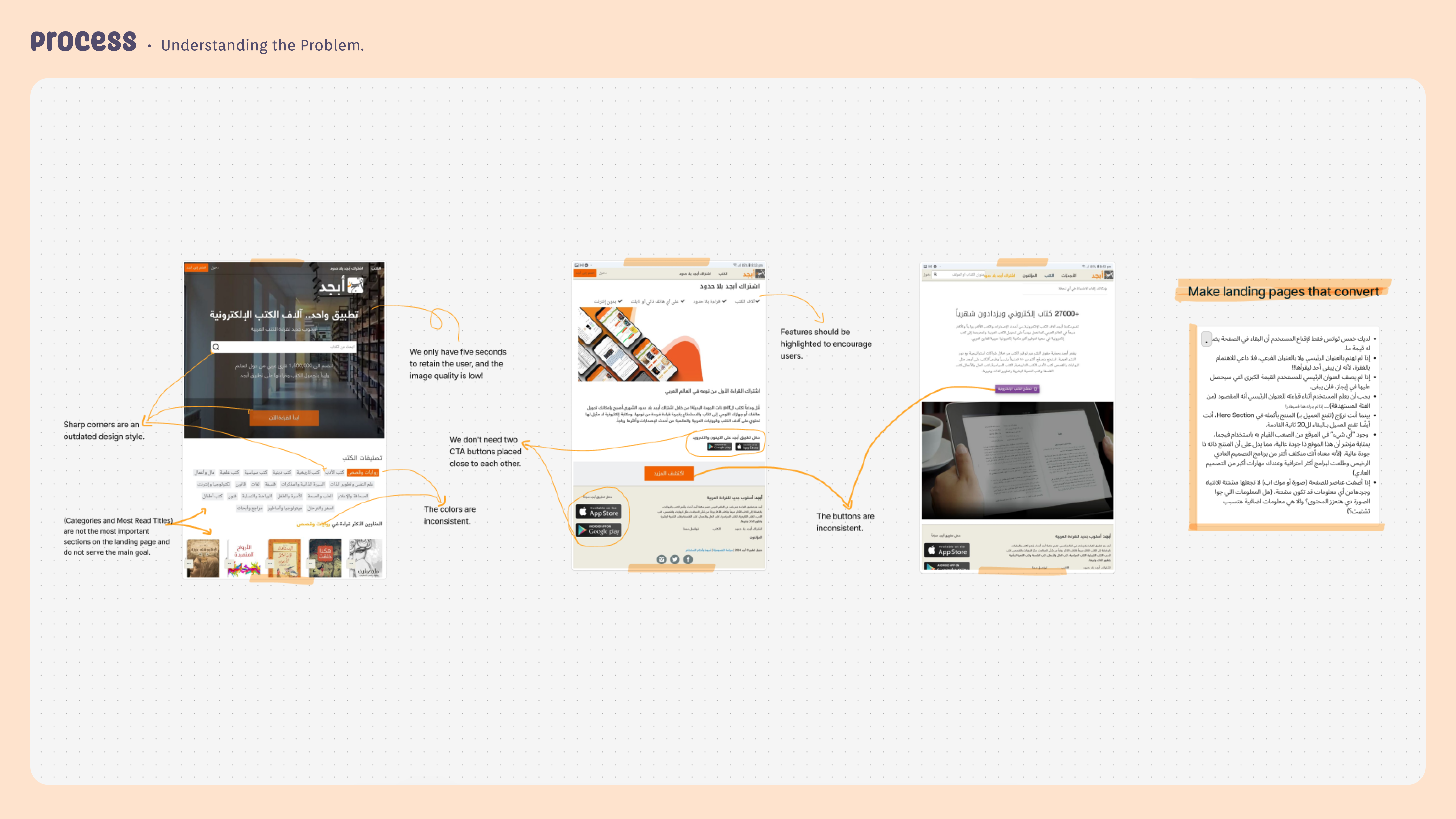
Your "old landing page analysis" shows you know how to spot what’s wrong. And that’s not easy. You made smart observations about CTA placements, image quality, and inconsistency. If you want to make this even stronger, maybe highlight just the top three issues more boldly so it doesn’t overwhelm the viewer. Trust your instincts — you already know what matters most.
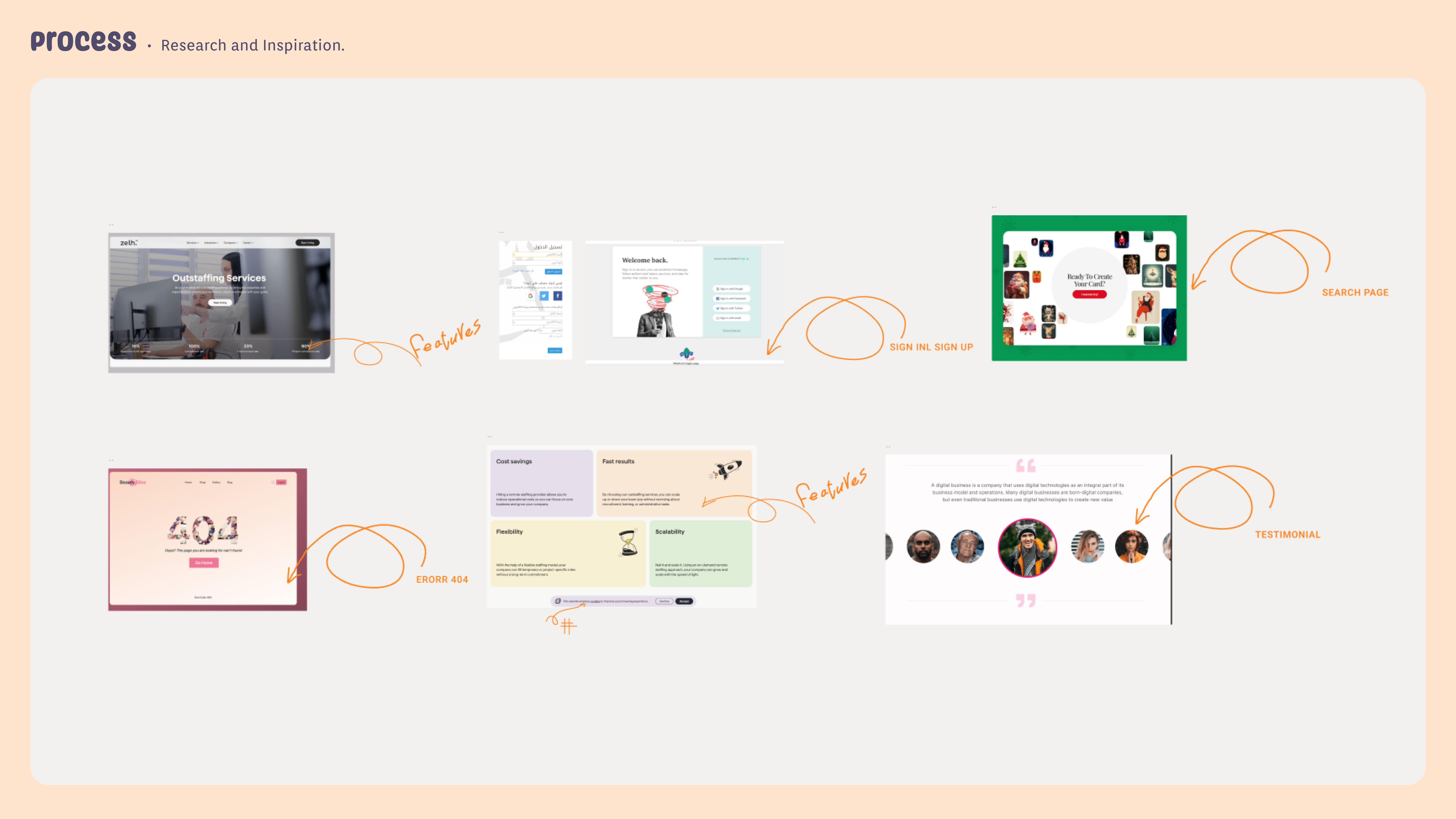
The "research and inspiration" page shows great taste. You picked clean, user-friendly examples. Next time, adding a short note under each, like "loved the clean layout" or "strong CTA design", would show even more thoughtfulness. You’re 90% there.
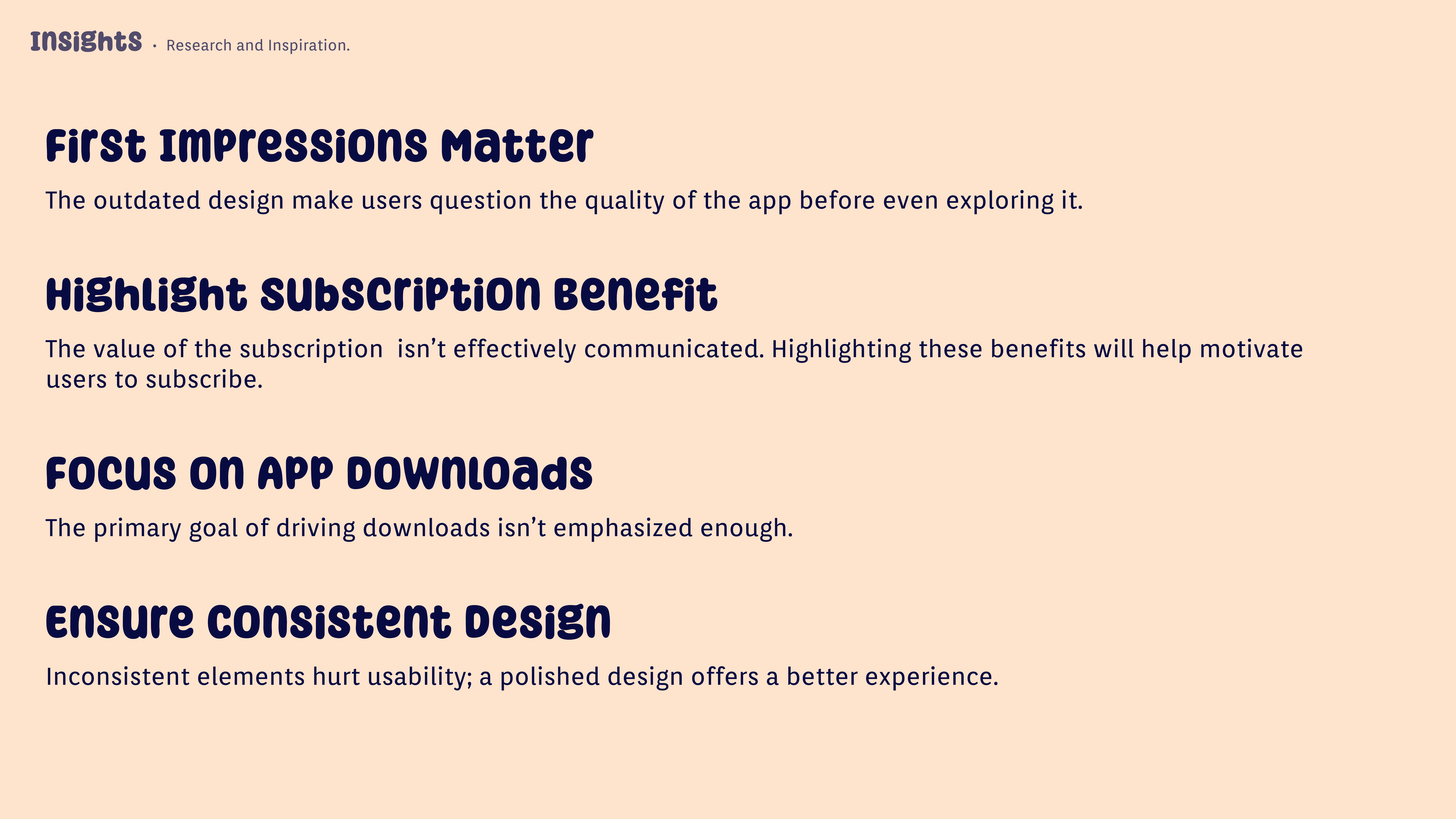
The "insights" are excellent. I can feel how much you learned through the process. If you want them to jump off the page more, just add a tiny symbol next to each point. You already have the content — this would make it even more visually engaging.
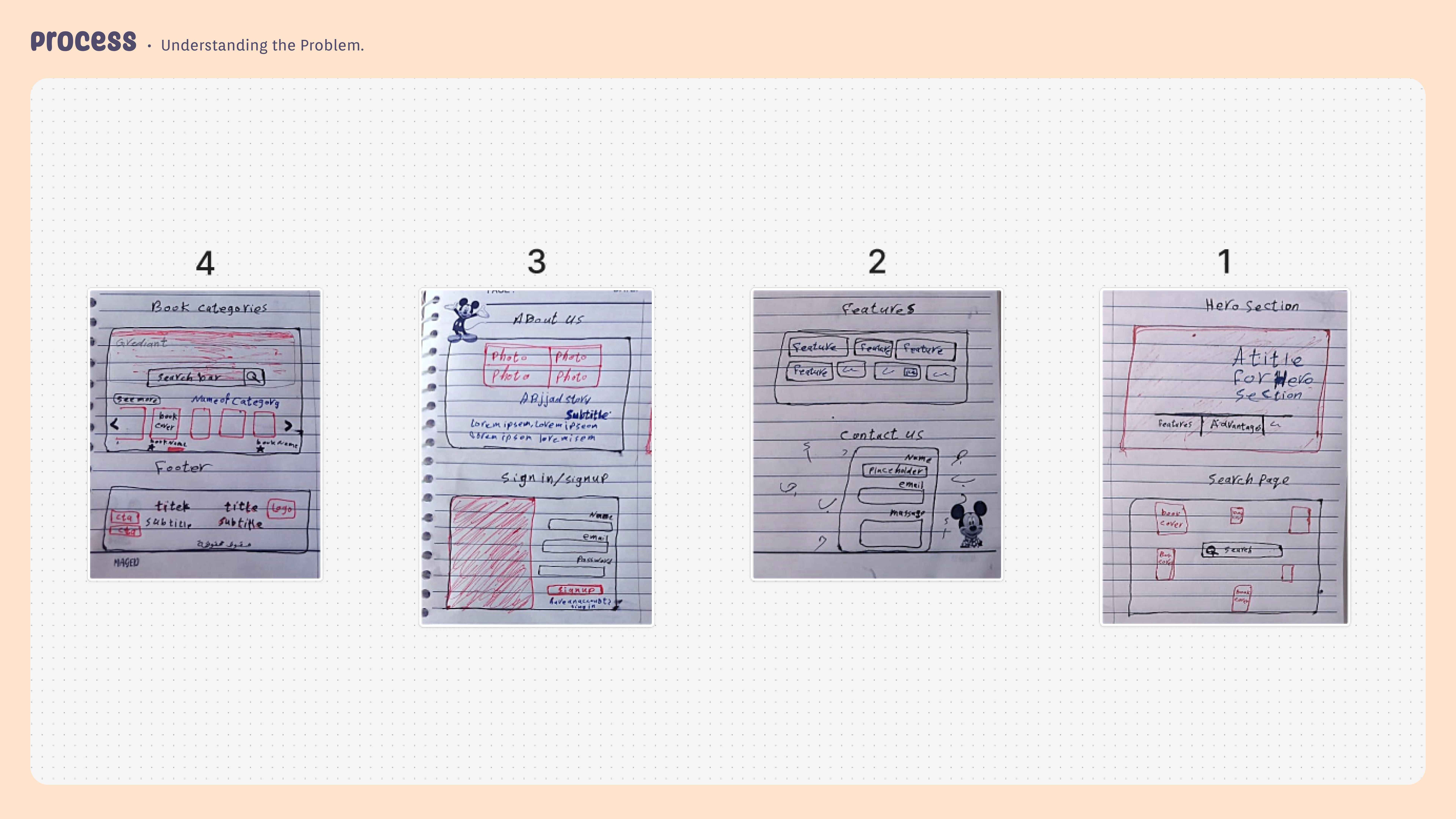
Your "hand sketches" made me smile. They show you explored different ideas before rushing into UI. It shows maturity. Just remember: numbering sketches from 1 to 4 (instead of 4 to 1) would guide people more naturally through your thinking. Small detail, but it shows polish.
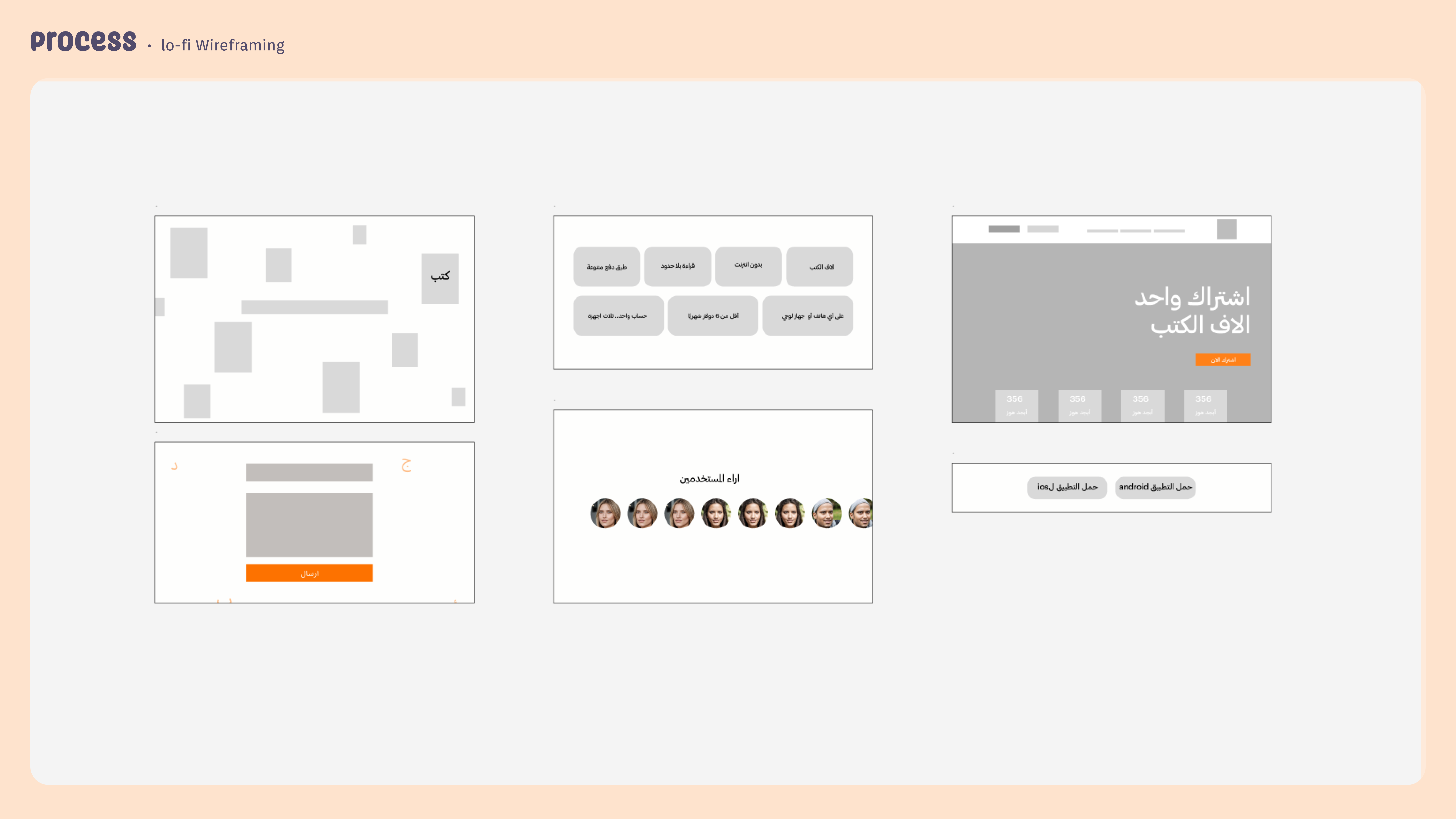
Your "low-fidelity wireframes" are clean and easy to follow. Adding little section labels (like "Hero" or "Testimonials") would push this even higher. But honestly, the structure already looks very good.
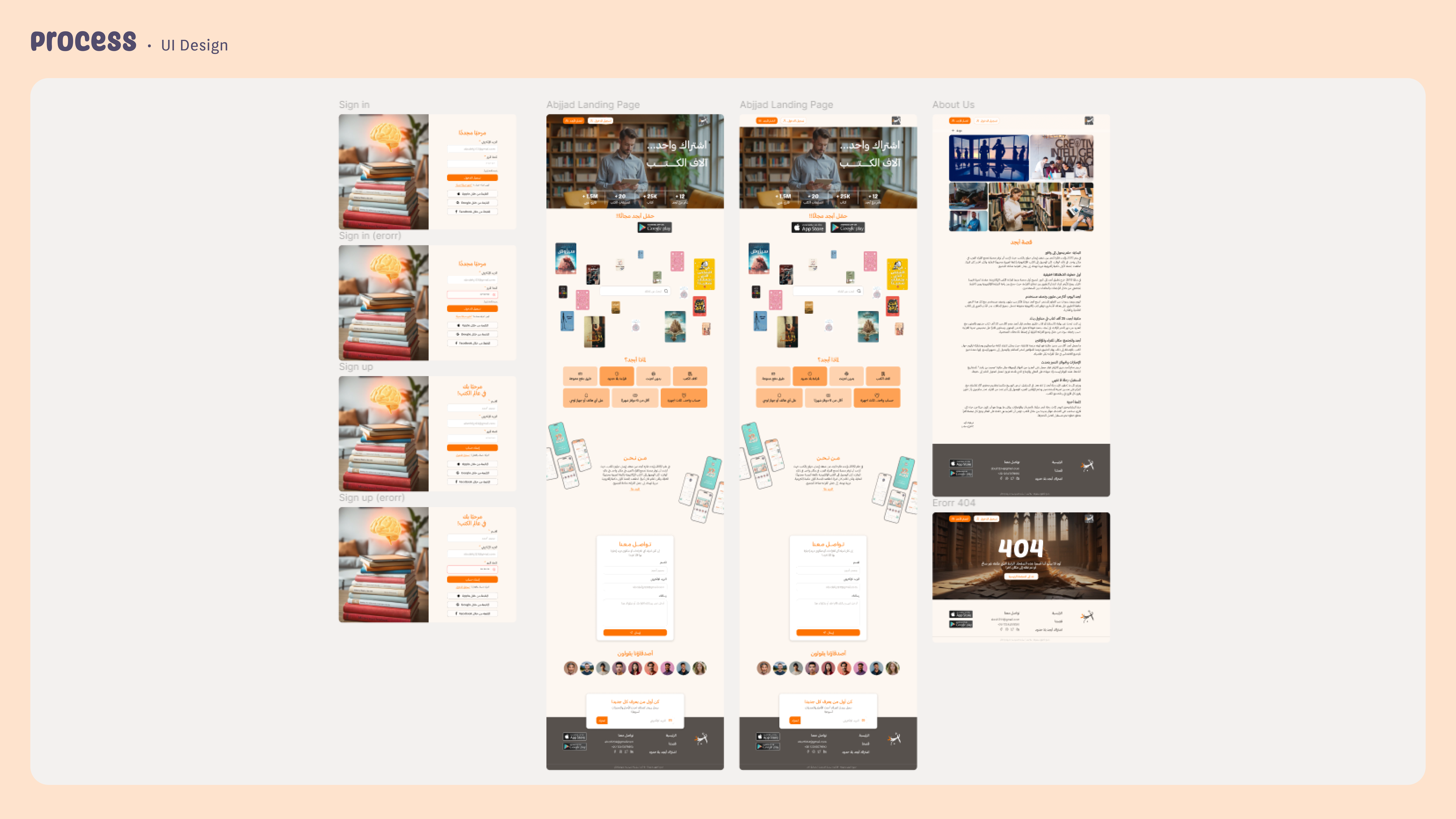
Now, about your "final UI design" — what a glow-up.
The landing page looks modern, welcoming, and easy to explore. The CTAs are visible and inviting. You should feel proud of how much more trust your design builds compared to the old one. One tiny thing: the man in the hero image could have a slightly friendlier expression. It’s a detail, but it can change how users feel emotionally. And maybe use a faint divider or soft background color between sections to guide scrolling even more smoothly.
The "sign-in and sign-up" pages are clean and professional. Your error handling is clear — and that’s such an important touch. The brain visual is fun! To make it even better, you could add a little tagline like "Expand your mind with Abjjad" to connect the image to the action.
Your "404 page" looks beautiful and feels dramatic in a good way.
The broken books idea fits perfectly. Just one push: make the "Back to Homepage" button bigger. Also maybe offer two paths like "Browse Books" too. But wow, the mood you set is powerful.
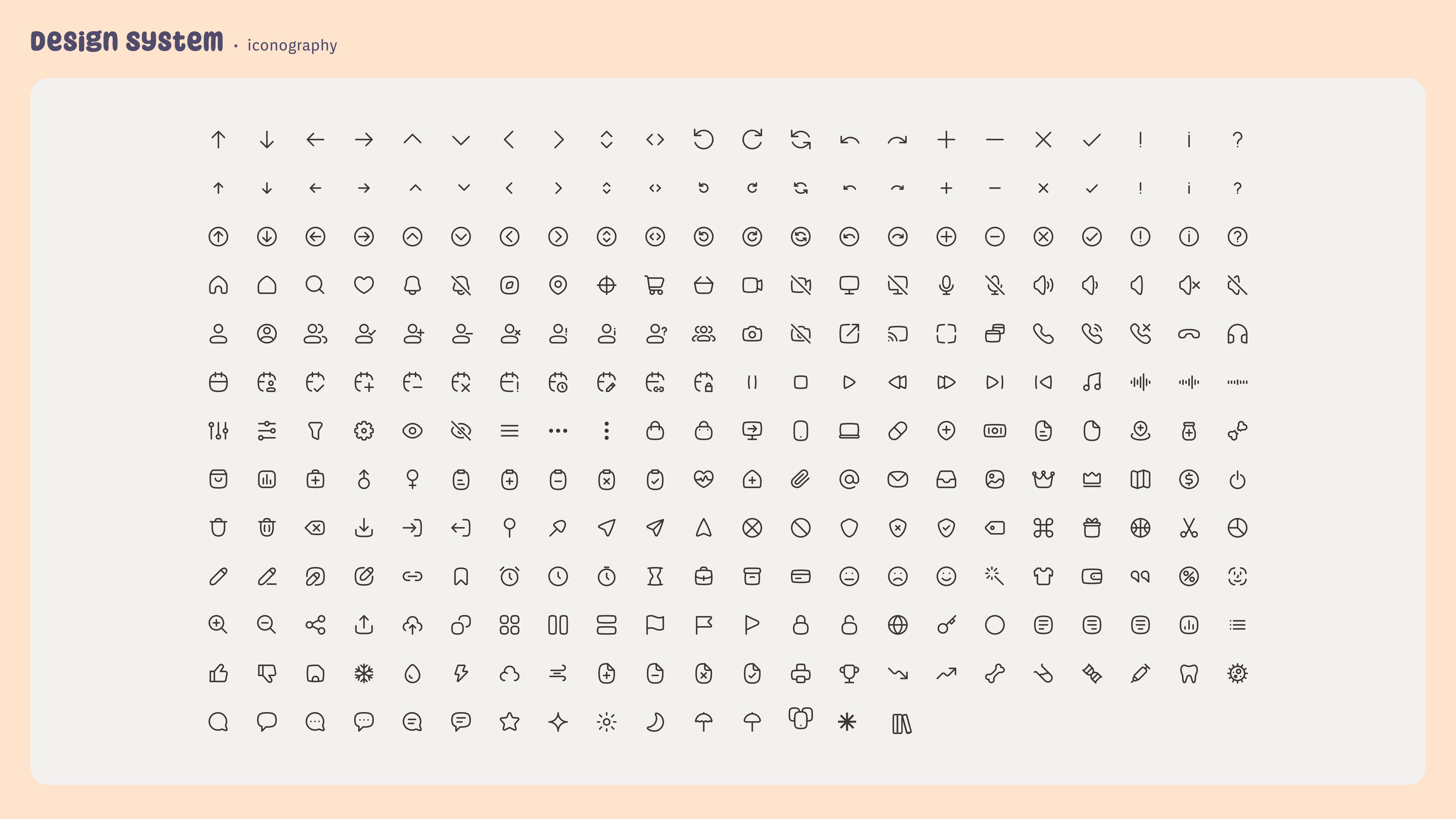
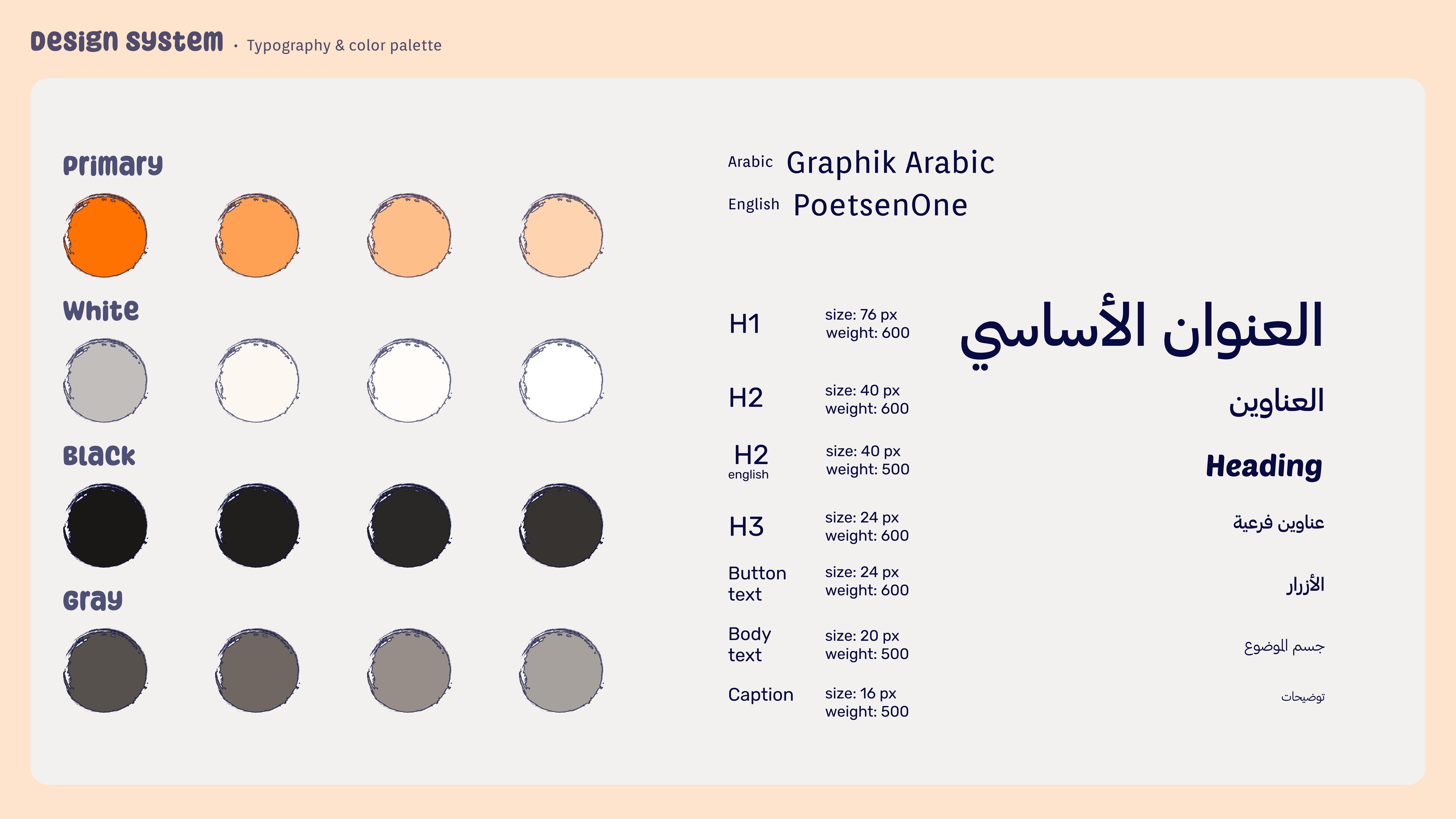
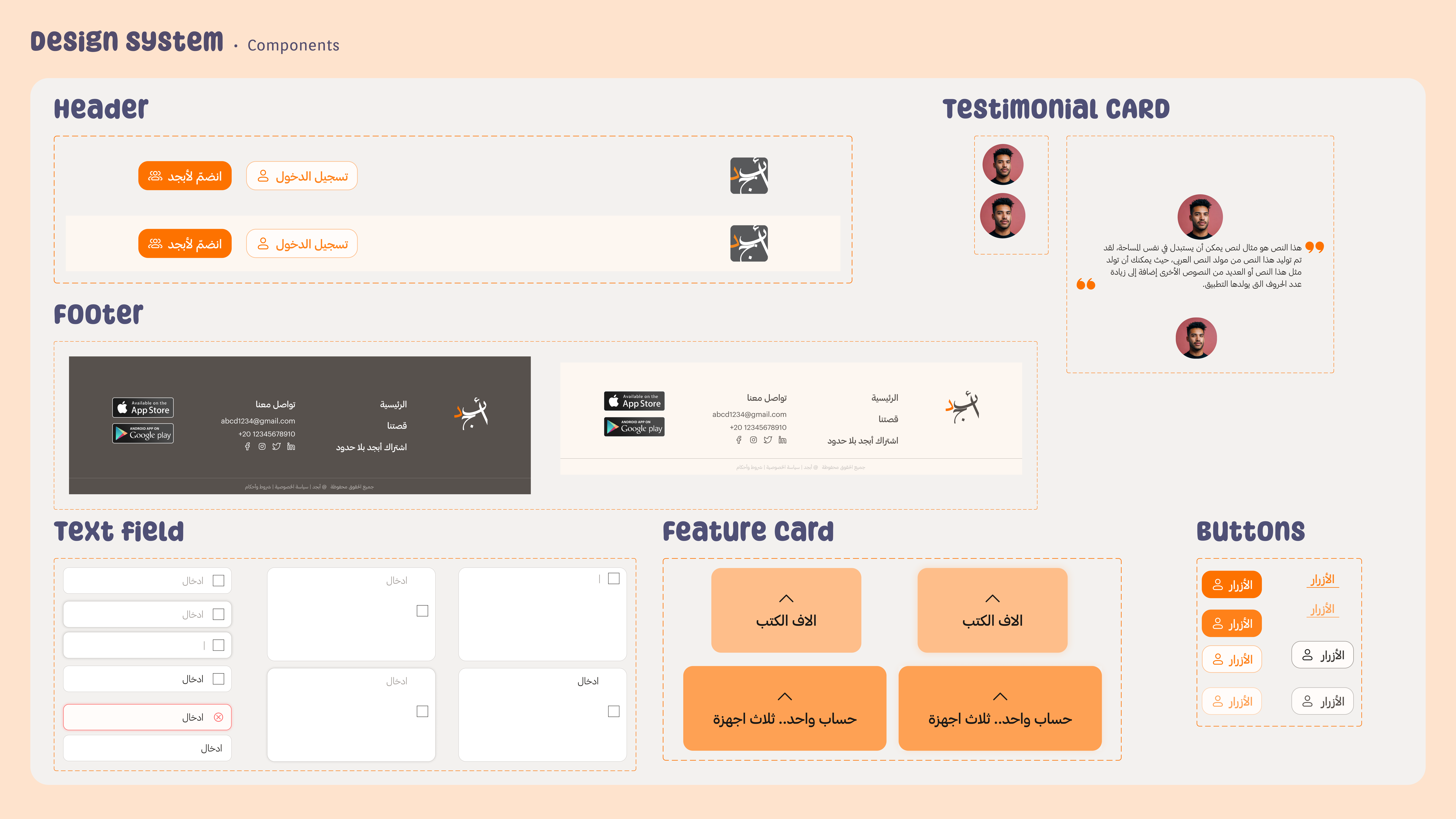
Your "design system" is impressive. It shows real thinking about consistency. If you want to show even more mastery, try displaying a few of the icons inside buttons or cards, just to prove how they behave in real design.
Your "personal gain" slide feels genuine and powerful.
You reflected on real lessons about UX. That’s the kind of thing hiring managers love to see. You could make your main learning stand out a bit more by writing: "UX is about solving problems, not just making things look good." A simple, human reminder of what you learned.
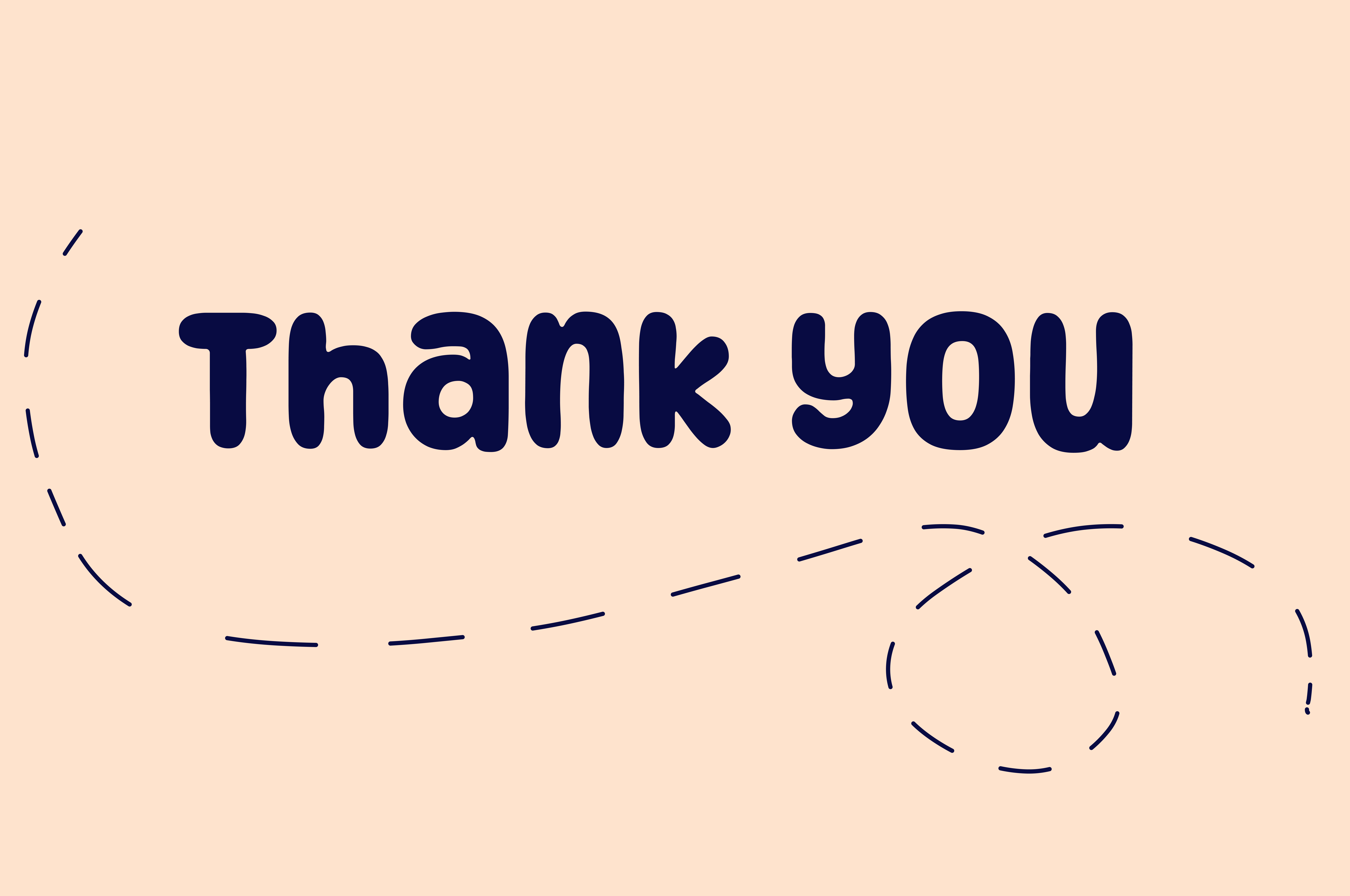
And your "thank you" slide is lovely. It’s warm.
If you want to make it even better, add a small invitation like "See more of my work" or "Let’s connect." It would make your closing feel like the beginning of a conversation, not the end.

amazing !
You might also like

Entrant - Analytical Dashboard


Transit Cairo — Digital Mobility Redefined


Entrant Accessible Signup and Login Forms

CJM x Mindspace case study - Ester Cinelli

LUMÉRA - Checkout Flow

A/B Testing for Bumble's Onboarding Process

Popular Courses

UX Design Foundations


Introduction to Figma

Design Terminology
