Boho Landing Page

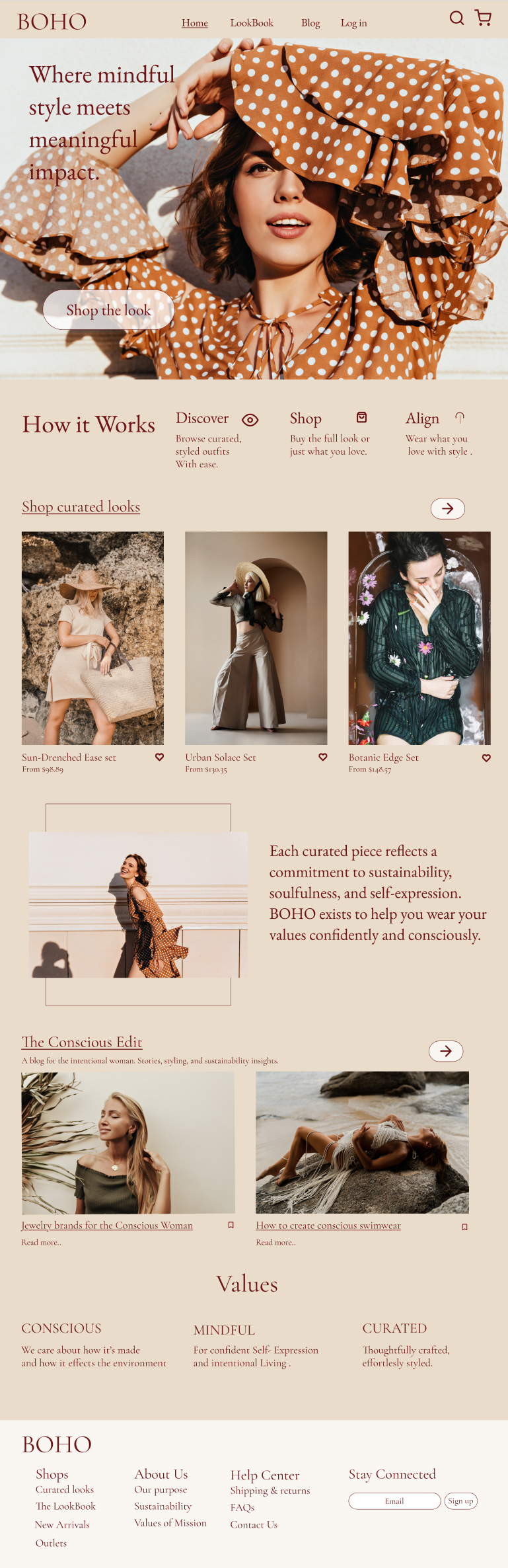
BOHO is a thoughtfully designed fashion landing page created to embody the spirit of intentional living and mindful style. This project combines earthy tones, elegant typography, and curated visuals to represent a brand dedicated to sustainability, self-expression, and curated fashion for the modern, soulful woman.
The page includes a detailed “How It Works” section, a curated product showcase, and brand-aligned messaging throughout. I developed a cohesive visual identity that reflects the brand’s values MINDFUL, CONSCIOUS, and CURATED and translated them into a clean, intuitive, and inspiring user experience. A blog and FAQ section are integrated for deeper storytelling, while the footer brings all navigation and community engagement together.
This was my first full landing page design, completed using Figma, and it showcases my evolving skills in UX/UI, branding, and responsive layout design.
Tools used
From brief

Topics
Share
Reviews
3 reviews

Wow it looks awesome! You did amazing job! Can't really add anything up. Hope to see your next project soon :D
Congrats on your first landing page, Krishael! What an awesome achievement! 🎉
Now let’s talk about the feedback. I imagine you’re looking for ways to grow and improve your work, right? Let’s dive in:
👉 1. Fix the Grid
If you plan to send this design to a developer, it’s super important that the layout has a well-aligned grid. This helps with visual clarity, better organization, and makes the design easier to build in code.
Tip: Search on YouTube for videos like:
“How to create a grid in Figma for landing pages”
👉 2. Spacing and Proportions
The spacing between elements can still improve. A great tip is to check out the spacing system from Tailwind CSS. Even if you’re not coding with Tailwind, their sizing ideas help keep things clean and readable.
Suggestion: Look up “Tailwind CSS UI Design system” on the Figma community.
Explore their typography sizes, spacing rules, and layout ideas.
👉 3. Hierarchy and Value Focus
A landing page should guide the visitor’s eyes. Work on visual hierarchy: make the title stand out, give your call-to-action (CTA) button more attention, and highlight the parts that really show the value of your product or service. Beautiful design is great — but design that converts is even better.
Right now, your action button needs more emphasis. Make it pop!
Remember: the design should sell and bring results to the client.
Searches you can do on YouTube:
- How to build visual hierarchy in landing pages
- How to design a high-converting landing page
- How to organize a design system in Figma
- How to apply Tailwind CSS in Figma (no coding)
- How to create smart grid systems for landing pages
I really liked your work! For your first landing page, it’s excellent. The most important thing is — you’re actually doing it. I see a lot of potential in you! Keep learning, practicing, trying new things — and most of all, enjoy the journey.
You’ve got everything it takes to grow big! 🚀

Great job! I like the structured grid layout and visual hierarchy of the content as well as the imagery. I would recommend the following:
- Reduce the size of the hero image, crop it more to the right, and increase the size of the headline to make it have more impact. Right now, it gets lost in the image.
- Add a darker, almost black color to the color palette for body copy and headings, and use that burgundy color for links and CTAs. It's difficult to know what is static text and what is a clickable link
- Make the CTA more punchy since it's the main action, maybe using a solid button using the burgundy color
- Make sure your icons have the same stroke weight
Great work. Just needs a little tightening up.
You might also like

SONZ - Entertainment platform


Camp & Travel Explorer - App Design


Solar system Dashboard Utility

Uxcel Halloween Icon Pack


Signup page for a SaaS website


Color System

Content Strategy Courses

UX Writing


Common UX/UI Design Patterns & Flows


Go-to-Market Strategy Fundamentals
