Behind the wardrobe
A website that is curated for explorers.

Reviews
1 review

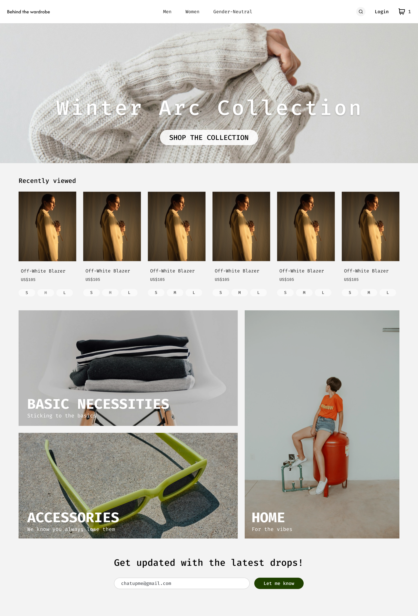
Great job! I love the clean look of the landing page, the visuals you’ve chosen, and the microcopy for categories like “Accessories” and “Home.” Here are a few suggestions to make it even better:
- The brand’s added value—offering timeless pieces—is clear. However, the value proposition could be enhanced by creating content that briefly introduces the brand, its values, and positioning. For instance, you could include a title, a short description, and a link, like the one you’ve used for the “Winter Arc” collection.
- UI: The main CTA, “Shop the collection,” could stand out more compared to other buttons on the page since it’s the primary action. For example, you might use the beautiful green color from the “Let me know” button. Regarding product cards, consider distinguishing the price from the product title by using a bolder font and adding an “Add to cart” button (or displaying it on hover).
- Don’t hesitate to highlight products other than those the user has recently viewed. For example, feature the brand’s bestsellers, provide access to a popular category on the site, or suggest products that align with the user’s internet searches (via cookie consent).
Thank you for your contribution!
5 Claps
Average 2.5 by 2 people
You might also like

Project
Pulse — Music Streaming App with Accessible Light & Dark Mode

Platform & DeviceFor this project, I designed Pulse, a mobile music streaming application for iOS devices (using the provided mobile templat

Project
Islamic E-Learning Platfrom Dashboard

Visual Language & Color I wanted the interface to feel like a quiet room you'd actually want to sit in and study. The warm neutrals - off-wh
Project
SiteScope - Progress Tracking App

🧩 Project OverviewThis project showcases the design of a mobile login and sign up experience for a construction progress tracking app. The

Project
Mobile Button System

As my first ever ux design attempt, I tried to go with a simplified approach with only a few button types and states. I kept the color palle

Project
FlexPay

The onboarding was designed to reduce financial anxiety, create a sense of instant reward, and encourage early action. Instead of overwhelmi

Project
CJM for Co-Working Space - WeWork

This project presents a customer journey map for WeWork, created to understand the end-to-end experience of a remote professional using a co
Content Strategy Courses

Course
UX Writing

Learn to write microcopy that communicates clearly and concisely to improve user experience, build trust, and boost conversions across digital products.

Course
Common UX/UI Design Patterns & Flows

Learn how to use tried and tested UX/UI design patterns and flows to solve recurring design problems faster and build interfaces that feel intuitive

Course
Building Content Design Systems

Master systematic approaches to creating consistent, reusable content across your entire product ecosystem