Babyface checkout

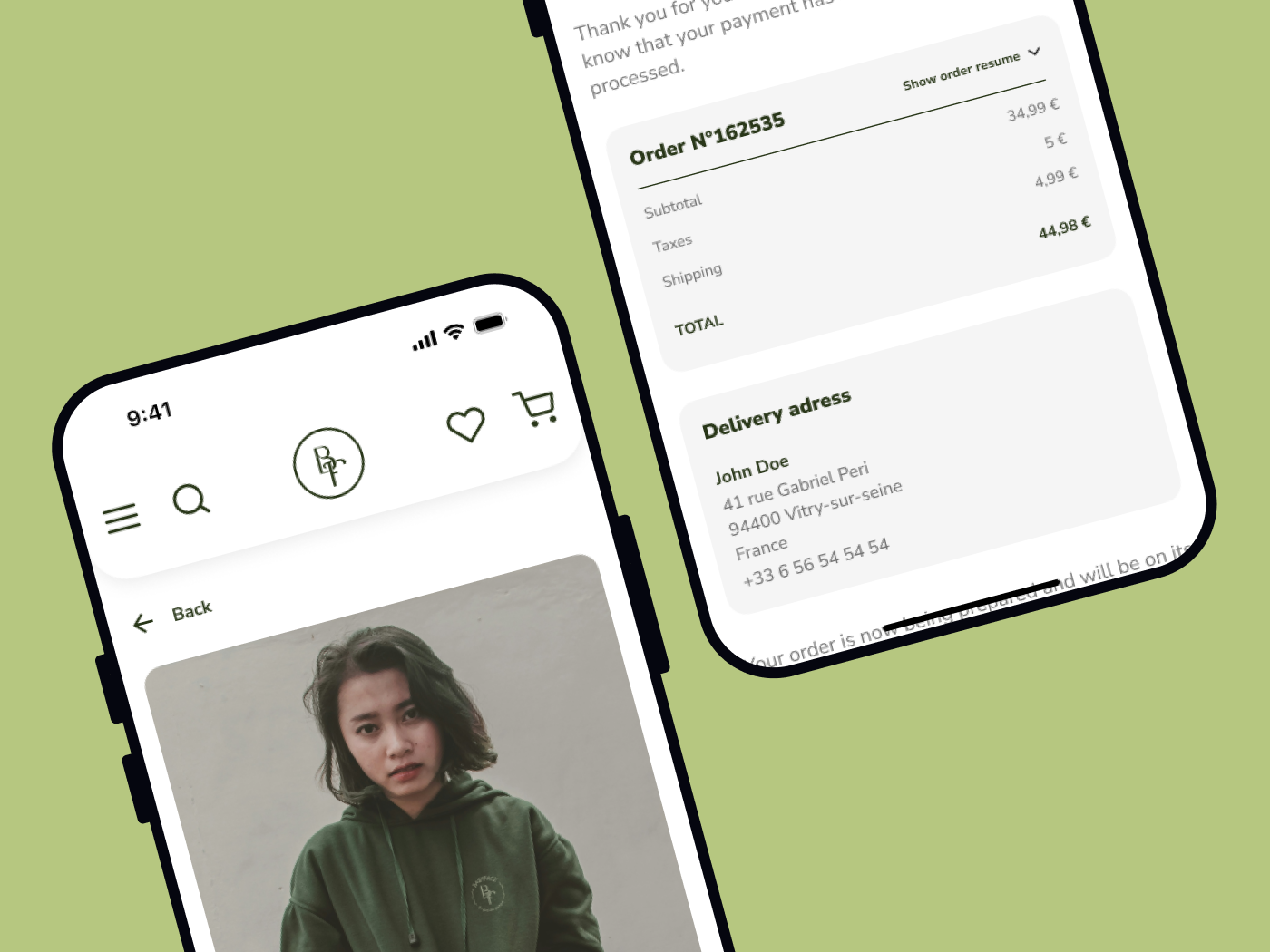
For Babyface, I designed a mobile-first checkout experience that prioritizes simplicity and efficiency.
The checkout flow is structured as a straightforward three-step process:
- Cart Review: A concise summary of items and costs, allowing users to modify and confirm their selections before proceeding. Users can choose to sign in, continue as a guest, or connect quickly via options like Apple Pay or PayPal, streamlining access to the checkout.
- Shipping Information: A quick-entry form with address autofill to reduce user input. Users also have the option to select a nearby pick-up point close to their home address, offering added flexibility.
- Payment and Confirmation: Users can select their preferred payment method, with options to pay through Apple Pay or PayPal for instant checkout, or they may enter card details with an option to save for future purchases. These choices enhance speed and security, building user confidence as they complete their purchase.
This simplified, three-step checkout flow is designed to minimize friction, enhance convenience, and build trust at every step. By incorporating quick payment options and flexible sign-in choices, Babyface’s mobile checkout experience reduces cart abandonment and ensures a smooth, enjoyable path to purchase.
Tools used
From brief

Topics
Share
Reviews
1 review

Good Work!
Here are a few suggestions that could further refine the user experience:
- Favorite button feedback: When users click the "Favorite" button, it changes to green, which aligns with the brand theme. However, green is often associated with "success" or "completion," which might confuse users about its intent. Have you considered using red or black instead? These colors could provide clearer visual feedback in this context.
- Button label: The “Continue with Credit or Debit Card” button could be changed to “Checkout.” This aligns better with the flow, as the next step involves user account details rather than payment information.
- User account: Adding a “Sign Up” option alongside “Log In” and “Guest Checkout” would enhance usability, providing more flexibility for users who might want to create an account at this stage.
- Guest checkout flow: Since the user flow focuses on guest checkout, it’s worth noting that typically, guest checkout doesn’t include saved addresses or payment methods.
- UI copy and spelling: Ensuring all UI copy is free of spelling errors is crucial unless the terms are specific to the users or context. This helps avoid any potential confusion.
6 Claps
Average 3.0 by 2 people
You might also like

Project
Smartwatch Design for Messenger App

Practice your interaction design skills and design experience optimized for smartwatches.

Project
Bridge: UI/UX Rebrand of a Blockchain SCM Product

A UI/UX overhaul project of Bridge, a blockchain-based enterprise supply chain management web app originally called BSCM. This short case st

Project
Pulse Music App - Light/Dark Mode

This project presents a mobile music streaming interface designed in both light and dark modes. The visual direction combines Japandi minima

Project
Monetization Strategy

This project evaluates two monetization models (freemium and paid) for a new mobile point-and-click adventure game. It compares their streng

Project
Designing A Better Co-Working Experience Through CJM

Project ContextThis project focuses on improving the experience of individuals using co-working spaces. The objective is to identify key pai

Project
Design a Settings Page for Mobile
Showcase your information architecture and content strategy skills by crafting a settings page for mobile.
Interaction Design Courses

Course
UX Design Foundations

Learn UX design fundamentals and principles that create better products. Build foundational knowledge in design concepts, visual fundamentals, and workflows.

Course
Introduction to Figma
Learn essential Figma tools like layers, styling, typography, and images. Master the basics to create clean, user-friendly designs

Course
Design Terminology

Learn UX terminology and key UX/UI terms that boost collaboration between designers, developers, and stakeholders for smoother, clearer communication.