UX Case Study • E-commerce
Design Rationale
The checkout form redesign follows a user-centric approach that prioritizes clarity, simplicity, and accessibility. Every decision was guided by the goal of reducing friction and helping users complete their purchase with confidence. The following principles shaped the design direction:
1. User-Friendly Organization
Form fields are grouped into clear, logical sections to support intuitive navigation.
By organizing inputs into meaningful clusters—such as Payment Details, Billing Address, and Order Summary—users can progress through the form more easily and process information in a structured manner. This improves flow, reduces confusion, and supports quick completion.
2. Visual Hierarchy and Scannability
A deliberate visual hierarchy ensures users can scan, understand, and complete each part of the form without cognitive strain.
While the current layout is functional, improvements focus on refining spacing and introducing visual dividers or fieldsets. These enhancements will create stronger separation between sections, reduce cognitive load, and help users identify required inputs at a glance.
3. Clear and Concise Microcopy
Labels, placeholders, and instructional microcopy were intentionally crafted to guide users with clarity.
Microcopy communicates the purpose of each field and helps prevent errors before they occur. Error messaging is already implemented effectively, but additional improvements will increase specificity and ensure feedback is more actionable and user-friendly.
4. Strategic Call-to-Action Placement
The “Place Order” button is positioned prominently at the end of the form, serving as a clear and intuitive call to action.
While the placement supports natural flow, the visual design will be further refined to ensure the button stands out appropriately without distracting from the main form content.
5. Accessibility and Inclusive Design
Accessibility is a core consideration in the design.
The form supports keyboard navigation, supporting users with motor impairments, and future enhancements will introduce ARIA labels, roles, and descriptive associations to improve compatibility with assistive technologies. This ensures a more inclusive experience for all users.
6. Streamlined Checkout Experience
The primary aim of the design is to create a frictionless and streamlined checkout journey.
Unnecessary distractions are minimized, while key information is prioritized to support quick and confident completion. Future improvements include implementing saved information for returning users and guest checkout options, both of which reduce effort and accelerate the path to purchase.

Reviews
3 reviews

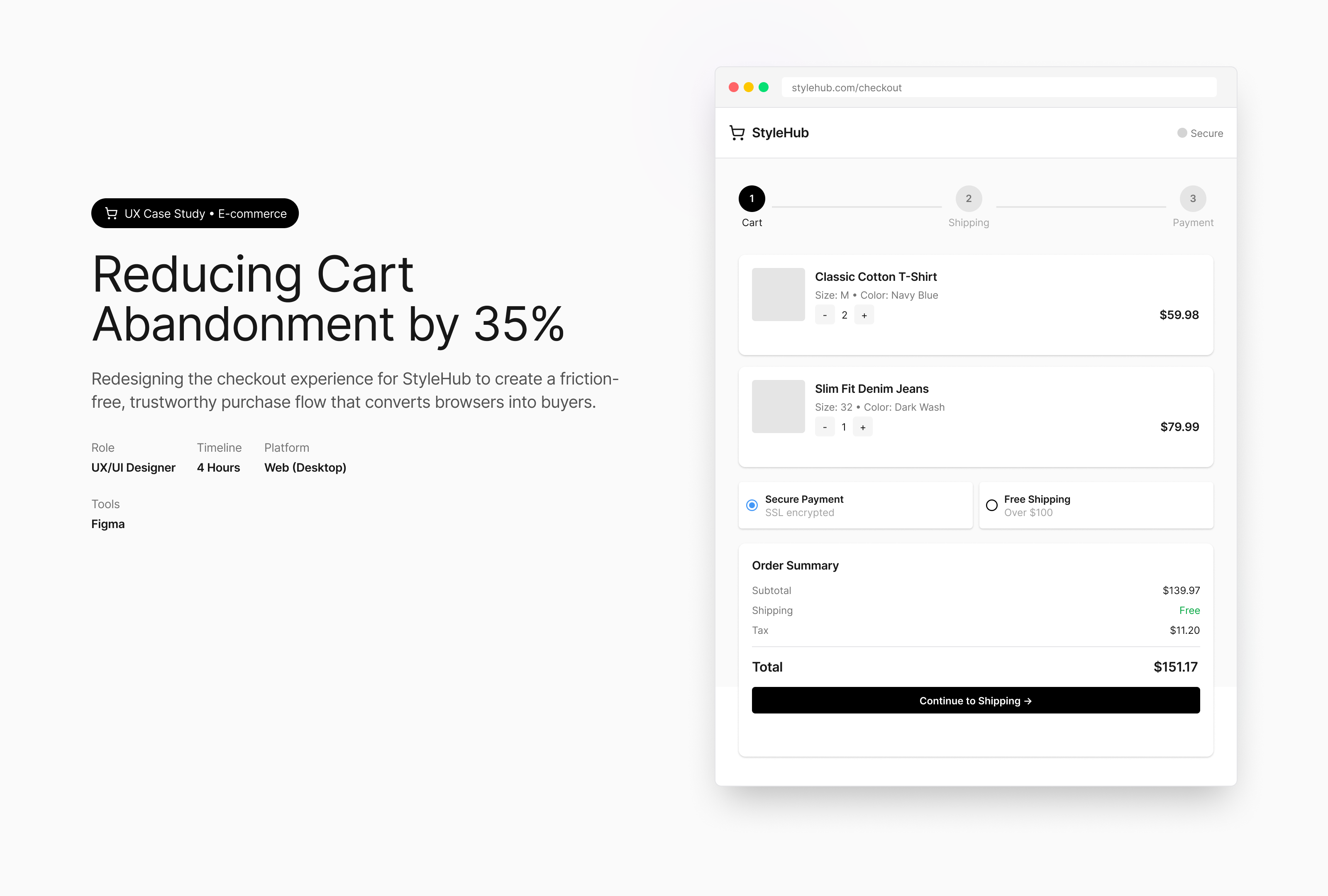
Judging by the project cover only, no wonder the cart abandonment rate was quiet high because customers had to choose between Secure Payment and Free Shipping 😄
Unless you turn those into checkboxes, that choice shouldn’t exist at all. Transactions should always be secured and free shipping should automatically apply based on the T&C.
Fortunately, those weren’t in the Figma file, yay! Here are the things I noticed:
- “Size: 32 • Color: Dark Wash” sits a bit too close to the quantity selector. Probably just a layout slip since there’s still room to let it breathe.
- Since everything is “cardify” I saw the heading “Shopping Cart (3 items)” like an orphan or not part of the group. I think it’s either lowered to the same baseline as the order summary card so it feels connected or included with the product cards below it.
- The trash bin icon feels visually paired with the price, which made me wonder whether clicking it removes the product or the price. Price should stay grouped with the product and delete should sit as its own action.
- Interesting choice that the country field isn’t mandatory while the rest of the shipping fields are. Curious what the rationale is 🤔
- In the Shipping step, “Shipping Method” took a little jump. Looks like it almost escaped its card.
- I'm not really sure about the “Continue Payment → ” button that takes up the rest of the space, but probably that's just my own pattern. I'm used to seeing them have space in between the “back” and “continue” button.
- “Save card for future purchases” seems to have lost its checkbox? The indentation is there but the box is blank.
- “Shipping to:” address line could use some space, especially when customers have to make sure they're putting the correct address. Give them some time to scan, Ayat!
- On the confirmation page, there’s indentation after “Your order is being prepared. You’ll receive shipping updates via email.” Not sure if those were meant for bullet points or a styling preference.
For a checkout flow that aims to build trust and momentum, these little alignment quirks and grouping choices matter because they either reinforce a sense of clarity or break it in small invisible ways. The smoother the flow feels, the less mental friction shoppers carry into payment.

Nice work

I really liked your checkout project, Ayat Sabra. The information architecture and visual hierarchy follow all the recommended guidelines very well.
As a suggestion for improvement, I would recommend increasing the contrast between the components and the background. One way to achieve this is by enhancing the background contrast while keeping the interface elements in lighter tones, as you already started doing.
Congratulations on the project! If you need anything, feel free to reach out.
You might also like

Smartwatch Design for Messenger App


Bridge: UI/UX Rebrand of a Blockchain SCM Product


Pulse Music App - Light/Dark Mode


Monetization Strategy


Designing A Better Co-Working Experience Through CJM


Design a Settings Page for Mobile
Interaction Design Courses

UX Design Foundations


Introduction to Figma

Design Terminology
