Dark Mode Music App


Reviews
3 reviews

Good work! Your design captures well the compliance with WCAG guidelines and the design looks clean.
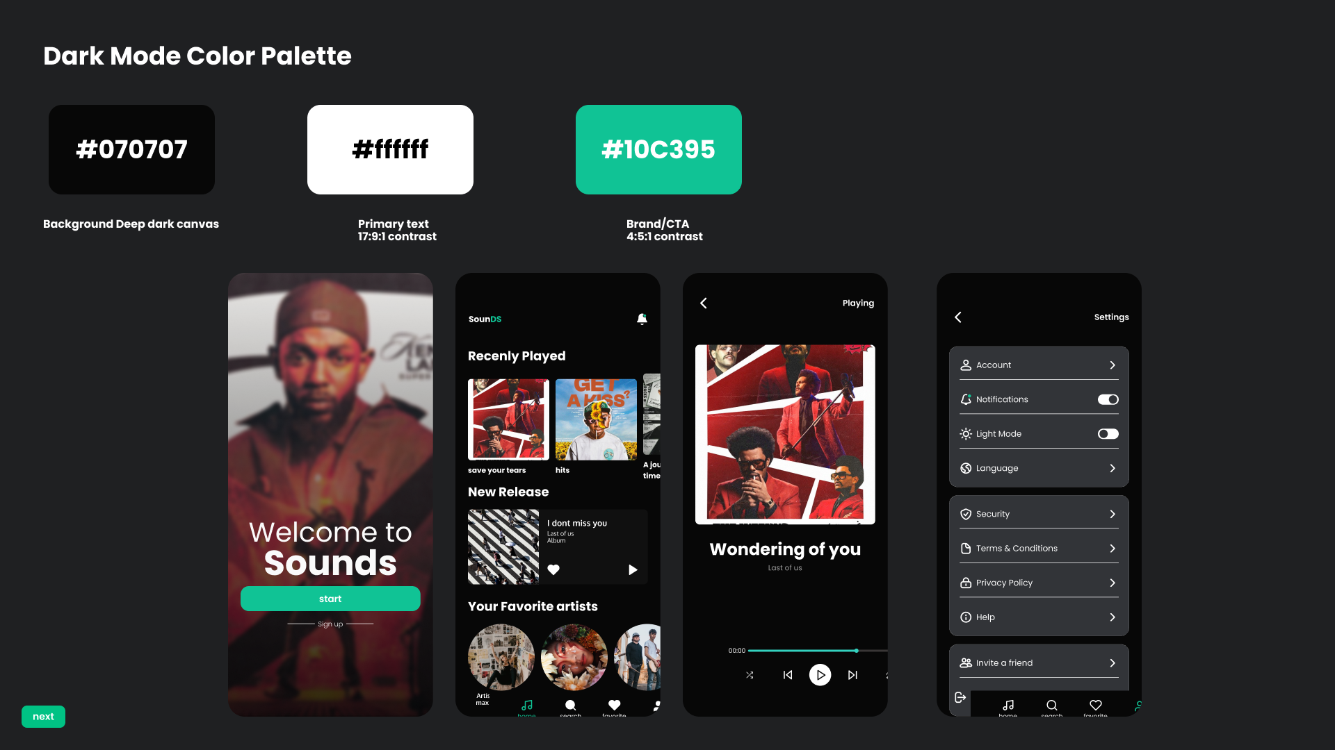
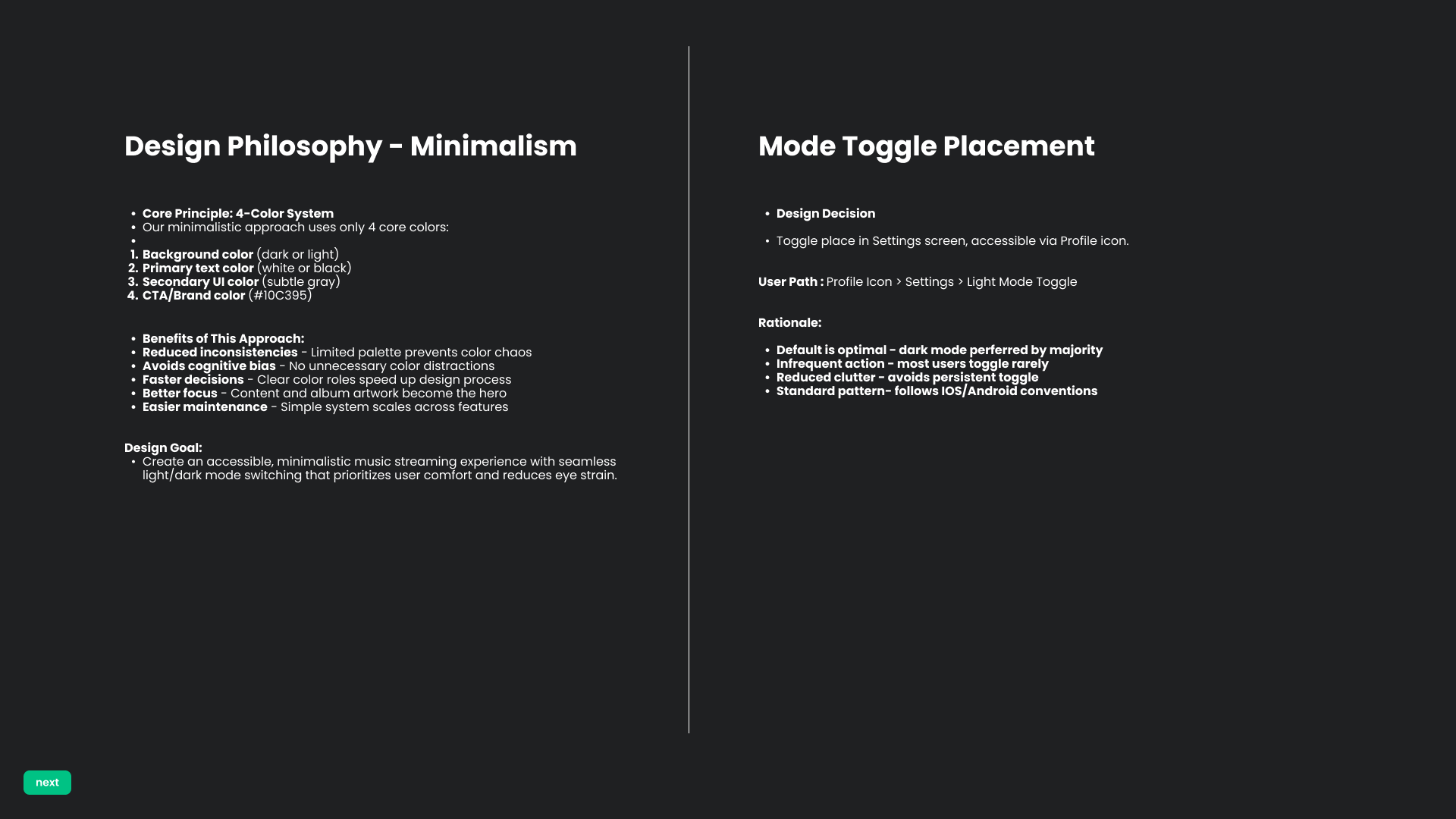
It is nice for the user to have the toggle in settings, to change the mode from dark to light. I would recommend however, to add some more variety on the colours, instead of using just #ffffff and #000000 - like some different shades. You could still follow the minimalism approach, and use dark/light colours, but make it a bit more eye-catching.
I also noticed that for cohesiveness it would be good to have the same logo also at the first welcome screen, as later on in the other screens.
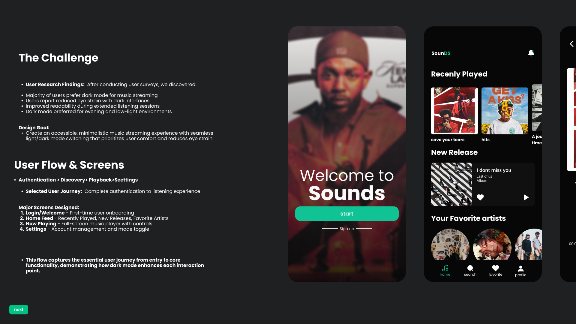
Regarding the flow - I would assume, the user has to sign in somehow in the app, aside from just clicking "start".

Good job! I like the design goal and overall philosophy: it’s clear, focused, and easy to understand. The color choices work well, and the contrast supports accessibility in both light and dark modes.
I’d recommend reviewing the margins, especially in elements like the navigation bar and the spacing between sections. At the moment, the layout can feel a bit overwhelming, which makes it harder to focus on the content. Adjusting the spacing could improve visual clarity and user comfort.

I thought your idea was really cool.
Can I offer some tips?
Take inspiration from streaming apps, pay attention to the details of the design, effects, spacing, and icons, so that your project looks even better.
There are many apps that are worth using as references for creating components and navigation options.
You might also like

Smartwatch Design for Messenger App


Bridge: UI/UX Rebrand of a Blockchain SCM Product


Pulse Music App - Light/Dark Mode


Monetization Strategy


Designing A Better Co-Working Experience Through CJM


Design a Settings Page for Mobile
Visual Design Courses

UX Design Foundations


Introduction to Figma

Design Terminology
