Accessible Signup and Login Experience

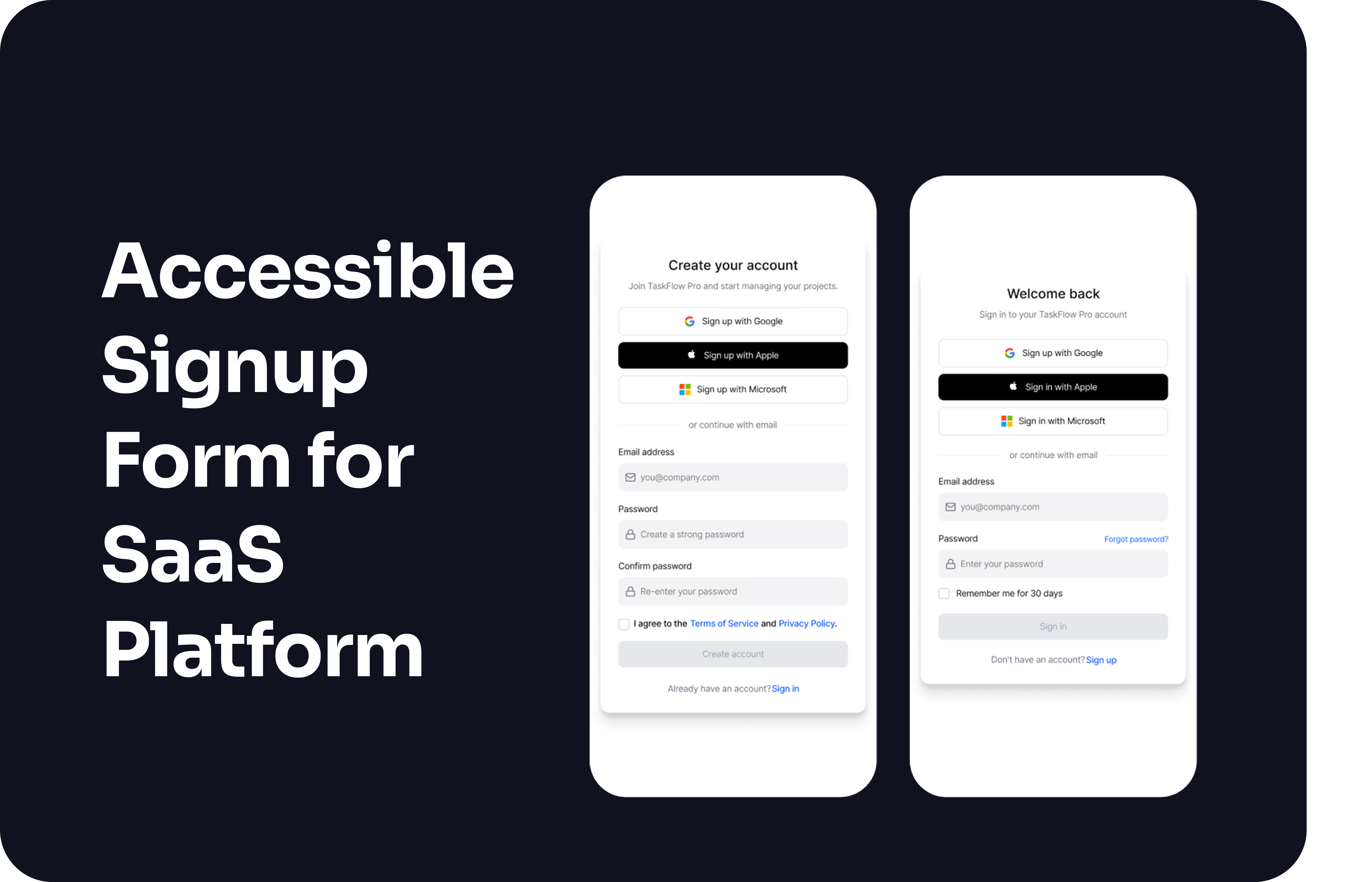
Accessible Login and Signup for a SaaS platform
This project explores how an accessible signup and login flow can reduce user errors while maintaining accessibility and trust.
The focus is on clear validation, predictable feedback and inclusive interaction patterns that work across devices.
The experience is designed to support a wide range of users and explores validation logic, error handling, loading states and success feedback.
Platform
TaskFlow Pro. Project management SaaS.
Device
Mobile and desktop.
Summary
This project explores an accessible login and signup experience designed to reduce errors and support a wide range of users.
Accessibility
- Follows WCAG 2.1 AA guidelines.
- Clear text labels and semantic structure support screen readers.
- Sufficient color contrast. Color is never the only way feedback is shown.
- Fully keyboard accessible with visible focus states and logical tab order.
- Touch targets meet minimum size requirements.
Usability
- Progressive disclosure for password requirements to reduce visual noise.
- Validation feedback appears after field completion. This avoids distracting feedback during typing while still preventing common errors.
- Errors are specific and actionable.
- Common email typos are detected and suggested. (gmial → gmail)
- Password strength feedback uses both text and visual indicators.
- Clear loading, error and success states.
Visual Design
- Simple layout with clear hierarchy and consistent spacing.
- Primary actions are easy to identify.
- Consistent patterns across login and signup reduce cognitive load.
Goal
To create a login and signup flow that feels clear, predictable, and usable for as many users as possible, without sacrificing accessibility.
Prototype
The prototype includes full validation logic, error handling, loading and success states.

Reviews
3 reviews

Good exploration. This could best practice that handle all edge cases when user try to login on any apps.
Good job!
Btw my I know your reason why don't you apply phone mockup since you're using figma prototype. Apply phone mockup can give more real feeling when try the prototype.
Waiting for your next showcase!

Hey Sanna.
I see a lot of good practices in your project. I really like that users can see what they’re typing when creating a password and that you guide them with clear validation rules.
I’m curious how you imagined the validation for incorrectly entered email addresses. Are you checking only the format, or are you also handling common mistakes like misspelled email providers?
I also wanted to ask about your decision to use two password fields. With all the good practices you already included in the first field, showing the password and validating it clearly, the confirmation step might not be necessary. For many users, repeating the password can feel tedious.
Since you have a “forgot my password” flow, users have a way to recover if they make a mistake. There’s even a case study showing that removing the confirm password field increased conversion by 56.3%, which makes this worth reconsidering. What do you think?

The project is really well thought out and shows solid UX foundations. 💪
Email validation with automatic correction suggestion is a great move. This kind of detail makes a difference in conversion because it catches errors before the user clicks submit. Progressive disclosure for password requirements is done smartly. Requirements appear only when needed, which reduces visual noise. Checkmarks with color and text are good accessibility practice. The user gets multi-channel feedback, not just a colored bar.
Validation states (error, focus, success) are clear and consistent. You can see the designer thought about different scenarios and didn't rely only on color. The success screen is minimalist and clear. The user immediately knows what happened and what's next.
I didn't see loading states, but that might be a matter of screen scope. Overall, the project shows good understanding of accessibility principles and validation logic, which is rare in junior case studies.
Solid work! 😊 You can see the designer didn't just apply patterns but actually thought through the flow and user needs. This kind of signup can really improve conversion. ❤️
You might also like
Loginino

Notification microcopy - Project

El Mandoub-GovTech App

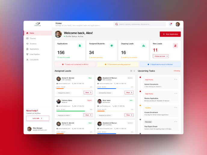
MalishaEdu Counselor Workspace

Portfolio website

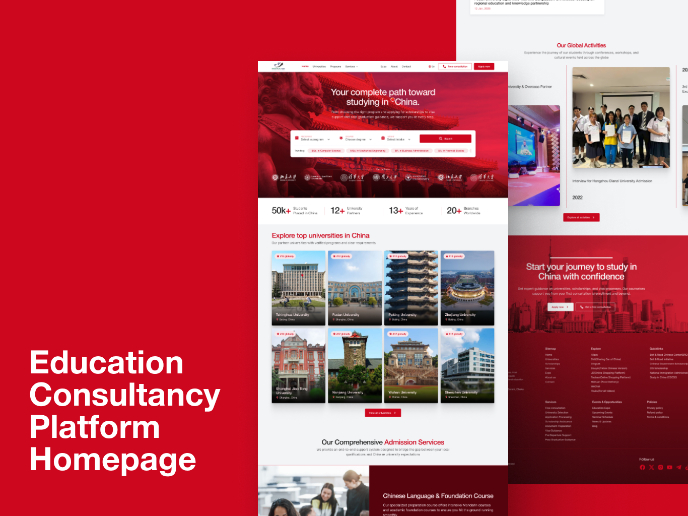
MalishaEdu - Website Design
Visual Design Courses

UX Design Foundations


Introduction to Figma

Design Terminology
