Nice. Underwear.

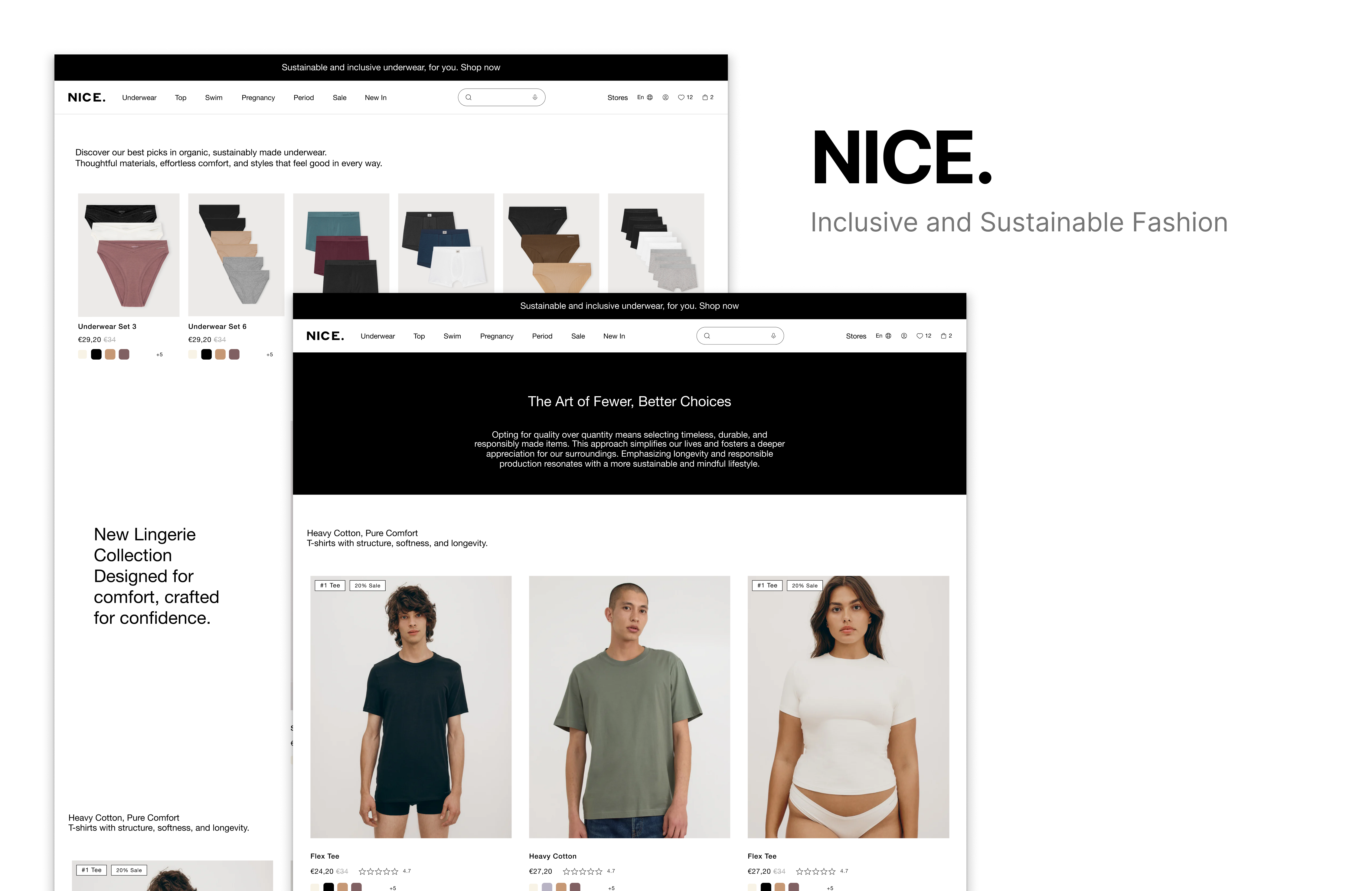
1. Accessibility & Navigation
Decisions
• Large, readable base font for comfortable scanning.
• Integrated microphone icon for voice search, supporting multilingual users and people with motor or cognitive limitations.
• High-contrast color system to meet accessibility standards.
Rationale
The goal is to remove barriers. Clear typography, voice input, and verified contrast create an interface that works for more people.
2. Visual Inclusivity
Decisions
• Imagery features people of mixed body shapes, skin tones, and styles.
• Photos avoid gendered aesthetics and follow a soft, neutral palette.
Rationale
Representation is delivered visually, without forcing identity labels.
3. Category Structure: Shop by Body Need
Decisions
• No “Men” or “Women” sections.
• Product discovery organized by functional needs:
– Tops
– Everyday underwear
– Period-friendly options
– Pregnancy-supportive fits
– Sensitive-skin fabrics
– Support and compression styles
Rationale
Including users who may be pregnant or menstruating but don’t identify with traditional categories. It avoids misgendering and reduces friction by focusing on the body, not assumptions.
4. Sustainable Value Proposition
Decisions
• Education around natural fibers like heavy organic cotton, recycled silk alternatives, and plant-based textiles.
• Transparent breakdown of materials, origin, and environmental footprint.
Rationale
Sustainability becomes a lived experience, not a marketing sticker. Users understand what they’re buying, why it matters, and how it impacts the planet.
5. Articles & Learning Hub: Circular Economy
Decisions
• Short, accessible articles explaining circularity, textile recycling, quality over quantity, and garment care.
Rationale
The brand positions itself as a trustworthy guide in sustainable fashion, not just a seller of products.
6. Aesthetic Direction
Decisions
• Neutral colors applicable to all genders.
• Minimal, soft layouts.
• Clean, naturalized product photography.
Rationale
Neutral tones and soft visuals reinforce the brand’s inclusive and sustainable ethos. The design avoids signaling who “should” wear what.
7. Overall Experience Philosophy
Decisions
• Build an interface that respects people’s bodies without labeling them.
• Make sustainability understandable and transparent.
• Prioritize accessibility from the first pixel.
Rationale
This project reframes underwear shopping as a safe, educational, and human-centered experience.
Project link
Tools used
From brief

Topics
Share
Reviews
5 reviews

Hey Martina, really "Nice" work! *pun intended* 😅
I liked how you explained your design rationale. The UI looks simple, minimalistic, on point, clean & trustworthy. I also looked at your Figma file and was impressed to see how you took inspiration also into consideration, from multiple sources.
Only one thing I am wondering in relation to UI choices is why you chose to put "+5" so far away from the colors in a product card. When seeing that it felt weird to me, I was expecting it to be close to the colors since I understand it says there are 5 more colors available.
I think the design overall is accessible and inclusive. Only thing I am wondering (and maybe in real life scenarios would require some user testing) is if men or women could get frustrated looking for something right for them, while having to navigate through all "underwear" category which includes products for all people, regardless how they identify, as you mentioned, since you removed traditional "men/women" categories in your website information architecture.
Really nice work! Keep creating and being awesome!

look good! I like it.

I really like this idea! It reminds me of Lucy & Yaks approach to their website.
One thing I’d look at is the navigation, as it feels a little crowded at the moment. You could consider a double decker header for items like stores and language.
Really good stuff!

Hey Martina, you have an interesting approach here and it is clear you are thinking about accessibility and inclusivity, which is genuinely good to see. That awareness shows you care about real users and not just the surface of the design.
I like that you included voice input in the search, but at the moment the input feels small and a bit awkwardly placed inside the navigation.
Your Shop by Body Need idea is really intriguing. It would be great to test whether users can still navigate comfortably without the typical male and female labels. It is also worth exploring whether there is a way to include male and female options while still supporting people who do not identify that way.
I would honestly love to look through the whole project, but when I click your project link, I cannot navigate the prototype at all. That makes it hard to evaluate the full experience. Also, under your flows I see different stores that do not seem connected to your actual project Nice, which is a bit confusing.
Love the idea and your explanations.

I can see the Brief describes a project with great intentions - inclusivity, accessibility, and sustainability, but the attached screenshots show mainly standard lingerie stores (Nice, Intimissimi, IUMAN, Organic Basics, Boody), not the actual realization of this concept.
If these screenshots are references/inspiration, that's fine. I see different approaches to product photography and navigation. But if this is supposed to be the result of working on the Brief, then honestly: I don't see the assumptions realized here. I still see traditional "Frauen/Männer" categories, typical gender divisions, no clear "shop by body need" structure, zero educational content about circularity or materials.
Your descriprtion assumes moving away from gendered categories toward functional body needs—that's not here. There's also a missing educational layer about sustainability and material transparency, which was supposed to be part of the experience.
The concept is really strong and needed in the market. If this is just the beginning of the work, I'd focus on consistently translating the assumptions into concrete interface solutions—from restructuring navigation to adding an educational content layer.
You might also like

Smartwatch Design for Messenger App


Bridge: UI/UX Rebrand of a Blockchain SCM Product


Pulse Music App - Light/Dark Mode


Monetization Strategy


Designing A Better Co-Working Experience Through CJM


Design a Settings Page for Mobile
Design Leadership Courses

UX Design Foundations


Introduction to Figma

Introduction to Design Systems
