Aura Landing Page
Aura is a modern fashion website that acts as a personal digital stylist, helping users discover, style, and shop outfits effortlessly. The platform allows users to explore clothing pieces and instantly view suggested outfit combinations that match colors, tones, and styles.
Aura also features a Personal Fit Finder, where users can enter their exact measurements to receive accurate size recommendations, ensuring confidence and comfort while shopping online.
Device: Desktop
Why Desktop: Most fashion shoppers complete purchases and browse deeply on desktop (larger imagery, easier product comparison, clearer layout for outfit visualizations). Desktop supports richer, side-by-side product + outfit UI and gives space for a Fit Finder UI and curated outfit carousels without feeling cramped.
Desk Research
I conducted secondary research to understand user behavior and market trends in fashion e-commerce.
The findings reveal that users prioritize visualization, trust, and personalization when shopping for clothes online.
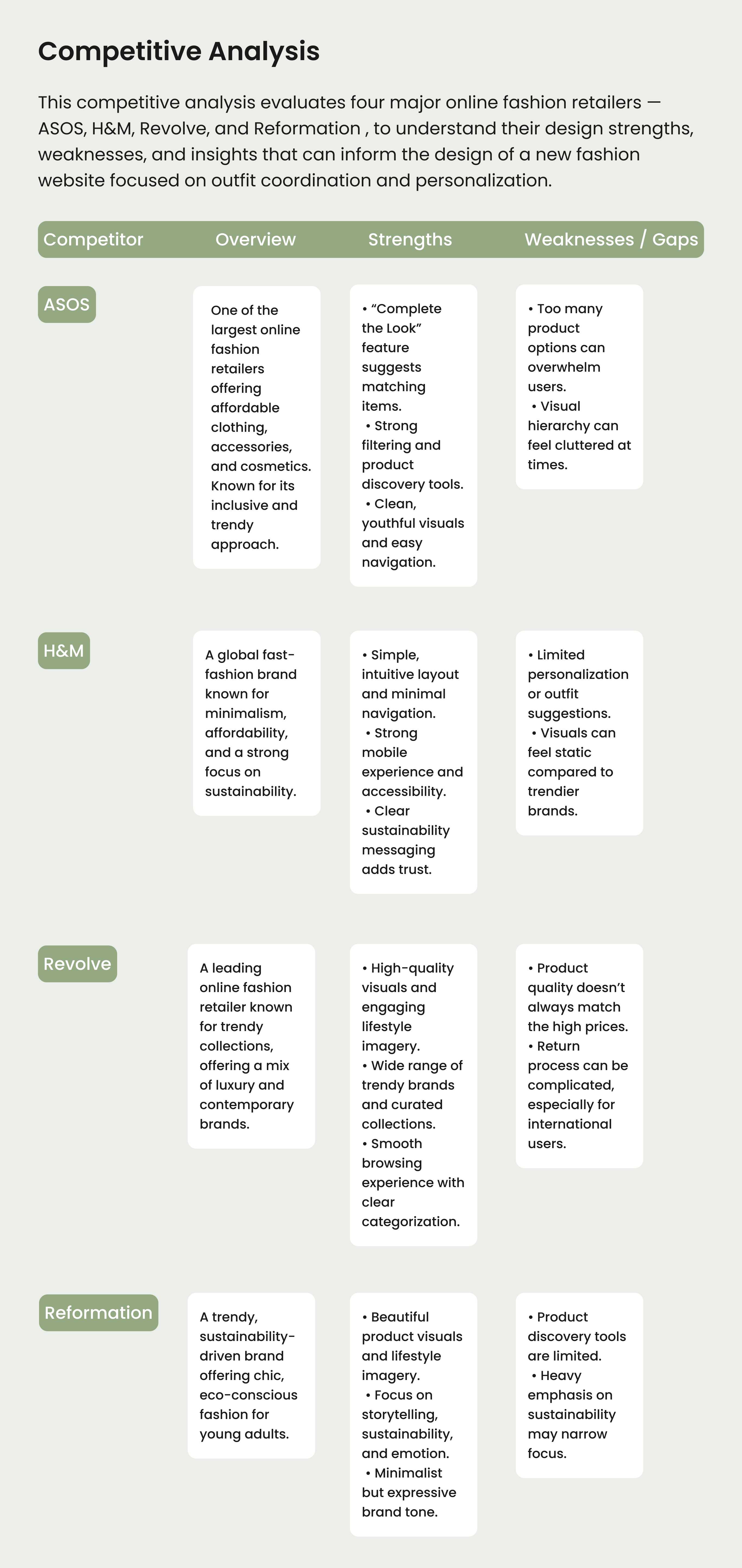
Competitors
Color System
Primary tone (#94A882) introduces a modern, calm vibe, distinct from the overused pinks and beiges in fashion sites, helping the brand feel fresh yet refined.
Neutrals (#FFFFFF, #EDEDED, #D9D9D9, #1A1A1A) maintain the minimalist, high-end feel of the layout and ensure the products remain the visual focus.
The palette together creates a soft contrast that enhances imagery and supports a clean, editorial-like aesthetic (common in premium fashion platforms).
Typography Selection
The chosen typography combines Outfit and Poppins to balance modern elegance with readability.
Outfit was selected for headings and titles because of its clean structure and confident appearance, giving the brand a sleek and fashion-forward identity.
Poppins complements it perfectly in body text with its rounded letterforms and friendly tone, ensuring comfortable reading and maintaining a cohesive minimalist style.
Prototype link:
https://www.figma.com/proto/9ZyCUb4BbrqUrMbSlBhmM8/Fashion-landing-page?page-id=0%3A1&node-id=58-482&viewport=-803%2C110%2C0.09&t=k5XG5bpxOmy71g9V-1&scaling=scale-down-width&content-scaling=fixed&starting-point-node-id=58%3A482
Thanks for watching, i am ready for feedback! 🩵
Tools used
From brief
Topics
Share
Reviews
2 reviews
Welp, since you're ready… buckle up, it's aura -100 (sorry, lol)
Idea, research, and implementation 💯; hierarchy & alignments 🫠 I'll tell you more. I was greeted by these three dudes when I entered Aura (fire fit of course) a bit discouraging at first, but my designer's eye immediately got distracted by the main menu, whether they want to be in a group with the logo so left-aligned, centered, or right-aligned with the icons. I'd ask the menu myself if I could, but it's beyond my realm.
“Aura” logotype is different but not different enough to uphold a hierarchy because it's the same size as the menu. Perhaps if the menu gang could be a bit smaller (in font-size), the hierarchy could be clearer, then again it's not up to me. Moving on to the hero buttons, they're tight like in a brotherhood, but a bit too tight I think. Giving them more padding will give them more of a sense of authority, as they should.
“Color” and “Matching Colors” in Smart Outfit Matching ironically do not have matching alignment. They're separated by groups, but still, you can align them vertically for the color selection. Same story with “Your measurements” and “Your Size” it'd be better if they're aligned more vertically.
What's with the double right arrow in image sliders > o >? Usually it's like this < o >, left and right arrow, not sure if this is an Aura-specific style or no.
Price and product title in Product card could use more differentiation. It's subtly there, but making it stand out will benefit users more.
Here goes the footer: “Aura: Where style meets intelligence” but not alignments? Why Nada, why T_T? Between Home, Support & Contact Us, clearly Home is the oldest sibling here. You don't care about Home enough that everything is flat in unison carrying all five sub-menus to the bottom. Support & Contact Us got treated better I see, is this some kind of sibling revenge? Lmk if you need to talk this out.
*I used lots of “little…” btw today.
Thank you for sharing the landing page—modern, minimal, and the color palette feels harmonious. You did a great job.
One thing to improve: the main CTA has low contrast; white text on the light green background is hard to read. Switch the text to black or a much darker shade of the same green so it meets accessibility standards. I’d also reduce button text size to 16–18 px for better balance, soften the shadows to avoid a “dirty” look, and tighten the line-height in the main heading so it feels more cohesive.
Overall, strong work—keep going!
You might also like

Smartwatch Design for Messenger App

Bridge: UI/UX Rebrand of a Blockchain SCM Product

Pulse Music App - Light/Dark Mode

Monetization Strategy

Designing A Better Co-Working Experience Through CJM

Design a Settings Page for Mobile
Content Strategy Courses

UX Writing

Common UX/UI Design Patterns & Flows


