Arabian Horses

✅ Project Plan: Accessible Login/Signup Page for a SaaS Platform
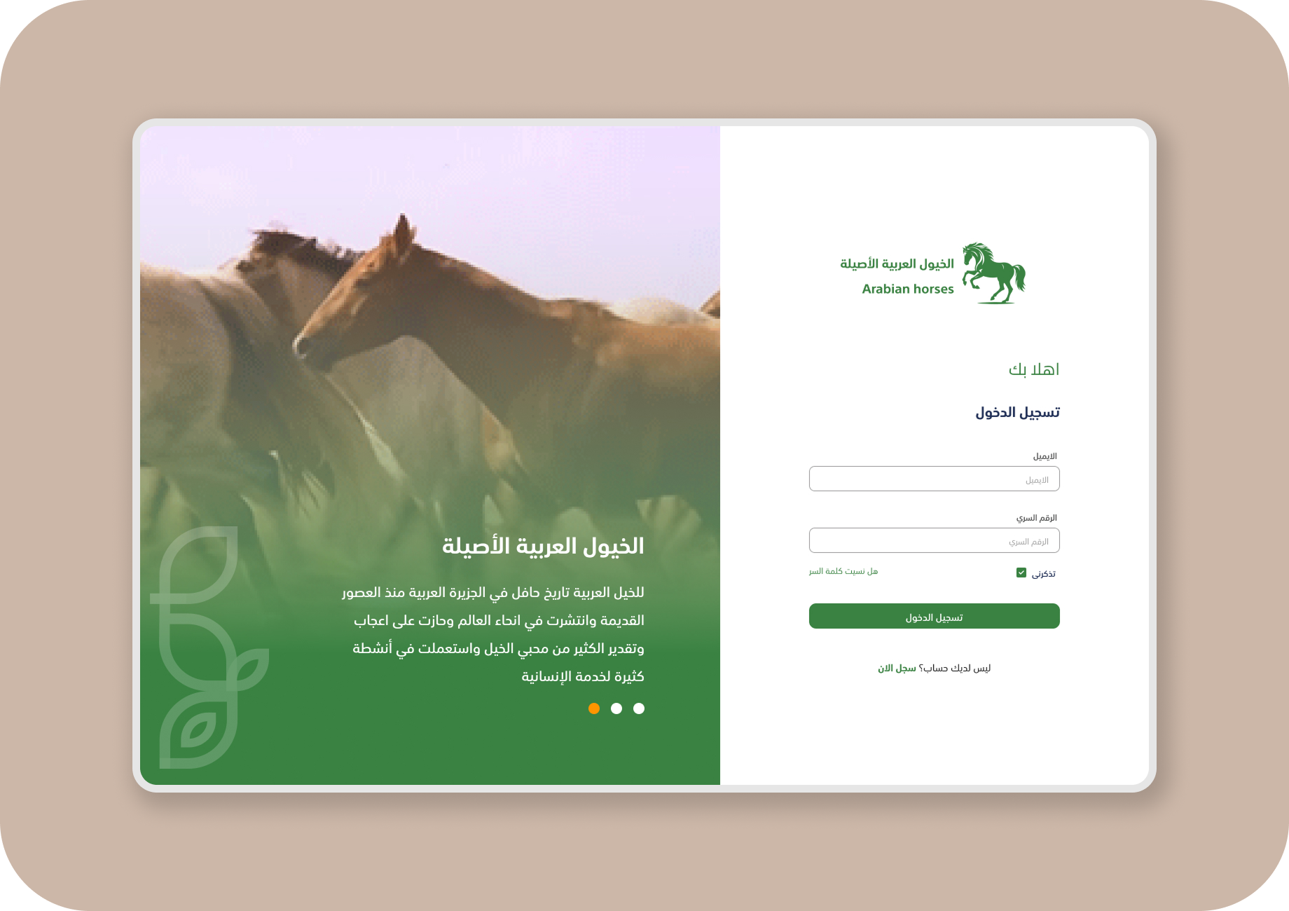
🔹 1. Platform & Device Type
Platform Idea:
A SaaS system for Arabian Horse Registration & Management, designed for individuals, government authorities, and commercial users.
Target Device:
Desktop Interface – the main platform used by official users and data administrators.
🔹 2. Login/Signup Page Design
The initial design is visually strong, but I applied specific improvements to meet WCAG accessibility standards:
🔹 3. Rationale Behind Design Choices
✳️ Visual Branding:
The color scheme, fonts, and imagery reflect the heritage and authenticity of Arabian horses, building user trust and emotional connection.
✳️ Progressive Flow:
I split the registration process into two clear steps:
Account type selection → user details.
This minimizes user confusion and keeps the flow simple.
✳️ Accessibility-First:
From the start, the design aimed to be usable for all:
Clear and readable labels
High contrast
Button sizes suitable for all users
Keyboard-friendly navigation
Direct guidance through the form
✳️ Mental Health Sensitivity:
I avoided pressure-based or guilt-triggering language.
- Instead, I used friendly, supportive language that respects the user’s pace — especially important for users handling sensitive or official tasks.

Reviews
1 review

Hey Ahmed :)
Thanks for sharing your Arabian Horses login page!
The design looks clean, and the green and beige colours fit the theme nicely! The two-section layout with the carousel on the left and the login form on the right is clear and straightforward. It’s also good to see the right-to-left reading support for Arabic text.
That said, the design feels a bit too simple and could use some more personality or detail to make it more engaging. Also, I wasn’t able to access the Figma file to check if you have more screens or additional flows. It would be great to see the full picture of the project.
The orange dot in the carousel feels a bit disconnected from the rest of the color scheme. A softer or matching colour might help it blend in better.
Lastly, the project description feels a little off, especially the last sentence about generating Figma templates. It reads like a Chat GPT prompt rather than part of a polished write-up, so I’d suggest removing and rephrasing the text in the description for a smoother presentation.
It’s a solid starting point! With some more detail in the design and polishing on the description, it can become great.
Good job!
You might also like

Pulse — Music Streaming App with Accessible Light & Dark Mode


Islamic E-Learning Platfrom Dashboard

SiteScope - Progress Tracking App


Mobile Button System


FlexPay


CJM for Co-Working Space - WeWork

Visual Design Courses

UX Design Foundations


Introduction to Figma

Design Terminology
