An intuitive platform that simplifies building data connections.

Project description
A user-centric platform designed to simplify data connection layer creation, focusing on intuitive workflows, seamless integration, and an optimized user experience for data engineers.
Process
The process for DataBridge includes research to understand user needs, wireframes to define structure, and high-fidelity designs for an intuitive interface. Prototypes are tested for usability, and developer-ready files ensure a smooth implementation.
Research & Planning
Conducted in-depth analysis to understand user needs, pain points, and project objectives. Developed a clear strategy and roadmap to guide the design process effectively.
Design & Prototyping
Created intuitive wireframes and high-fidelity prototypes to visualize the user journey and interactions. Focused on usability and aesthetics to ensure a seamless experience.
Implementation
Collaborated closely with developers to transform designs into functional, responsive interfaces. Provided detailed design specifications and ongoing support during development.
Testing & Optimization
Conducted usability testing to gather feedback and identify areas for improvement. Optimized designs based on insights to enhance performance and user satisfaction.
Solution
Our solution centralizes data with an integrated data layer, ensures seamless transfer through intuitive field mapping, and offers real-time execution tracking. It also provides secure, role-based credential management to protect sensitive information and ensure compliance.
Create Data Layer
Build a centralized data layer that seamlessly integrates data from multiple sources, ensuring uniformity and easy accessibility. This layer serves as the backbone for all data-related operations, enabling consistent data storage and retrieval across various applications.
Manage Credentials
Introduce a secure credential management system that allows users to store and control access to sensitive data resources. This system provides role-based access, ensuring that only authorized users can manage or view confidential credentials, enhancing data security and compliance.
Map Data Fields
Implement an intuitive data mapping interface that allows users to easily link source data fields to target fields. This ensures data is transferred accurately between systems and eliminates mismatched or missing data, streamlining data synchronization and reporting.
Data Summery
Provide a real-time execution dashboard that visualizes the flow of data and the success or failure of operations. This feature helps users track data processing activities, monitor performance, and quickly identify issues, ensuring smooth data operations.
Results
The project successfully enhanced user engagement, streamlined workflows, and improved overall efficiency, resulting in a positive impact on user satisfaction and business outcomes.
Improved Data Accuracy
Users experience more accurate and reliable data transfers due to seamless mapping and integration, reducing errors and mismatched data.
Enhanced Operational Efficiency
Real-time tracking and centralized data management streamline workflows, allowing users to monitor and optimize data processes, saving time and resources.
Increased Security and Compliance
Role-based credential management ensures that sensitive information is protected, minimizing the risk of unauthorized access and helping maintain compliance with data security regulations.
Better Decision-Making
With clear visibility into data execution and a robust data layer, users can make more informed decisions based on accurate, up-to-date insights.
Revenue Growth through Data Efficiency
By optimizing data flow and reducing errors, the app enhances operational efficiency, leading to cost savings and ultimately contributing to higher profit margins.
Reviews
2 reviews

You’ve done a really good job setting this up. The flow makes sense. The structure is strong. You clearly understand what your users need. It doesn’t feel like a random UI — it feels like a tool with purpose. That’s already a big win.
But it still feels more like a polished wireframe than a final product.
The biggest thing holding it back is clarity. In the data connection list, everything has the same visual weight. Icons are too large. Text blends together. Nothing stands out. That makes it harder to scan. You can fix this by:
- Reducing icon size
- Adding space between rows
- Giving the status column more contrast
The detail view has a good layout — the two-column structure works. But the text is too flat. Labels and values look the same. Try using stronger contrast and spacing. The “Map Fields” section looks static. If it’s editable, show it. If it’s not, still add some interaction hint — maybe a hover effect or icons.
Execution logs are clean but too quiet. Failed runs need to stand out more. A red pill isn’t enough. Think about color, spacing, and maybe an icon to draw quick attention.
Now, the “New Data Connection” screen — that’s your strongest one. The layout is clean. The step is clear. The use of platform logos builds trust. It feels simple, focused, and confident. That’s the energy you should bring to the rest.
You’ve already nailed the hard part: building something functional. Now it’s just about refining what you’ve made.
- Add hierarchy
- Use motion or feedback
- Make the UI feel responsive and alive
You’re close. You’ve got the thinking right. Just push the execution a little more, and this will feel like a real, production-ready tool.

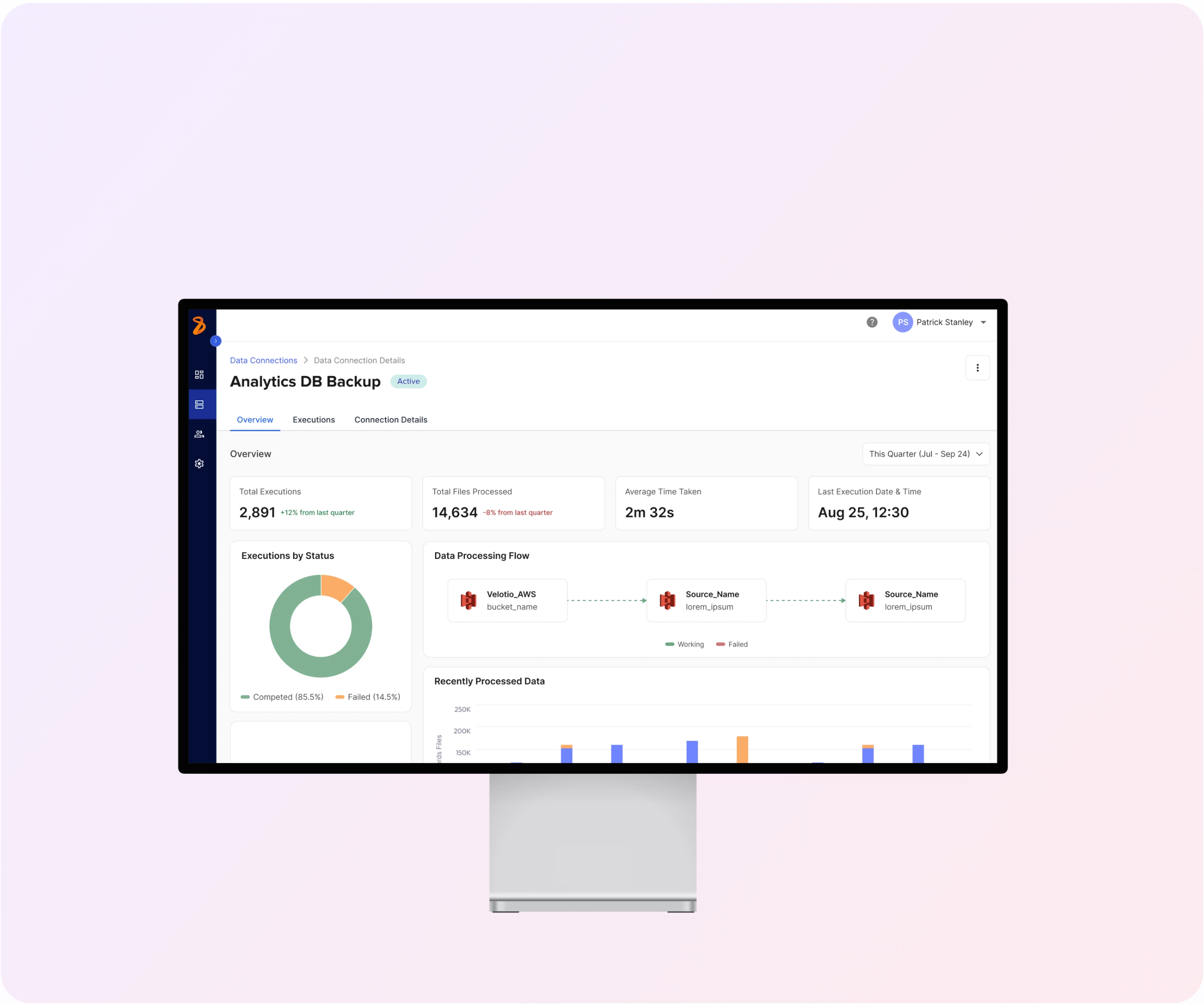
Hey, Nice Work on the Dashboard
Just checked out your Analytics DB Backup dashboard design - here are my thoughts...
What I'm Loving 👍
Clean and Clear: The key metrics at the top are super easy to spot! Those execution numbers, processed files, and timing stats jump right out.
Smart Visualizations: That green/orange donut chart showing 85.5% successful executions vs 14.5% failed ones? Perfect way to show system health at a glance.
Flow Diagram: The connection visualization between data sources is intuitive and shows the relationships clearly. Love how you've kept it simple but informative.
Quick Suggestions 💭
Bar Chart Labels: The "Recently Processed Data" chart could use some clearer time labels. Also curious about that one orange bar - might help to explain what makes it different!
Placeholder Text: Once you replace those "lorem_ipsum" placeholders with real status messages, users will be able to troubleshoot much faster.
Use That Space: There's room at the bottom that could be put to good use - maybe for alerts or quick actions?
Overall Take 🏅
You've nailed the balance between technical detail and usability! The dashboard delivers on the project goals - it centralizes data visualization, shows execution status clearly, and would definitely help data engineers work more efficiently.
It's clean, and actually makes complex data management look approachable. Great job taking those requirements and turning them into something that looks genuinely good!
You might also like

Pulse — Music Streaming App with Accessible Light & Dark Mode


Islamic E-Learning Platfrom Dashboard

SiteScope - Progress Tracking App


Mobile Button System


FlexPay


CJM for Co-Working Space - WeWork

Popular Courses

Introduction to Design Systems


Apple Human Interface Guidelines


UX Design Foundations