Airtable: Sign up form redesign


Why Airtable?
I am familiar with Airtable and have heard about their product before. While searching for a SaaS platform for this assignment, I came across their signup form. Many well-known platforms already have highly optimized signup flows backed by extensive research, so my goal was to find a platform that is popular but still has room for improvement.
When I reviewed Airtable’s signup form, I was drawn to its minimal design. However, a closer inspection revealed several usability and accessibility issues that I could improve as part of this design challenge.
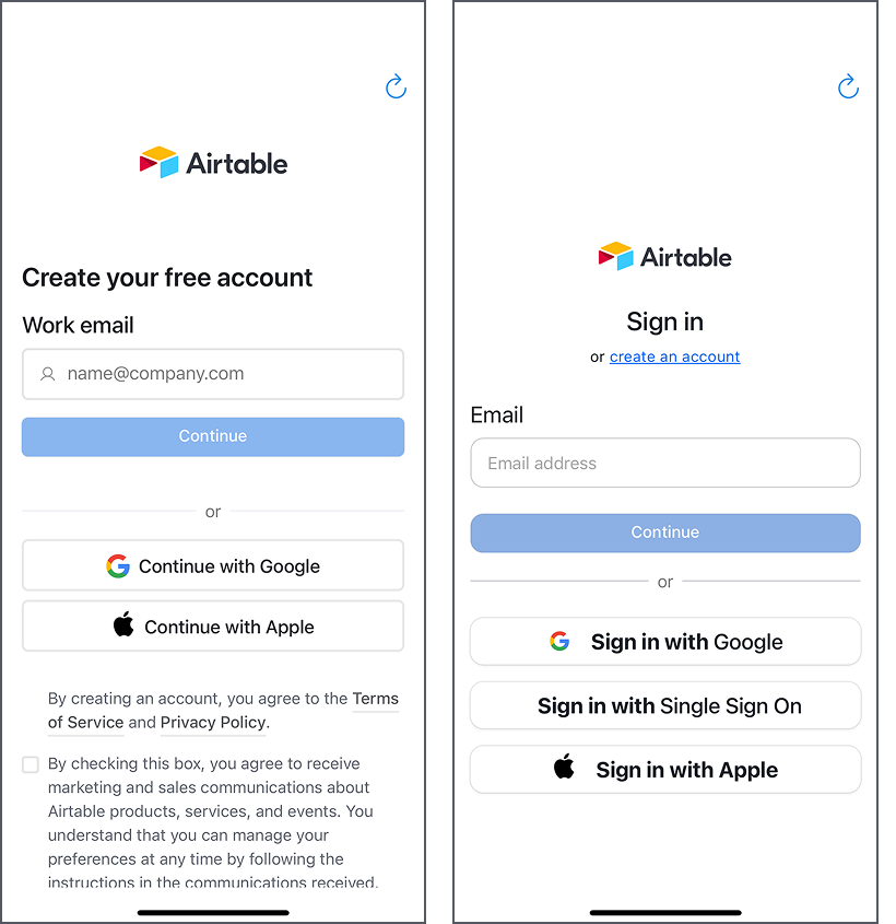
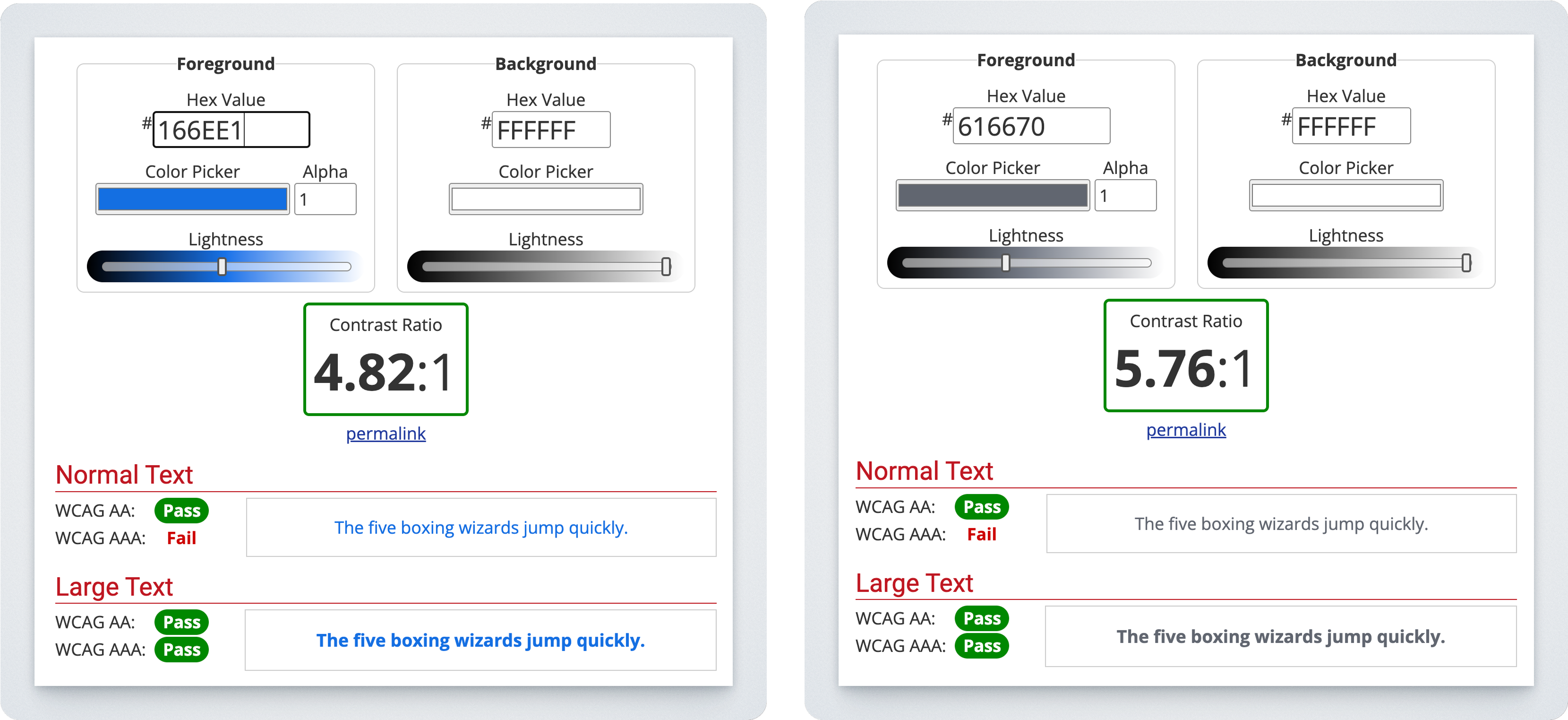
Low Color Contrast
Some text elements do not meet WCAG 2.1 AAA contrast requirements for readability, making it harder for users with visual impairments to distinguish the text from the background.
UI Inconsistencies
- The title alignment for the signup and sign-in screens is inconsistent when placed side by side.
- The border radius of the CTA button is not uniform, leading to a lack of visual consistency.
- The CTA button text size and hierarchy as well as wording differ between the signup and login screens.
Scrolling & Visibility Issues
Although not visible in the screenshots above, a portion of the Terms & Conditions (T&C) section is cut off, and users are unable to scroll to view the full content, which affects transparency and compliance.
By addressing these issues, I aim to create a more accessible and visually cohesive signup experience that enhances usability for all users.
Final Results
Sign-up screen

Sign-in screen

Tools used
From brief

Topics
Share
Reviews
5 reviews

Great job!
If I were to recommend any changes here, there are two aspects which I'd consider:
- It is important to analyse the context of the application and, seeing that the main primary button for CTAs is blue, the two blue buttons (one for continue, or for login via Facebook) create a situations with two main CTA buttons of nearly identical colors. At first glance, a user is met with three filled "primary" buttons, one being black, which may seem overwhelming at first and disrupts the hierarchy. A potential approach would be to either make all buttons white / outlined (if allowed by the third party app branding regulations) or making the buttons circular placed horizontally, which would also free up space given that not all the content fits on the sign up page.
- Secondly, the checkbox on the bottom of the sign up page is halfway outside of the viewport, which would likely lead to many missed opportunities to see it and thus low conversion rates for mailing subscriptions (and if the checkbox is obligatory to continue then that causes a whole other UX issue). All elements as such should always be above the button which leads the user onwards. This can be mitigated by placing the checkbox below the inputs but above the continue CTA. If any additional information needs to be added, the checkbox can be shortened and an asterisk (*) can be added to guide users to the longer terms or link located at the vey bottom of the page.
Hope this feedback helps you make your design even better! Otherwise, amazing work!
Thy Nguyen

That's Great man the Allignment, Button Rules is fits and apply the UX Laws
Thy Nguyen

👏 Great work, Thy Nguyen!
Your Airtable Sign-Up Redesign feels clean, modern, and thoughtfully structured 💡 The way you identified real accessibility gaps — like color contrast, alignment, and scroll visibility — shows strong analytical thinking 👏

Nice Airtable Sign-Up Form Redesign! The layout feels clean and modern, with a good balance of spacing and clarity. The input fields and CTAs stand out well. Maybe refining the contrast on some elements could improve accessibility, but overall, great work!
Thy Nguyen
Thy Nguyen

An absolutely wonderful design! Better than the current one, in my opinion. It's a little cluttered though, but I can't think of a good way to avoid it.
Thy Nguyen
You might also like

Accessible Signup Form


Entrant - Analytical Dashboard


Transit Cairo — Digital Mobility Redefined


Babylon Balance - Designing Financial Clarity Through Constraint


Entrant Accessible Signup and Login Forms

CJM x Mindspace case study - Ester Cinelli

Visual Design Courses

UX Design Foundations


Introduction to Figma

Design Terminology
