AI feedback for interactive prototypes

Designers get frustratingly little access to users.
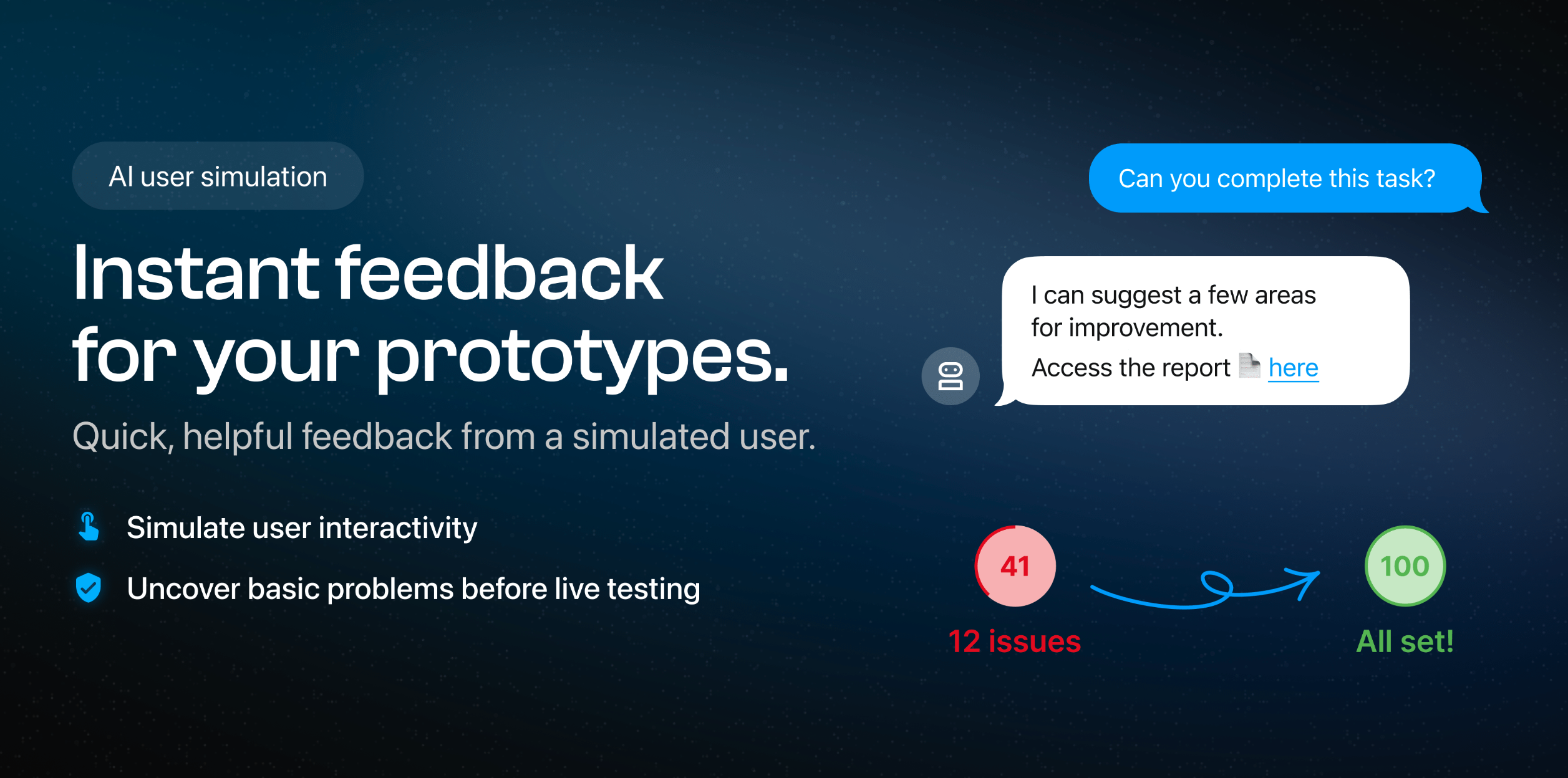
Our Figma plugin tests interactive prototypes with AI to ensure you avoid embarrassing failures and wasting human time. Always test first with simulations!
We continue to iterate over it's utility, changing our designs based on feedback every week! We ruthlessly only work on items which are prioritised through customer feedback so it's bare bones but we hope it's useful. Please let us know: contact@appvelocity.io
On-demand feedback 🤖
- 🧭 Check AI can successfully navigate before asking users
- 📢 Simulated 'talk-out-loud' observations
- 🤨 Ask WHY AI made interaction decisions
...then Human feedback 👴
- 🔗 Fastest way to share a clickable challenges (< 1min!)
- Gather feedback from users & stakeholders
- View responses in-app
- Shareable web reports
- Heatmaps show response navigation

Reviews
1 review

Hello Kevin, great job on your project—well done! You should treat yourself to a coffee! ☕ Here are my recommendations and suggestions for your design:
- Logo Visibility: Make the logo larger on the navigation bar to enhance brand visibility. Perhaps increasing the width to about 200px could make it more legible and noticeable.
- Navigation Bar Buttons: Add top and bottom padding to the buttons in the navigation bar. I like the CTA button on your hero page—why not replicate that style?
- Micro-Copy Consistency: Ensure your micro-copy is consistent. For instance, the "Challenge AI with your prototype" button and the "Try our Figma Plugin" button seem to have the same functionality. If so, unify the text to avoid user confusion and maintain consistency across the page.
- Border Radius: Make the border radius consistent across elements like images and cards. A uniform look will enhance the overall visual harmony.
- Card Layout: Consider using the Golden Ratio to adjust the composition of the cards and make their heights consistent.
- Social Media Alignment: Align the "SOCIAL MEDIA" section at the bottom with the "App Velocity" logo and its description for a cleaner layout.
- Wordmark Alignment: Align the "App Velocity" wordmark with its description text. Since it’s a wordmark, this alignment will feel more natural.
- Social Media Icons: Use icons for social media platforms if possible, or alternatively, make the platform names bold to draw attention.
Also, I really liked the following aspects of your design:
- The smooth micro-animations when hovering over the cards.
- The thoughtful font choices.
- The minimalistic and cohesive color palette.
Well done again, and I hope these suggestions help! 👏🏼
4 Claps
Average 4.0 by 1 person
You might also like

Project
Smartwatch Design for Messenger App

Practice your interaction design skills and design experience optimized for smartwatches.

Project
Bridge: UI/UX Rebrand of a Blockchain SCM Product

A UI/UX overhaul project of Bridge, a blockchain-based enterprise supply chain management web app originally called BSCM. This short case st

Project
Pulse Music App - Light/Dark Mode

This project presents a mobile music streaming interface designed in both light and dark modes. The visual direction combines Japandi minima
Editors’ Choice
Project
Uxcel Halloween Icon Pack

🎃 Introducing the Uxcel Halloween Icon Pack! 🎃 This custom Halloween-themed icon set was created to enhance the seasonal user experience o

Project
Monetization Strategy

This project evaluates two monetization models (freemium and paid) for a new mobile point-and-click adventure game. It compares their streng

Project
Designing A Better Co-Working Experience Through CJM

Project ContextThis project focuses on improving the experience of individuals using co-working spaces. The objective is to identify key pai
Popular Courses

Course
Introduction to Figma

Learn essential Figma tools like layers, styling, typography, and images. Master the basics to create clean, user-friendly designs

Course
Ethical & Responsible Product Design
Learn to build products that respect users, society, and the planet while driving sustainable business growth

Course
AI Prompts Foundations

Learn to craft precise AI prompts to accelerate your product design and development workflows.