Accessible Signup Form for Trello

Project Overview:
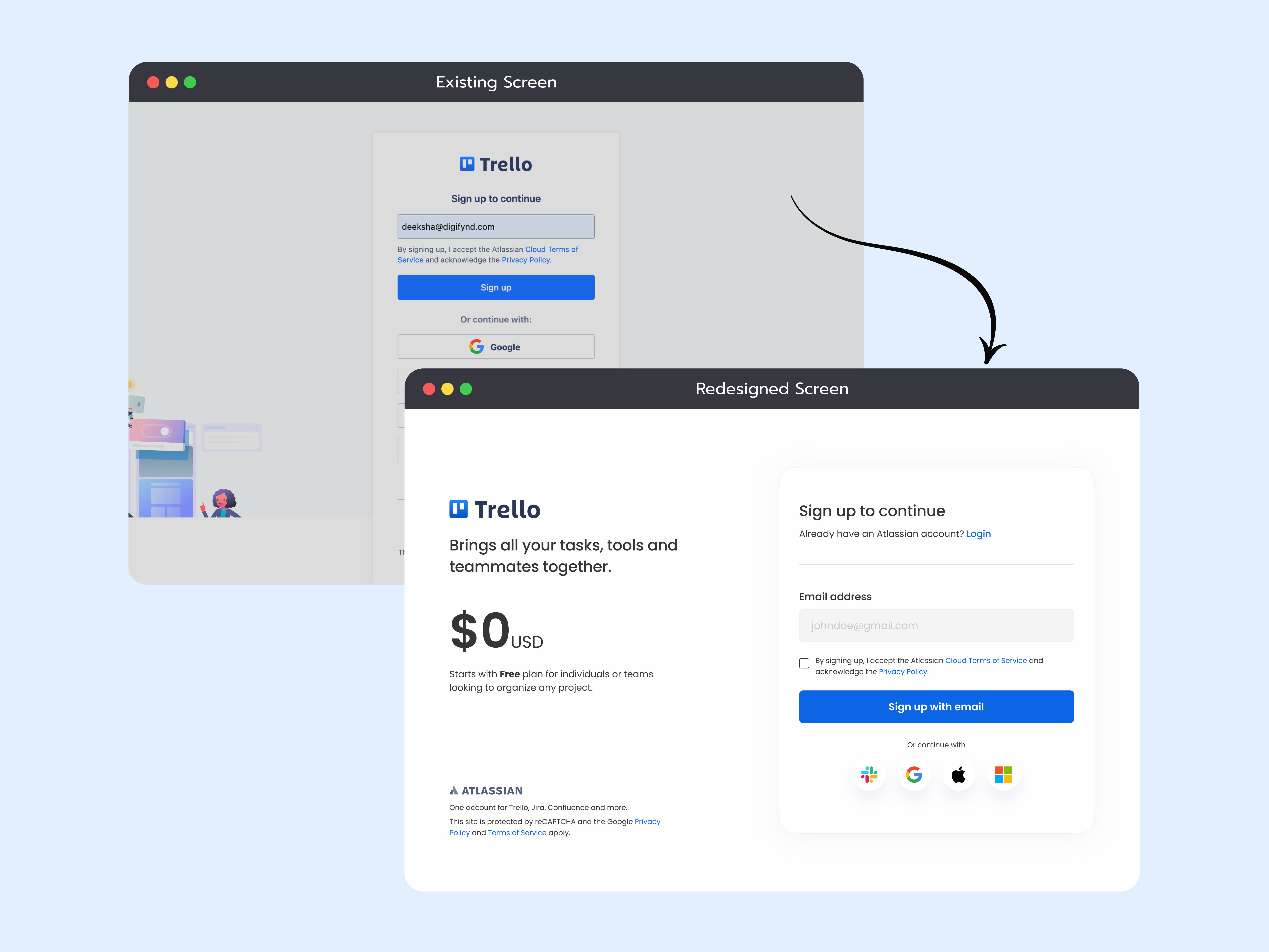
The project is based on redesigning the signup/login page of a SaaS platform for which I’ve chosen “Trello”.
The primary focus has been on optimizing the existing page and coming up with a more accessible and improved screen to meet the accessibility guidelines and follow the best practices.
Key Findings:
- Accessibility Issues: There was missing label for the input field and representation of placeholder text wasn’t helping in a way to understand a user what/how needs to be enter.
- Improper order of Action buttons: As per best practices on the signup/login page, both the action whether it’s signup or login should be placed in adjacent order to make it easy for user to take action as they want to. It was missing on the page.
- Content & Space Management: There was some content that’s below the fold and gives the impression to the user that there’s more. It could be managed without any scrolling.
Possible Solutions:
- Improved Accessibility: By adding a label on the input field with an example of what to add gives a clear message and better understanding and improves the accessibility of the overall form.
- Proper order of Action buttons: Just below the headline of the page, added the login option for the user to right away decide whether they want to login if already have an account instead of going down the page and find it later. Also added a checkbox for terms & conditions acceptance.
- Content & Space Management: To manage the content without any scroll, I decided to keep the social logins in a single row which gives enough space to add more information if needed.
Additional Implementations for enhancement:
- To give a brief understanding about the platform and its usability, I decided to convert the screen in 1*2 layout grid. On the left side of the screen was a brief introduction about Trello and the basic pricing plan to encourage users that they can try the platform without any charges.
- On the right side kept the Input Form keeping in mind the eye movement from left to right.
- Removed the illustrations to keep the screen design minimal and giving a whitespace to process only the required information needed.
Tools used
From brief

Topics
Share
Reviews
5 reviews

The redesigned sign up page looks informative, intuitive, and user-friendly. Your design rationale is clear and helpful in explaining your decisions. Love that you've really focused on usability and accessibility. I feel it's a strong improvement that will benefit users. Keep up the great work!

This is 5 out of 5.
I would only improve the contrast between the placeholder and stick with one placeholder and label text size (+- 2 pixels).
Best, Fedir)

I like the way you changed the layout of the form. It presents clearly important information without clutter the form and the negative space increase the readability. For the icons without labels, you can consider to add alt text for the accessibility. Keep going :)

Things to note:
1. Remove the checkbox, this is a single action form, and submitting is possible only when accepting, so the checkbox is redundant.
2. The social login icons now do not have text, this may be okay, but is not an improvement in terms of accessibility. Maybe keep them rectangular, in a 2x2 grid?

Nice
You might also like

Pulse — Music Streaming App with Accessible Light & Dark Mode


Islamic E-Learning Platfrom Dashboard

SiteScope - Progress Tracking App


Mobile Button System


FlexPay


CJM for Co-Working Space - WeWork

Visual Design Courses

UX Design Foundations


Introduction to Figma

Design Terminology
