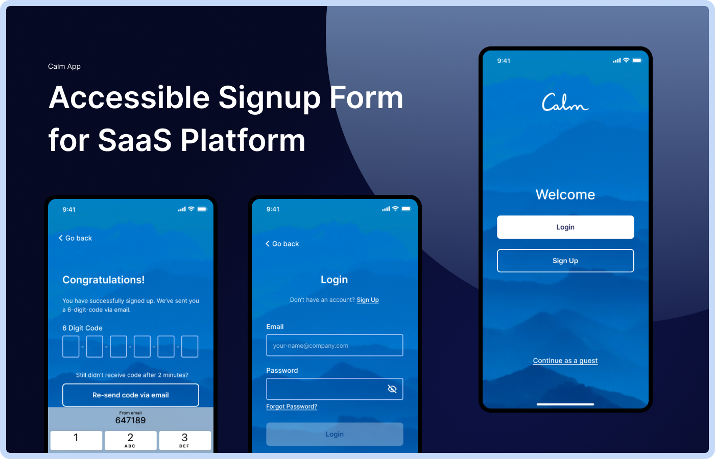
Accessible Signup Form for SaaS Platform

Assignment:
- Create an accessible Login & Signup user flows and screens for SaaS Platform ‘Calm’.
- It needs to adhere to accessibility best practices for forms and to meet WCAG accessibility standards.
- Explain the rationale behind design choices.
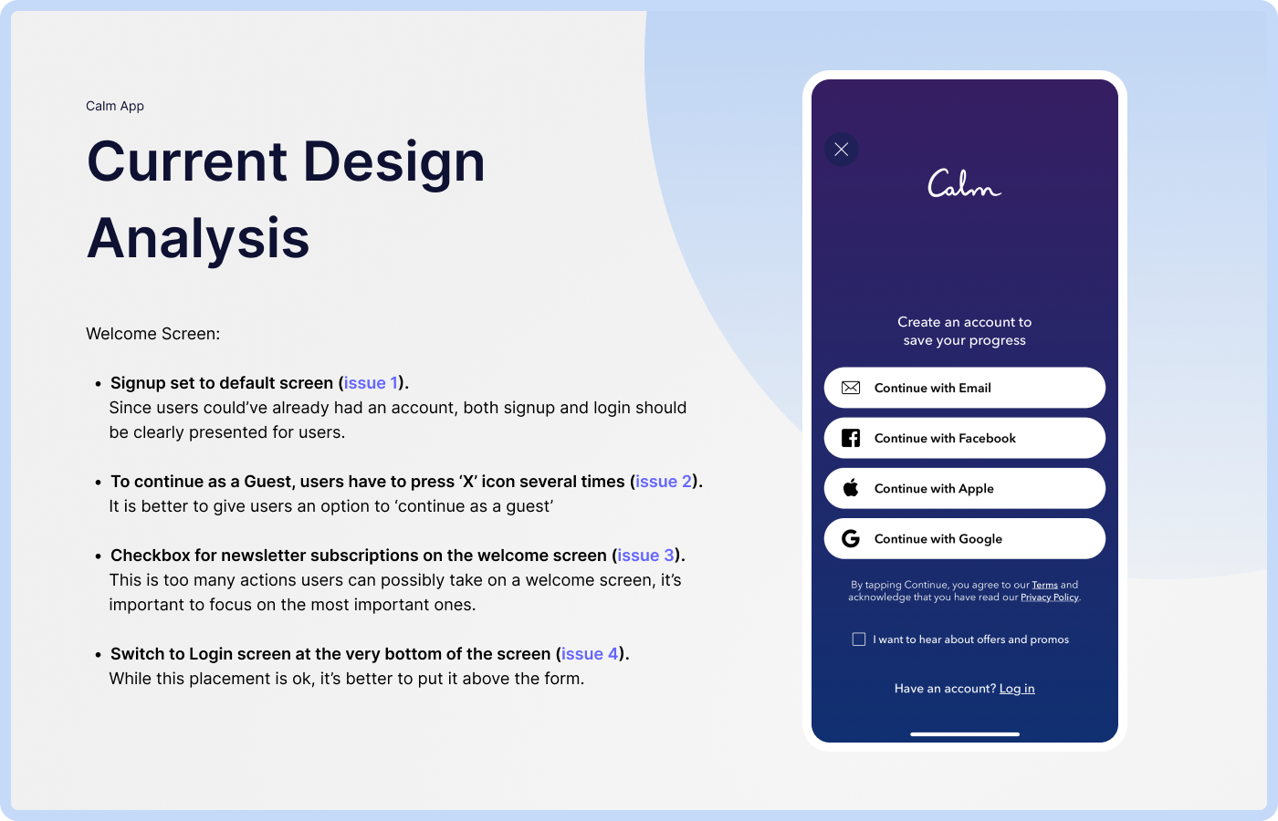
Welcome Screen Analysis:
- Signup set to default screen (issue 1). Since users could’ve already had an account, both signup and login should be clearly presented for users.
- To continue as a Guest, users have to press ‘X’ icon several times (issue 2). It is better to give users an option to ‘continue as a guest’
- Checkbox for newsletter subscriptions on the welcome screen (issue 3). This is too many actions users can possibly take on a welcome screen, it’s important to focus on the most important ones.
- Switch to Login screen at the very bottom of the screen (issue 4). While this placement is ok, it’s better to put it above the form.
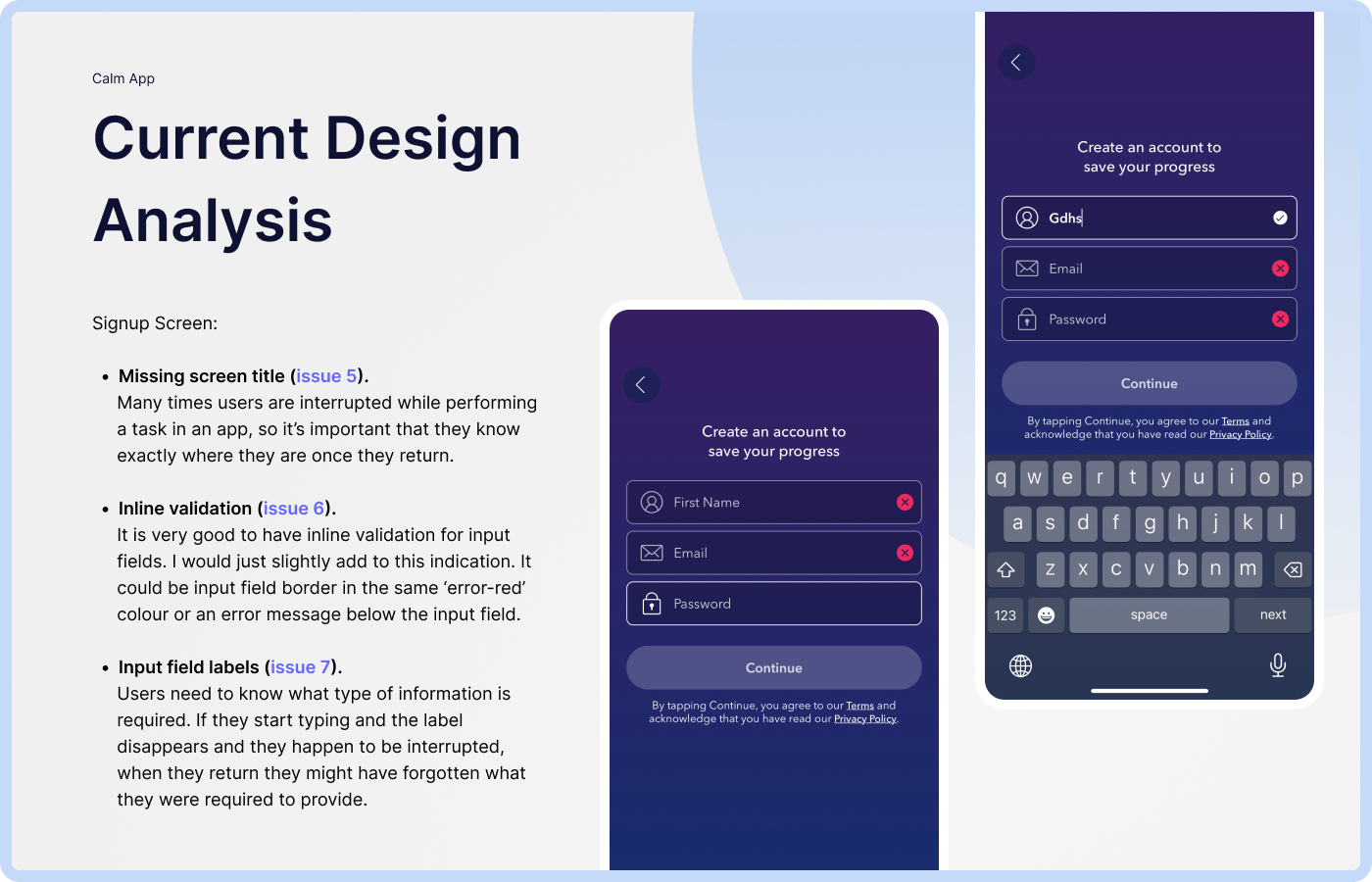
Signup Screen Analysis:
- Missing screen title (issue 5). Many times users are interrupted while performing a task in an app, so it’s important that they know exactly where they are once they return.
- Inline validation (issue 6). It is very good to have inline validation for input fields. I would just slightly add to this indication. It could be input field border in the same ‘error-red’ colour or an error message below the input field.
- Input field labels (issue 7). Users need to know what type of information is required. If they start typing and the label disappears and they happen to be interrupted, when they return they might have forgotten what they were required to provide.
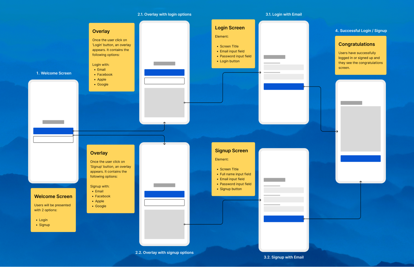
Simple User Flow
Addressing Design Issues:
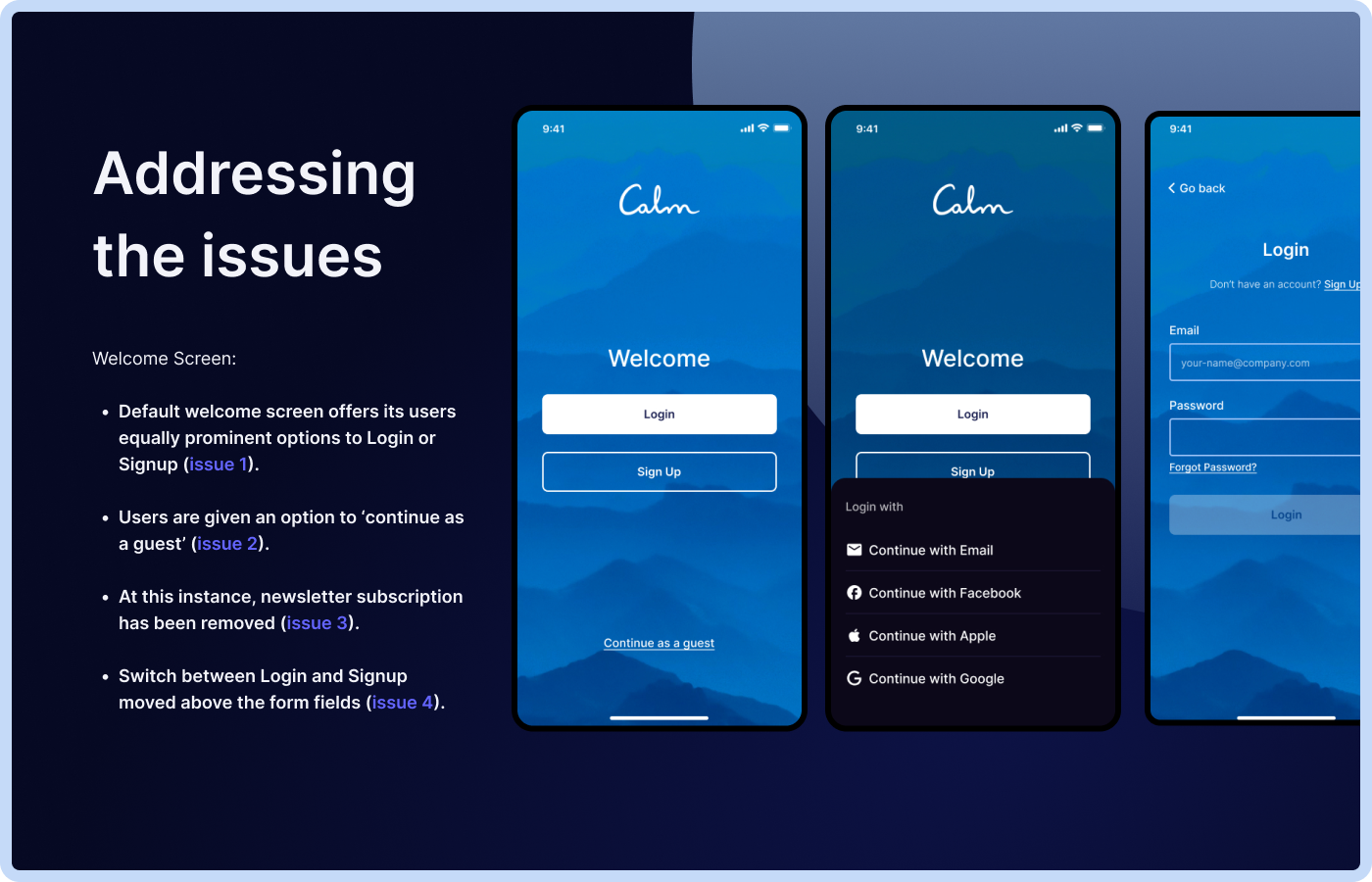
Welcome Screen:
- Default welcome screen offers its users equally prominent options to Login or Signup (issue 1).
- Users are given an option to ‘continue as a guest’ (issue 2).
- At this instance, newsletter subscription has been removed (issue 3).
- Switch between Login and Signup moved above the form fields (issue 4).
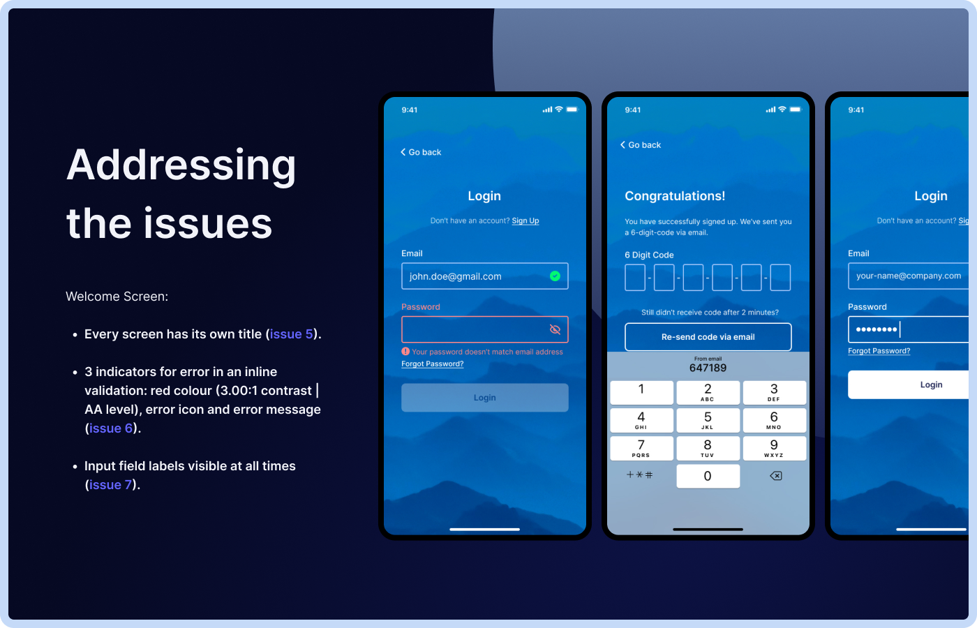
- Every screen has its own title (issue 5).
- 3 indicators for error in an inline validation: red colour (3.00:1 contrast | AA level), error icon and error message (issue 6).
- Input field labels visible at all times (issue 7).
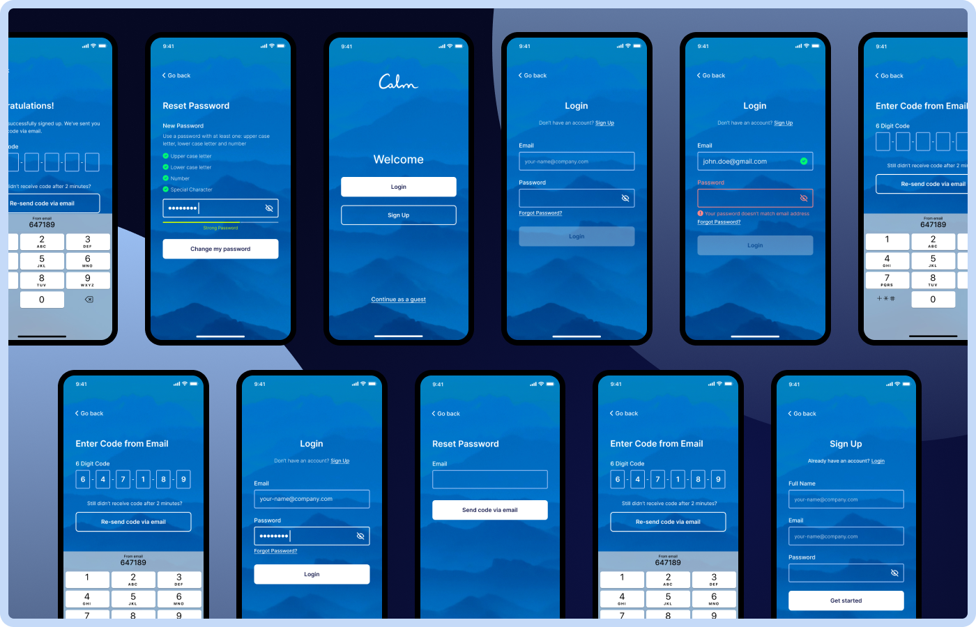
All Screens
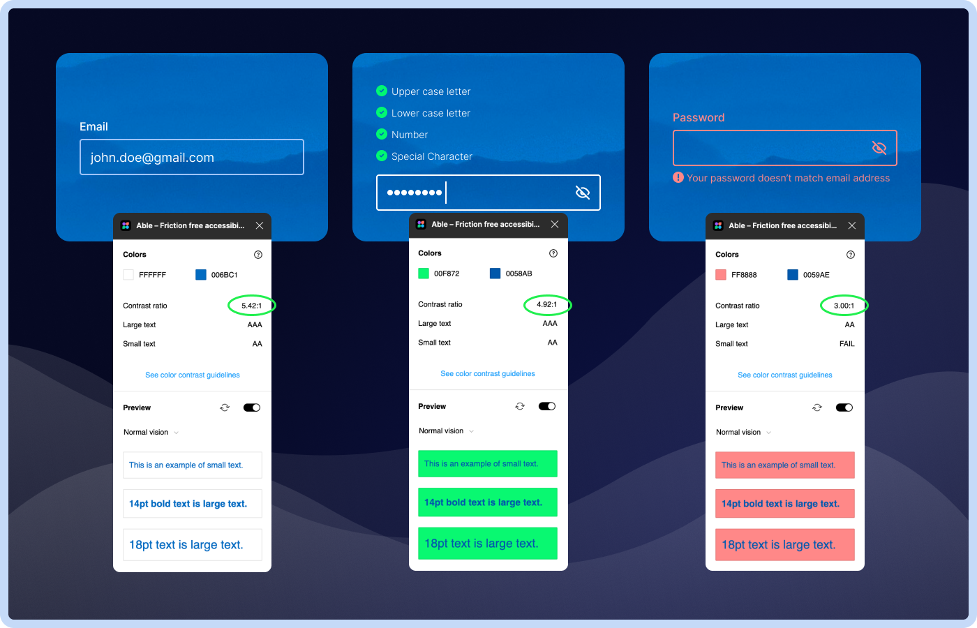
Accessibility according to WCAG
Thank you!
Tools used
From brief

Topics
Share
Reviews
2 reviews

Good job trying to approach it professionally.
Hope I will manage to write my criticism constructively. I even downloaded the app to see how it works for myself.
Issue 1. Since users could've already had an account, both signup and login should be clearly presented for users.
– users may not remember if they have an account or not, although it's not standard yet, most bigger companies are already transitioning away from strict division between sign up and log in and I believe it will be seen less and less often. Because the system can determine if the user already has an account, we can keep the language included in the buttons: "continue with ...".
Issue 2. It is better to give users an option to 'continue as a guest'.
– better for what? Their feelings? I didn't know about that app before, so I learned quite a by clicking it 3 times and reading about their offer. I am sure this approach makes them win customers. If you are going to remove it, you should think of a replacement that would still generate customers. If I got straight to the screen I got by clicking the X three times, I would be overwhelmed by the choices there.
Issue 3. This is an early simple way that may increase newsletter signups. Probably a separate screen explaining what the newsletter will be used for would be best both in effectiveness and UX, so I agree partially with you here.
Switch to Login screen at the very bottom of the screen (issue 4). While this placement is ok, it's better to put it above the form.
– why it's better? As I said the continue approach is best nowadays, I think they leave the log in at the bottom just for people who may be looking there for it, it acts the same way as the continue buttons.
Missing screen title (issue 5). Agree 👍
(issue 6). The contrast you suggested is worse in a couple places than theirs, they have a darker calmer background. Border color change is a good idea, but the icon is enough I believe, if there was no icon, the border would be a must.
(issue 7). Agree 👍

It's really good and typography and colours more elegant. You are follow the all of design principle end of the design is very well. i am a good learning form your design. My personal favourite In this design colour selection.
You might also like

Smartwatch Design for Messenger App


Bridge: UI/UX Rebrand of a Blockchain SCM Product


Pulse Music App - Light/Dark Mode


Monetization Strategy


Designing A Better Co-Working Experience Through CJM


Design a Settings Page for Mobile
Visual Design Courses

UX Design Foundations


Introduction to Figma

Design Terminology
