Accessible Signup Form
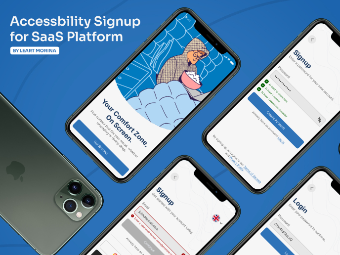
Hello! This is an Accessible Signup Form for a mobile app!
Main aspects:
• Clear background color
• Focus states
• Clear error and confirm icons
• Multiple login options
• Designed with WCAG standards
Tools used
From brief
Topics
Share
Reviews
4 reviews
Hi Alexandra,
First off, well done on completing your design brief!
This is my favorite submission for this task so far—really stunning work. The design feels ultra-clean, modern, and subtly quirky in just the right way. It’s visually appealing and well-executed.
Great job on prototyping this to give viewers a full experience of your design. The immediate feedback on inputs is a fantastic touch, helping reduce inefficiencies in the flow. I also love how the password requirements only appear when the field is activated—this minimizes cognitive load and keeps the page feeling uncluttered.
Here are just a few tiny points of feedback:
- Button Feedback: Your inactive state before form completion is great—it adds real-time feedback to the experience. I’d love to see a pressed state as well to reinforce user interaction and provide clearer action confirmation.
- Confirm Password Field Consideration: Removing a confirm password field makes sign-up quicker but can introduce risk. Many modern OS/devices autofill and save passwords, making your approach efficient. However, for those manually entering passwords, a typo could lock them out. The decision ultimately depends on user research, but it’s worth considering.
- Design Rationale: Even though these screens are simple, I would have loved to hear a bit more about your design decisions. You’ve made great usability accommodations—make sure to highlight them so readers fully appreciate the thoughtfulness behind your work.
These are just small refinements—overall, I absolutely loved reviewing this. Fantastic work!
Nice work on making the signup form accessible!
The focus states and clear icons improve usability, and multiple login options make it more user-friendly.
You might consider adding real-time error validation for an even smoother experience.
Great job
Great job! I really like how simple and minimalistic, yet effective this design is. It contains all the necessary elements of a sign up page without being too much. It seems very user friendly and clear. I also appreciate the password validation which appears during the entering of a new value, looks very clear. Bravo
The signup form's accessibility improvements are commendable. The well-defined focus states and clear icons enhance usability, while the diverse login options cater to a wider audience. For an even better user experience, incorporating real-time error validation could be beneficial. Overall, excellent work!
You might also like
Events Managment App
Customer Journey Map — Offsite Co-Working Experience
Mobile Onboarding: Casa di Pasta
Accessible Signup & Login Experience — Brainex
Accessible Signup Form
Accessible Signup Form
Visual Design Courses

UX Design Foundations

Introduction to Figma


