Accessible Signup and Login Form

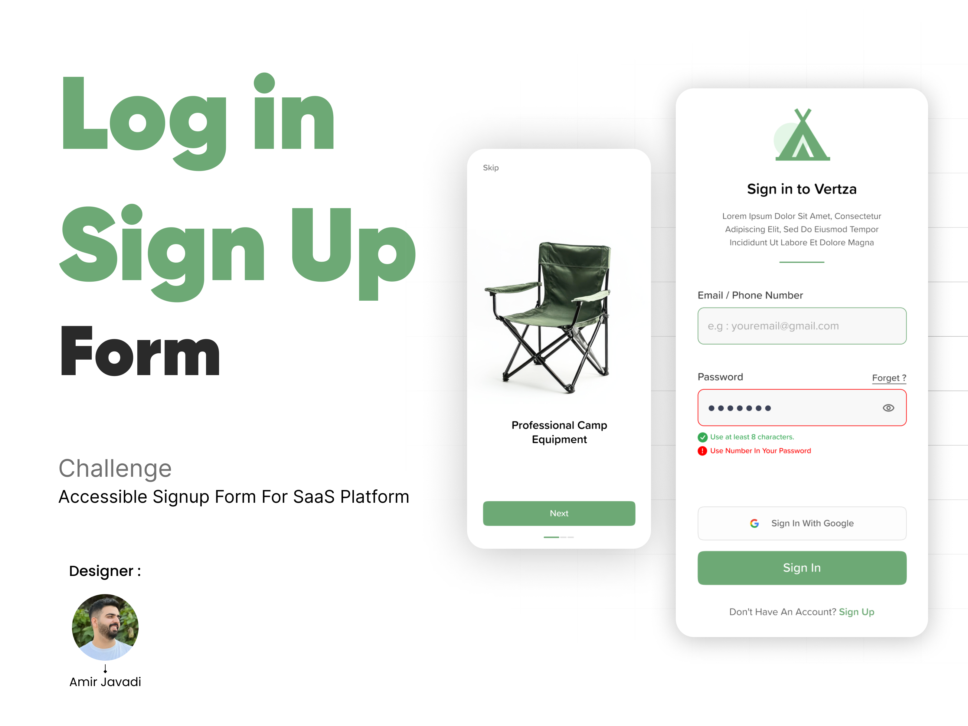
This project presents a signup form designed for a SaaS platform, ensuring compliance with WCAG accessibility standards and best UX practices. The goal was to create a seamless, user-friendly, and fully accessible signup experience across both desktop and mobile devices.
Key Features & Accessibility Considerations:
✔️ Clear Error Messaging – Users receive detailed, descriptive error messages to help them correct input mistakes easily.
✔️ Toggle for Password Visibility – A visibility toggle allows users to view or hide their password, enhancing usability.
✔️ Multiple Login Options – Users can sign up using email, social media, or third-party authentication methods, ensuring flexibility.
✔️ Focus States for Clarity – Clear focus indicators help keyboard users navigate the form efficiently.
✔️ Multi-Language Support – The form supports multiple languages, making it accessible to a diverse audience.
✔️ WCAG-Compliant Design – The form adheres to color contrast guidelines, keyboard accessibility, and screen reader compatibility.
Design Rationale:
- Minimalist & Intuitive UI – A clean, distraction-free layout enhances usability.
- Only Essential Fields – Reducing friction in the signup process to improve conversion rates.
- Interactive & Responsive – The design is optimized for both mobile and desktop, ensuring a consistent experience.
Presentation & Submission:
- The project is showcased using mobile and desktop templates.
- It includes interactive elements to demonstrate functionality and accessibility.
This signup form prioritizes usability, accessibility, and inclusivity, ensuring that users of all abilities can register effortlessly.
Tools used
From brief

Topics
Share
Reviews
1 review

Hey Amir,
Great job on your submission! I really appreciate the effort you put into the custom cover image and product walkthrough—it makes for a polished and engaging presentation. The colour scheme is fresh and clean, perfectly capturing the outdoor feel.
Here are some refinements to elevate your design even further:
- The landing page feels a bit sparse. A stronger title and adding a subtitle can provide clearer context and highlight your value proposition. Also, adding a logo reinforces brand presence.
- The skip button’s placement might make it easy to miss—consider repositioning it for better visibility.
- Allowing users to sign up or log in from the landing page itself could streamline the experience and remove an unnecessary click.
- Replacing any placeholder or dummy text enhances credibility and communicates the final vision more effectively.
- The "eg" in the email field isn't necessary. If the input accepts both email and number, consider a clearer hint.
- The "Forgot Password" button feels unconventionally positioned—placing it where users expect it could improve usability.
- Ensure button labels are consistently sized for uniformity.
- A password strength indicator is used on signup screens rather than login—it needs to be removed on your login and used on signup.
- The email and password fields seem visually detached, which disrupts flow—bringing them closer together can improve readability.
- The input field’s default color is quite faint against the background, which may impact accessibility.
- A repeat password field in the signup flow helps mitigate user errors.
- The username field currently has an email hint, which might be misleading.
- Consider prototyping your design—the hard work is already done, and interactive testing could highlight areas for further refinement.
With these tweaks, your design is on its way to becoming even better! Looking forward to seeing more.
You might also like

SONZ - Entertainment platform


Camp & Travel Explorer - App Design


Solar system Dashboard Utility

Uxcel Halloween Icon Pack


Color System

Duolingo Halloween Icon Pack

Visual Design Courses

UX Design Foundations


Introduction to Figma

Design Terminology
