A11y Signup Form for SaaS Platform

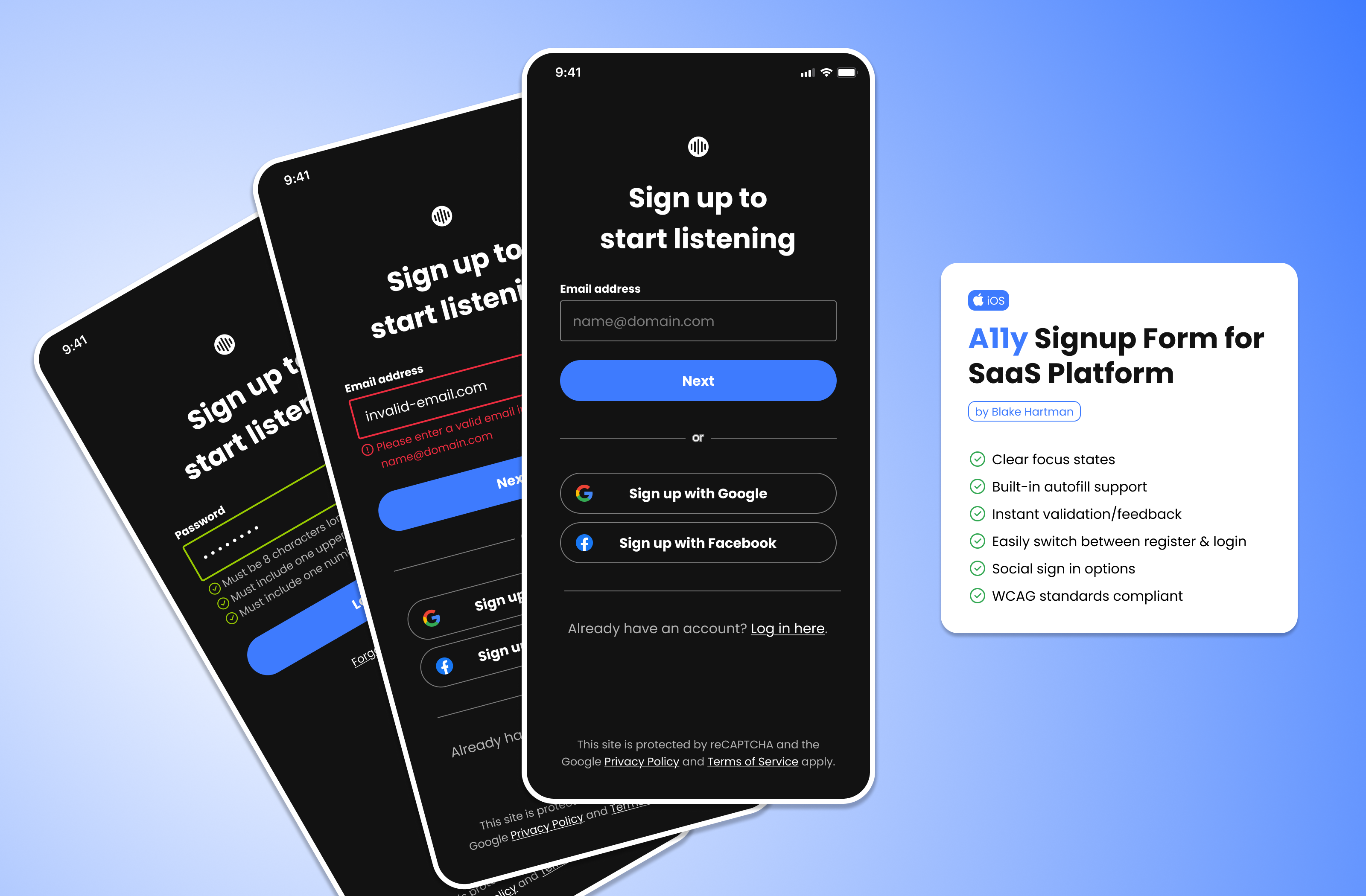
I wanted to create a signup flow for a music streaming platform, with a heavy focus on accessible inputs and ease of use.
Tools used
From brief

Topics
Share
Reviews
2 reviews

I personally like the dark mode, but the white space consistency is what make this less appealing to me, though the grouping is good, the space between element are not consistent. For example, email address and the email textbox should got atleast 8px and 16 for the next button on page 2. As for the space between submit and ---or--- and login with third parties and sign in should be 24. That way you could give the grouping some space to breath. Next is the text label size is too small which is not accessible because the only people who can read it is younger people but older than 30-35 will have a difficulties in reading the text, also it is not consistent with the text inside the email textbox.
TL;DR
- I like the colour palette
- the design is not consistent enough, in this case the white space between element/object and text font
- The label is not a good accessibility option because it is too small for people over 30+ to read

good, love it))
You might also like

Events Managment App


Customer Journey Map — Offsite Co-Working Experience


Mobile Onboarding: Casa di Pasta


Accessible Signup & Login Experience — Brainex


Accessible Signup Form


Accessible Signup Form

Visual Design Courses

UX Design Foundations


Introduction to Figma

Design Terminology
