Showing Input Error
Delve into the principles of providing clear and informative input error messages that guide users toward resolving the issue
Users mistype all the time — whether it's a finger slipping or rushing through letters, errors happen. Since it is an everyday occurrence, solving an error should be obvious and seamless.
One of Nielsen's heuristics states that a good system should help users recognize and recover from errors. What can designers do to enforce this?
- Provide strong visuals to indicate the problem clearly.
- Use simple and straightforward language to explain the cause of the problem and guide further steps.
Good error messages shouldn't just inform users of a problem. They should make it clear how to fix the issue and move forward effectively.
In the ideal world, users never make mistakes and complete tasks successfully every time. Unfortunately, in the real world, systems can be confusing, users may get distracted or lose attention, and
Error-prevention strategies for inputs include:
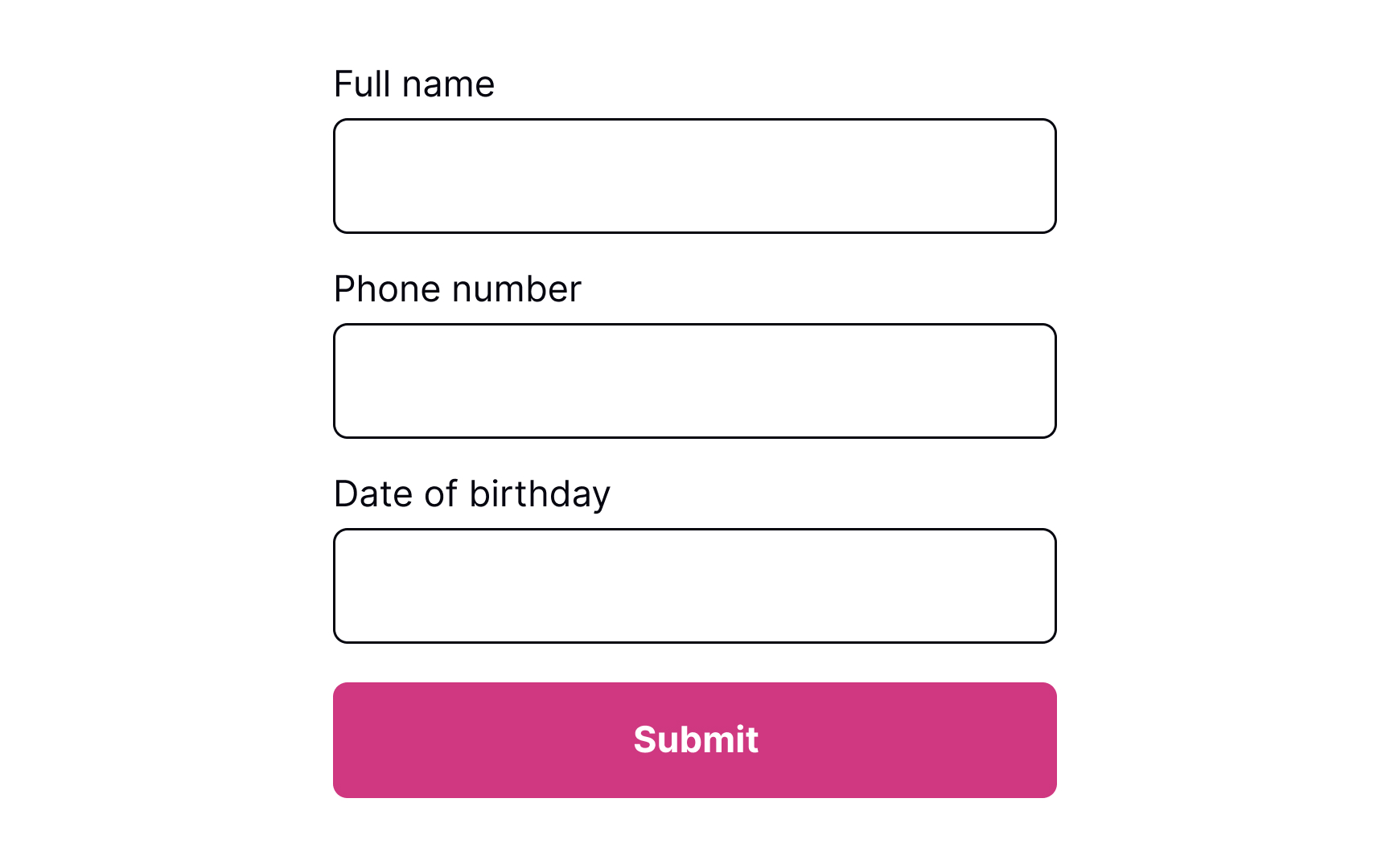
- Using constraints: Constraints prevent users from typing a wrong input by setting boundaries. For example, inputs asking for users' phone numbers or banking card numbers should show a numeric keyboard only.
- Using forgiving formats: Rather than forcing users to type in a format desired for your system, allow them to type in a way that's convenient to them. Then, format their input while users are typing and add necessary spaces, parentheses, or hyphens, removing letters if it's a phone number input, for example.
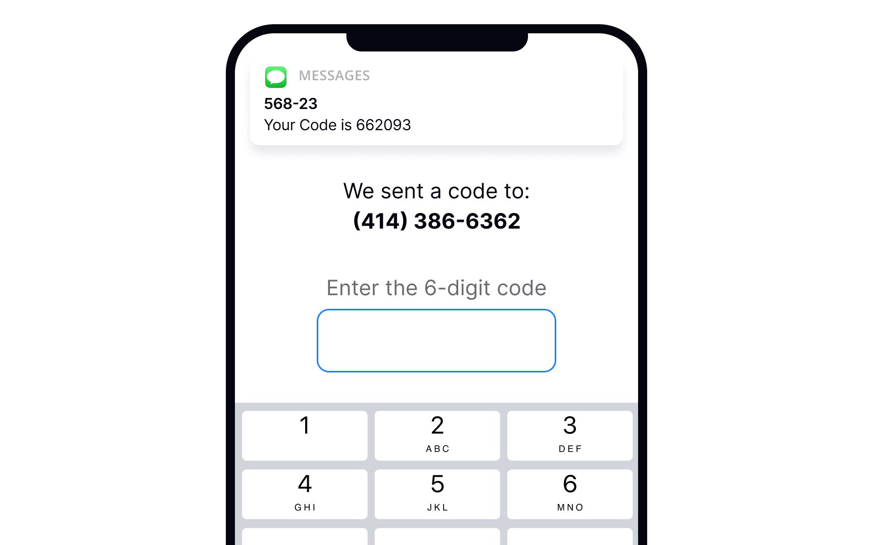
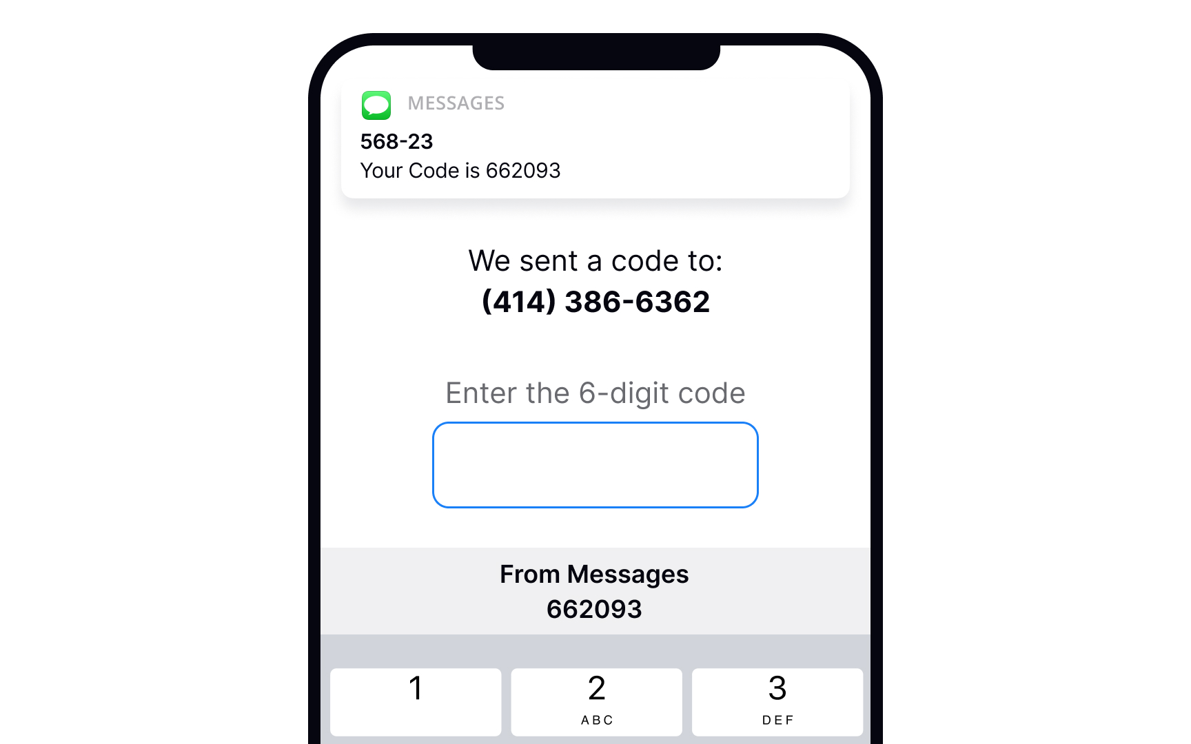
- Reducing cognitive load: Don't force users to keep too many things in mind. For example, it's a good practice to detect the SMS passcode from their messages and display it above the keyboard. This way, users don't need to switch between screens and strain their memory.[1]
- Providing clear instructions: Users don't like reading and prefer skimming information. So make sure labels, tooltips, and form instructions are concise and straight to the point.
Error
Pro Tip: Use inline validation to indicate successful entries. It'll remove any second-guessing that users may have to do when filling in a complex form with multiple inputs.
While users are filling out a form, they may want to edit some information and go back to previous fields. Let them type without interruption and don't check for
Inline validation makes sense for complex
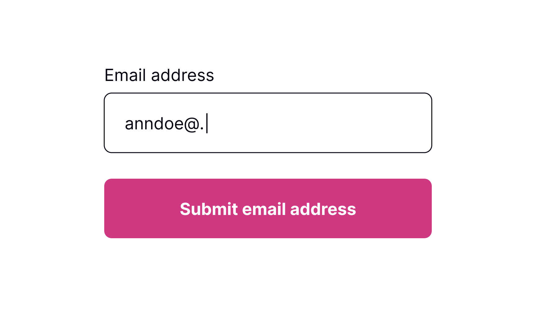
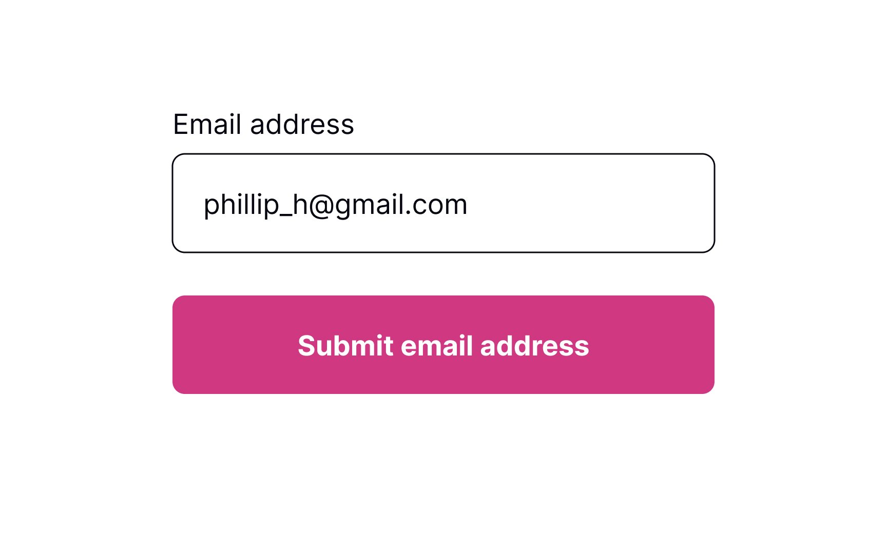
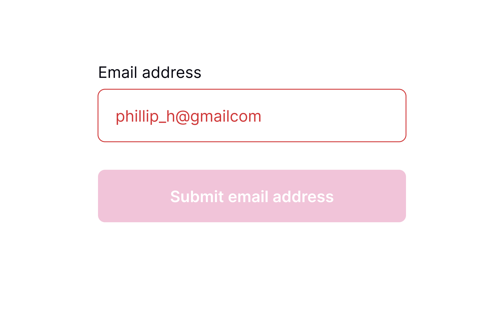
Placeholders are supposed to clarify what information users need to enter and increase the form completion speed. Unfortunately, many people confuse placeholders with real data filled in by default.
Plus, if placeholders substitute
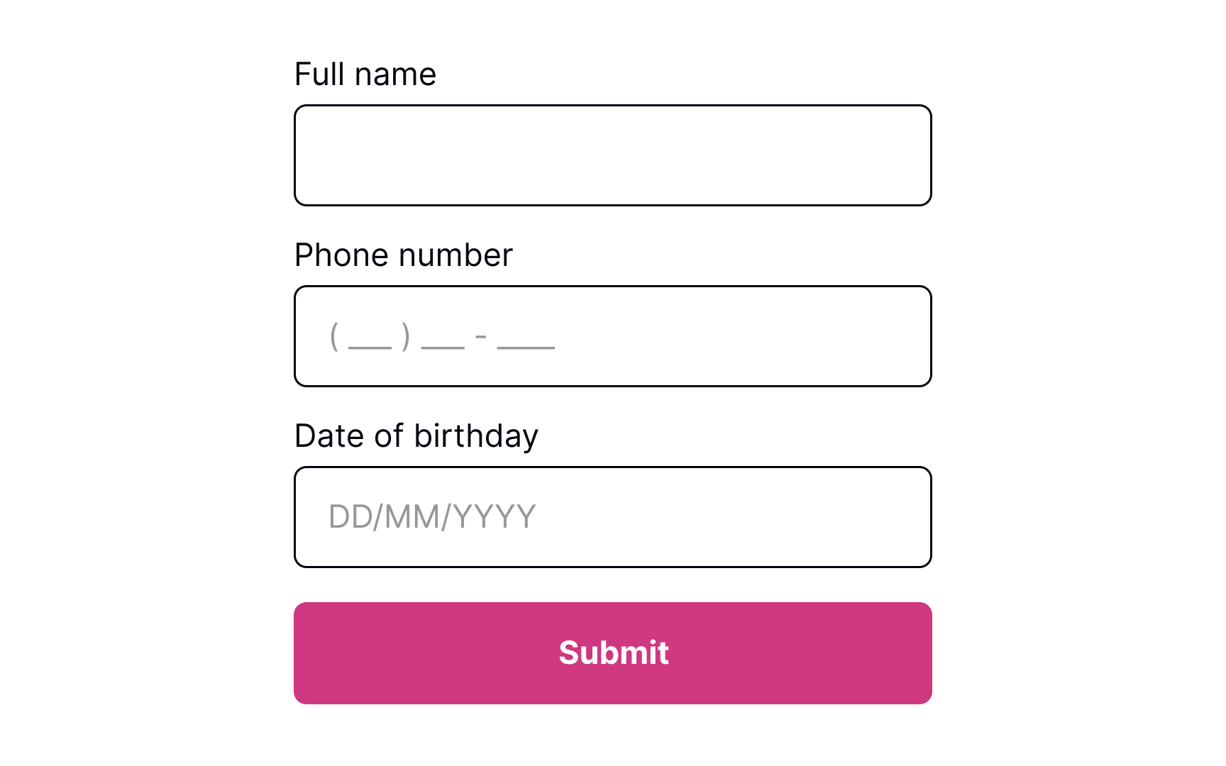
Input masks are an excellent solution when formatting matters (for things like phone numbers or dates). Besides displaying the desired input format, they also automatically apply it to users' input as they type. This tool reduces cognitive load and confusion, so users don't need to worry and double-check if they have typed everything correctly.
Once users move away from the
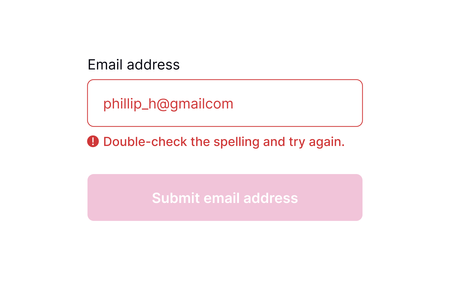
Pro Tip: From an accessibility viewpoint, it's important to accompany the error message with an icon indicating an error.
Even if you take all measures to prevent
- Use plain language: Get rid of technical jargon and passive voices, which may confuse users.
- Keep the message short: Users don't like to read, and in the face of a stressful environment, they are even less likely to read something longer than 1-2 sentences. A study by the American Press Institute shows that users are more likely to understand the whole piece of information only if the sentence contains no more than 8 words.[4]
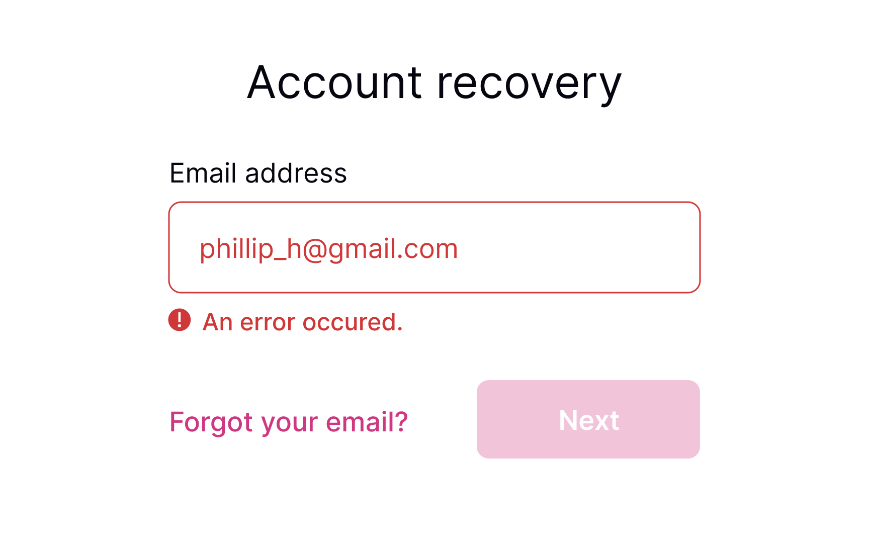
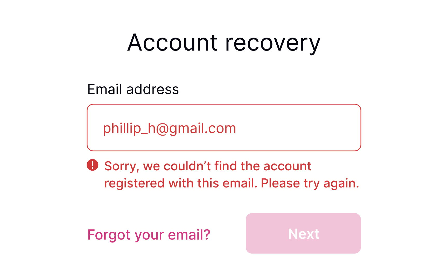
- Be precise: Avoid ambiguous phrases like "an error occurred," as they don't help users identify the root cause. Tell them which input contains the error and what they are expected to enter in order to solve it.
- Be polite: Avoid blaming users or making them feel stupid. Focus on fixing the problem and building trust and loyalty.
Keeping the
- It maintains context about what needs to be fixed
- Users don't have to remember what the error was
- It provides immediate feedback as they work toward a solution
- It prevents confusion about whether the error has actually been resolved
The field should only return to its default or success state when the
The only visual change during user input should be real-time validation feedback, like checkmarks appearing next to requirements as they're met.
References
- Preventing User Errors: Avoiding Unconscious Slips | Nielsen Norman Group
- How to Report Errors in Forms: 10 Design Guidelines | Nielsen Norman Group
- Placeholders in Form Fields Are Harmful | Nielsen Norman Group
Top contributors


Topics
From Course

Share


Similar lessons

Login & Signup Flows

User Onboarding
