Influencing Behavior With Color
Understand how user behavior can be predicted and prompted with the help of color
Color has a powerful impact on our daily lives. Golden sunlight streaming through our windows energizes us in the morning. A gluten-free muffin in a brown paper bag with a green leaf logo from a nearby bakery makes us feel healthier at breakfast. We choose a blue t-shirt to feel calmer or a red jacket to look more confident. But why?
Colors are known to stimulate purchases, evoke anxiety or relaxation, boost performance, create hope, or repulse. For example, according to multiple studies, sedative pills of blue, green, or purple are more effective, while antidepressants tend to work better when the pills are in warm colors.[1] Another study found that students who were exposed to the color red before taking an exam showed 20% worse results than those presented with green and black.[2]
The impact of color on human behavior is undeniable, but the subject still needs additional research. As a designer, always consider users' personal, cultural, and situational aspects when selecting colors to influence their behavior.
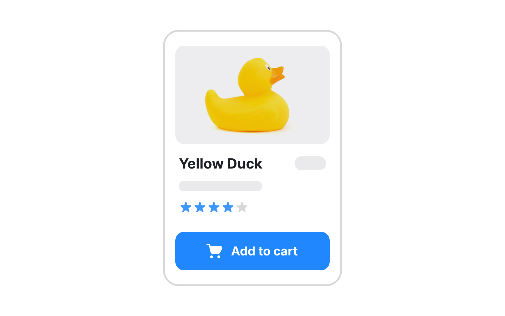
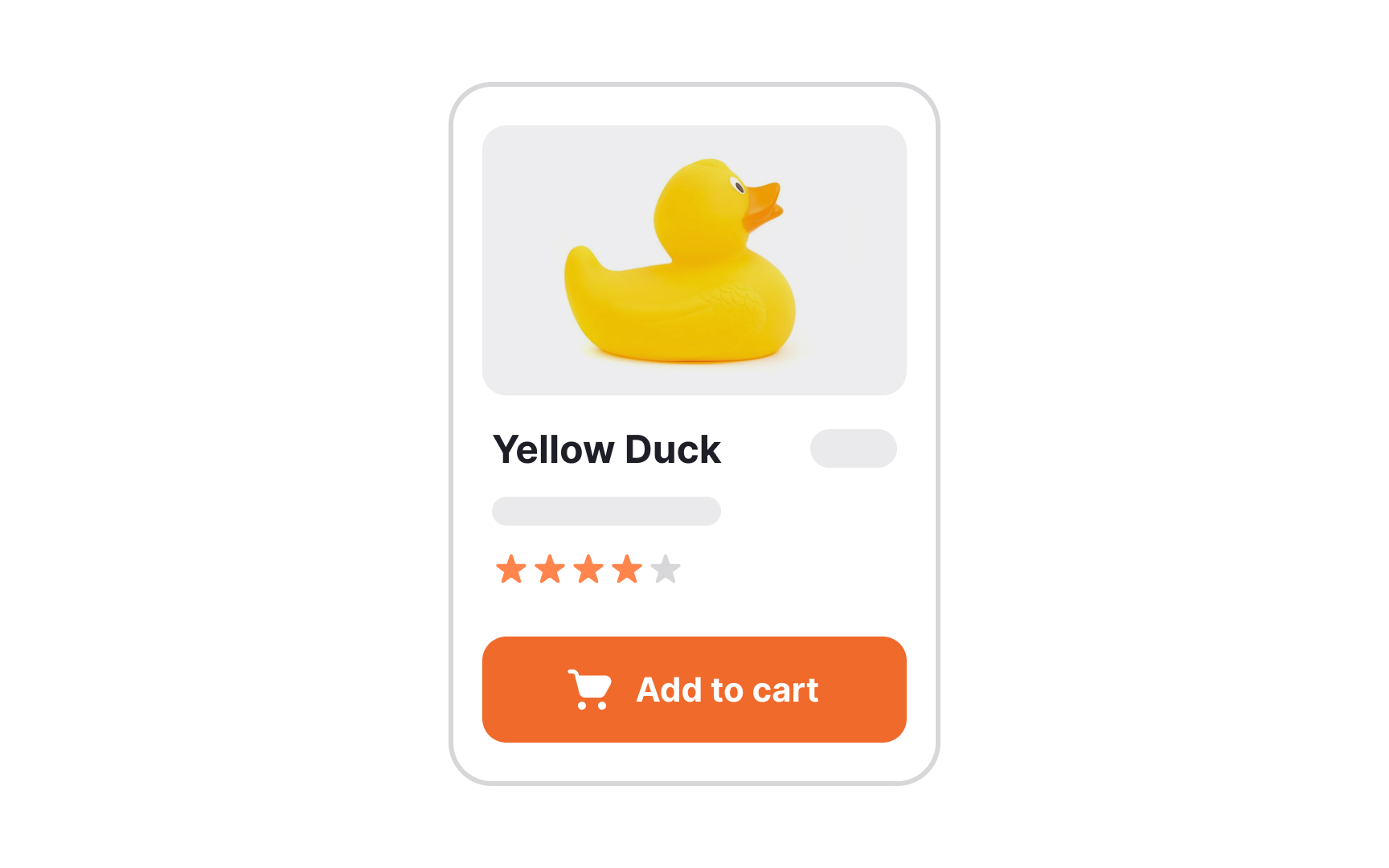
What is the primary marketing goal of any product? That's right, to maximize conversion rates. A Big Orange Button (BOB) is a solution to catch users' attention and encourage clicks. However, it doesn't have to be orange. BOB is an acronym created by conversion rate optimization platforms to describe a clearly clickable button
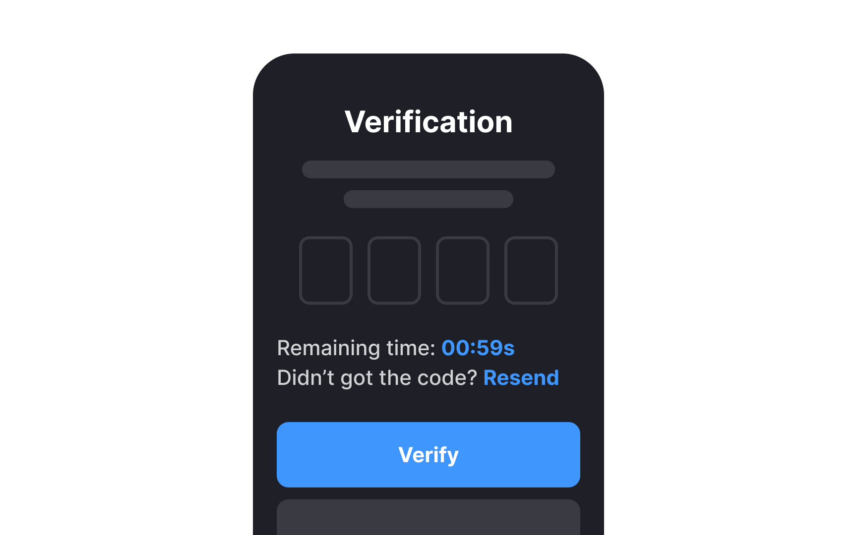
Warm colors like orange, red, yellow, and pink are linked to action, while cool colors like blue, green, and purple are linked to passivity. A/B testing by HubSpot showed that a red CTA button outperformed a green one by 21%.[4] Despite red's association with warnings and aggression, it also feels more urgent and encouraging.
However, don't blindly change all your CTA buttons to red or orange. First, consider the overall color palette and contrast between the CTA buttons and surrounding content. Second, test your assumptions with your users on your pages.
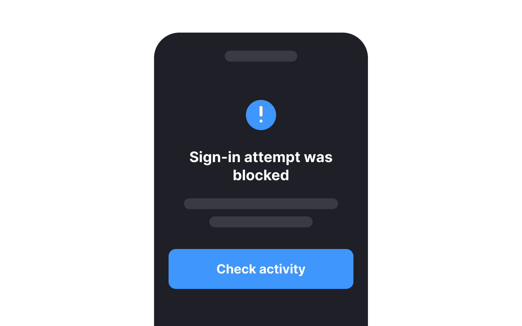
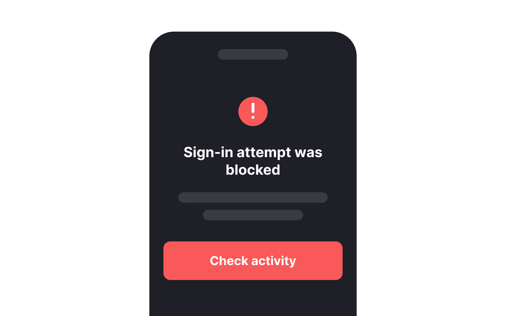
Some theories suggest that humans are naturally attuned to see red because it helped our ancestors survive. Human eyes have more cones that are sensitive to red and yellow wavelengths compared to blue.[5] This helped early humans notice red signals that could indicate danger, like poisonous animals or plants, or benefits, like ripe fruits.[6]
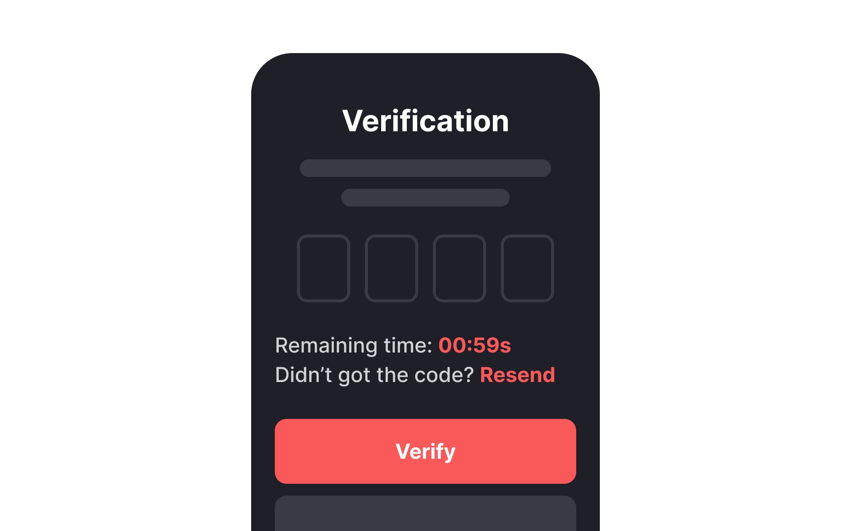
In design, red often serves to warn users or signal a stop, like indicating an error or a destructive action such as deleting an account. The instinct to notice red can also make users act quickly, as it creates a sense of urgency.
Pro Tip: Accompany red with additional visual cues like icons to make warnings stronger for all people, including color-blind individuals.
Many studies show that natural environments with blue and green hues promote health, reduce stress, fear, and anger, and positively impact cognitive recovery.[7] In the early 1900s, a New York City psychiatric hospital even had different colored wards to treat different kinds of patients. Blue and green rooms were designed for boisterous individuals while red rooms were used to improve mood and ward off sadness.[8]
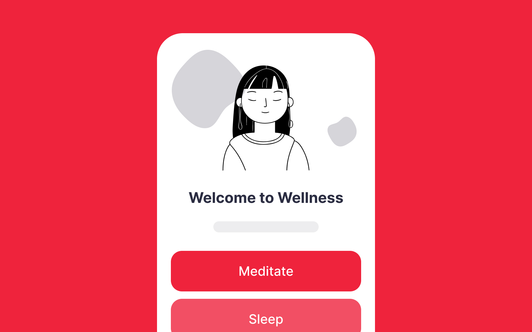
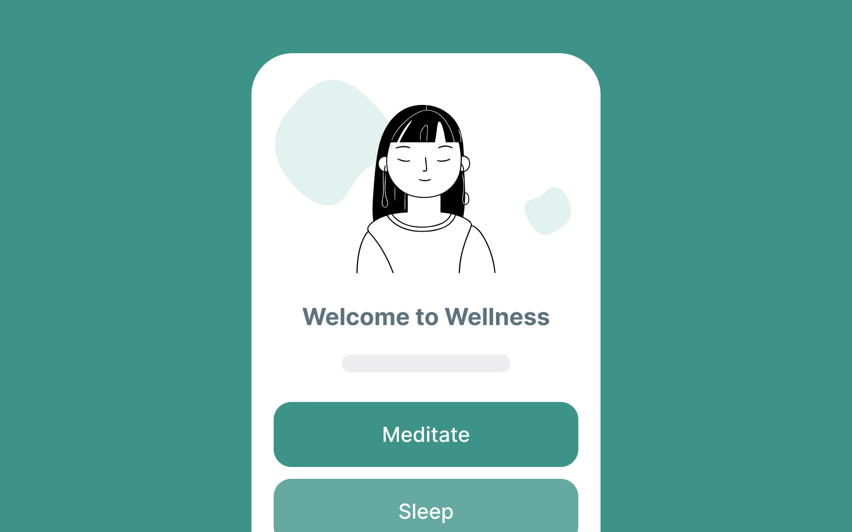
The right combination of soft blues and greens can be a perfect fit for situations where you need to calm and reassure users — for example, in meditation or yoga apps. These
Have you noticed how time seems to fly when you're on vacation, relaxing on a beach or swimming in a pool? Conversely, time drags when you're in a tense situation, like taking an exam or having a tough conversation with your boss. Interestingly, colors also affect our perception of time.
In 1975, professors K.W. Jacobs and J.F. Suess's experiment found that participants felt less anxious after viewing blue slides compared to red or yellow ones. In 2004, another study had participants evaluate the download speed of web
Designers can use this information to understand the impact of
The human mind can significantly influence our physical state, leading to relaxation, tension, healing, or even recovery from illness through brain processes. This phenomenon is known as the placebo effect.
The placebo effect isn't about positive thinking. Often, people are unaware that they are being treated with "sugar pills" that have no medical effect. Patients believe they are receiving real treatment, and their minds trick them into experiencing therapeutic results.[10]
Studies show that pills or capsules of warm, active
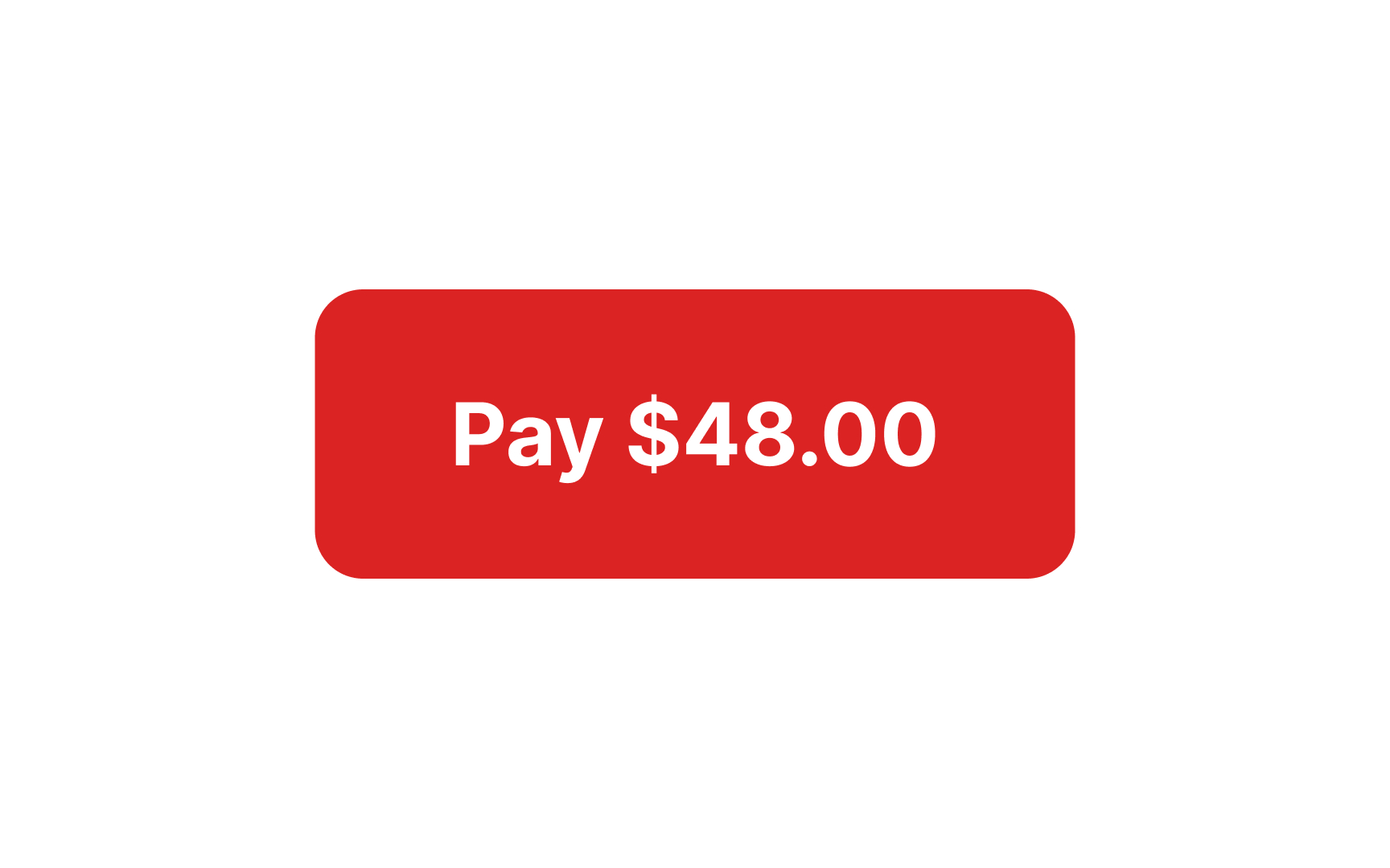
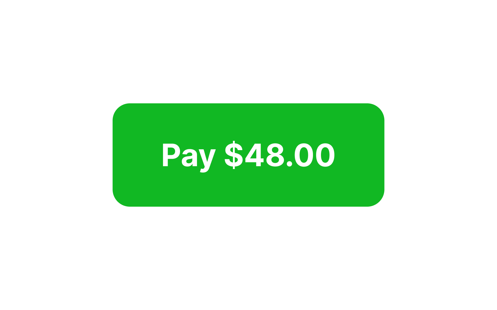
The perceived qualities of colors can be used in design to show users that their expectations will be met. For example, using green for a Pay
Despite cultural differences and personal experience, people generally have similar positive and negative associations with some
For example:
- Yellow symbolizes the sun, warmth, energy, and joy.
- Green brings to mind thriving plants and nature, the spring season, and new beginnings.
- In most Western countries, white represents purity, enlightenment, and a fresh start.
Although yellow, green, and white have other associations, including negative ones, their harmonious blending creates a sense of tenderness, quietness, and hope.
In the biological world, decay and growth go side by side, and life is always accompanied by death. The
Additionally, certain shades of brown and black are sometimes described as negative colors that bring to mind darkness, dirt, and mourning.
Triggering disgust through design can discourage harmful behaviors, such as smoking or littering, by making users aware of the negative consequences.
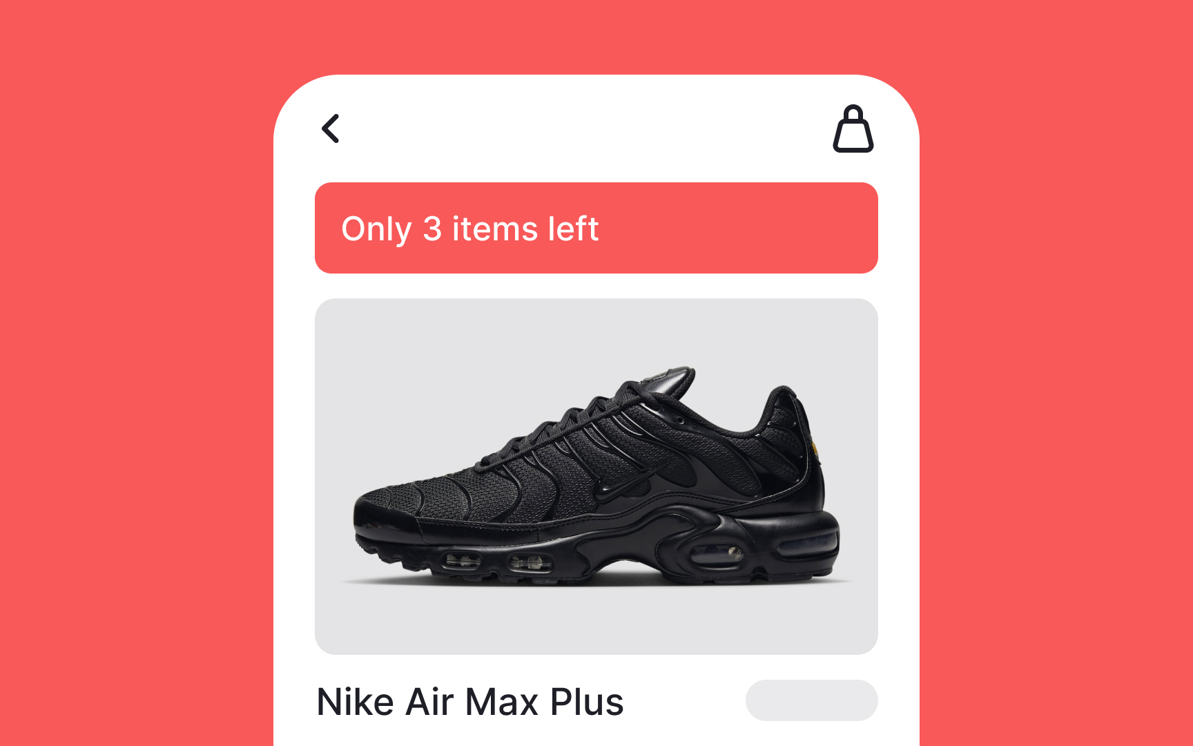
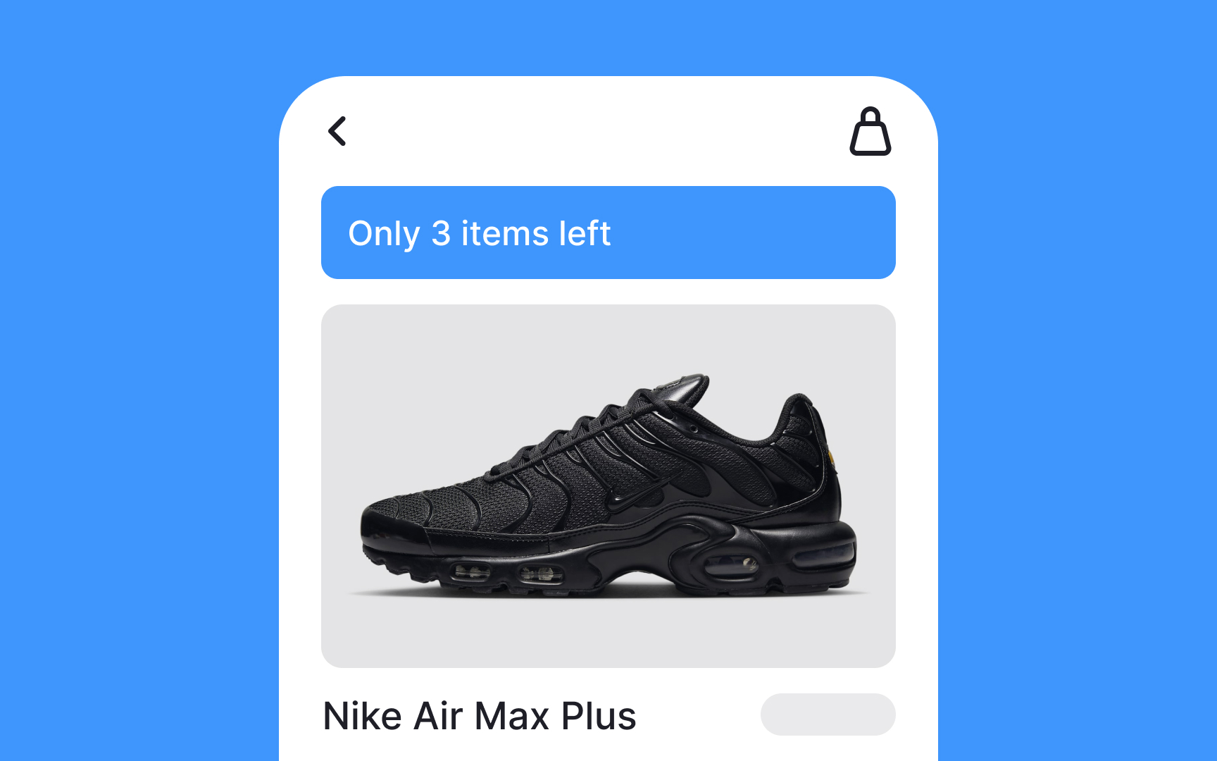
FOMO is an acronym that stands for the "fear of missing out." It was coined in 1996 by
Using too much red and orange in your designs can provoke a sense of anxiety, stress, and mental exhaustion that intensify FOMO. While it might increase your
References
- The Influence of Forest Resting Environments on Stress Using Virtual Reality | PubMed Central (PMC)
- How Does the Placebo Effect Work? | Verywell Mind
- Do You Have FOMO? Here Is How to Cope | Verywell Mind
Top contributors


Topics
From Course

Share


Similar lessons

Intro to Color Theory

Color Properties
