Filter chips
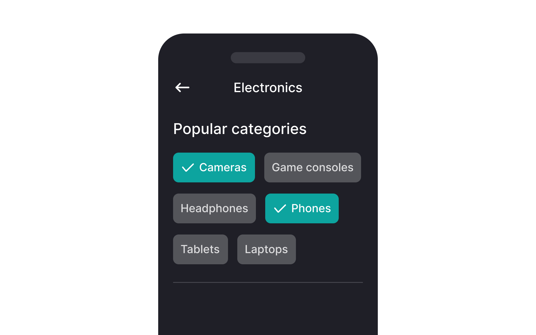
Filter chips allow users to refine and narrow down content based on specific criteria or categories. They can be a good alternative to segmented buttons or checkboxes when viewing a list or search results. A single chip can also be selected, offering an alternative to segmented buttons, radio buttons, or single-select menus.
However, avoid mixing chip set behaviors. All chip sets on a page should be either single-select or multi-select. When combined with a menu, the filter chip opens a list of selectable options. For example, on an online shopping site, filter chips may include categories like "Price Range," "Brand," or "Size." Users can click on these chips to filter products and view only those that match the selected criteria.
Filter chips can contain a trailing icon (x) to dismiss the option or an arrow to expand into a menu to display more options. They can be stacked horizontally and span multiple rows, making them adaptable to various interface layouts and enhancing the user experience by keeping the filtering process intuitive and organized.
Pro Tip: You can also include details like the number of available items in each category within filter chips.