How to Design UI Chips for Filtering & Selection
Use chips to label, filter, and organize content in compact, interactive elements
Chips are small but versatile. These compact elements appear throughout modern interfaces, handling tasks that would otherwise require bulkier components. They label content, represent user inputs, enable filtering, and trigger actions, all while taking up minimal space.
Their size makes them ideal for situations where screen real estate is tight or where users need to see multiple options at once. A row of filter chips lets users refine results without navigating away from the content. Input chips display user selections like tags or email recipients in a form that's easy to scan and modify.
But chips aren't interchangeable with buttons, even though they sometimes look similar. Understanding when to reach for a chip versus another component prevents confusion and keeps interactions predictable. The distinctions between chip types matter too. Some chips are purely informational. Others respond to taps. Some toggle on and off. Each type carries different expectations about how it should behave.
You might wonder how
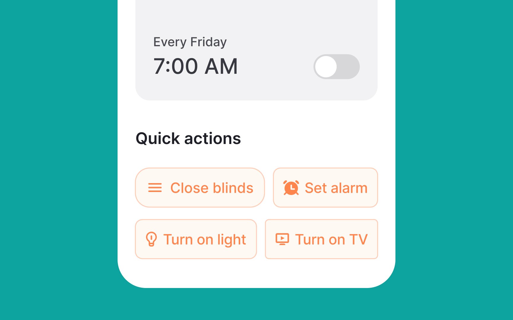
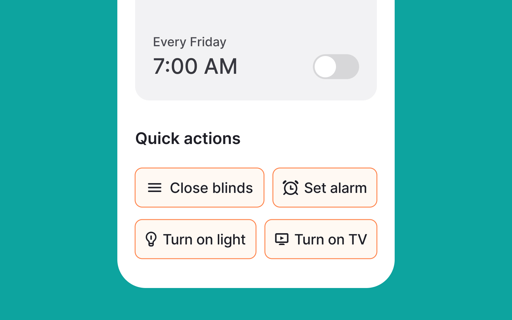
Buttons, on the other hand, are for clear, single-purpose actions like "Save," "Submit," or "Cancel." They’re used when the user needs to make a decision or move to the next step.
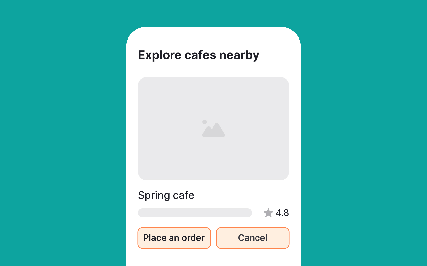
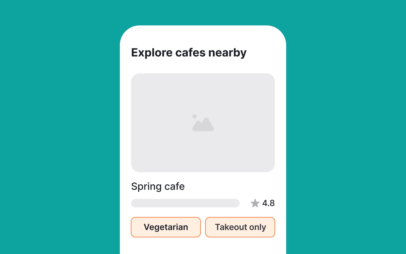
Use filter chips when you want users to refine or explore. Use buttons when you need them to commit or continue.
Also called assist or suggestion
During an
- Transformation: Can turn into modals or transition into full-screen views of new
content . - Adjustment: Can readjust to display more results inline.
- Action trigger: Can trigger actions or show progress and confirmation.
- Dynamic text: Start with a verb and adjust text dynamically if the state changes (e.g., "Save" to "Saved").
- Placement: Displayed after primary content, such as below a card or persistently at the bottom of a screen.[1]
You know when you start typing the
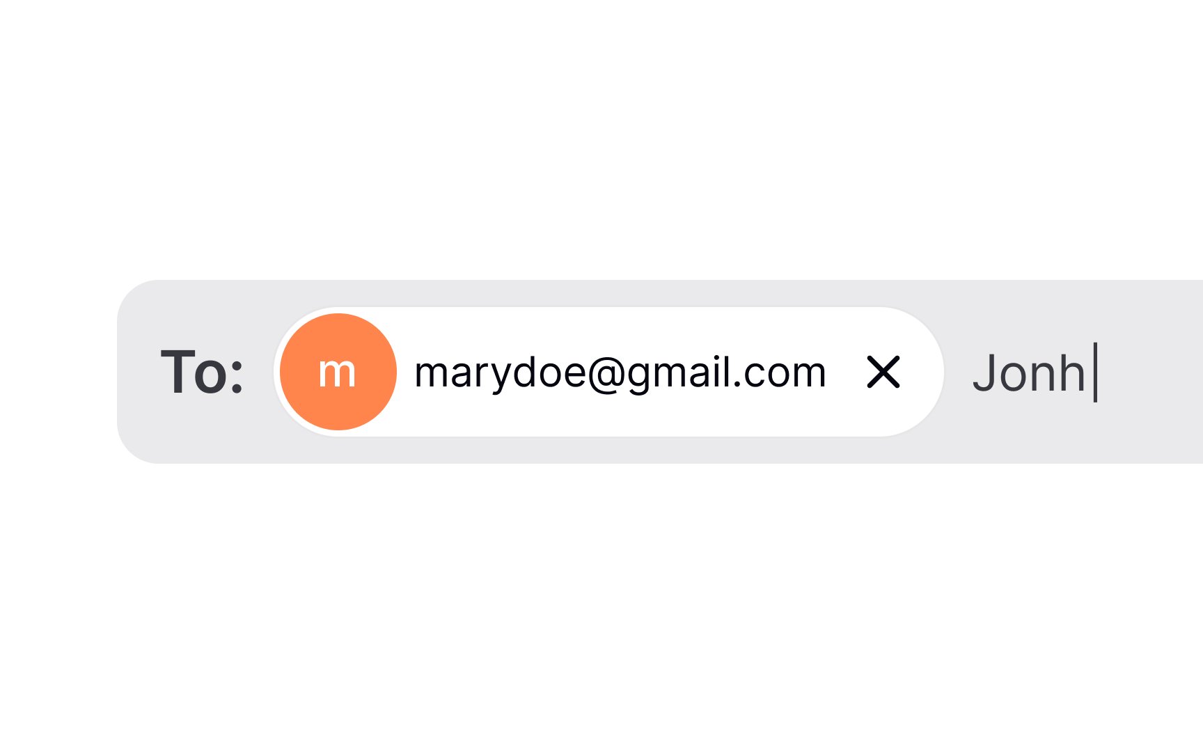
Input
Pro Tip: Let users deselect input chips by adding a clickable trailing cross icon (x).
However, avoid mixing chip set behaviors. All chip sets on a
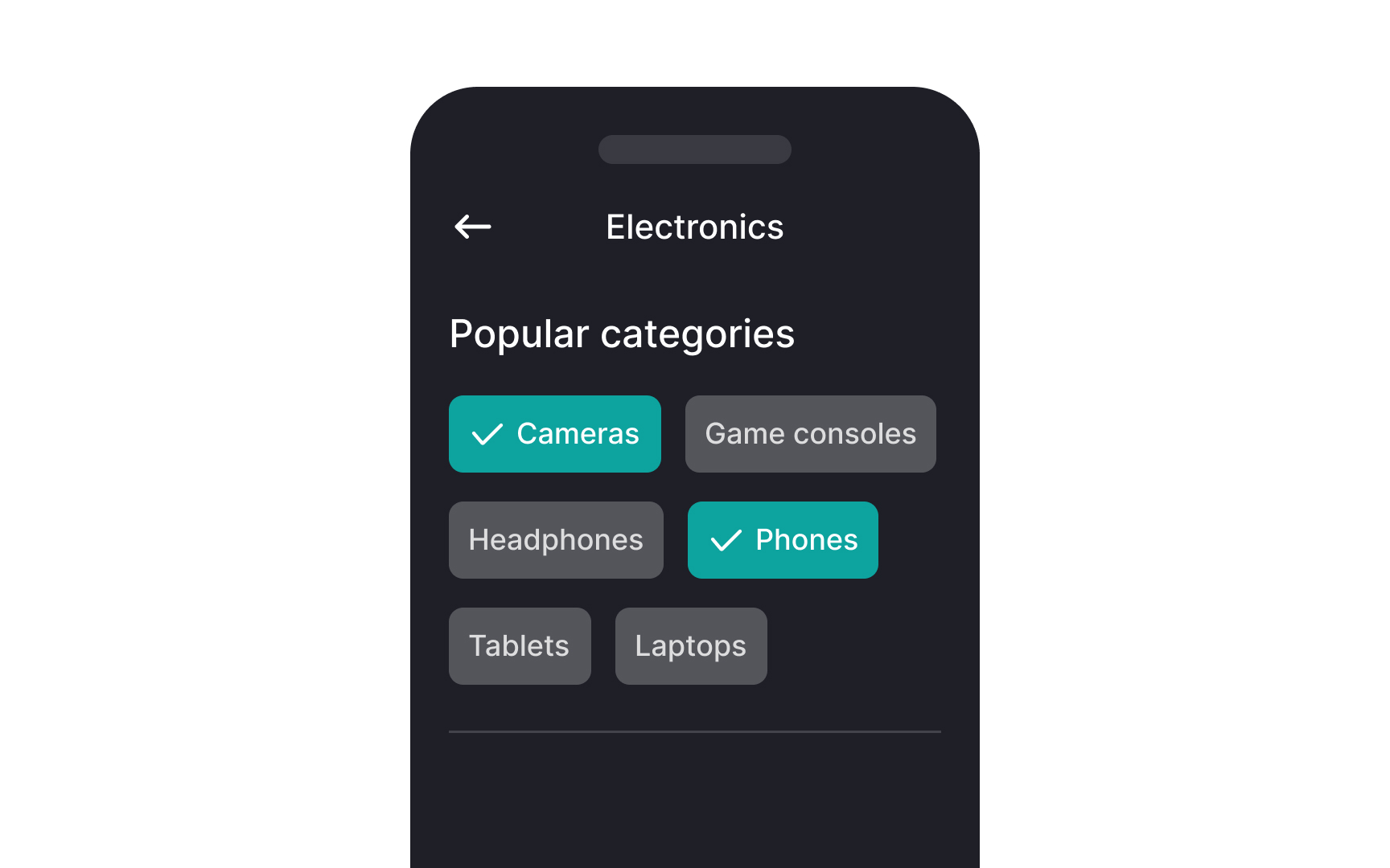
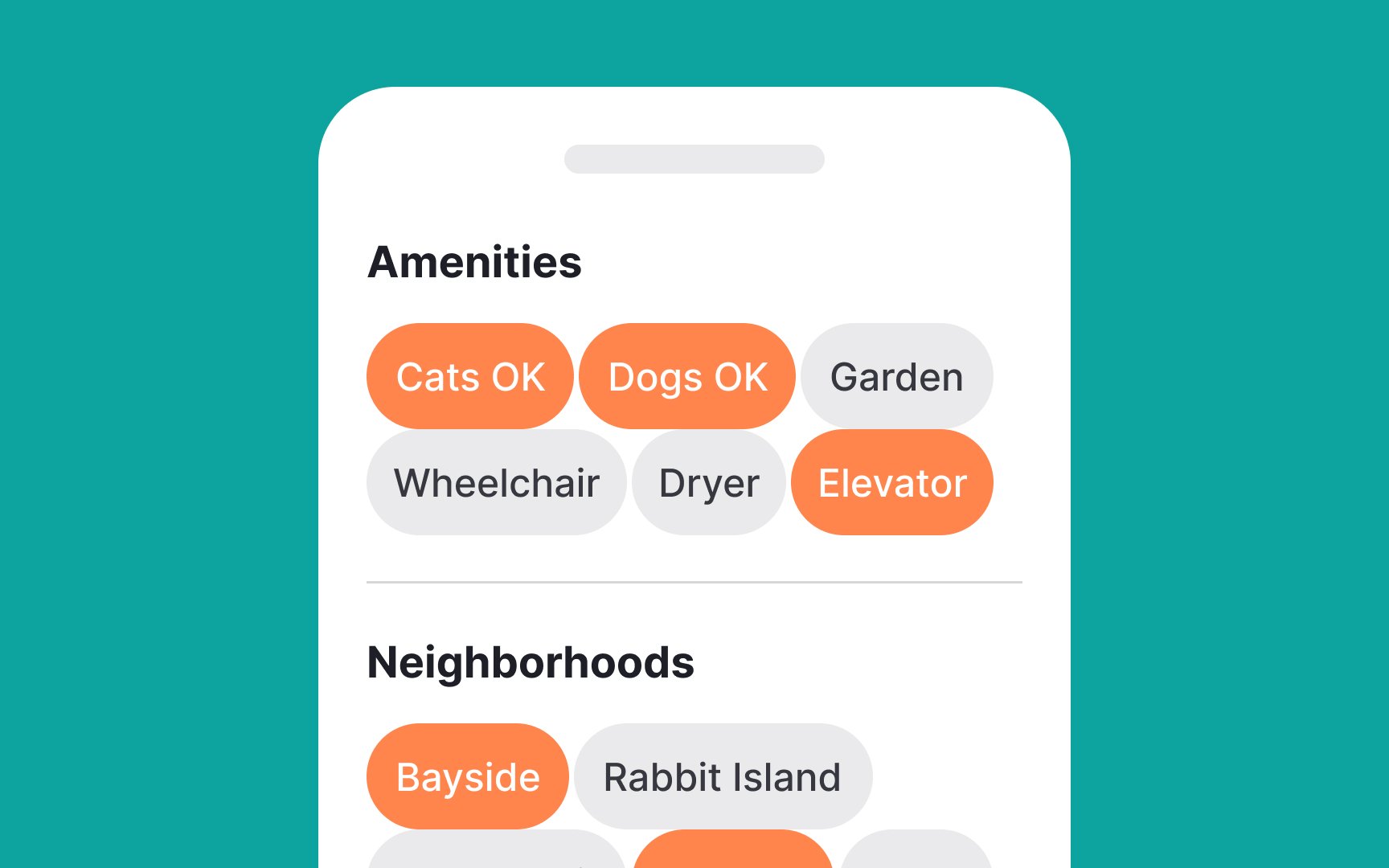
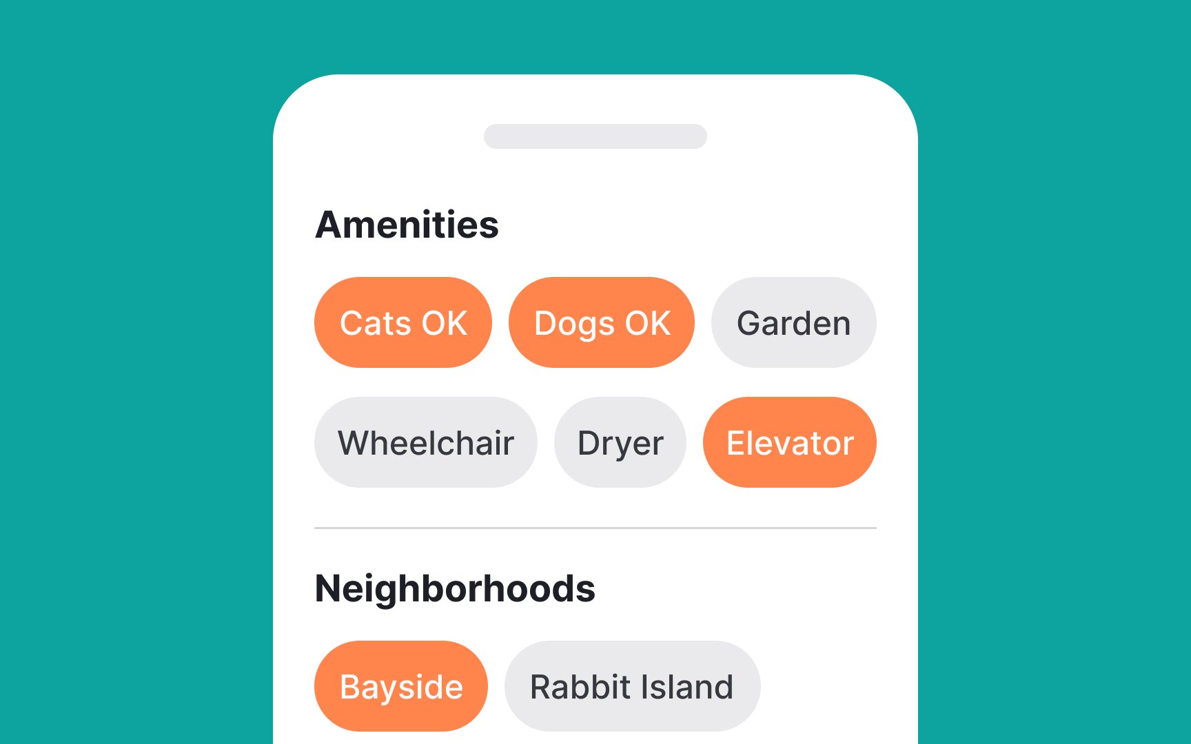
Filter chips can contain a trailing icon (x) to dismiss the option or an arrow to expand into a menu to display more options. They can be stacked horizontally and span multiple
Pro Tip: You can also include details like the number of available items in each category within filter chips.

A basic non-interactive chip is a simple text
Suggestion
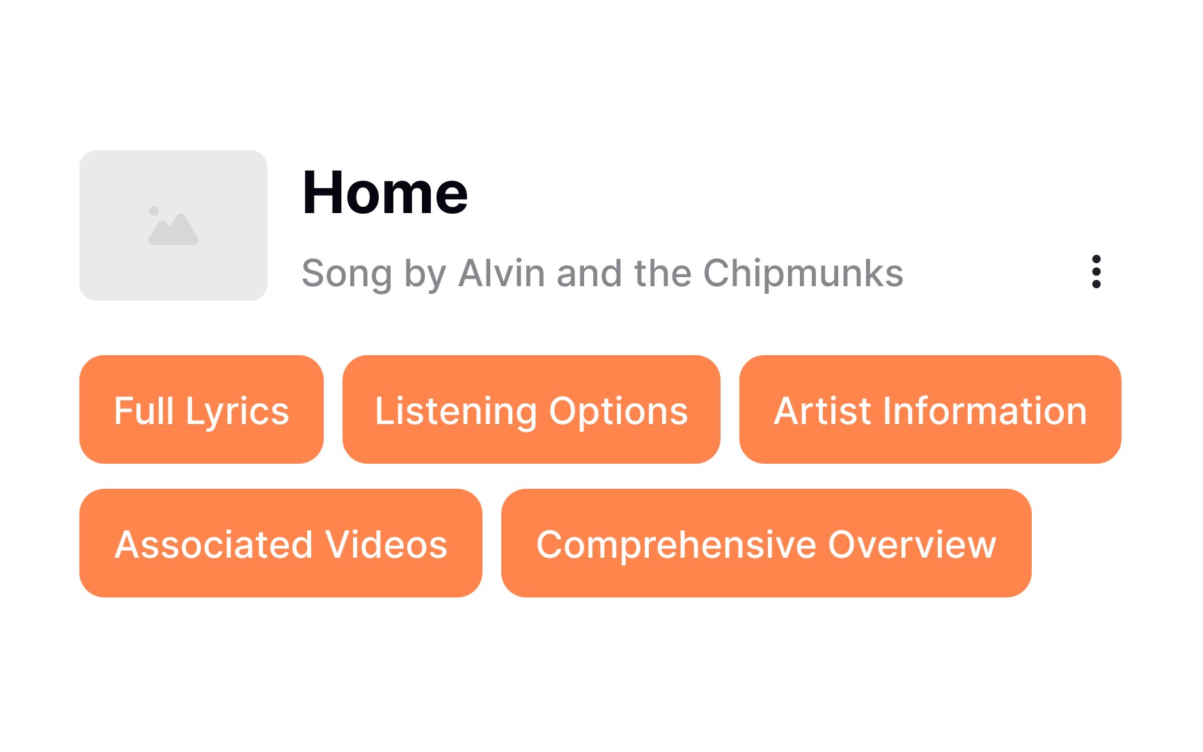
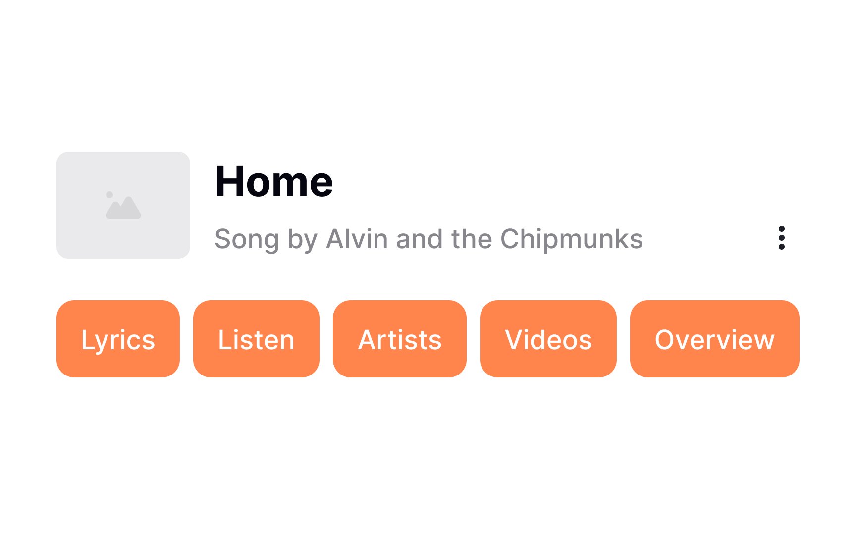
When creating suggestion chips, it's best to use nouns or short phrases that are clear and concise. Aim to keep each chip under 20 characters to ensure they are easy to read and interact with. This brevity helps maintain a clean and user-friendly interface.
When dealing with tag
Pro Tip: If you are unable to shorten the tag label, set a maximum width, collapse the text into ellipsis, and provide a tooltip that expands and reveals the full text on hover.
In order to ensure your chips are visually appealing and functional:
- Use relevant and clear leading and
trailing icons that are easy to understand. For example, using a star icon at the beginning of a chip for "favorite" items, and a cross icon at the end of the chip that can be clicked to remove it. - Consider rounded borders for an aesthetically pleasing chip design — while this is not a rule, most UIs style
chips this way, so users are more likely to find this styling intuitive. - Create a distinction between the chip background (fill color) and
page color. Use distinctive borders or shadows to make them as prominent enough but not too attention-grabbing. Keep in mind that chips are only for secondary, non-critical actions and style them as such. - Make sure the contrast ratio of the text
label to the background is at least 3:1 to ensure readability.[2]
Key states for
- Default (normal view)
- Hover (when moused over)
- Active (during
interaction ) - Focus (selected for action)
- Disabled (unavailable for use)
Properly indicating these states is crucial for usability and accessibility, ensuring the interface is user-friendly and responsive.
Effective methods to denote state changes include:
- Different
colors or shades to signify different states - Microinteractions in response to user actions
- Slightly changing the element's size
Shadows to make elements appear raised or pressed- Borders or outlines to indicate focus or active states
The minimum recommended touch target for interactive elements is 48x48dp (48x48px at 1x pixel density) according to Material Design Guidelines. Make sure your
Pro Tip: Maintain a minimum spacing of 8dp between chips.
References
- Chips – Material Design 3 | Material Design
- Chips – Material Design 3 | Material Design
- Chips – Material Design 3 | Material Design
Top contributors


Topics
From Course

Share


Similar lessons

Common UI Components Part I

Image Terminology
