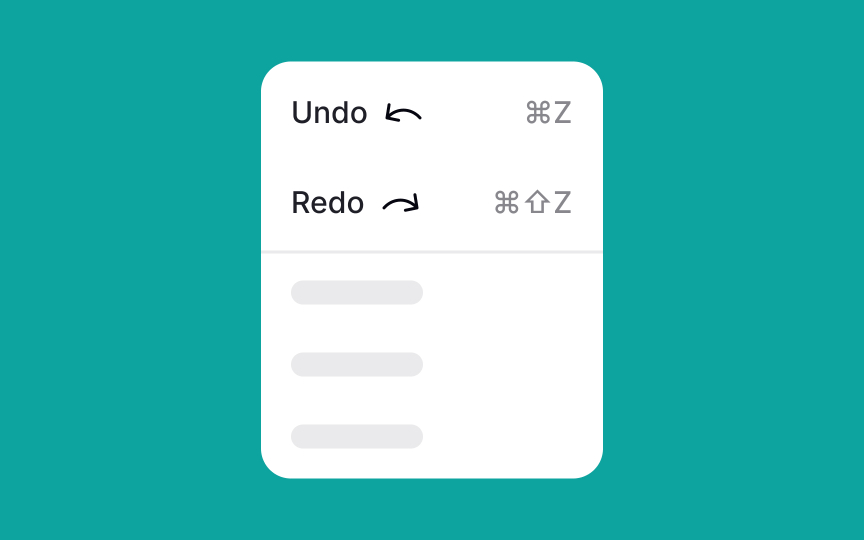
Place icons before labels
Leading icons are visual cues that help users quickly recognize menu items. When scanning a menu, users process familiar icons faster than they read text labels. Common examples include the scissor icon for "Cut" and the overlapping paper sheets for "Copy."
Place leading icons before the label or to the left in left-to-right writing systems. This way, users see them first while scanning. Use well-known, universally recognized icons to support quick recognition. Unfamiliar or abstract icons can slow users down and make the interface harder to understand.
Some brands place icons after labels. While this may seem counterintuitive, it highlights an important point. Every interface decision should be tested. In some cases, placing icons after the label can improve usability, match brand style, or support a specific interaction flow.
Pro Tip: If you doubt whether icons are self-explanatory enough, test them on your users with open-ended questions like: "What do you think this icon means?"


