<?xml version="1.0" encoding="utf-8"?>

Sliders have become familiar UI design components that add more interactivity to designs while also improving usability when done right. They’re often seen on e-commerce sites for functions like choosing a price range, or in product UIs for functions like volume control. 

When you follow best practices for implementing sliders into your UI, you’ll make it easier for users to make certain types of selections. They’re excellent for allowing users to select a specific value within a range, or to select a range of options. They’re particularly useful when values don’t have to be too precise.[1]

Exercise #1

Use sliders for showing immediate changes

Sliders should offer instant, intuitive interaction. As soon as users move the thumb along the track, the changes should be immediate, offering real-time feedback. This eliminates the need for a separate "Submit" or "Apply" button, streamlining the user experience. By doing so, you make it straightforward for users to understand the impact of their actions, without adding unnecessary steps. Immediate feedback not only enhances usability but also helps users feel more in control.[2]

Exercise #2

Maintain enough space between sliders

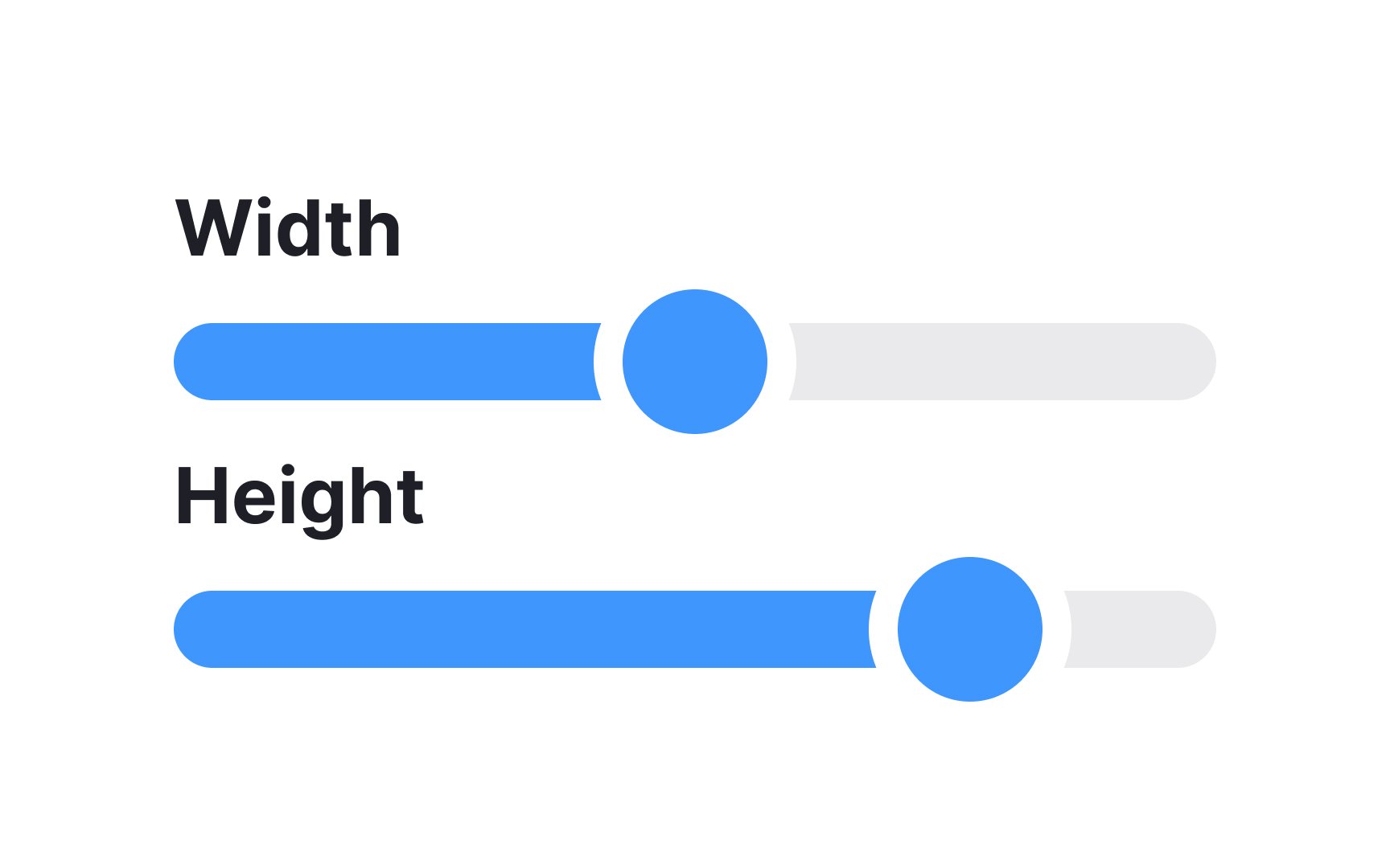
Ensuring ample distance between
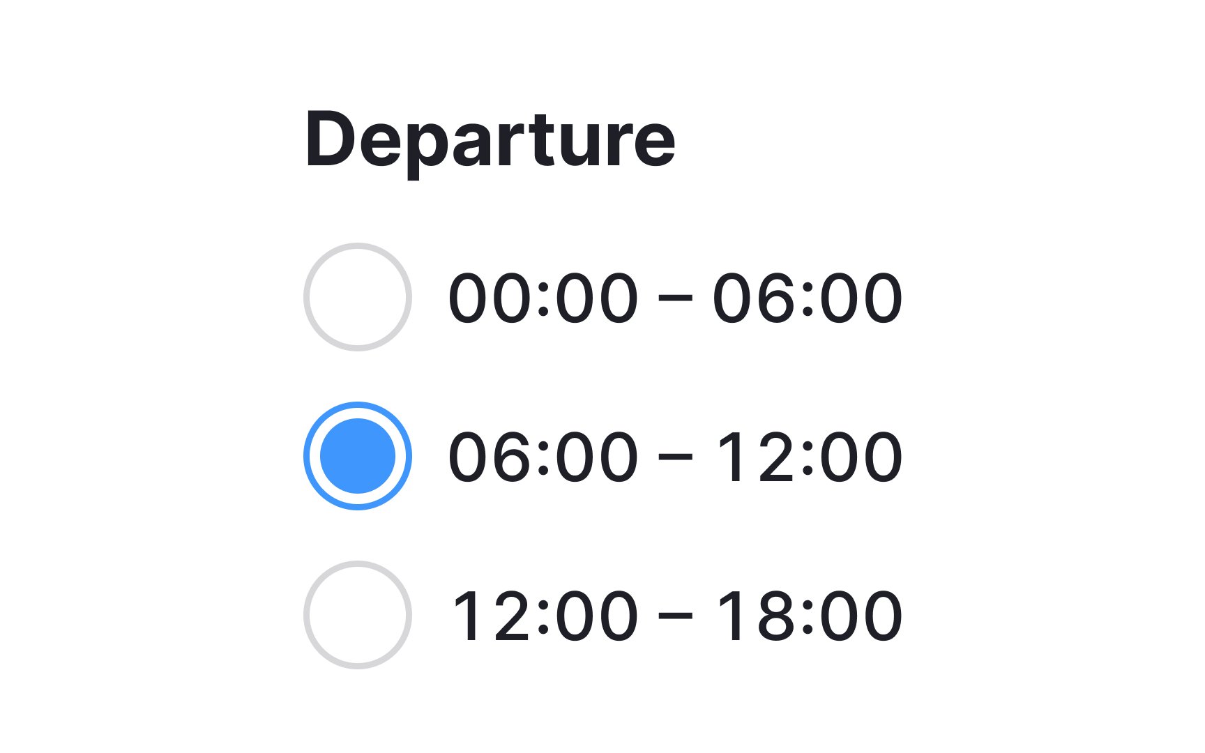
 sliders is key to an effortless user experience. Close-proximity sliders can lead to accidental adjustments, frustrating users and muddying the interface. So, give each slider room to breathe, allowing for precise control without any unintended clicks on neighboring elements.[3]

Exercise #3

Use a recognizable slider thumb style

A recognizable slider thumb style not only looks visually appealing but also signals to users that they can interact with it. It's a crucial cue that can prevent users from feeling confused or stuck when they encounter a slider.

When you opt for a familiar design, you're relying on users' past experiences with other interfaces. This means less cognitive load and quicker interactions. On the flip side, an unconventional or overly artistic slider thumb might leave users scratching their heads, wondering what to do next. So, it's not just about aesthetics; it's also about usability and efficiency.

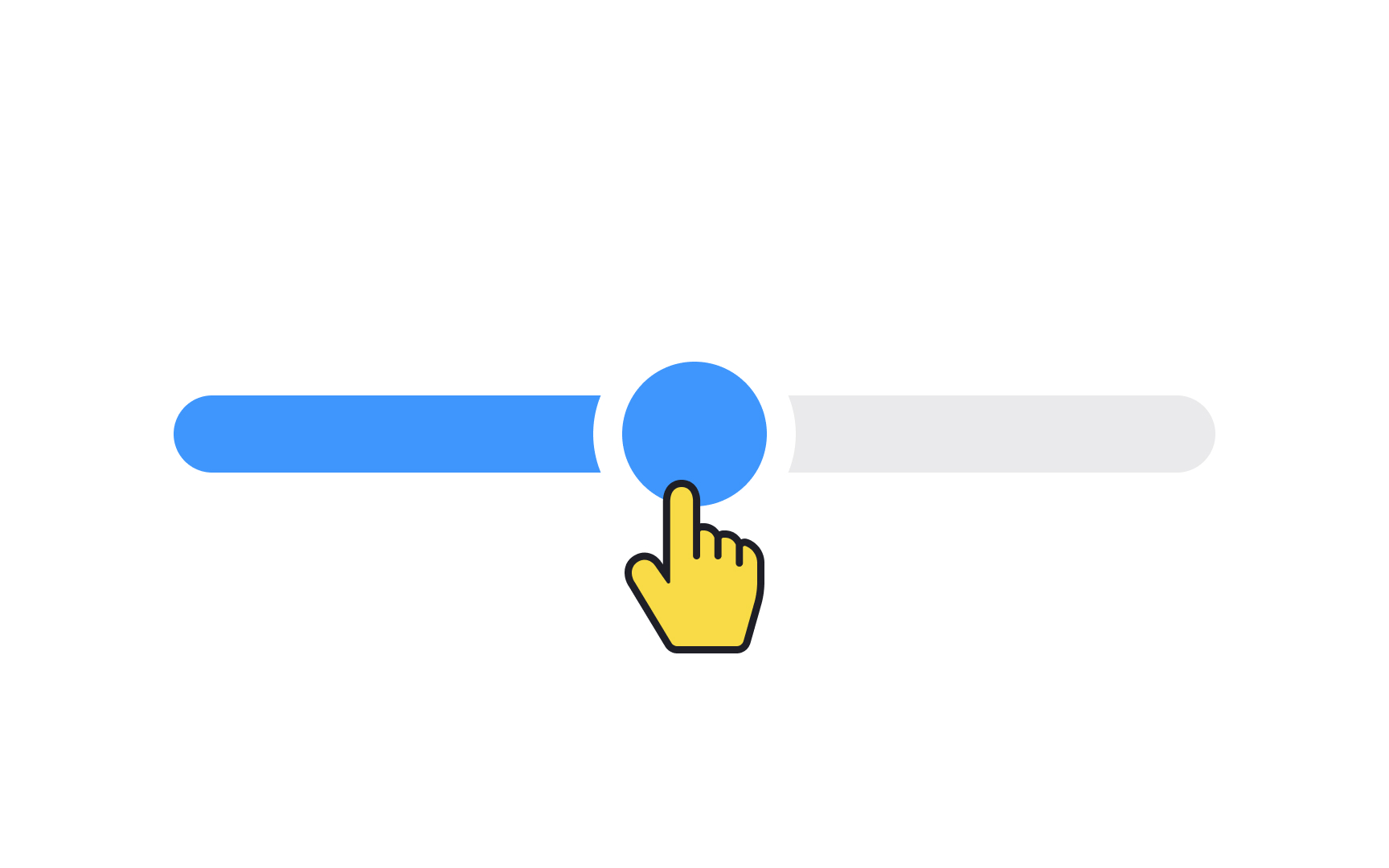
Pro Tip: In general, a 32×32px thumb works well, but make the clickable area a bit larger than that.

Exercise #4

Auto snapping

Auto-snapping in sliders is a useful feature that nudges the thumb to the nearest valid value when users are setting a discrete number. It's particularly helpful when there are predefined options or when precision is necessary, streamlining the user experience by minimizing errors.

To elevate this experience further, consider adding visual cues like tick marks or value labels. These indicators guide users toward acceptable values, making the
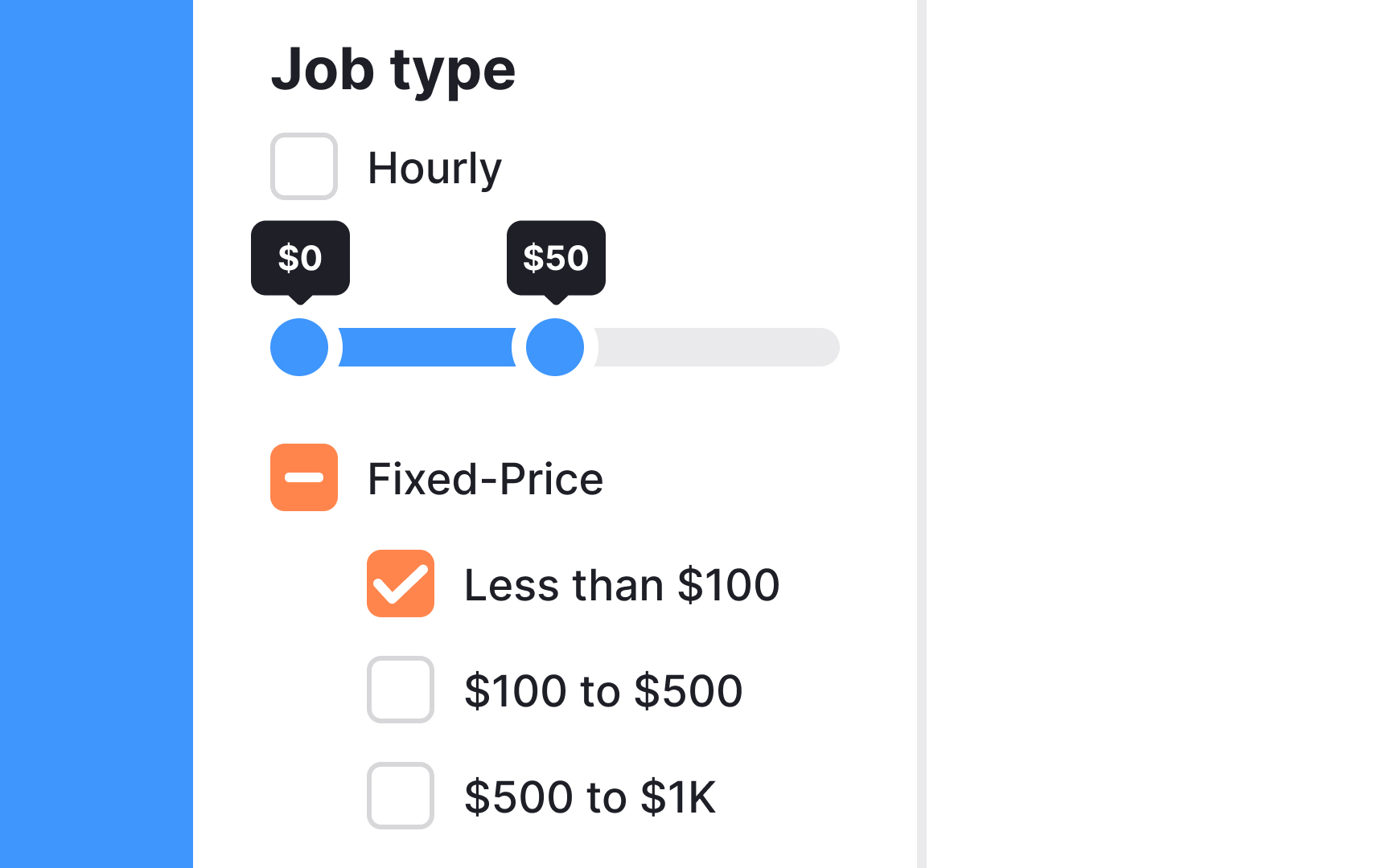
 interaction more intuitive and satisfying.

Exercise #6

Right-to-left sliders

Not every language is read left-to-right. When reaching a global audience, always keep in mind cultural differences in your design choices, including sliders.

When localizing a product for various countries, make your sliders operate from right to left in areas where the language is read in that direction for ease of use.

Exercise #7

Video slider

Video sliders are interface elements commonly found on platforms like YouTube, allowing users to jump to specific timestamps and navigate through content.

Here's a few recommendations on how to elevate user experience with video sliders:

  • Add a preview thumbnail: Displaying a thumbnail as users slide across the timeline can provide valuable visual cues.
  • Make the thumb clickable: Ensure the slider thumb is large enough for easy interaction.
  • Prioritize responsiveness: The slider should adjust smoothly to various screen sizes.
  • Offer keyboard shortcuts: For more fine-tuned navigation, shortcuts can add an extra layer of usability.
  • Utilize timestamps: These markers can spotlight key segments of your video, aiding users who want to skip to specific parts or review certain sections.
Exercise #8

Histogram slider

Histogram sliders are nifty UI elements that do more than allow range selection; they provide valuable context by displaying underlying data trends. Often employed in data-driven environments like e-commerce platforms or travel booking sites, they give users a snapshot of what's popular or typical within the range they're exploring. For example, Airbnb utilizes histogram sliders to reveal peak price points based on various factors such as travel dates and location. This added layer of information helps users make more informed decisions, elevating the overall user experience.

Exercise #9

Use sliders to declutter the screen space

Dual sliders offer a high degree of flexibility in defining ranges, which can be especially useful in various contexts like time schedules or financial budgets. However, it's worth noting that they require more interaction from users than simpler options like radio buttons. While radio buttons may offer a quicker selection process, dual sliders provide a more compact and visual way to cover a wider range of choices without cluttering the interface.

So, if space efficiency is a priority and you expect users to be comfortable with a slightly more interactive element, dual sliders could be an excellent choice to enhance the user experience.

Exercise #10

When sliders aren't appropriate

Sliders are handy for letting users pick from a range of values, but they're not a one-size-fits-all solution. When you're dealing with a small set of specific options, sliders can actually overcomplicate the decision-making process. In scenarios where only a few distinct choices are available or where precision is key, it's better to opt for other UI components like radio buttons or dropdown menus. These alternatives streamline user choices, making the interaction more straightforward.

Complete this lesson and move one step closer to your course certificate