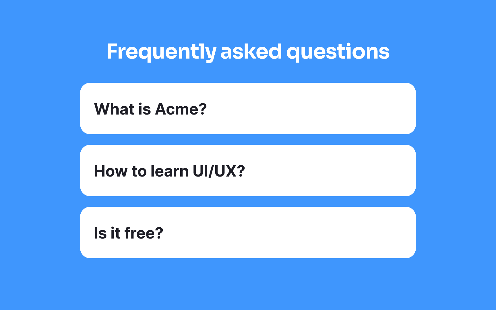
Collapsed state
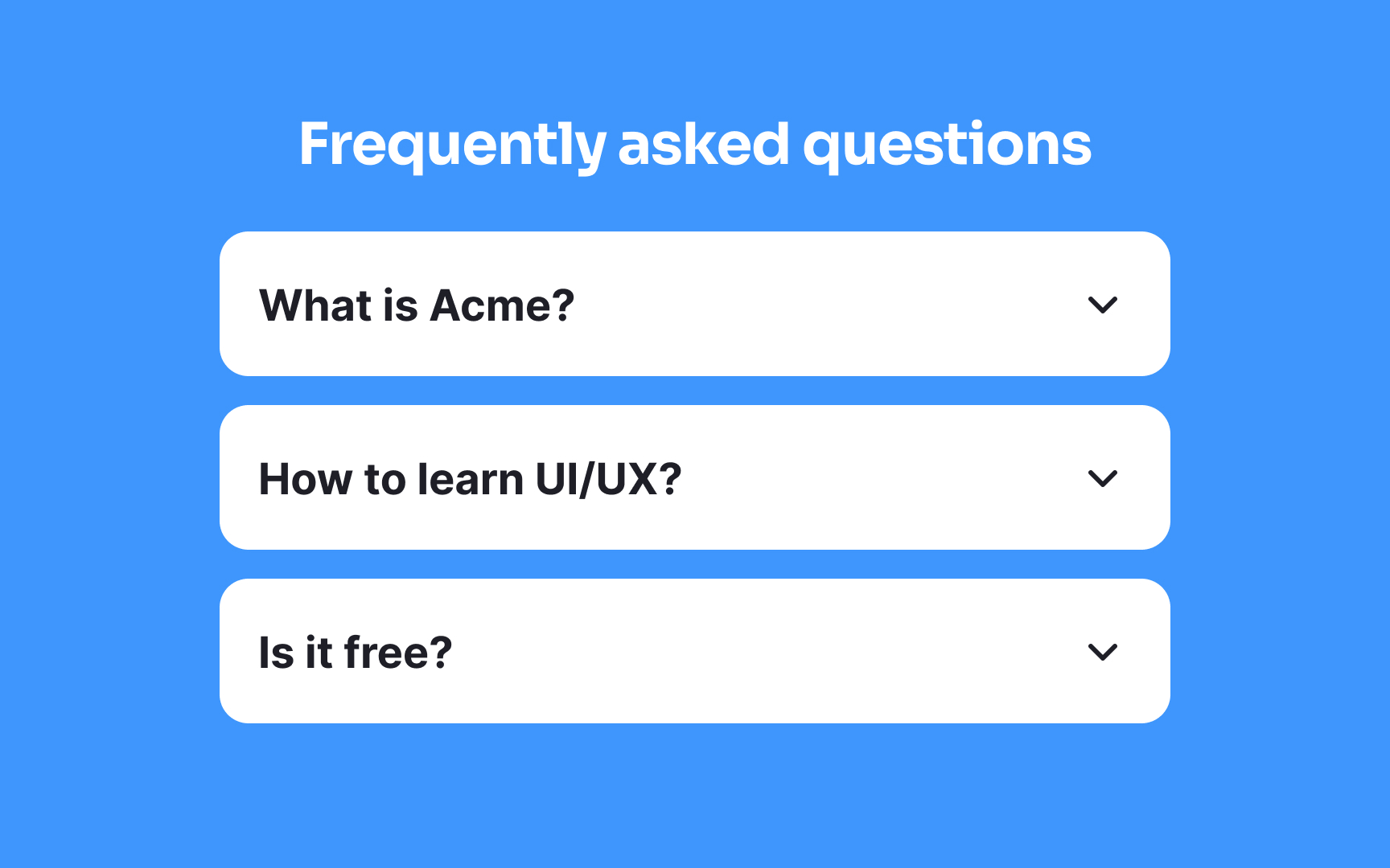
An accordion menu typically starts in a collapsed state, meaning the content is hidden and requires a click or tap to expand. To show that more content is inside, you can place a downward-facing arrow or a caret (▾) beside each item. This keeps the layout neat while still giving a clear cue that the item can open.
Conventionally, arrows (→) or plus icons (+) are used as well, but a study by the NN Group found that only the caret stands out to users in a clear way.[1]
References
- Accordion Icons: Which Signifiers Work Best? | Nielsen Norman Group
