Tooltips & helper text
Good design should not rely on guesswork. What feels obvious to designers is often unclear to users, so well-placed guidance is necessary. In interfaces, this guidance is frequently delivered through small, supporting text.
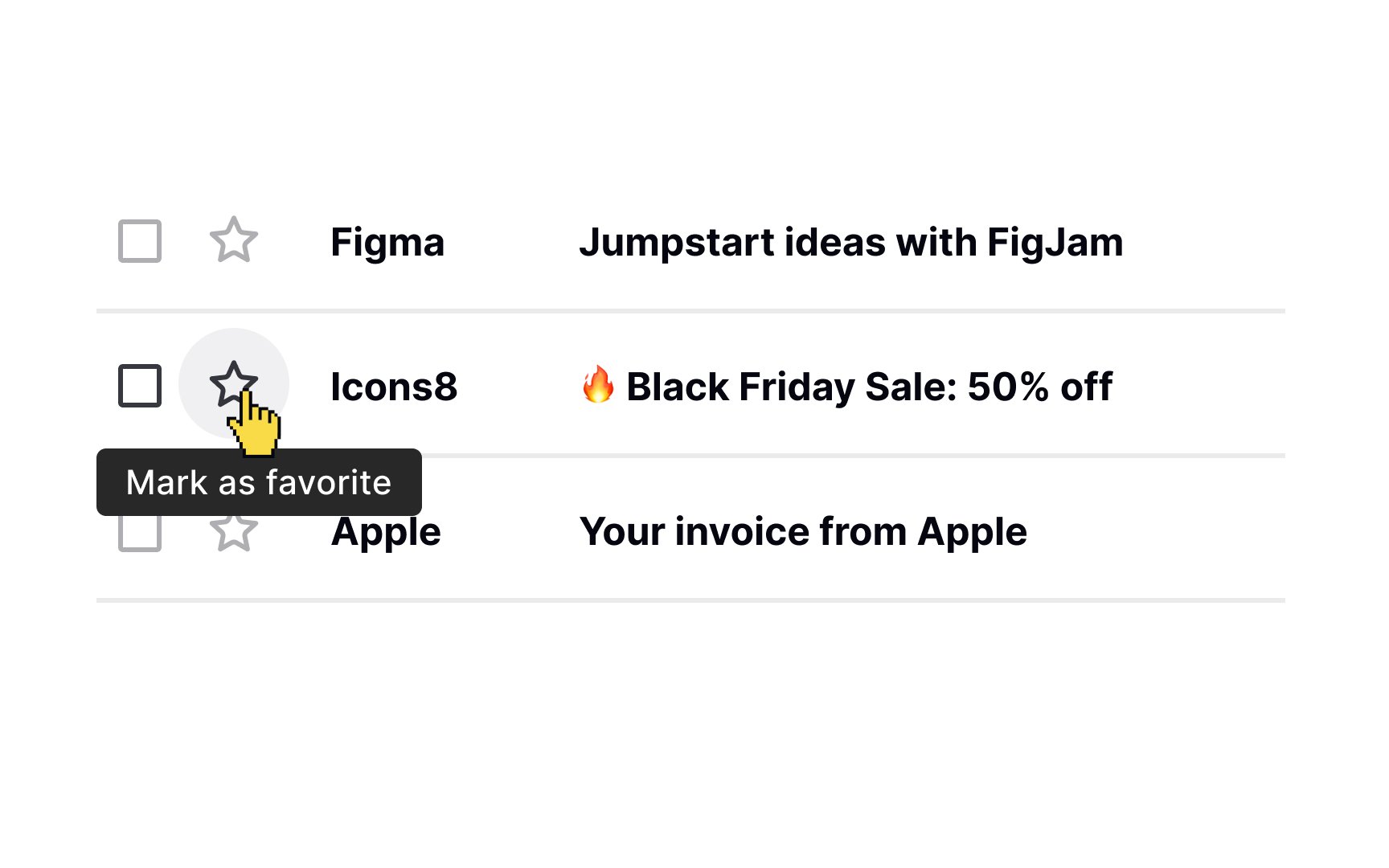
Tooltips are a common example. They provide short, contextual explanations for icons, links, or controls. From a typography perspective, tooltip text typically uses one of the smallest text sizes in the type system. Even so, it must remain readable and meet the minimum accessible text size defined for the product.
Avoid shrinking tooltip text simply to make it feel secondary. If text becomes hard to read, it fails its purpose. Use contrast, spacing, and placement to establish hierarchy, and reserve size changes for clearly defined steps in your typographic scale rather than arbitrary reductions.
Top contributors