Handling Small Blocks of Text in Typography
Discover strategies for effectively handling small blocks of text in typography to maximize readability and impact
Details matter. Short texts, like notifications, button labels, or error messages, are critical components of any design. Like guiding lights, they help users navigate a product and find the most effective way to complete a task.
Commonly, UX writers, copywriters, and sometimes, UI designers should follow guidelines and rules for writing compelling short tidbits of copy. For example, verbs and imperative phrases are much better at describing an action than adjectives or nouns. Active voice with personal pronouns like "you" or "we" help build a more lasting relationship with users than passive voice.
Poorly written copy doesn't speak to users and doesn't meet their needs. As a result, the product appears confusing and unclear. However, the formatting of short text matters a lot, too. It helps establish a solid visual hierarchy and makes it easier for users to find what they need in a system.
Ultimately, they tell users what to do and should be as visible as possible. Make sure to comply with WCAG's color contrast requirements for labels — 4.5:1 for normal-sized text, which is less than 18 pt or 14 pt if bold.


Image captions often represent the smallest font size on a page and include brief explanations accompanying visual content. They can also include acknowledgments to the author or the copyright holder of a photograph, image, illustration, or graph.
When designing captions, keep it simple: black or gray text positioned either to the side or below an image. From an accessibility viewpoint, italics aren't the best choice for users with visual or cognitive impairments. Instead, you can experiment with text
Pro Tip: Captions should convey a lower level of importance and be 2-3px smaller than the body text. If the body text is 16px, the captions should be 13-14px.

Microcopy includes
Its main goal is to guide, engage, and provide cues so users can complete their tasks quickly and effectively. Microcopy is also a fantastic tool for introducing the brand's personality. Depending on what emotions you want your users to experience when they interact with your product, you can adjust the voice and tone to make the brand appear friendly and casual or poised and calm.
When it comes to formatting, microcopy should be visible and contain enough visual weight. After all, this tiny piece of copy can empower users to take action.
When an
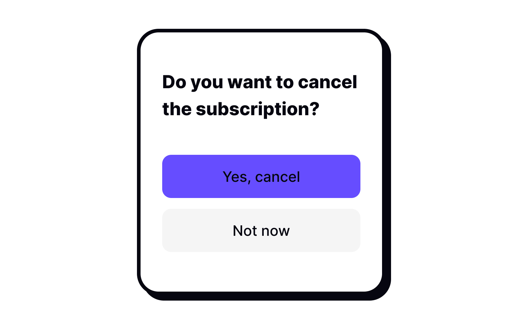
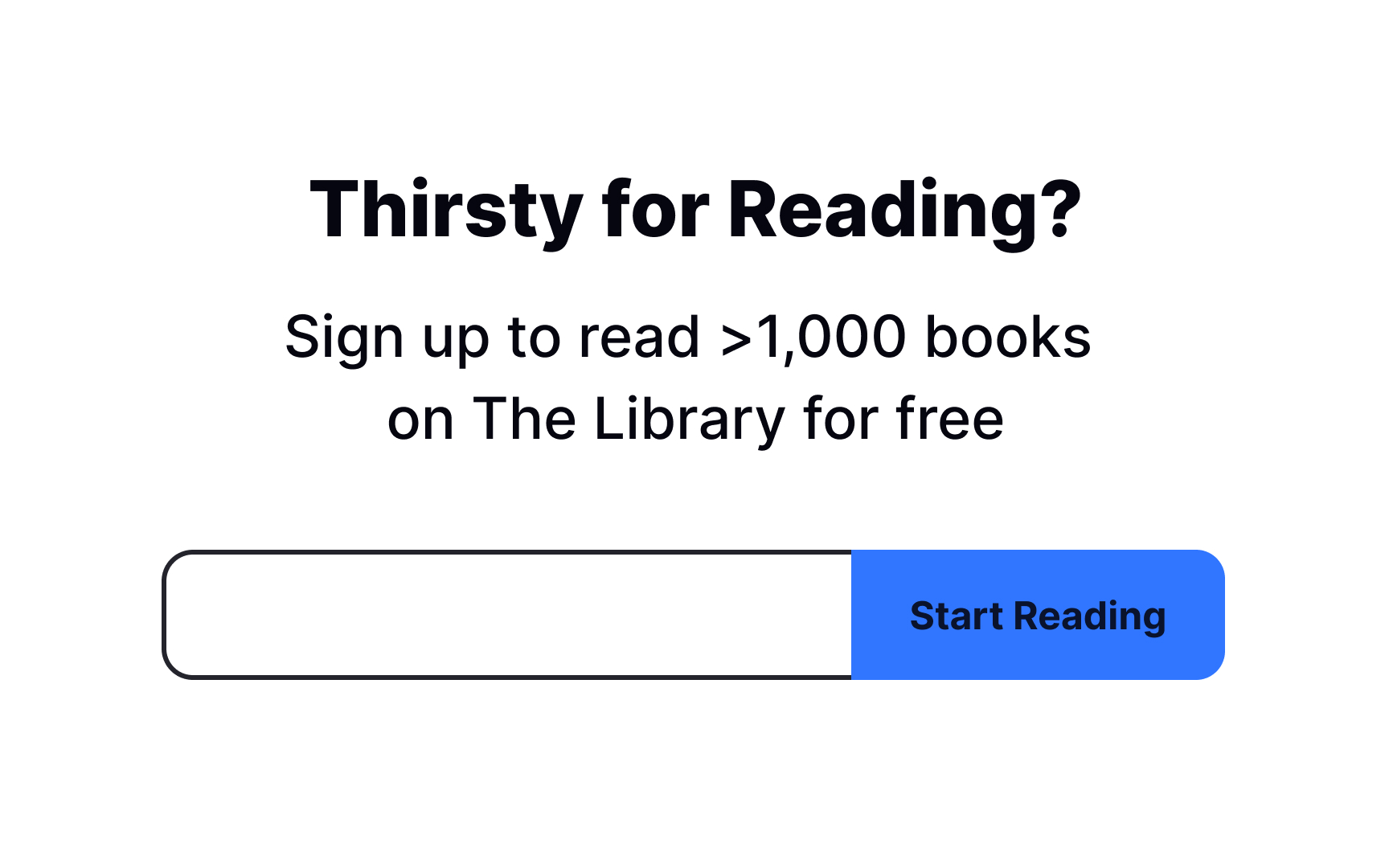
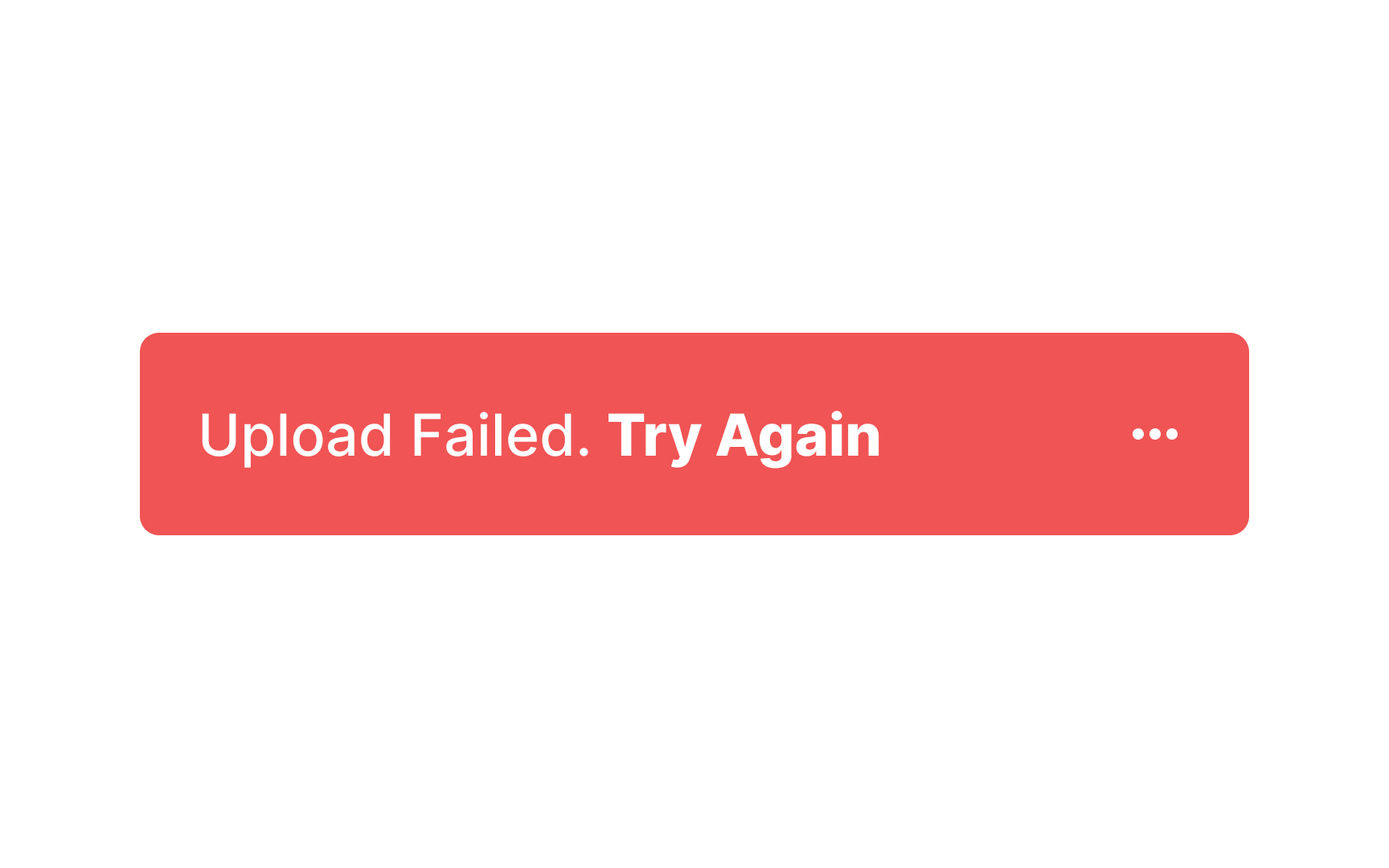
In error messages, form is as important as
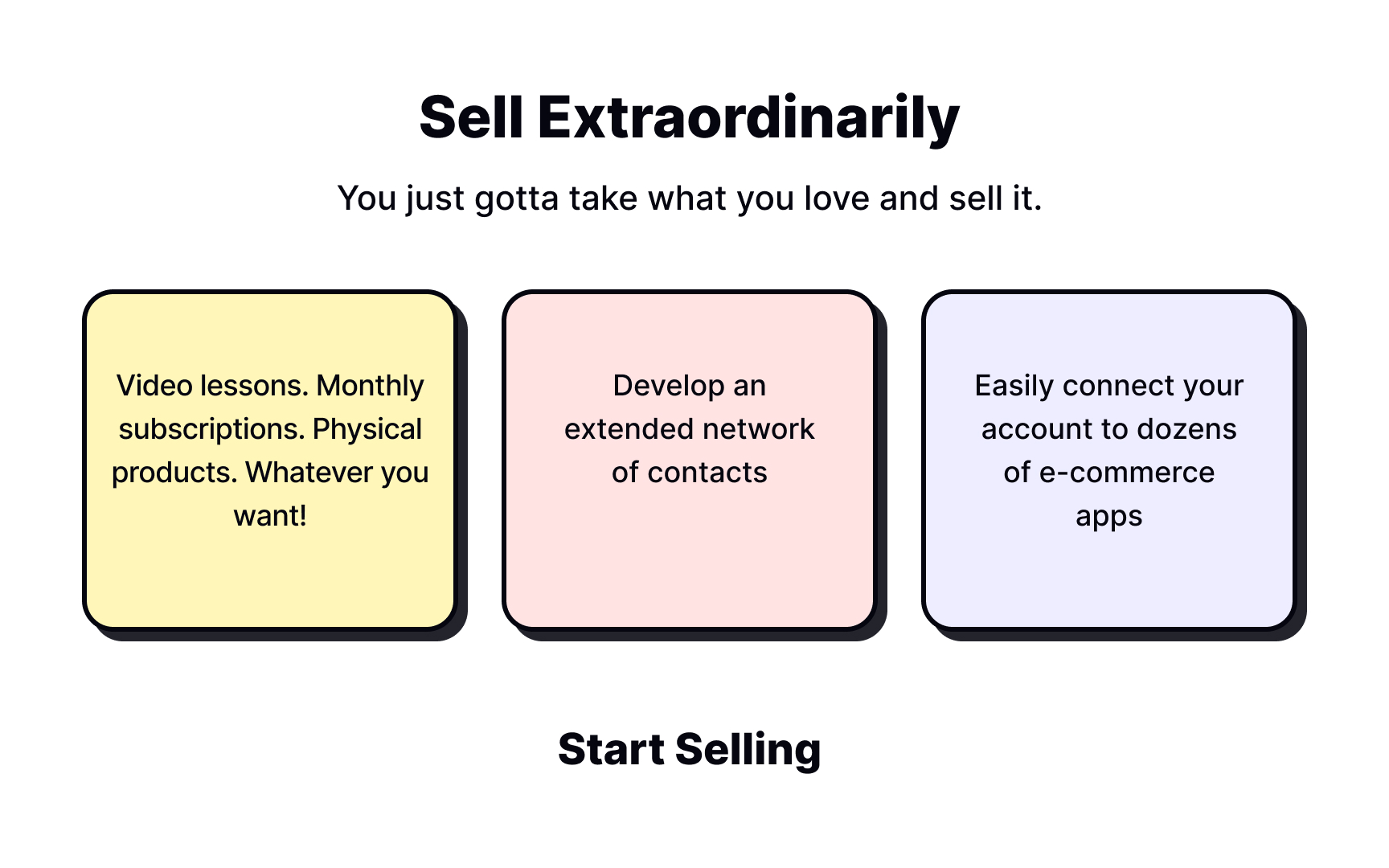
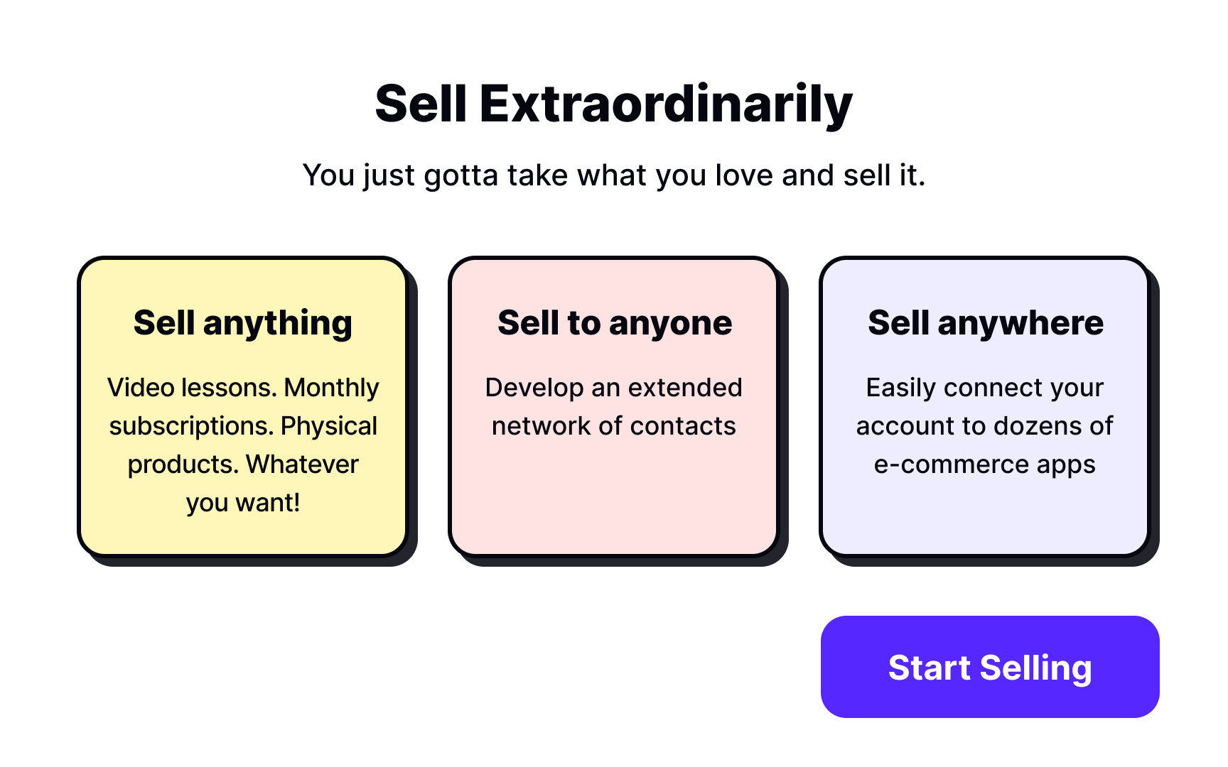
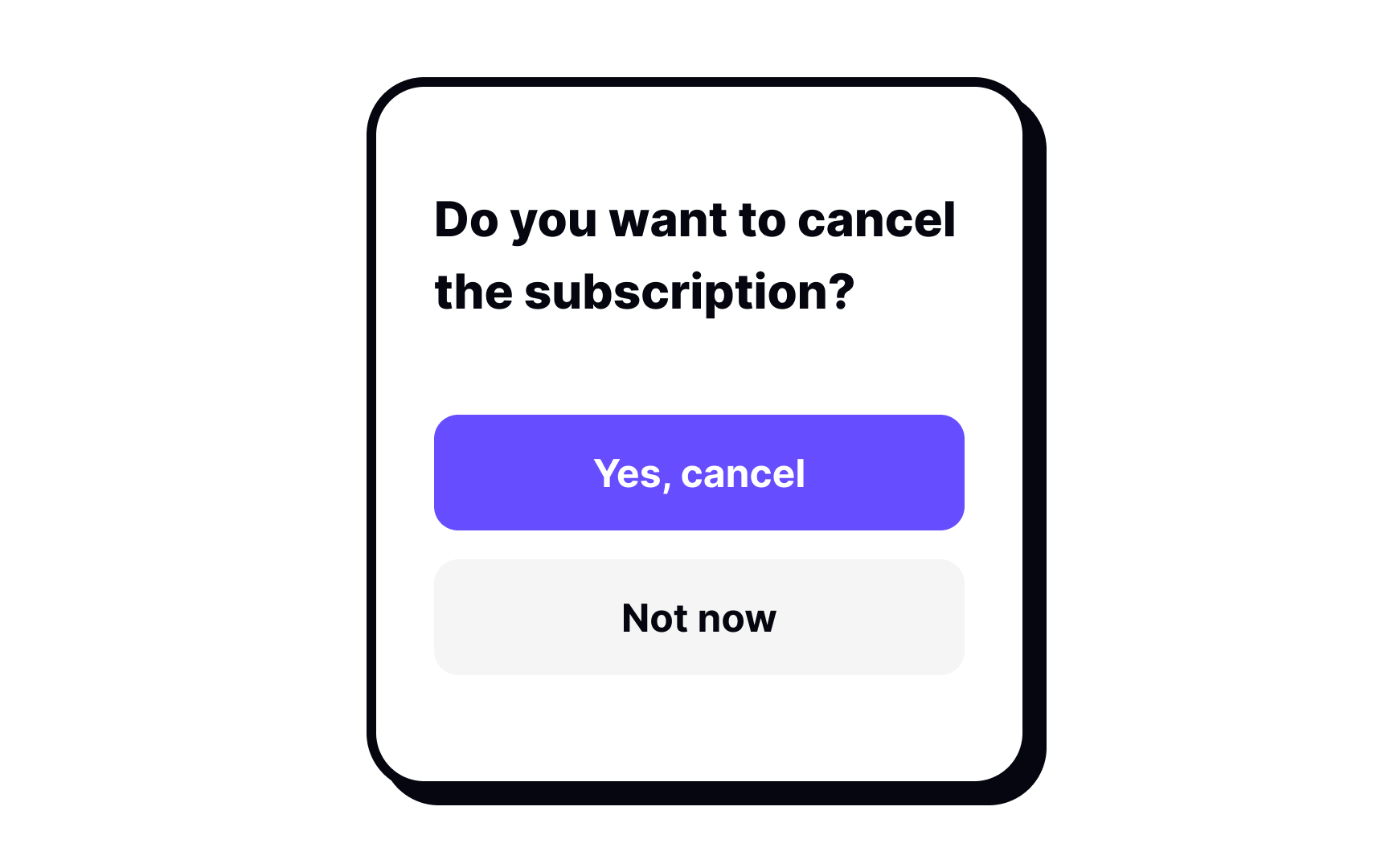
Call to Action (CTA) is a marketing term for a design element that aims to catch user attention and encourage them to take the desired action (sign up, buy a product or a service, subscribe to newsletters, book a demo, etc.). Designers and marketers often use the term to describe CTA
As one of the most important elements on a
Pro Tip: Since the CTA button should stand out visually, it might be a good idea to make the label bolder to increase the contrast and emphasize the element's importance.
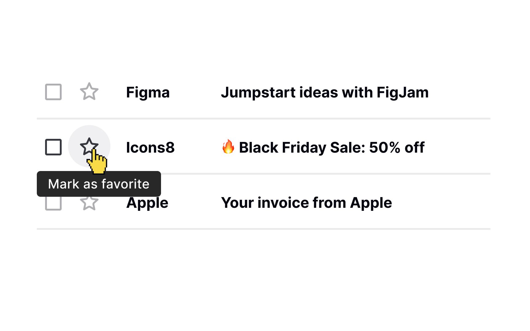
Good design should not rely on guesswork. What feels obvious to designers is often unclear to users, so well-placed guidance is necessary. In interfaces, this guidance is frequently delivered through small, supporting text.
Avoid shrinking tooltip text simply to make it feel secondary. If text becomes hard to read, it fails its purpose. Use
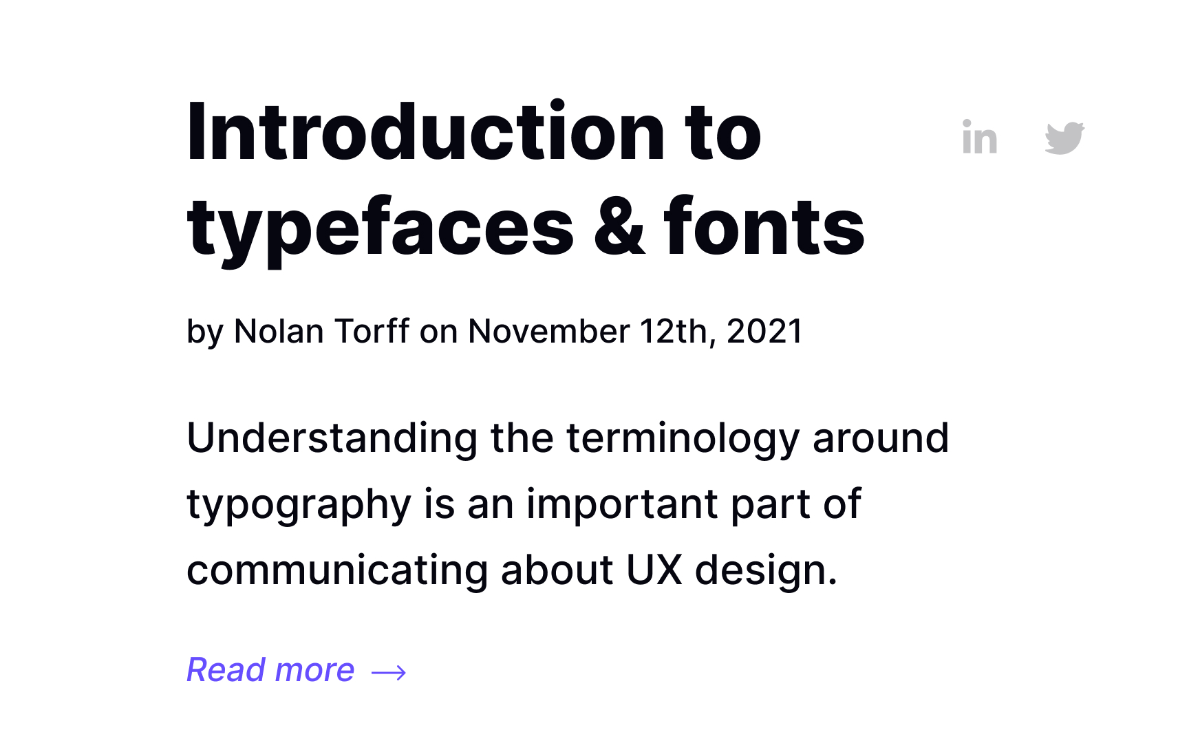
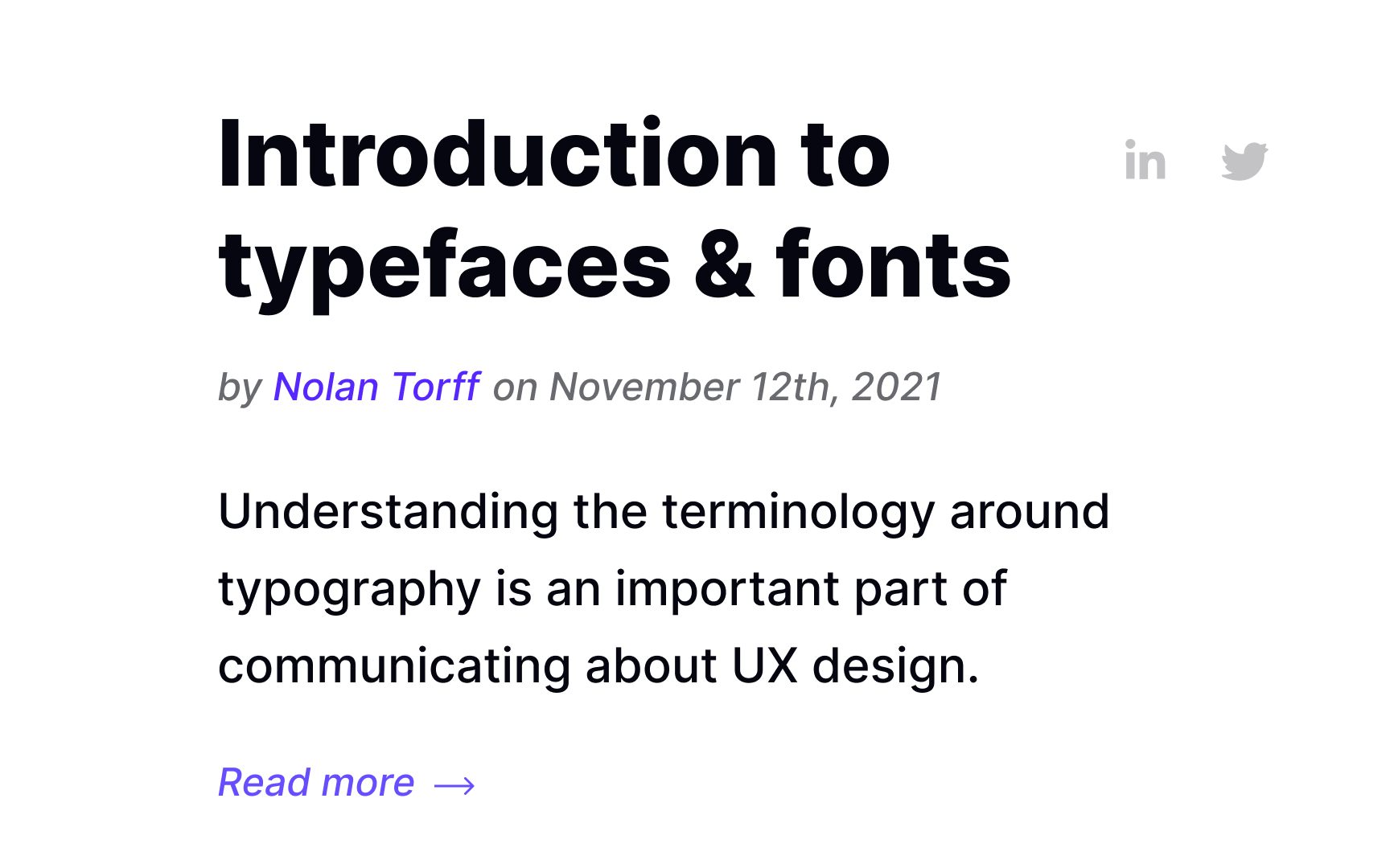
A byline is a piece of information providing the author's name, publication date, and sometimes, editors or their biographical information. It usually sits between the headline and the body text or below the story. You can often encounter bylines in newspapers and magazines.
A byline can be easily confused with the term "metadata" which refers to information about a document. It could contain the author's name, the creation date, as well as file size and keywords used to describe the document. In
The byline is considered secondary text and should be smaller than the body text. Make sure to distinguish the byline from the content by using bold or italics judiciously.
References
- Error Message Guidelines | Nielsen Norman Group
- Metadata Follows You Everywhere You Go | ThoughtCo
Top contributors


Topics
From Course

Share


