Creating MVP wireframes and mockups
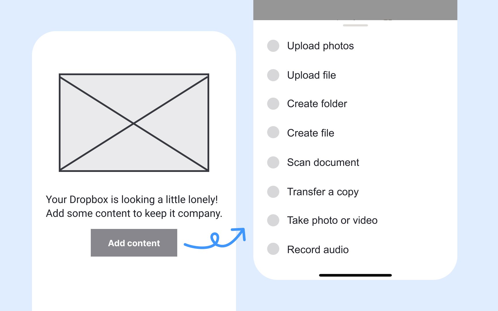
Most MVPs begin with low-fidelity wireframes or simple prototypes to maximize speed and learning. These early sketches are intentionally minimal, focusing on layout, key user flows, and the product’s core value rather than visual detail. A low-fidelity wireframe might show only boxes, lines, and placeholder text to illustrate how information is arranged, where buttons appear, and how users move through the interface.
Because the goal at this stage is validation, clarity matters more than polish. Even a simple sketch can reveal whether users understand where to click or how to complete a task. For example, a wireframe for a file-sharing MVP may include only an upload button and a list of files, leaving colors, icons, and typography for later iterations. This approach prevents teams from spending time on visuals before confirming that the core structure and flow make sense.
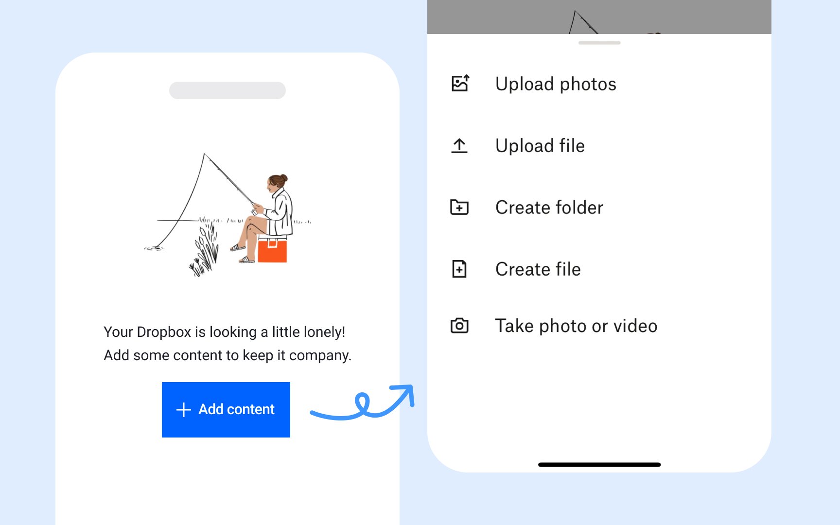
High-fidelity prototypes with full color, branding, and realistic UI elements are typically developed later, once the MVP shows signs of product–market fit or when usability testing expands to a broader audience. Creating these detailed assets too early is costly and risky because they assume user preferences that have not yet been validated. Starting with lo-fi designs allows teams to learn quickly, adjust easily, and invest in polish only once the essentials are proven.
