Sliders
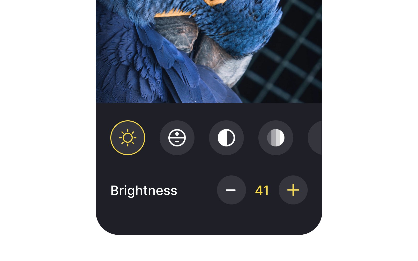
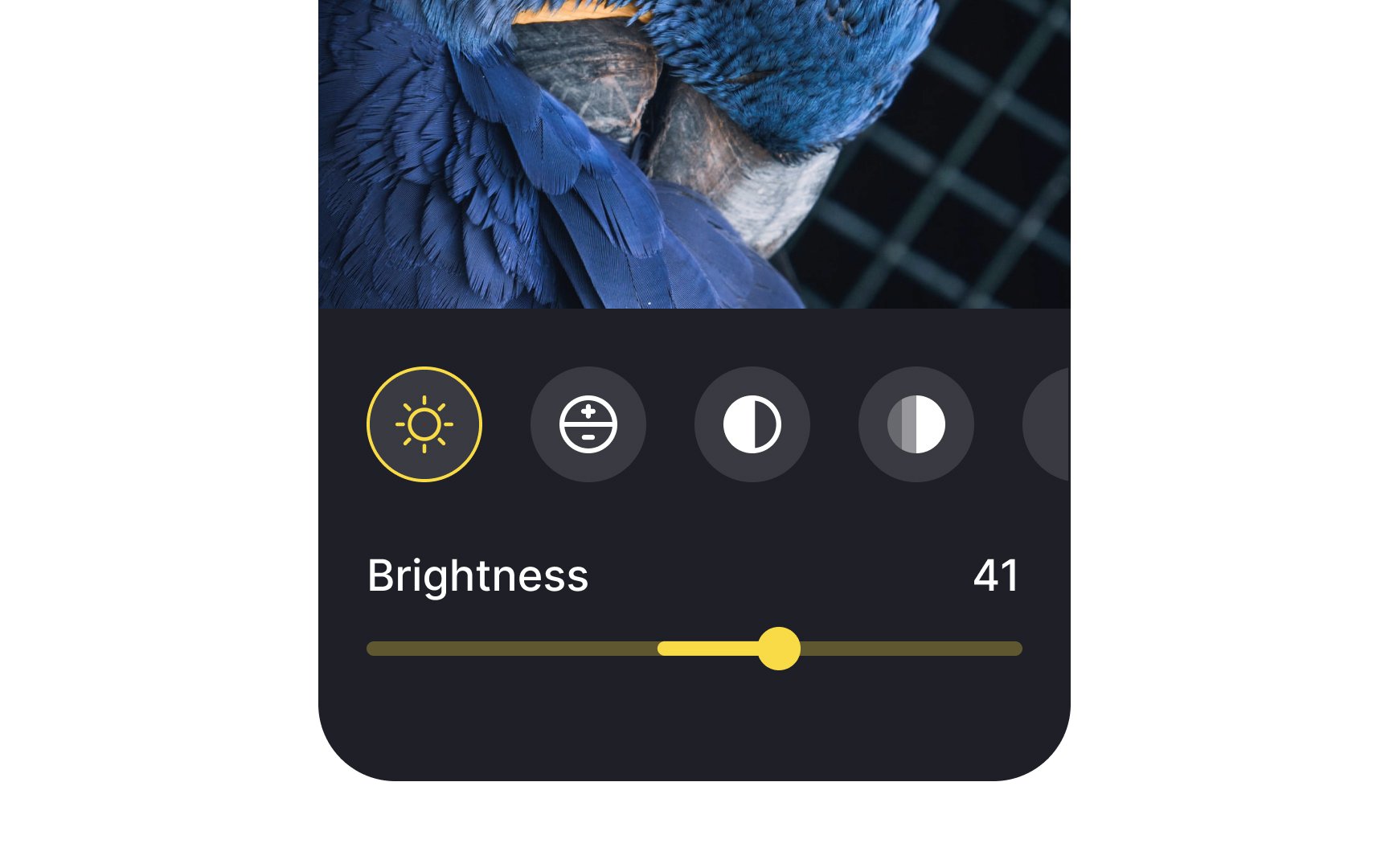
Slider controls are UI components for adjusting settings such as volume and brightness, selecting the price range, or applying image filters. They take immediate effect and allow users to fine-tune the value by moving the handle — called 'thumb' — along the 'horizontal track'. As a slider moves from left to right (from right to left in right-to-left languages like Arabic) and its value increases, the portion of track between the minimum value and the thumb fills with color.
On mobile, designers should be careful with sliders, making sure they're easy to handle. The thumb should have a proper touch target size so even older people or individuals with motor disabilities can drag it without effort.
You can customize the track color, thumb icon, and left and right icons representing the maximum and minimum values to reinforce your brand style and increase recognition of the feature.
Sliders aren't the best solution when the preciseness of value matters. Consider using radio buttons or a simple input field to offer more precise values and minimize the interaction cost.
