Radio buttons
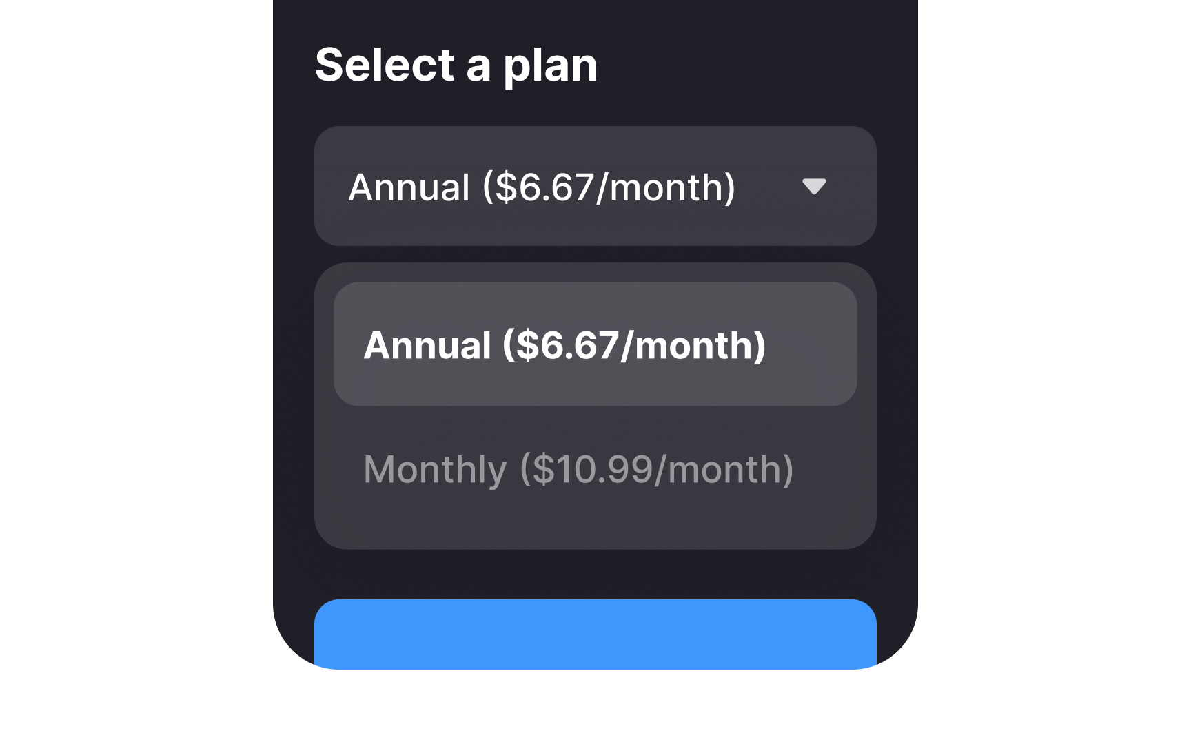
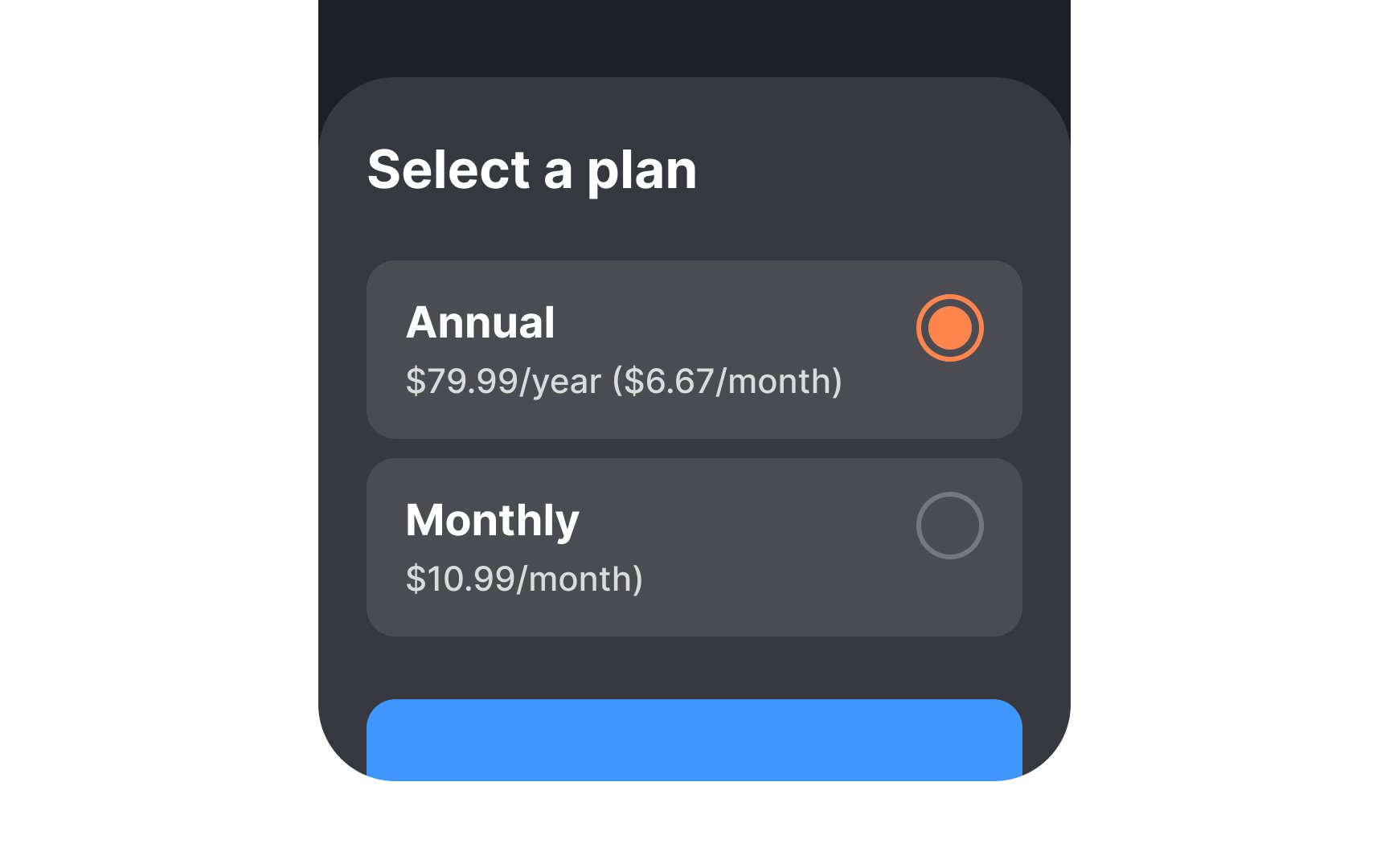
Unlike checkboxes, radio buttons allow only one selection. They show empty circles for unselected and filled dots for selected states.
Key principles for radio button design:
- Use for two or more mutually exclusive options
- Align options vertically for better scanning — horizontal layouts need more space between buttons and labels
- Choose radio buttons over dropdowns for fewer than 5 options to reduce the interaction cost
- Set research-based default selections that match common user choices
- Make both button and label tappable
- Maintain standard circular design to ensure familiarity.[1]
References
- Checkboxes vs. Radio Buttons | Nielsen Norman Group
Top contributors