Checkboxes
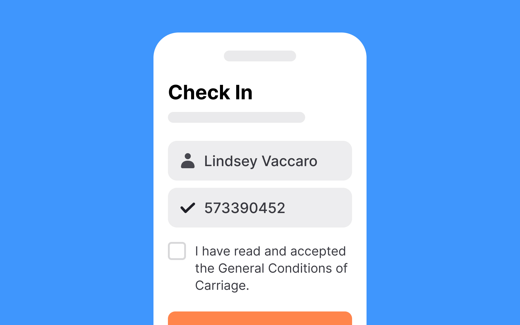
Checkboxes let users make multiple selections and toggle individual options. They show a checkmark when enabled and remain empty when disabled. An indeterminate state can indicate mixed states in multi-level lists.
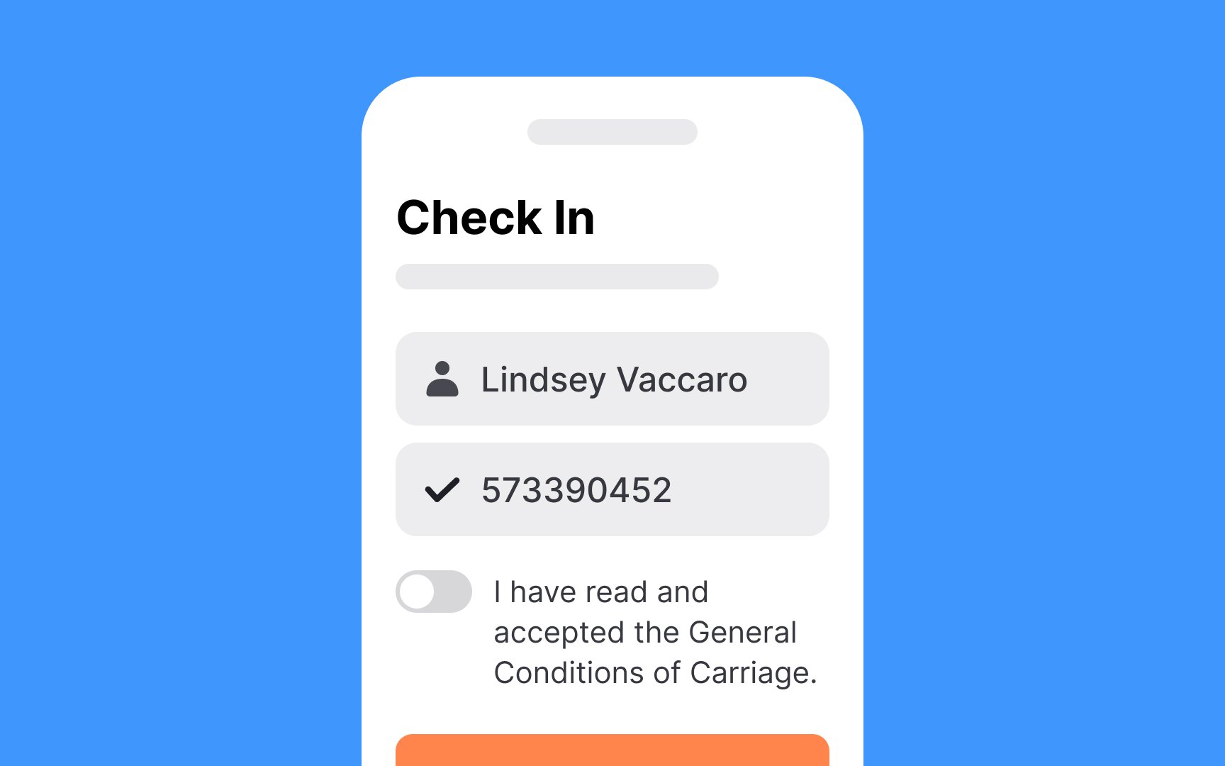
While similar to toggle switches, checkboxes serve different purposes.
Use checkboxes for:
- Actions requiring final review and confirmation via Submit button
- Forms with additional steps after selection
- Multiple-choice options within one category
- Actions needing clear on/off states
Design checkboxes following standard control guidelines: recognizable shape, clear icons, and adequate touch targets.
Labels vary by context: brief for option lists, but can be longer for standalone checkboxes (like Terms and Conditions agreements).
