Make button labels clear
Even if users expect modals to appear, they’ll most likely want to close them as soon as possible and get back to the task at hand. Buttons are the best tool to allow users to do that. The microcopy on the button label should be notably clear and specific about what happens after users click it.
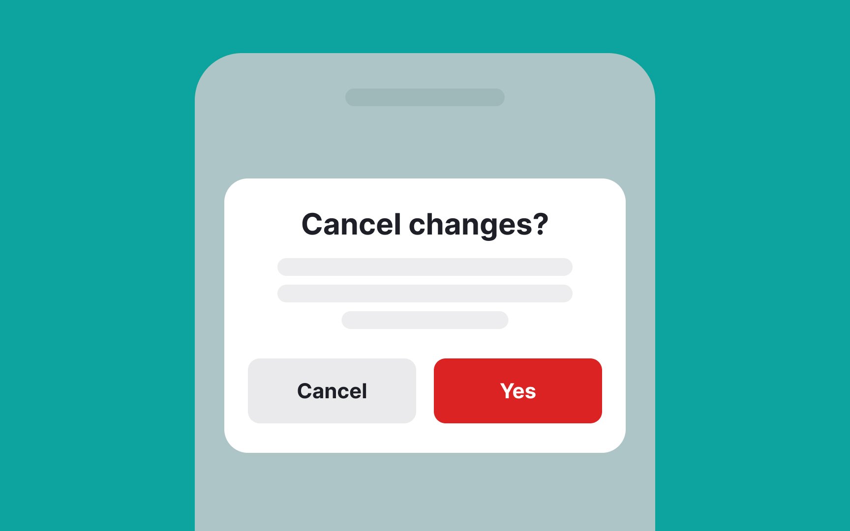
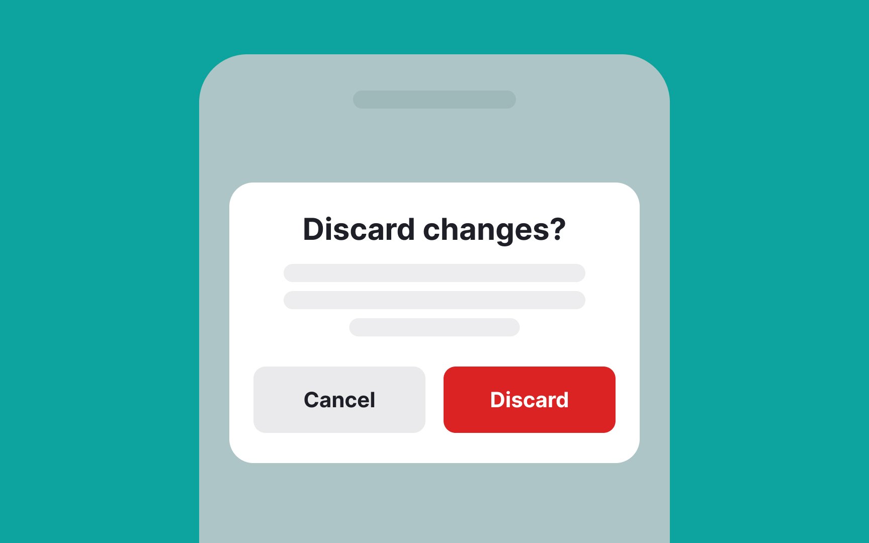
Avoid generic words like "yes," "no," "cancel," "submit," or "confirm" if they don't add to the meaning. Instead, be more descriptive so users can immediately understand which action they should implement.
If you're struggling with formulating a better command, ask yourself, "What will happen after users tap the button? What will they get?" For example, after clicking the button, a file gets removed. In this case, the primary button label should say "Remove file," whereas the secondary button label should prevent users from doing it and say "Cancel.” "Cancel" is explicit enough here because it's combined with a more contextual primary button.
