Minimize clutter
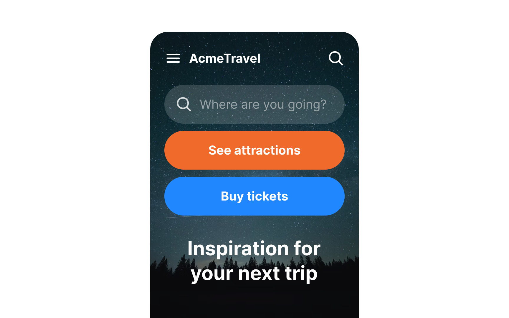
Minimizing clutter in mobile interfaces allows users to concentrate on completing the task they are on. Prove your app's value by giving users what they want right away. Avoid distracting them with unnecessary buttons, images, or text.
A simple rule of thumb is to use one primary action per screen.[1] Every screen you design for the app should support a single action of real value to the person using it.
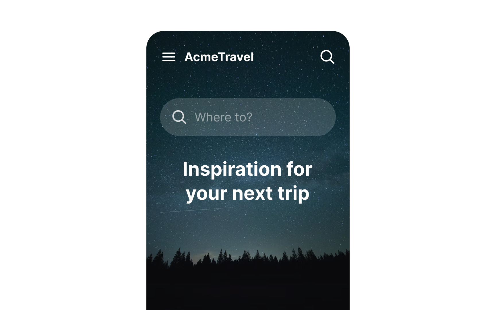
For example, Airbnb knows that its users' goal is to book accommodation. The main screen with a search field asks users, "Where to?" without distracting them with other elements. Additional functions like Experiences or Inspirations can be found below the fold, while the top bar offers navigation options.
