Keep the layout consistent with desktop versions
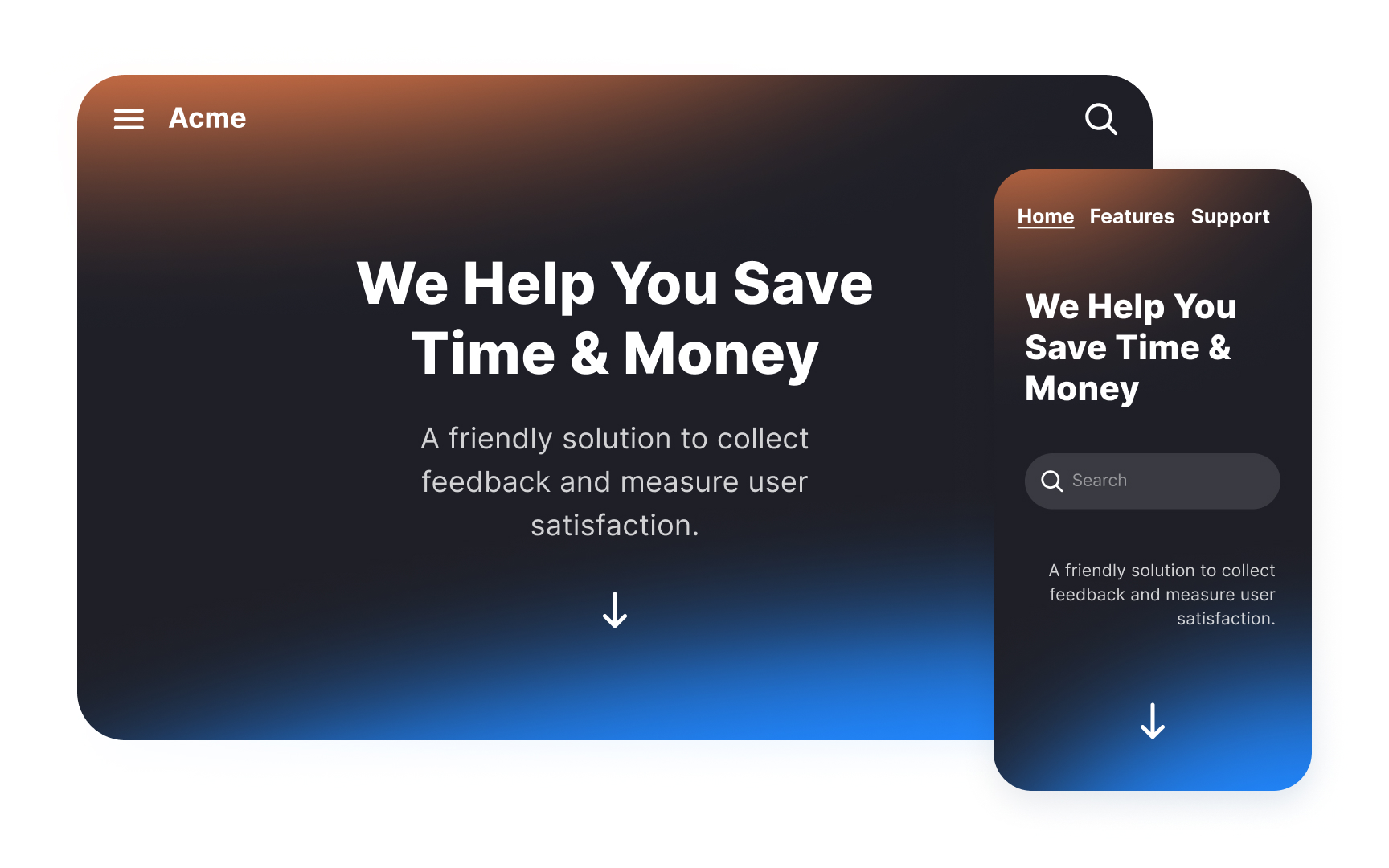
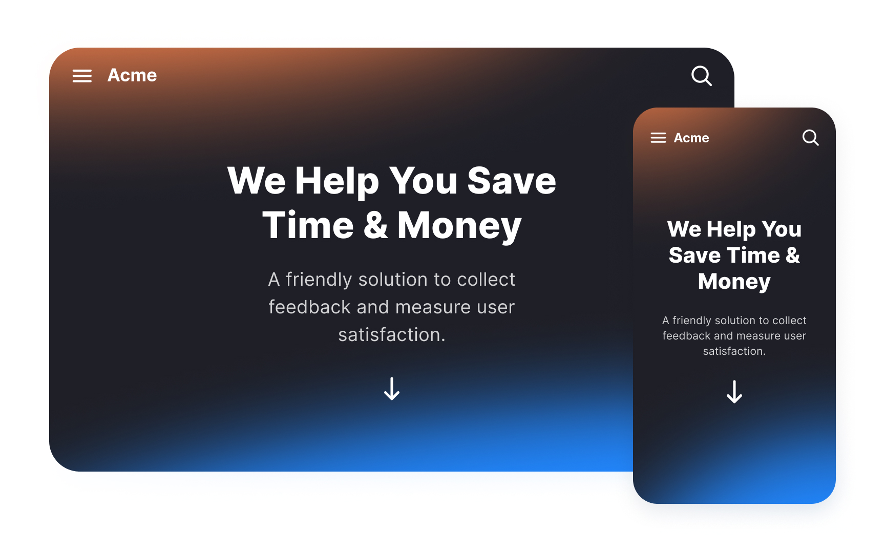
While mobile and desktop layouts will differ, they should feel like the same product. This will help orient users and create a seamless experience.
Keep navigation and visual elements consistent across devices. The buttons, input fields, and other application elements should be based on your brand image. Don't change the color palette or other basic functionality to avoid confusion.
Make sure your users can predict most of the time how your app will work and look. Mobile users don't have the advantage of hovering and having a cursor to help them guess the outcome of their actions. Carefully design all elements to help users recognize their purpose.
