Graceful Failure Design
Design AI experiences that help users move forward productively when predictions fail.
AI systems work with probabilities, not certainties. This means they sometimes make mistakes or give unexpected results. How these failures are handled can make the difference between a helpful product and a frustrating one.
Graceful failure design treats errors as chances to help users. Good interfaces admit when something goes wrong and offer useful alternatives right away.
Think about a music app that suggests a song you don't like. Rather than leaving you stuck, it could let you adjust your preferences, browse music yourself, or explain why it made that suggestion. These backup options turn frustration into progress.
The main goal is to keep users in control when things fail. This means giving them manual options, explaining what the system can and cannot do, and helping them finish tasks without AI help. Error messages should guide users forward, not stop them in their tracks. Feedback options improve future results while making users feel heard.
Smart failure design builds trust through honesty. It shows what the AI can and cannot do, and keeps users moving toward their goals even when perfect results aren't possible.
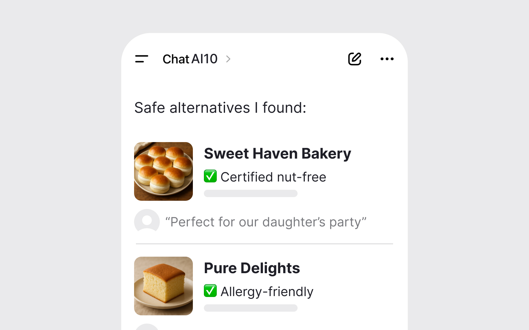
Consider a party planning app. Suggesting the wrong balloon color causes minor disappointment. Recommending unsafe food for guests with allergies could cause serious harm. The same app needs different error strategies for each scenario. High-stakes situations require detailed explanations, human escalation options, and conservative defaults. Ask about every feature: What happens if AI fails here? Your answer shapes the entire error experience. When stakes are unclear, choose caution over convenience.[1]
Pro Tip: Test error handling with users who have accessibility needs or lower tech literacy.
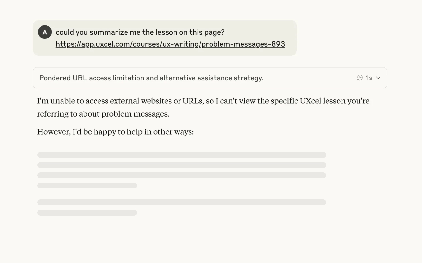
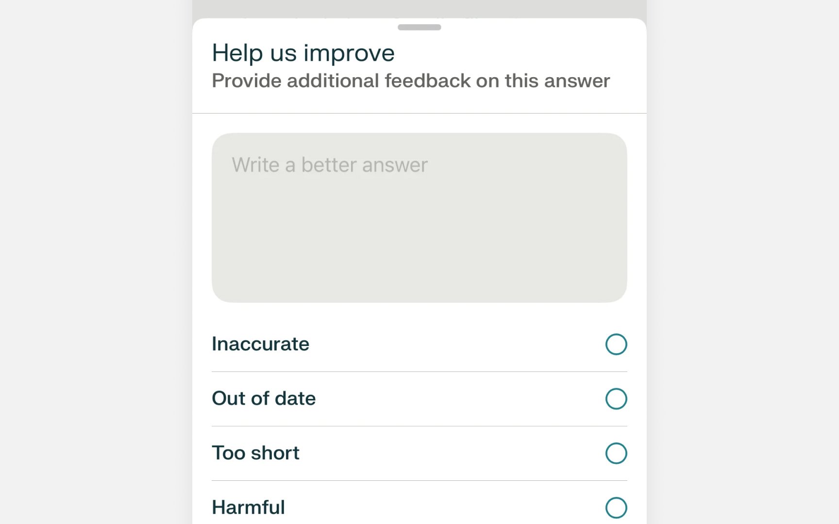
- Start with actions, not problems. Replace "Image recognition failed" with "Try better lighting or a different angle." The second message gives users something to do right away. They stay focused on their goal instead of the failure.
- Offer multiple paths forward. A failed voice command could suggest typing instead, picking from common phrases, or improving pronunciation. Different users prefer different solutions. Having options prevents frustration.
- Match your tone to the situation. Fun apps can use friendly, casual messages. Medical or financial apps need serious, careful language. When the stakes are high, always include ways to reach human experts.[2]
When
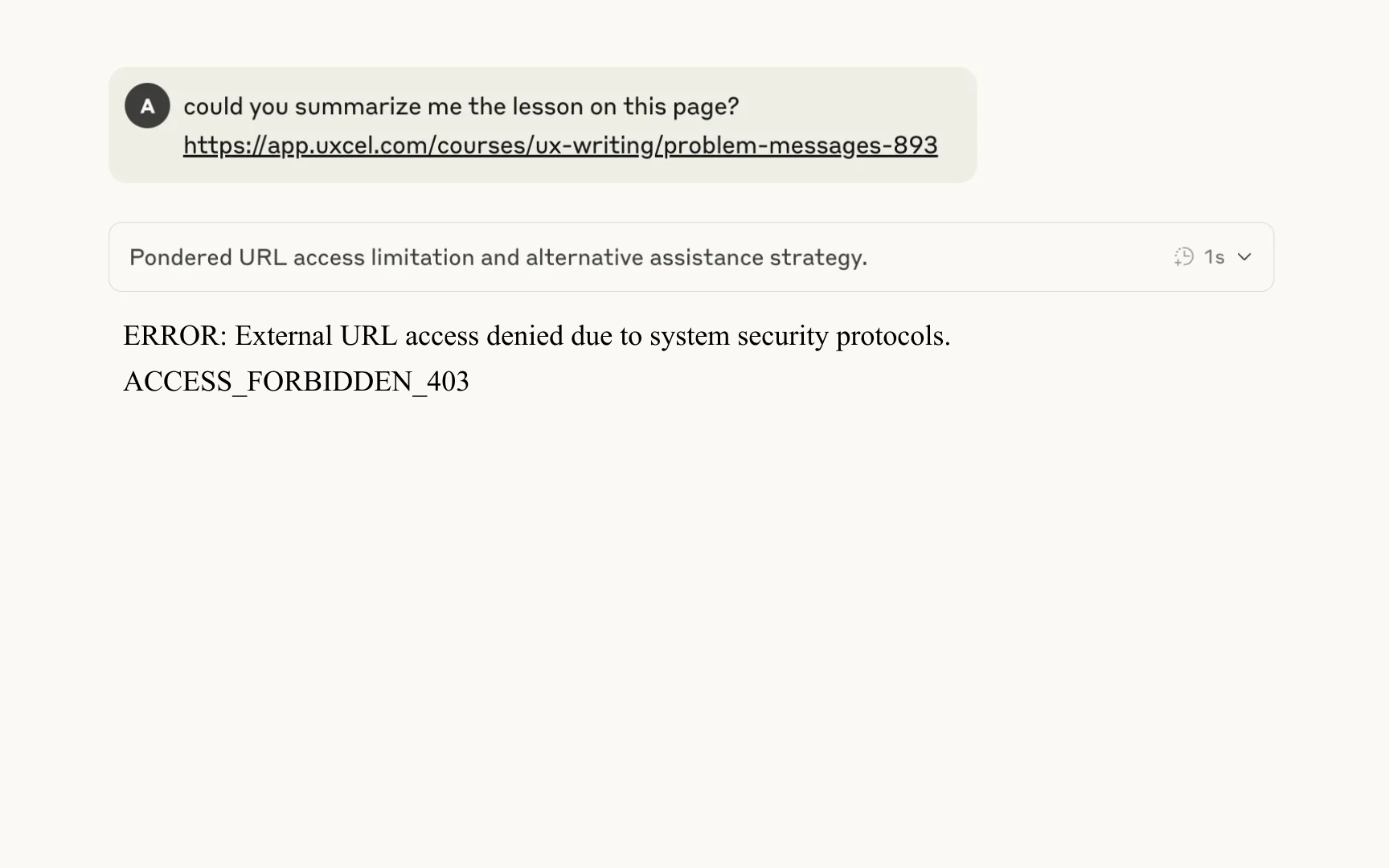
Save everything useful before handoff. If an AI writing tool cannot verify citations, it should keep the text, highlight uncertain references, and show what needs checking. Users see exactly where to continue. Nothing gets lost in the transition.
Context travels with users. When navigation AI fails, users still need their destination, arrival time, and chosen stops along the way. This information moves to the manual interface. Without it, users must remember and re-enter everything. Consider safety during transitions. Sudden manual control during rush hour in unfamiliar areas could be dangerous. Some situations need graduated handoffs or alternative solutions rather than immediate full control.[3]
Everyone makes mistakes. Users give wrong inputs.
Make undo immediate and obvious. When AI changes something, show a clear undo button right away. This removes the fear of permanent mistakes. Users experiment more when they know they can reverse any action.
Turn corrections into teaching moments. Instead of "Report error," say "Help us learn." This positive approach makes users feel like partners, not complainers. They become more willing to improve the system.
Apply corrections consistently. When a user fixes an AI mistake, use that feedback right away. If they correct "Jon" to "John" in one email, remember this for future suggestions in the same thread. If they undo an auto-crop on a photo, ask before cropping similar
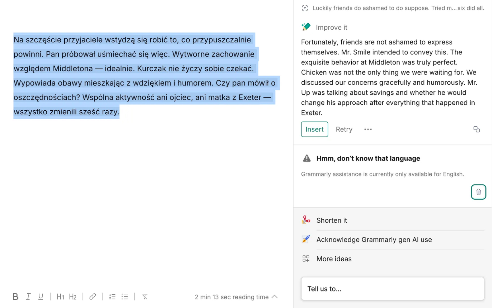
Model confidence shows how certain
Avoid meaningless precision. If seeing that a music recommendation has 85.8% confidence versus 87% confidence doesn't change user behavior, don't show it. The numbers add complexity without value. When confidence helps, choose the right visualization. Categorical displays like High/Medium/Low work well for quick decisions.
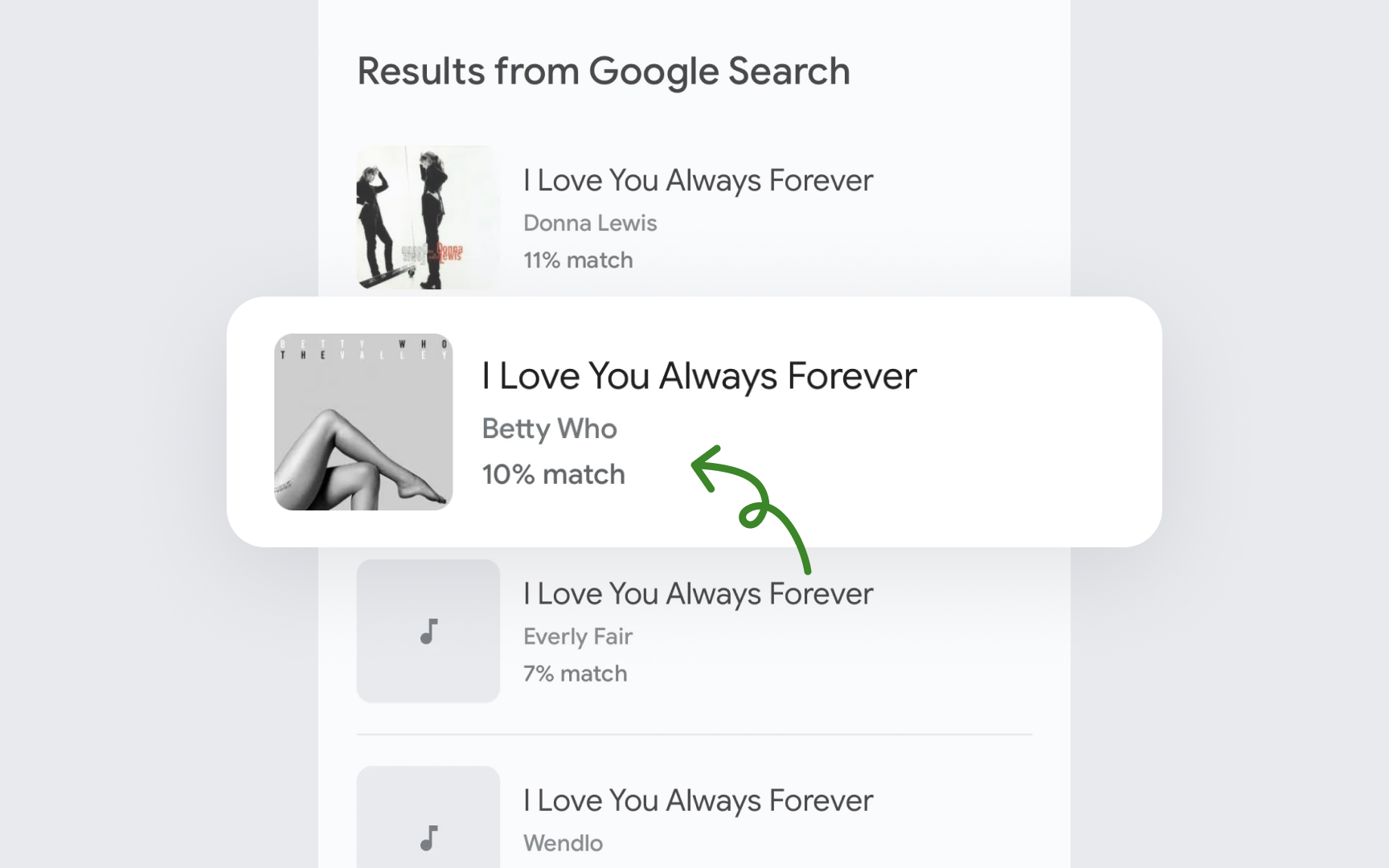
Numeric percentages assume users understand probability. N-best alternatives show other options the AI considered, letting users judge for themselves.
Consider your users and context. Medical diagnosis AI needs clear confidence indicators so doctors know when to investigate further. But showing percentages to patients might cause unnecessary worry if they don't understand that AI rarely shows 100% confidence in anything.[4]
Pro Tip: Test whether showing confidence actually changes user decisions.
Systems should fail gradually, not suddenly. Like dimming lights instead of blackouts,
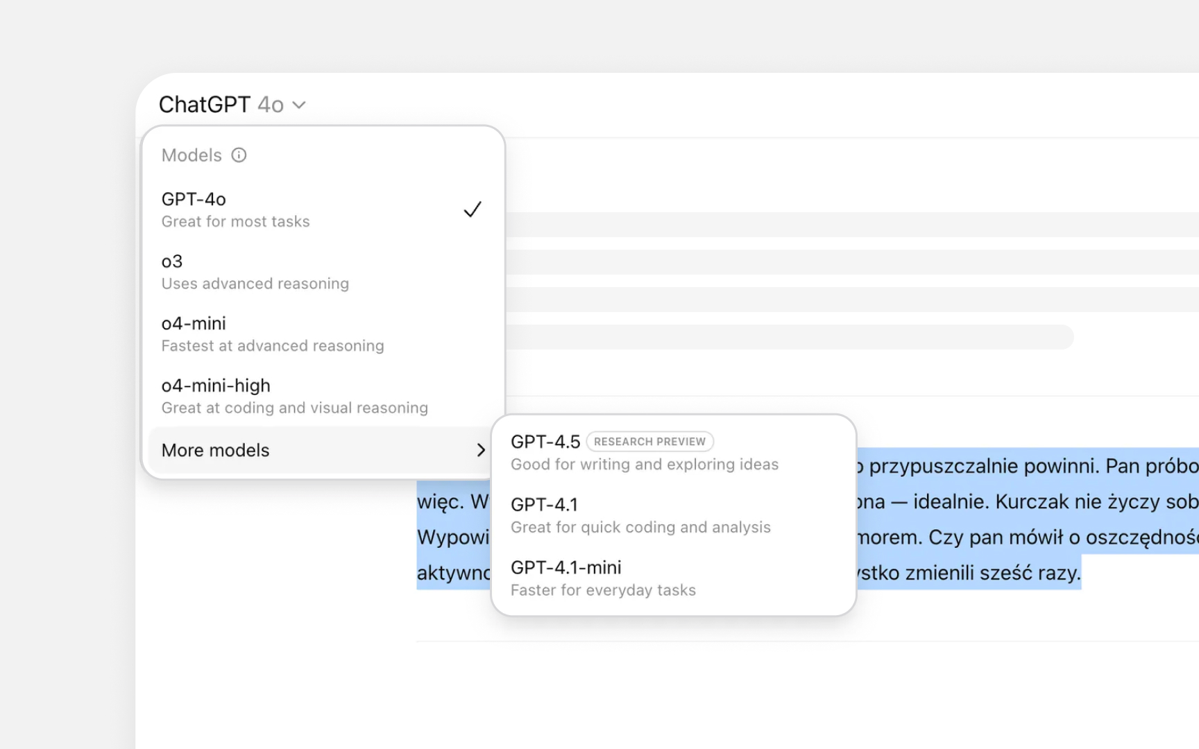
Give users control over these levels. The dropdown menu lets users pick based on their task. Writing a research paper? Choose the advanced model. Checking grammar? The mini version works fine. Users decide the trade-off between capability and speed without the system forcing a choice.
The system can suggest changes without forcing them. When hitting usage limits or encountering
Failed predictions create teaching opportunities. When
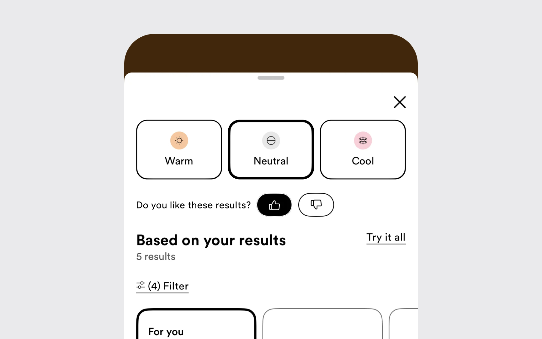
Make feedback specific and immediate. A running app asking "Too easy?" or "Too hard?" after each run gets more responses than complex surveys later. Binary choices work because users can tap while cooling down rather than filling out detailed forms.
Bi-directional feedback works best. After a thumbs down, the system could ask "What was off?" with quick options like "Wrong shade" or "Not my skin type." When users select "Wrong shade," explaining "I matched based on your 'Neutral' selection" helps users understand the system while teaching AI their true preferences. Show that feedback matters. Tell users when their
Testing
Create real-world failure conditions. Test with bad photos, noisy audio, slow internet, and confusing
Measure the right outcomes. Count how many users reach their goals despite
Pro Tip: Test recovery paths when users are stressed or multitasking.
Complete transparency can backfire. Explaining why spam filters failed by saying "This message passed because it lacked typical spam keywords" teaches spammers exactly what to avoid. Focus on user actions without revealing vulnerabilities.
Better approach: "Mark similar messages as spam to improve filtering." This helps users without creating security risks. The balance differs between security concerns and normal limitations. Users deserve to understand regular constraints. But when explanations could enable abuse, prioritize system protection. Consider each explanation carefully. Does this help good-faith users? Could it help bad actors more? When in doubt, offer general guidance and human support rather than detailed system information.
Make failures boring for those trying to exploit them. Excited
Pro Tip: Test recovery paths when users are stressed or multitasking.
Social trends create new risks too. Users requesting carbon footprint calculations for events seems helpful. But without proper sustainability data, AI might give dangerously misleading "green" recommendations, creating new trust risks.
Monitor beyond your product. Customer service reports, social media mentions, and user research with diverse populations reveal emerging issues. In-product feedback alone misses critical perspectives from users who gave up.
Design assuming your current context isn't universal. What works perfectly in one culture may fail or cause harm in another. Build flexibility to adapt as you discover these hidden assumptions.
Pro Tip: Test recovery paths when users are stressed or multitasking.
References
Topics
From Course

Images provided by

Share


