Creating Effective Explanations
Master techniques for explaining AI decisions in ways that build understanding and enable informed user choices.
AI systems make thousands of decisions every second, weighing variables humans can't track. Yet users need to understand these decisions to trust and use AI effectively. How do you explain something that even its creators might not fully understand?
The challenge goes beyond technical complexity. A medical diagnosis AI might analyze hundreds of patient factors, but doctors need to know which symptoms matter most. A loan approval system processes financial data instantly, but applicants deserve to know why they were rejected.
Some explanations focus on the big picture, describing how the system works overall. Others zoom in on specific moments, revealing why the AI made this particular choice. Neither approach works universally. Confidence levels add another layer. Showing that an AI is 73% certain sounds precise, but what does that number mean to someone checking plant safety while hiking? The same percentage might be reassuring in a movie recommendation but alarming in a medical screening.
The most effective explanations adapt to context. They recognize that users need different information when the stakes are high versus low, when they're experts versus beginners. Like a good teacher, AI explanations must match the student's needs.
- General system explanations describe how the entire AI behaves, regardless of individual inputs. General explanations might state that a recommendation engine uses viewing history and ratings to suggest movies. This helps users form mental models of the system's approach. These explanations remain consistent across all users, providing stable understanding. General explanations work in onboarding and documentation.
- Specific output explanations clarify why the system produced a particular result for a particular user. Specific explanations dig into individual cases. They might reveal that a movie was recommended because you watched 3 similar thrillers last week. These change with each interaction, connecting user actions to system responses. Specific explanations belong in the moment of interaction when users question results.
Context determines the choice. New users benefit from general explanations that establish baseline understanding. Experienced users troubleshooting unexpected results need specific explanations. High-stakes decisions often require both. Many successful AI products layer both types, starting broad and allowing drill-down into specifics.
Partial explanations clarify key elements of how
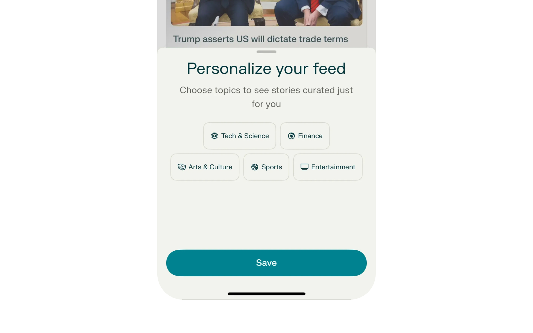
Consider a news app showing "Choose topics to see stories curated just for you." This explains that personalization happens through topic selection without detailing recommendation algorithms. Users understand how to influence their feed without needing technical knowledge.
Similarly, a weather chatbot might say "I need your location to provide accurate weather." This reveals a data requirement without explaining how it processes geographic and meteorological data. These explanations reveal just enough to be helpful. Too much detail overwhelms. Too little leaves users guessing. The key is identifying what helps users make decisions.[1]
Pro Tip: Use progressive disclosure with partial explanations to give curious users more detail without overwhelming others initially.
Influential feature explanations describe which key factors or data
A resume screening AI might indicate that work experience and relevant skills were the primary factors in its recommendation, while education level had moderate influence. This helps job seekers understand which parts of their application carried the most weight. Feature explanations can also show chains of influence. A travel recommendation system might reveal that your selected month and activity preferences directly shaped its suggestions. Choosing "December" plus "outdoor adventures" leads to ski resort recommendations, while "December" plus "beach relaxation" suggests tropical destinations.
For complex models like language generators, the influential features often involve patterns from training data. A writing assistant might explain that formal business documents in its training influenced its professional tone suggestions, making the connection clear without technical details.
The key is showing users which inputs matter most for their specific results. This transparency helps them understand the AI's reasoning and make better use of the system.[2]
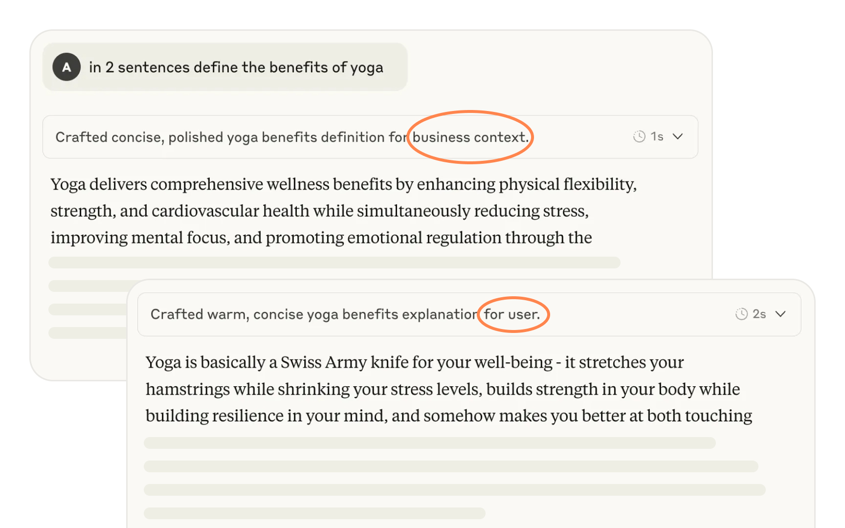
Contrastive explanations clarify why
The power lies in revealing alternatives. Users understand not just what is, but what could be.
Pro Tip: Use progressive disclosure with partial explanations to give curious users more detail without overwhelming others initially.
Every
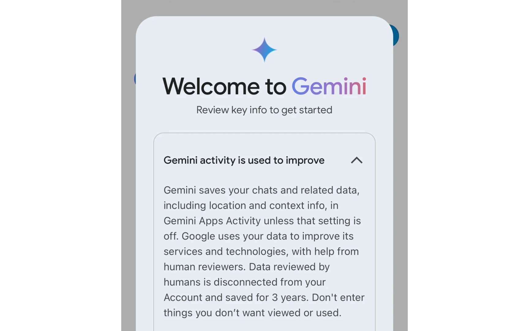
- Scope: overview of data collected
- Reach: whether personalized or aggregated
- Removal: whether users can delete or reset data
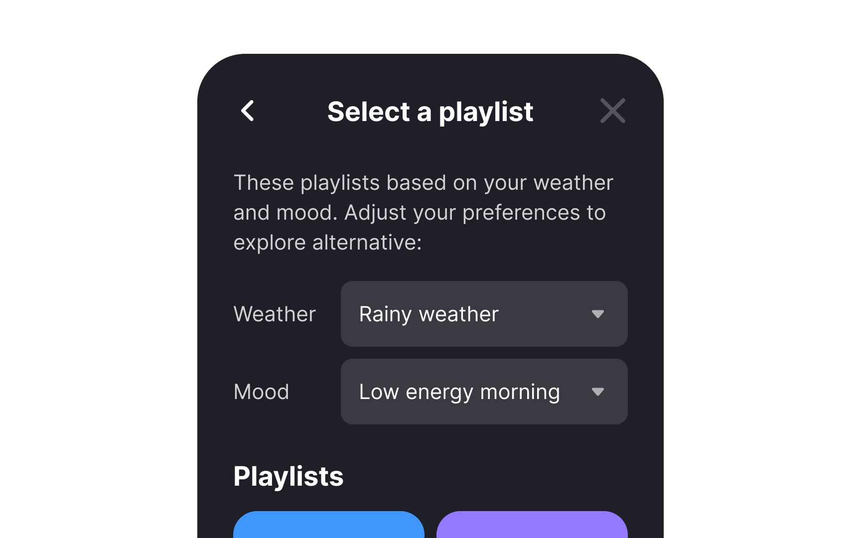
Consider a music app suggesting "Time to wind down" playlists at 9pm. Users might wonder how it knows their schedule. Explaining "Based on your typical listening patterns showing calmer music after 9pm" clarifies the data connection. Without this transparency, personalization feels creepy.
Data source explanations help users know system limits. If a fitness app only tracks steps and heart rate, users understand why it misses their weightlifting when calculating calories. This prevents over-trusting incomplete assessments.
Feature explanations show which data mattered most. A job matching AI might explain: "Match score based on skills overlap (45%), experience level (30%), location preference (25%)." This helps candidates understand why certain jobs ranked higher.
Privacy requires proper infrastructure beyond basic policies. Be transparent about data use while respecting boundaries.
Model confidence indicates how certain the system is in its prediction. 4 main approaches exist:
- Categorical displays group confidence into buckets. A weather app might show sunny icons for high-confidence predictions but cloudy icons with question marks for uncertain forecasts. This simplifies decisions without requiring probability understanding.
- N-best alternatives show multiple possibilities. A bird identification app might display "Likely: Robin, Cardinal, or Sparrow" rather than picking one. This excels when confidence is low, prompting users to apply their own judgment while revealing system thinking.
- Numeric displays show percentages but assume probability comprehension.
AI rarely predicts with 100% confidence, potentially confusing users expecting certainty. Context matters: 85% confidence in a game recommendation differs from 85% in medical screening. - Visual approaches use graphics intuitively. Stock predictions might show expanding forecast ranges over time, with narrow bands for tomorrow but wide spreads for next month. This communicates uncertainty naturally.
Testing different displays early reveals what resonates with your specific users and use cases.
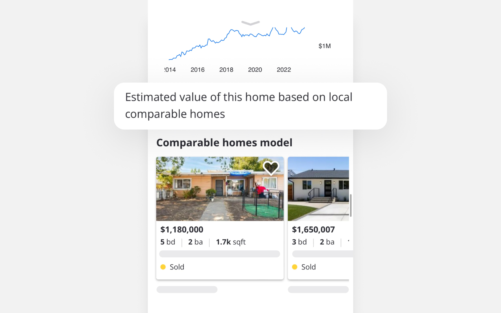
Example-based explanations show users similar cases to help them understand
Real estate apps demonstrate this approach perfectly. When estimating a home's value at $1M, the app displays actual comparable homes nearby. Users see a 5-bedroom house at 1115 Berkeley Ave that sold for $1,180,000 and a 3-bedroom at 1216 Windermere that sold for $1,650,007. This makes the valuation understandable without any technical explanation.
The power comes from selection. Showing random similar homes won't help. The examples need to highlight what drives the price difference. Is it the number of bedrooms? The square footage? The neighborhood? Good examples make these factors obvious through comparison.
Users trust what they can verify themselves. Seeing real sold prices from actual addresses feels more convincing than any algorithm explanation.
Interactive explanations let users experiment with
Photo editing apps show this well. Users can test AI filters on sample images before using their own photos. Trying "Vintage Film" versus "Professional Portrait" reveals each filter's effects without risk. They learn by doing, not reading.
Financial tools excel here too. Users move sliders for retirement age or savings rate and watch projections update. Changing retirement from 65 to 70 might add $200,000 to savings. These instant updates make abstract concepts concrete.
Speed matters. Results must appear immediately after changes. A recipe app that slowly recalculates serving sizes breaks the learning connection. Users need that instant feedback to understand relationships.
Good design provides enough options to explore meaningfully without overwhelming users. A language app might offer speed and accent controls while hiding complex phonetic settings. This focused approach keeps experimentation productive and enjoyable.


Model metrics can explain
A document search showing "0.73 cosine similarity" means nothing to most users. But "73% relevant to your search" makes immediate sense. Movie apps do this well by showing "85% match" instead of complex
Generative AI needs different approaches since single accuracy numbers don't capture quality. A coding assistant might create "helpfulness scores" based on developer feedback. Seeing "92% helpful" gives users meaningful context about whether to trust a suggestion.
Choose metrics that connect to user goals. News apps benefit from "freshness scores." Dating apps use "compatibility percentages." But showing "perplexity values" for text generation helps no one. Visual elements improve understanding. Stars, progress bars, and color coding communicate better than numbers alone. Keep these consistent across your product so users learn what to expect.
Not every
Spell checkers demonstrate this perfectly. When "teh" becomes "the," nobody needs to know why. The correction matches what users want and expect. An explanation would waste time on something already understood.
Some explanations could harm more than help. They might reveal company secrets or user data that should stay private. A small "AI-enhanced" label might be enough without details. Consider interface complexity too. A camera app with plant identification and video stabilization shouldn't explain everything at once. Wait until users actually use a feature before explaining it. Context determines when silence works better than words.
The best
Most cases need focused explanations. A social media feed might explain it shows "posts from friends you interact with most" without listing every ranking factor. Users get enough to understand their feed without overwhelming detail. The detailed explanation would distract from the main task.
High-stakes situations demand transparency. AI systems helping judges with sentencing must explain everything. This context requires full documentation including data sources and decision thresholds.
Testing reveals the right balance. Watch real users to see where they get confused or overwhelmed. Different audiences often need different explanation depths. Build flexibility into your approach rather than forcing one size on everyone.
References
Top contributors


Topics
From Course

Images provided by

Share


Similar lessons

Intro to UX Copy

What is UX Writing?
