Design panel
When nothing is selected on the canvas, the Design panel allows access to file-specific styles and variables, the ability to update the canvas's background color, and options to preview and export the entire page. However, the panel's capabilities expand significantly when a layer is selected.
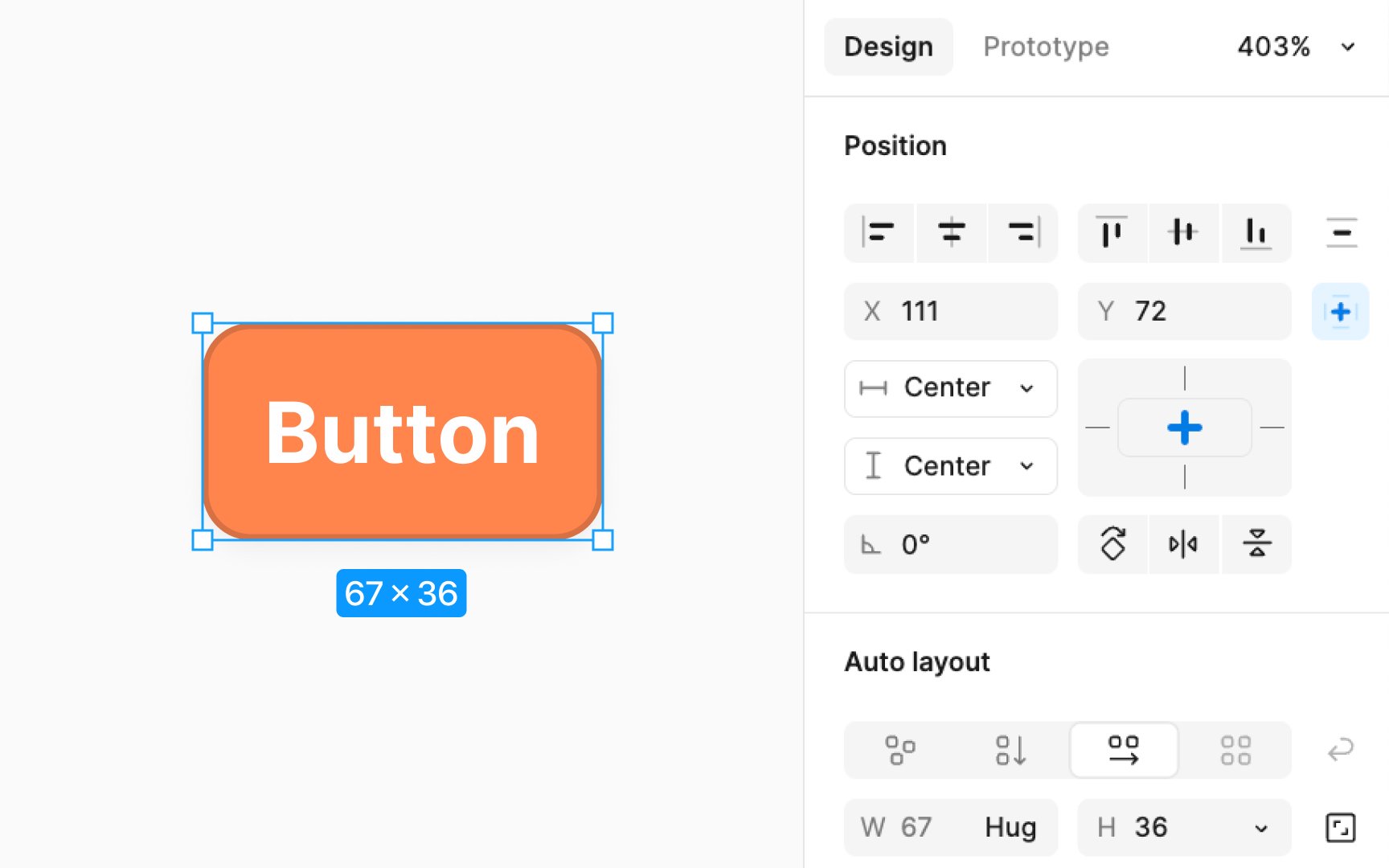
For selected layers, the Design panel offers a variety of settings, including but not limited to:
- Alignment and distribution: Adjusts the positioning of elements in relation to each other.
- Position and dimensions: Sets the location and size parameters, including rotation.
- Constraints and layout grid: Set responsive behavior and structure for layouts.
- Component properties and instances: Manages reusable components and their instances.
- Auto layout: Automates element spacing and alignment.
- Text, fill, stroke, and effects: Customizes visual attributes like typography, color, borders, and shadows.
- Individual export: Allows exporting selected elements separately with customizable settings.
