Attention & Well-being
Learn what goes into products that create genuine value without exploiting psychological vulnerabilities
Digital products compete for something more valuable than money: human attention. Apps, platforms, and services use sophisticated techniques to keep people engaged, often prioritizing screen time over genuine value. This creates real consequences for mental health, productivity, and relationships. In fact, research shows that excessive digital engagement correlates with anxiety, sleep disruption, and decreased life satisfaction.[1] Yet many companies still measure success purely through engagement metrics without considering psychological impact.
Healthy products balance business goals with user wellbeing. This means designing features that deliver value efficiently, creating notification systems that respect boundaries, and measuring success beyond time spent in-app. Teams that prioritize wellbeing build stronger user trust and more sustainable businesses. The shift toward ethical design isn't just morally right; it's strategically smart as users increasingly reject manipulative products.
The attention economy treats human focus as a scarce resource to be captured and monetized. Tech companies compete intensely for screen time because advertising revenue depends on eyeballs. This creates incentives to maximize engagement regardless of whether users benefit from the time spent.
Every
This model has real costs. Studies connect excessive social media use to increased depression and anxiety, particularly among teenagers. Sleep quality suffers when devices compete for bedtime attention. Productivity drops as constant interruptions fragment focus.[2] Understanding these dynamics helps product teams make better choices about what to build and how to measure success.
Persuasive design applies behavioral psychology to influence user actions and decisions. Techniques like variable rewards, social proof, and scarcity create powerful motivators that can benefit or manipulate users depending on intent.
Casinos pioneered many methods now common in digital products. For example, variable rewards work like slot machines. Pull-to-refresh mimics the anticipation of gambling, never knowing what content appears next. Snapchat streaks use commitment consistency, making users feel obligated to maintain daily engagement. Red
These techniques aren't inherently evil but require careful application. Persuasive design becomes manipulation when it serves business goals at user expense. Ethical use means aligning persuasion with genuine user benefit, not just engagement metrics. Product teams must ask whether influence helps users achieve their goals or undermines their autonomy.
Fear of missing out (FOMO) drives compulsive checking behavior as users worry about being excluded from conversations, events, or trends. Social platforms amplify this anxiety by broadcasting what others are doing, creating constant comparison and pressure to participate. This transforms social connection into a source of stress rather than joy.
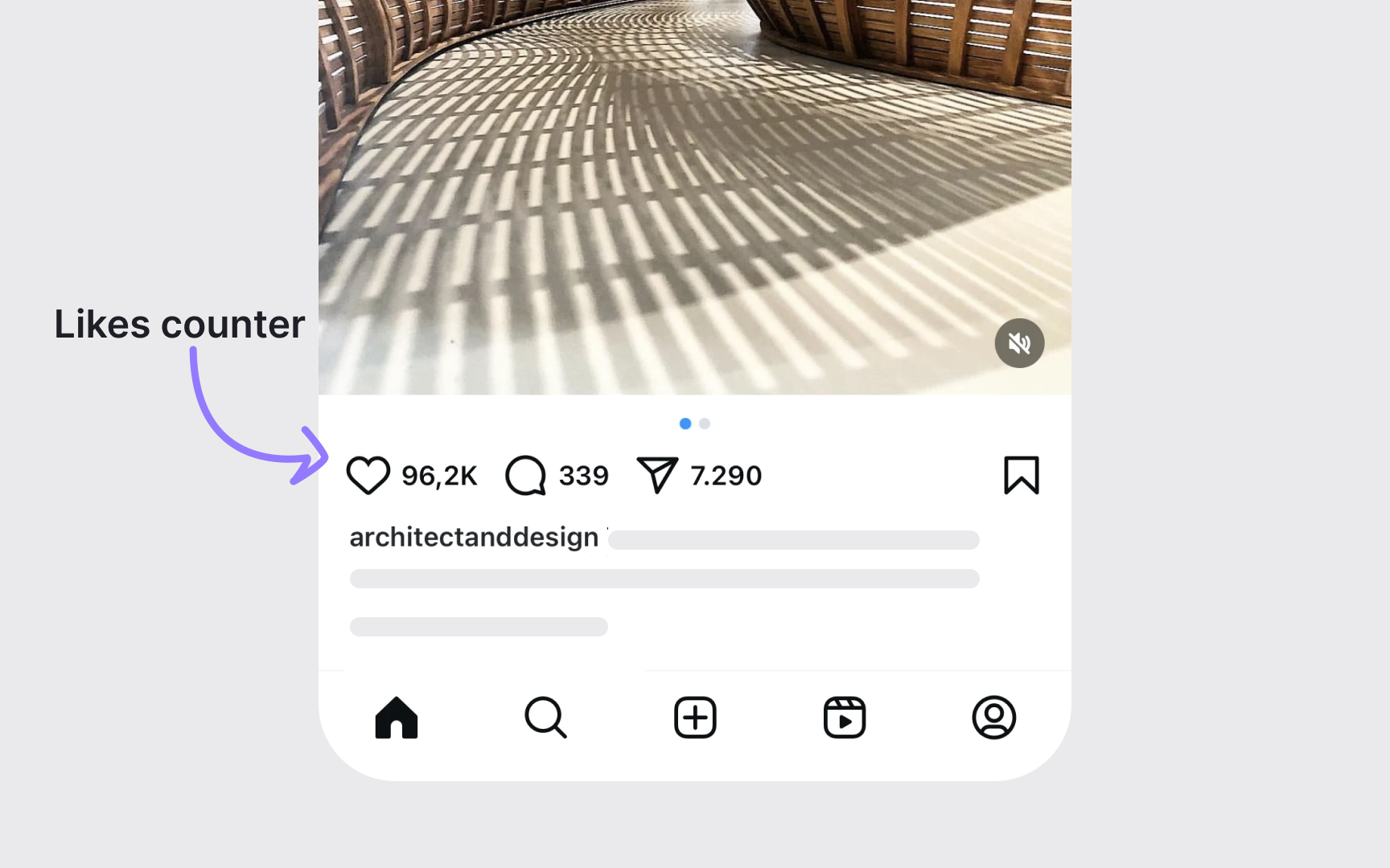
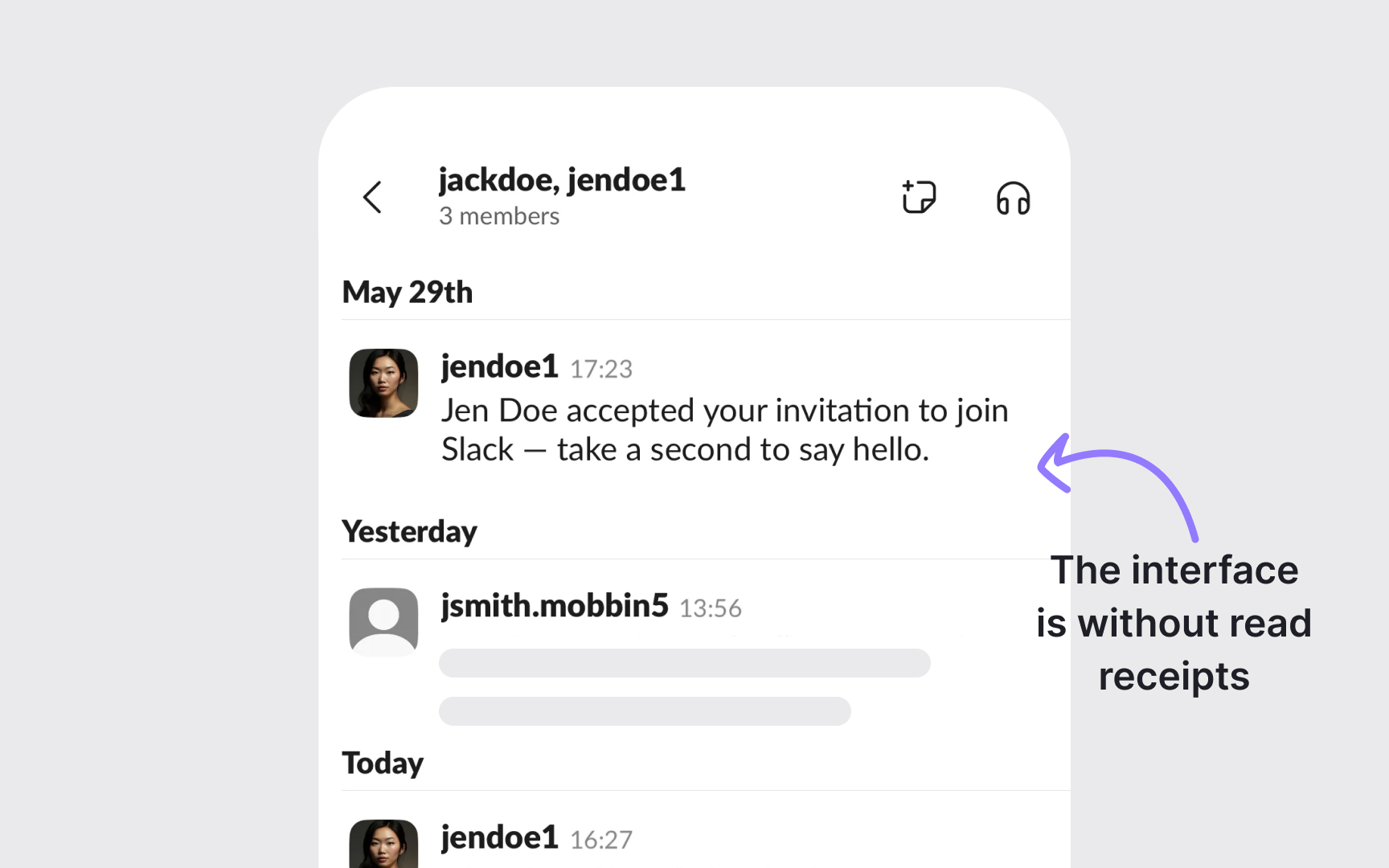
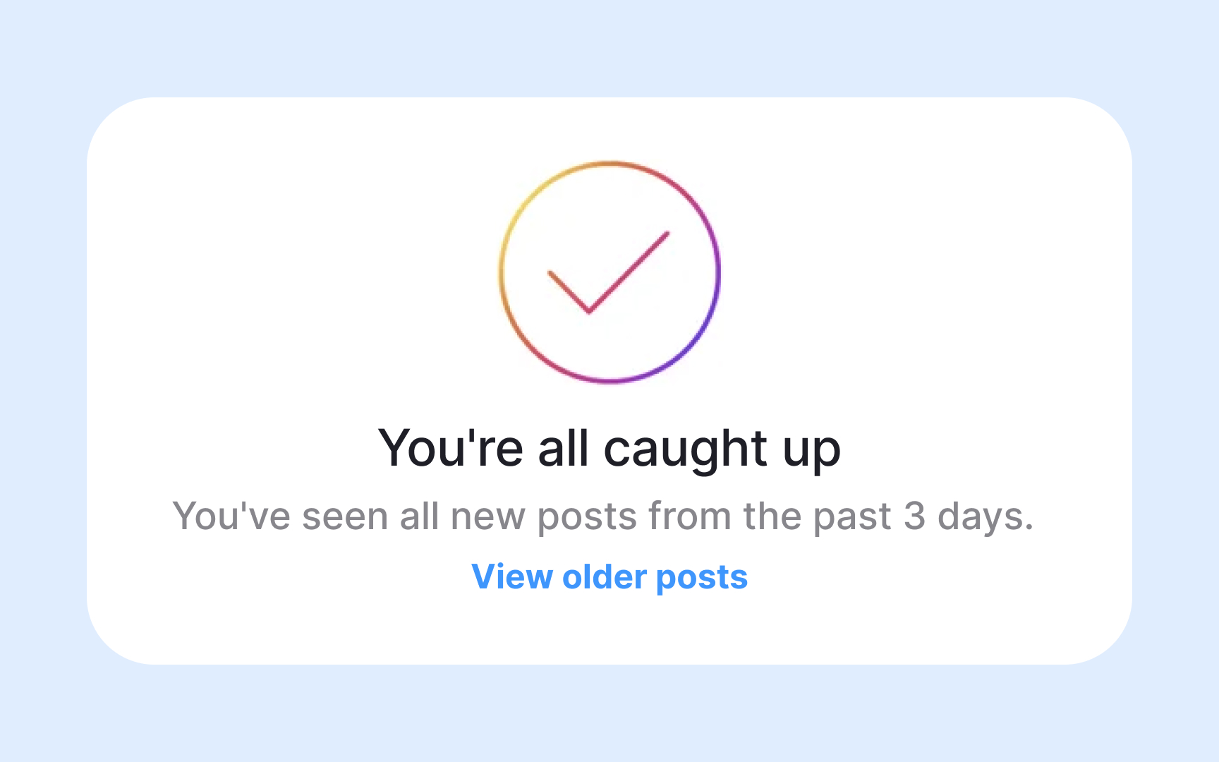
A lot of design patterns actively manufacture FOMO. Read receipts and "last seen" timestamps create expectations for immediate responses. Public follower counts and engagement metrics turn relationships into competitions. Stories that disappear after 24 hours force frequent checking to avoid missing
Products can reduce FOMO through deliberate design choices. For example, hide vanity metrics like follower counts and like numbers to minimize comparison pressure. Make asynchronous communication the default by removing read receipts and typing indicators. Replace disappearing content with persistent access so users engage when ready, not under time pressure. Provide batch
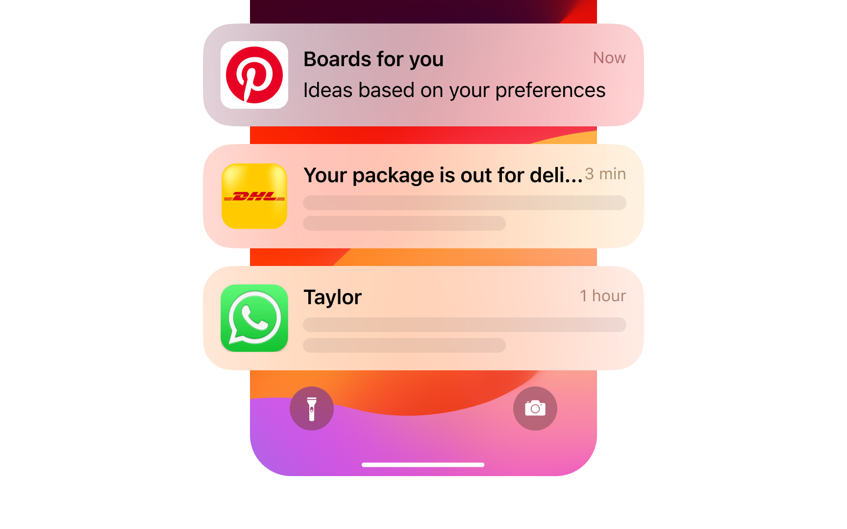
Apps send 3 notification types: transactional, social, and engagement-driven. Transactional notifications serve clear user needs like delivery updates or payment confirmations. Social notifications signal genuine human interaction like direct messages or mentions. Engagement notifications exist purely to drive app opens, like "trending now" alerts or
Poor strategies default to all notifications enabled, bury settings deep in menus, or use manipulative copy like "we miss you" to guilt users into re-engagement. Ethical notification design means asking whether each alert genuinely serves the user or just company metrics. Default to fewer notifications, make disabling easy, and respect user preferences once set.
Addictive
Breaking addictive patterns requires intentional design choices. Instagram tested removing like counts to reduce validation-seeking behavior. TikTok introduced screen time limits and break reminders. These changes prioritize long-term user relationships over short-term engagement spikes.
Product teams can audit features for addictive mechanics by testing if removal decreases compulsive behavior without harming value delivery. Add friction to endless behaviors through natural endpoints, deliberate pauses, or completion celebrations. Provide users transparency about time spent and tools to set boundaries. Measure success through user control and satisfaction rather than maximum retention.
Onboarding shapes user expectations and habits from first
On the other hand, mindful onboarding respects user autonomy and sets healthy precedents. It explains why permissions matter before requesting them, allowing informed decisions.[4] Users can defer non-essential setup to explore core value first. Default
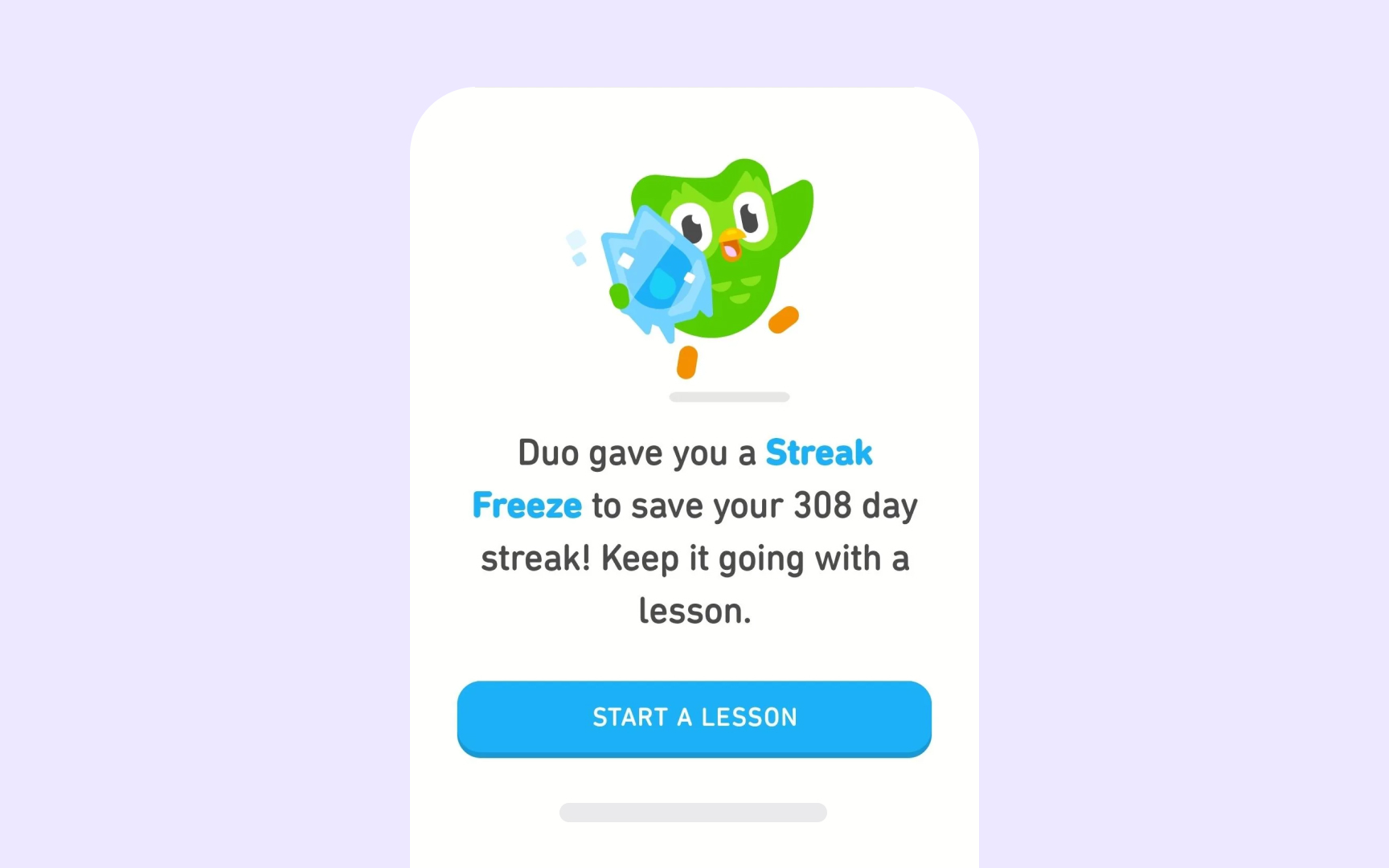
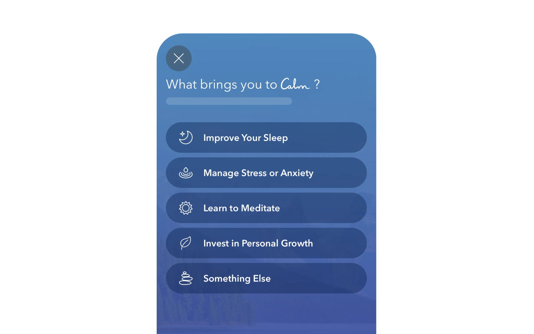
For example, Duolingo allows users to set realistic daily goals during onboarding rather than pushing maximum commitment. Superhuman teaches keyboard shortcuts that reduce time spent managing email. Calm demonstrates value through a brief meditation before requesting subscriptions or permissions. These approaches build trust and establish products as tools serving users rather than exploiting attention.
Pro Tip: Delay permission requests until users experience core value and understand why each permission benefits them specifically.
Time well spent focuses on intentionality and value rather than duration. Users should feel their time accomplished something meaningful, whether completing tasks, learning, connecting genuinely with others, or relaxing purposefully. This concept, popularized by Tristan Harris, challenges the engagement-first design philosophy.[5] Products built for time well spent help users achieve clear objectives quickly and efficiently.
Measuring time well spent requires new frameworks:
- Track goal completion rates and efficiency improvements over time
- Survey users about post-session feelings using questions like "Was this time worthwhile?" or "Did you accomplish what you intended?"
- Monitor the ratio of purposeful opens versus habitual checking
- Compare user
retention based on value delivered rather than hooks deployed
Companies embracing this philosophy often see counterintuitive results. However, remember that shorter sessions can increase long-term retention when users consistently accomplish goals. Lower daily active users might indicate healthier, more sustainable relationships.
Traditional metrics like daily active users and session duration measure quantity without quality. Healthy engagement metrics assess whether users accomplish goals, feel satisfied, and maintain balanced usage patterns. This requires looking beyond time spent to understand user outcomes and wellbeing indicators.
Healthy engagement shows distinct patterns. For example:
- Users complete specific tasks efficiently rather than browsing aimlessly
- Return rates stay consistent without compulsive checking behavior
- Session lengths match task complexity, shorter for simple needs and longer for complex work
- Voluntary returns outnumber notification-driven opens, indicating genuine value rather than manufactured urgency
Product teams can implement healthy engagement tracking through post-session surveys, goal completion rates, and voluntary return ratios. Compare users who disable
References
- Link between excessive social media use and psychiatric disorders | PubMed Central (PMC)
- Smartphone addiction, daily interruptions and self-reported productivity | PubMed Central (PMC)
- Impact and Story | Center for Humane Technology
Top contributors

Topics
From Course

Share


Similar lessons

Mental Models in UX Research

Psychological Theories Behind Gamification
