Calculating readable line heights
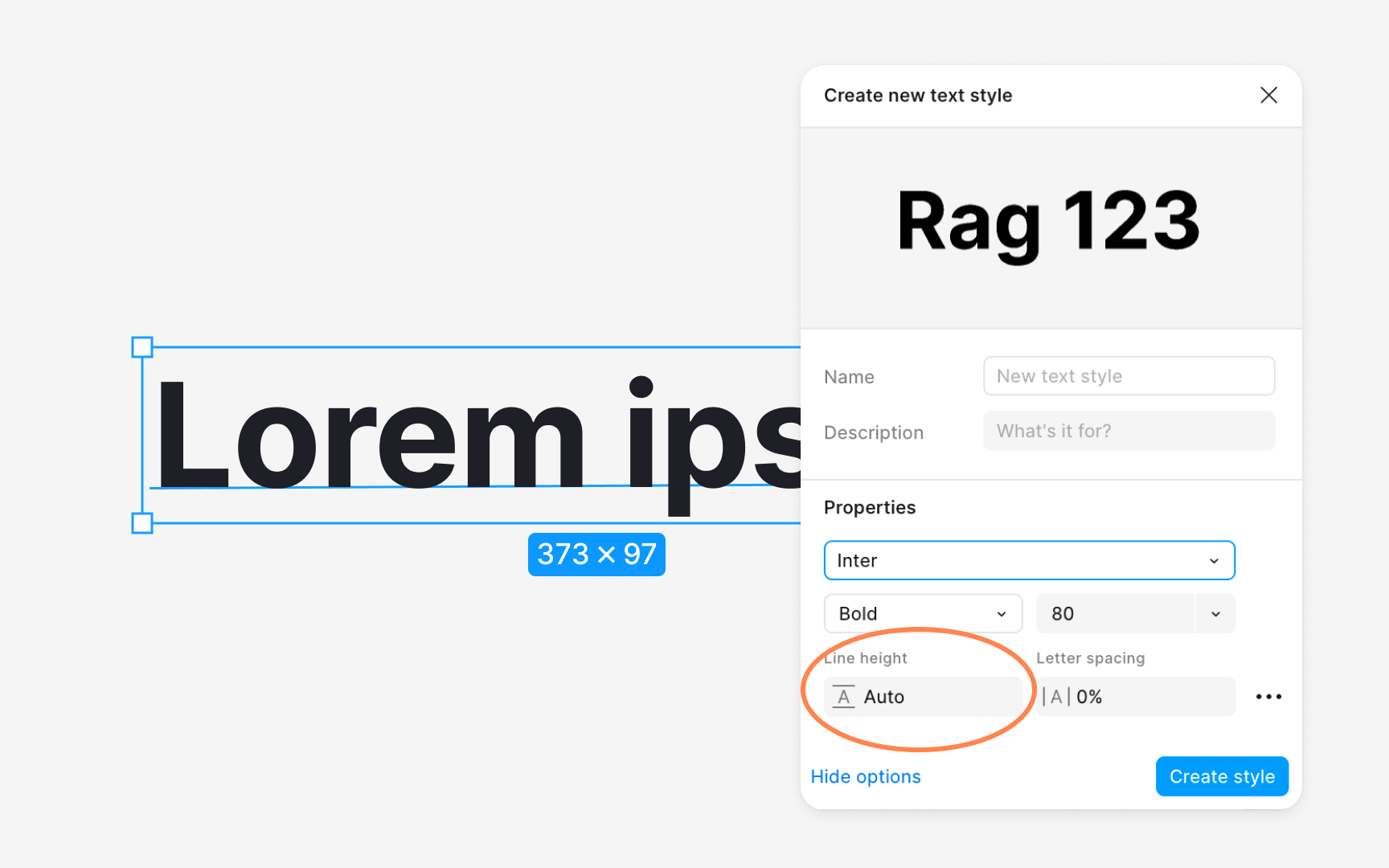
Line height directly affects how easily users follow lines of text. If spacing is too tight, the eye struggles to track the next line, especially in longer paragraphs. If spacing is too wide, text loses cohesion and slows reading. A practical starting point for body copy is a line height around one and a half times the font size, which aligns with WCAG guidance and keeps text open without feeling disconnected . Designers often refine this value by testing several options in real content rather than relying on a single formula. In dense interfaces, even small variations like 18, 20, or 24 pixel line heights create noticeable differences in clarity and rhythm .
Line height also interacts with vertical rhythm and spacing systems. When line heights align with a 4 or 8 point grid, text blocks snap more naturally to layout spacing, making designs easier to structure and maintain in code. This alignment helps create consistent gaps around paragraphs and components, reducing unexpected jumps between elements. Because grids often guide spacing tokens, keeping line heights grid friendly ensures that text styles integrate smoothly with other foundations of the design system.[1]
Pro Tip: Always review line height inside real paragraphs. Short samples hide spacing issues that appear during actual reading.
