Building consistent icon frames and grids
Icon size is defined by the outer frame, such as 16, 24, or 32 pixels. This frame sets alignment and bounding rules, making it easier to place icons consistently in layouts. However, the frame defines the technical size, not how large an icon feels visually. Different shapes can appear heavier or lighter even when they share the same frame.
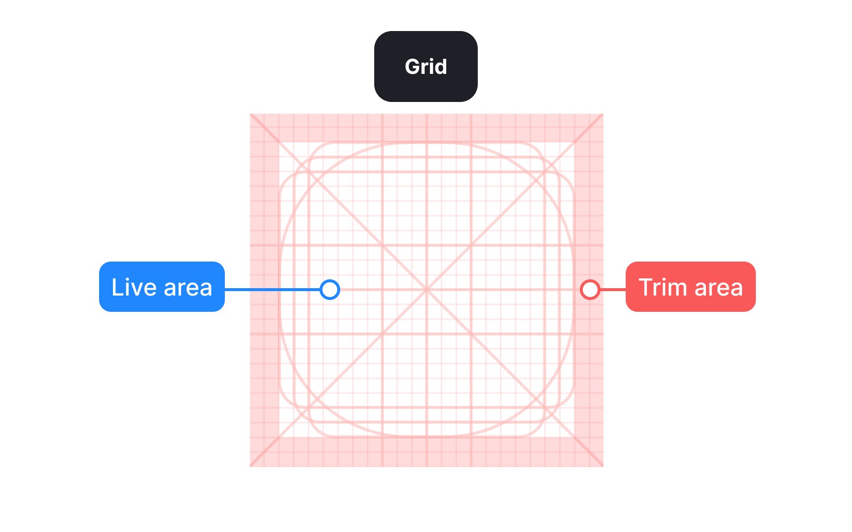
Inside the frame, a grid helps position shapes and separates the live drawing area from the trim area. The trim creates breathing room so icons do not feel cramped. Not all icons should fill the frame evenly. Compact or square shapes often need more padding, while narrow or elongated shapes may extend closer to the edges. This optical balance ensures icons feel equal in size and weight, even when their shapes differ. Beginners often fill the entire frame, which can make some icons feel too heavy or visually dominant.
Smaller frames usually use tighter trim and thinner strokes, while larger frames allow more space and thicker strokes to maintain balance. For example, a 16 pixel icon often uses a 1 pixel stroke, while a 24 pixel icon may use a 1.5 pixel stroke. Larger sizes can increase further to keep visual weight consistent. Treating each size as its own design task and adjusting shapes optically rather than scaling them mechanically helps icons remain clear, balanced, and consistent across the set.[1]
Pro Tip: Keep corner rounding consistent across icons. Even small differences can make shapes look uneven at smaller sizes.
