Buttons
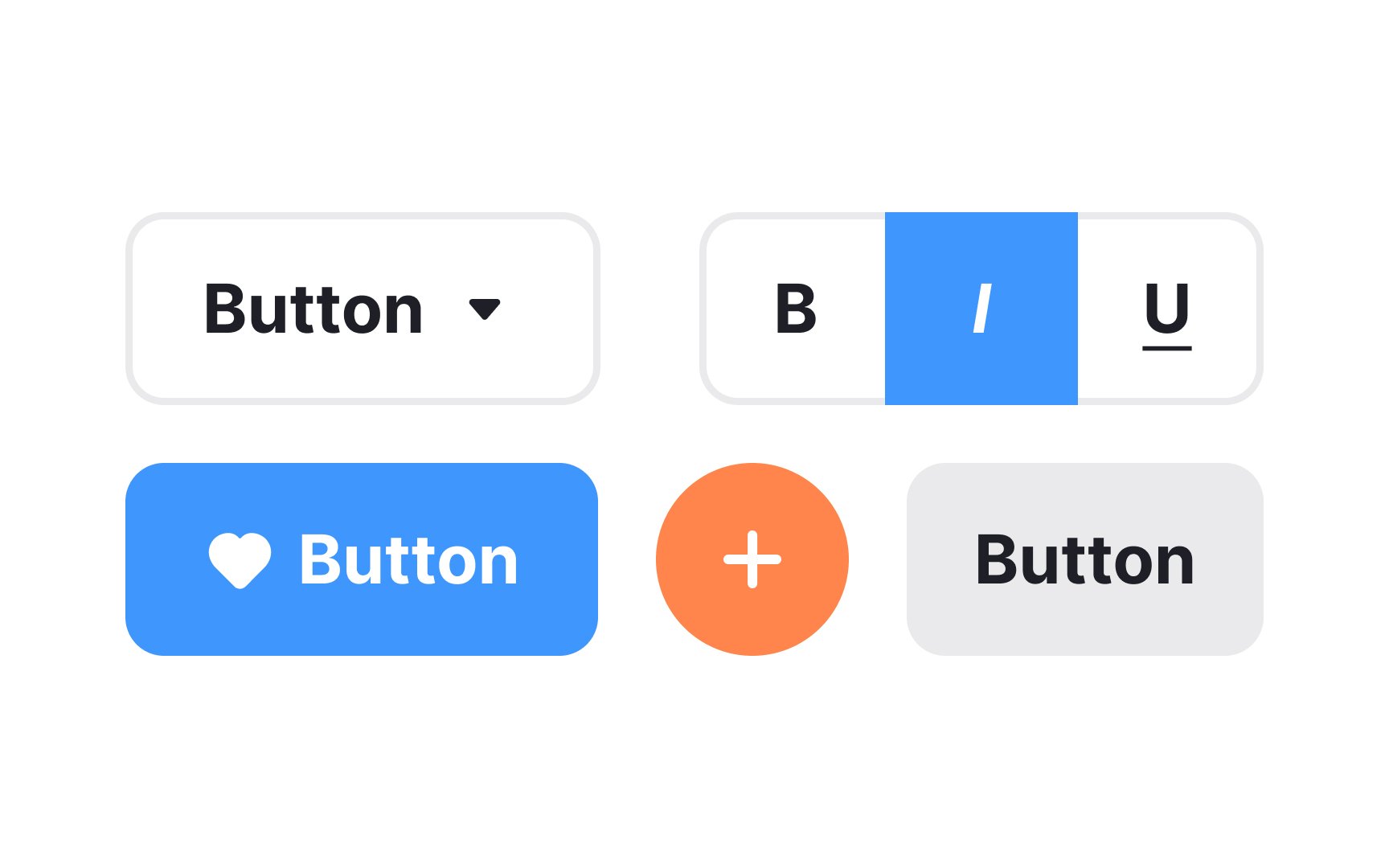
In digital products, buttons communicate actions that users can take. They usually consist of a rectangular, square, or circular shape with a label or an icon. Buttons allow users to perform actions with a single click or tap.
A button can also be represented solely by an icon or label. Text buttons and links may look similar but they do different things. Clicking buttons changes the state of a system (either front or back end), while clicking links redirects you somewhere else and doesn't change the system's state. Plus, links often appear in the text and thus, can be longer. Buttons can also be used to toggle states, open dropdowns, or trigger overlays like modals and tooltips.