Make the search bar noticeable
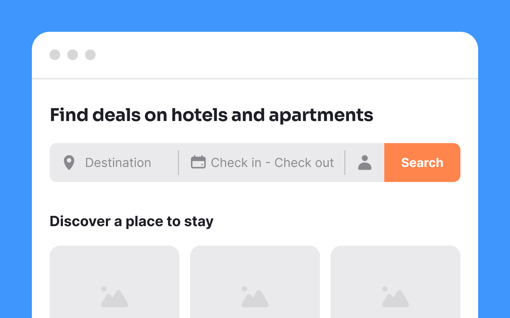
After entering a booking site, users typically begin their journey with a search for tickets, rooms, or apartments. Conventionally, the search bar is at the top of the page. Placing it elsewhere or hiding it behind an icon can add cognitive load and disrupt the user flow. To streamline the experience, the search bar should be prominent, minimizing confusion and facilitating seamless navigation.
Additionally, pay attention to the sizing of each element in the search component. Text should be readable, inputs spacious, and button click areas large enough for all devices and resolutions. Accessible touch targets for interactive elements, like buttons, benefit everyone, including those with motor disabilities, low vision, or larger fingers. Aim for touch targets of at least 48x48dp, spaced by 8dp or more, to ensure usability and balanced information density.[1]
