Influencing Mood with Color Combinations
Learn how to use color combinations to influence the moods of users
When working with established brands, it's crucial to understand the significance of their brand colors, which can be influenced by color meanings in different cultures. These colors define a brand's visual identity and complement its personality and style.
Generally, there are two different types of brand colors, primary and secondary. Primary colors are the main colors used in all graphics, publications, and logos. Secondary brand colors act as a complementary color palette to the primary. These are the colors you can update to reflect strategy trends and marketing goals.[1]
For example, you can change secondary colors to appeal to a younger demographic, create sophistication, liven up dull colors or soften more "aggressive" color palettes. Keep in mind that colors can look quite different in combination. Combinations can amplify and reinforce individual color meanings.


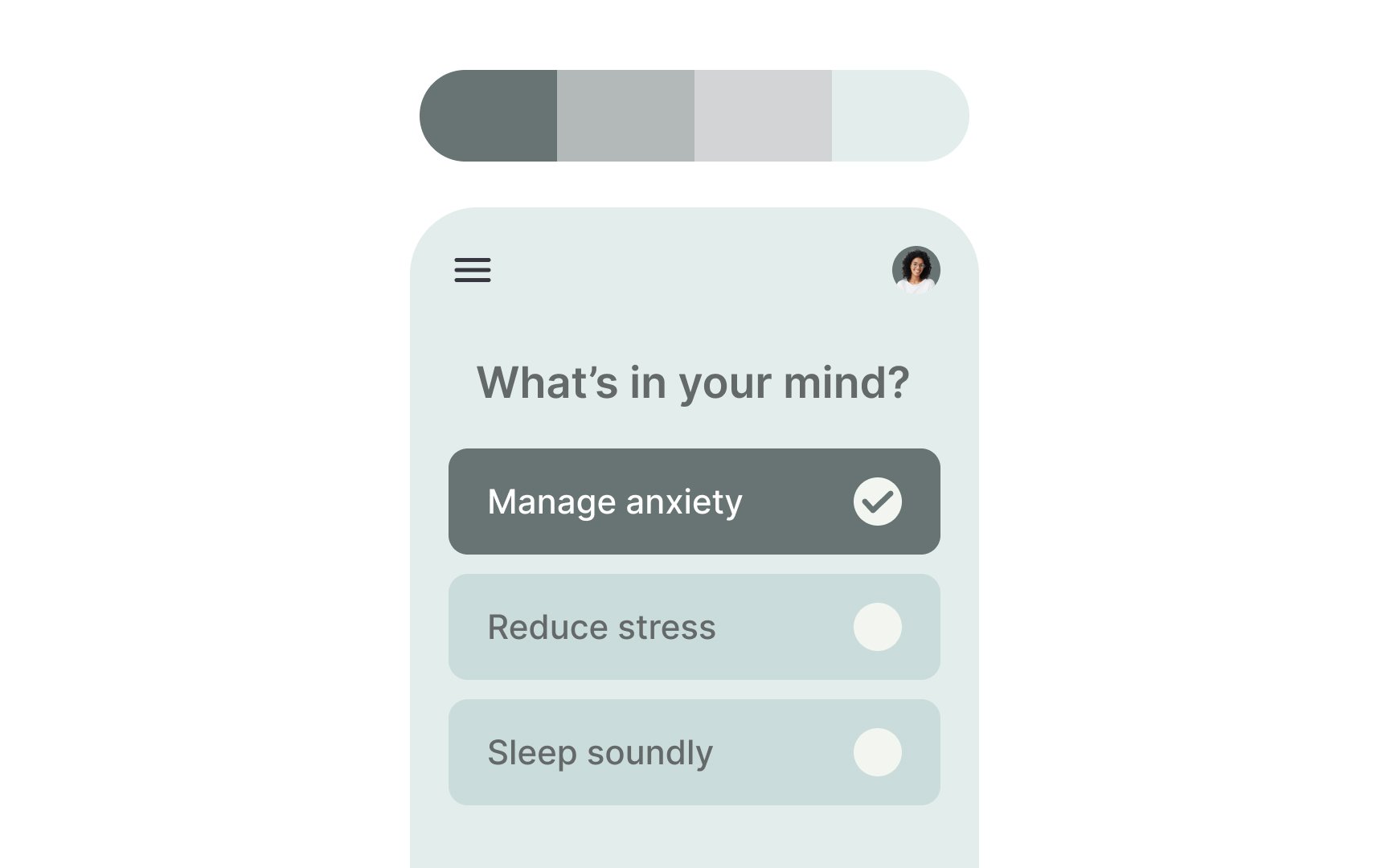
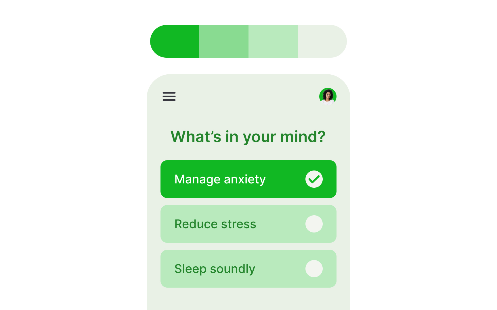
Have you ever wondered, "How do colors affect our moods?" Blue, the world's favorite
So what colors can you add to blue to make it more exciting and appealing to younger people? Go for triadic or tetradic color combinations — 3 or 4 hues equally distant from one another on the color wheel.[2]
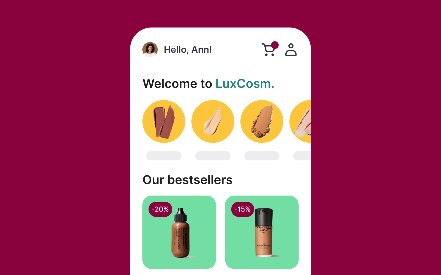
Blue's tetradic colors are pink, yellow, and green. These color combinations tend to be quite vibrant, even when toned down, tinted, or shaded. They can come across as playful and youthful. Make sure to balance these combinations because they can be easily overwhelming, for example, by lowering the color saturation and value.
Magenta is a purplish, pinkish
Magenta also carries a sense of sophistication that you can emphasize by adding other colors. You can keep the
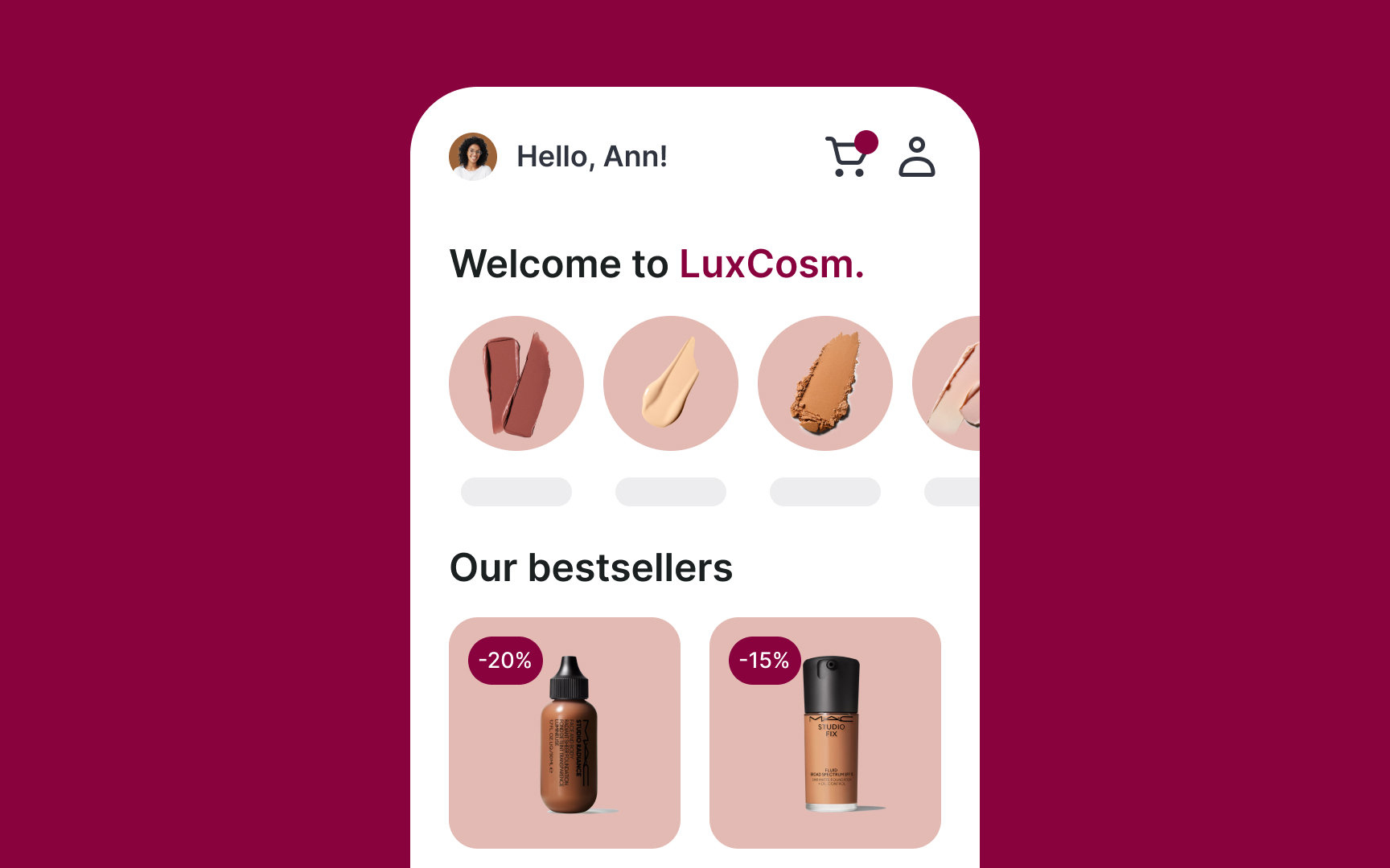
If you want a bit more variety, you can use analogous colors. These are colors that sit next to each other on the color wheel. For example, blue, blue-green, and green. Since they’re close together, they still feel harmonious. Then, add neutrals like grey and black, both of which are considered elegant and sleek.
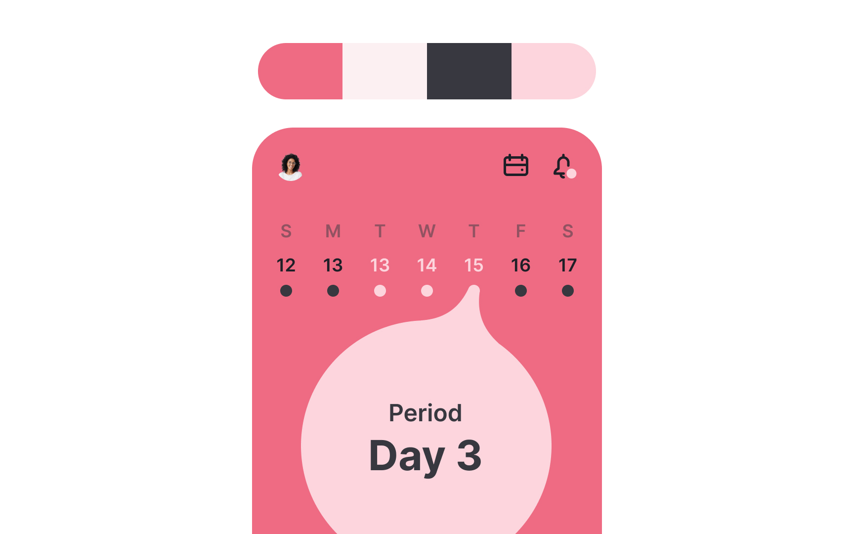
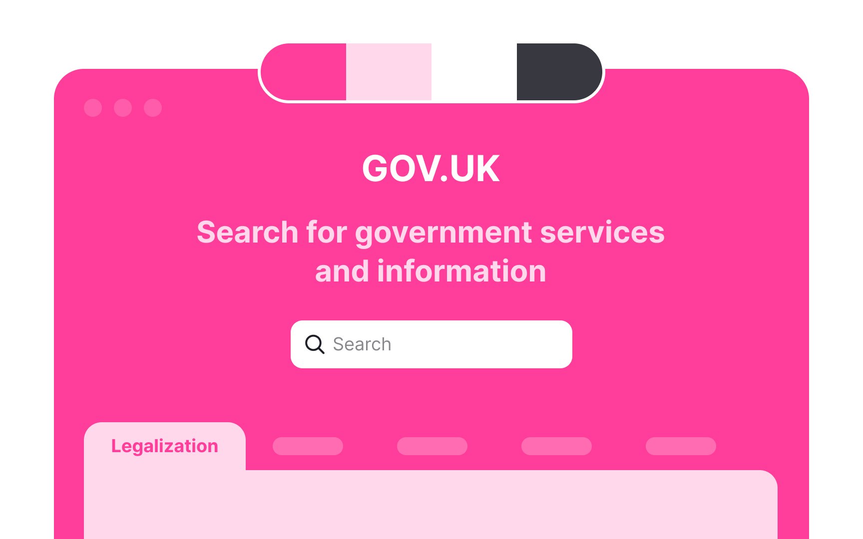
Bright pink is an engaging and vibrant
One way is to create monochromatic pastel palettes. To do this, increase the value of the
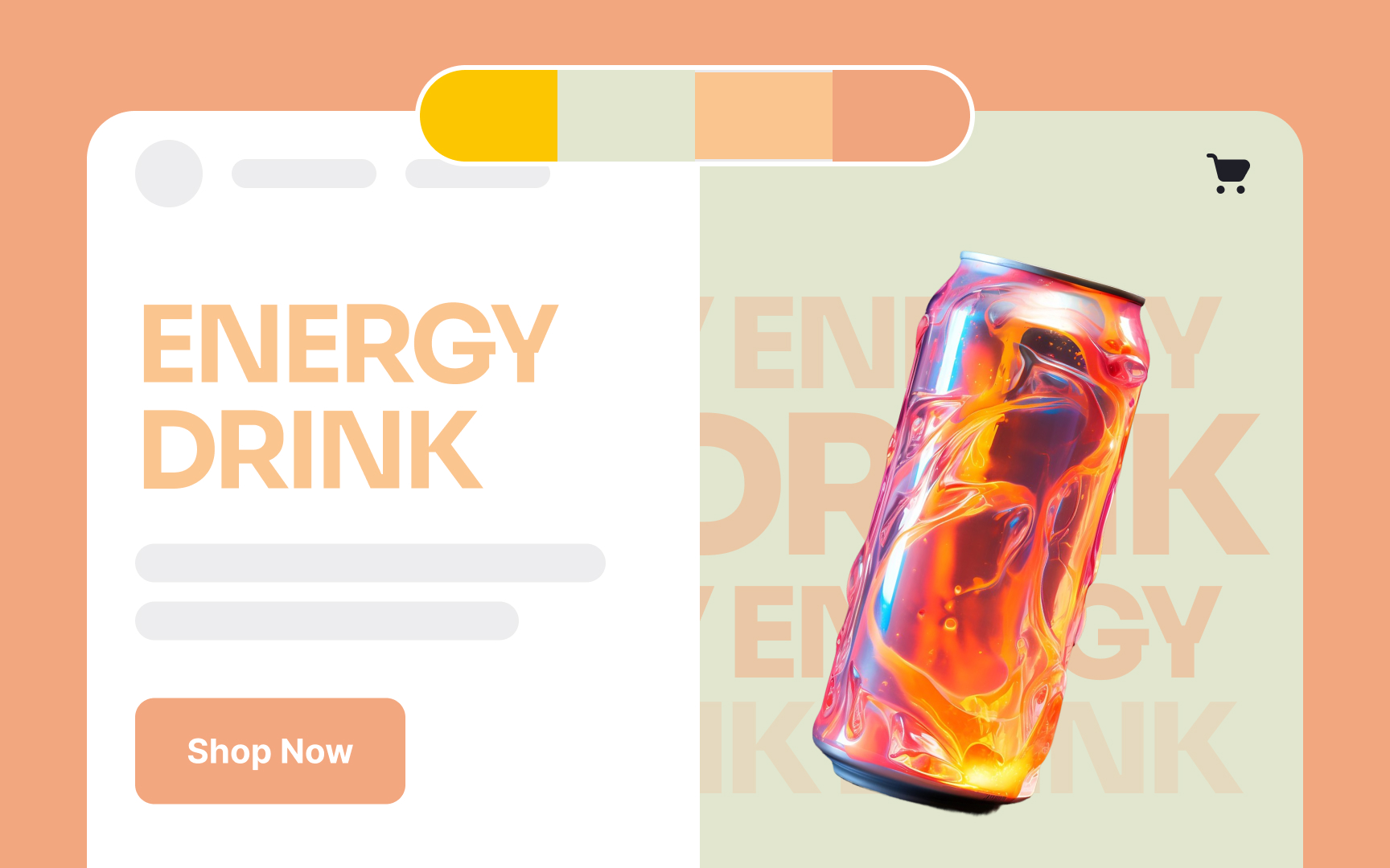
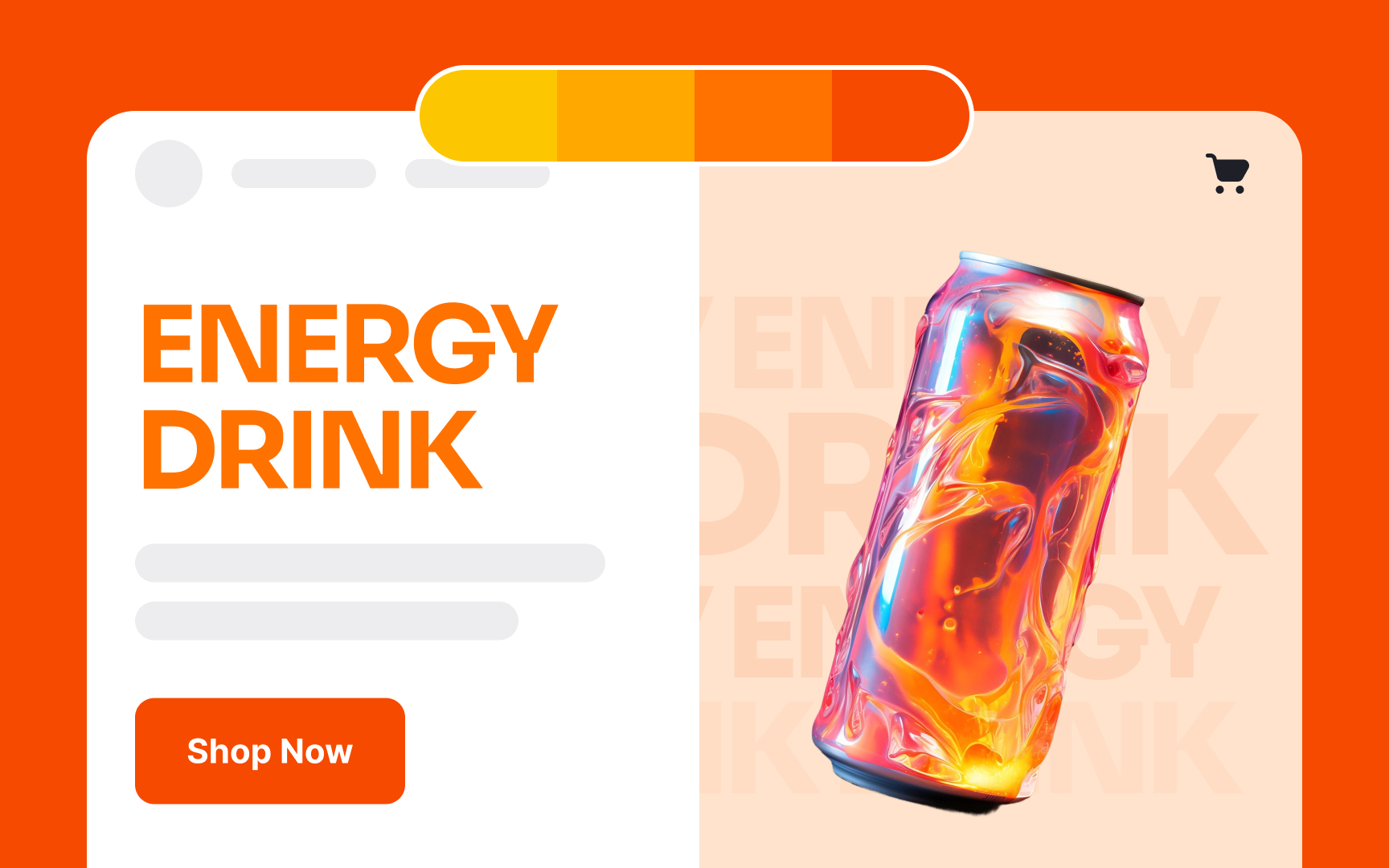
Warm colors like yellow, red, and orange are eye-catching and stimulating. To create an energetic
If you don't want to use an analogous color scheme, you can add some complementary colors to create an accent. For example, pair a vibrant orange with a deep blue or a bright yellow with a rich purple. However, make sure the palette is not overwhelming.
This approach is perfect for products and designs meant to evoke excitement, enthusiasm, and activity.
Sometimes, the main
This approach can be particularly effective for corporate and professional websites, technology and SaaS, as well as educational platforms.

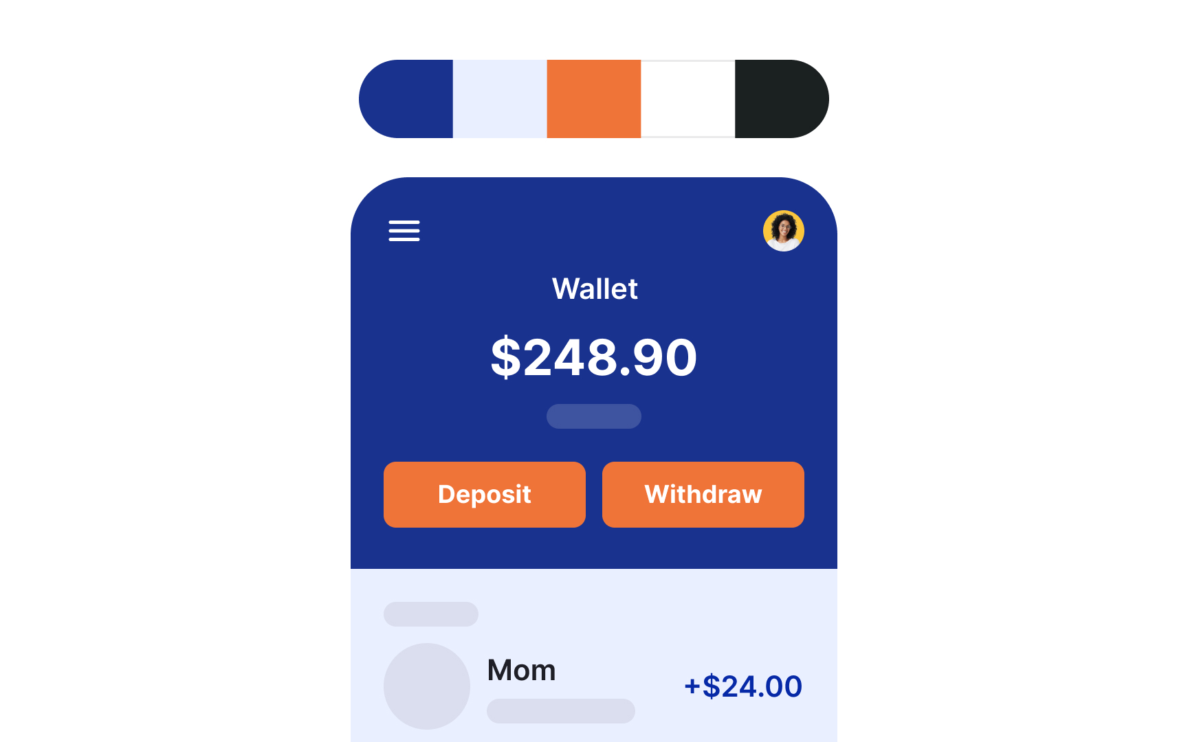
A brightly colored palette looks energetic. Bright
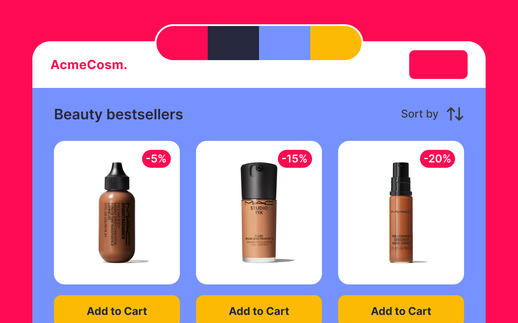
You can amplify the effect by using triadic colors. For example, if you're starting with yellow, add magenta and cyan to create a vibrant palette that's full of energy.
This approach can be particularly effective for startup websites, productivity apps, online marketplaces, and tourism platforms.
Overusing muted or neutral colors can make your palette appear dull. How can you remedy that?
Create

Sometimes we use neutral colors when we don’t know which colors to choose. But neutral colors can do much more than that. They help create harmony between colors as they highlight the rest of the colors and don't compete for attention. They also create more
The pure neutral colors are black, gray, and white. Brown and beige are also considered neutrals but are actually variations of orange (which is why they aren't considered pure neutrals). Adding different neutral colors will produce different effects.
For example, adding white to a mostly red palette can make it feel softer and more romantic. But adding black — another neutral
Pro Tip: Experiment with adding different neutral colors to see what helps produce the right impression.

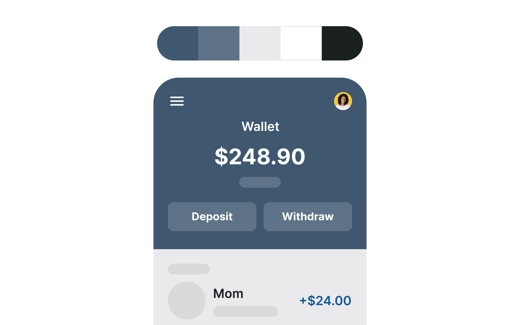
Neutral and muted colors like deep blues, grays, and blacks convey professionalism and reliability, setting a serious tone. Adding accents of dark greens or burgundy can introduce a touch of sophistication without losing the serious feel. Keeping the
References
- What are Brand Colors and How to Use Your Brand Colors | Mark Brand Boutique
- Color wheel - color theory and calculator | Canva Colors | Canva's Design Wiki
- When to Use Saturated Colors | The Visual Communication Guy
Top contributors


Topics
From Course

Share


Similar lessons

Intro to Color Theory

Color Properties
