Optical sizing
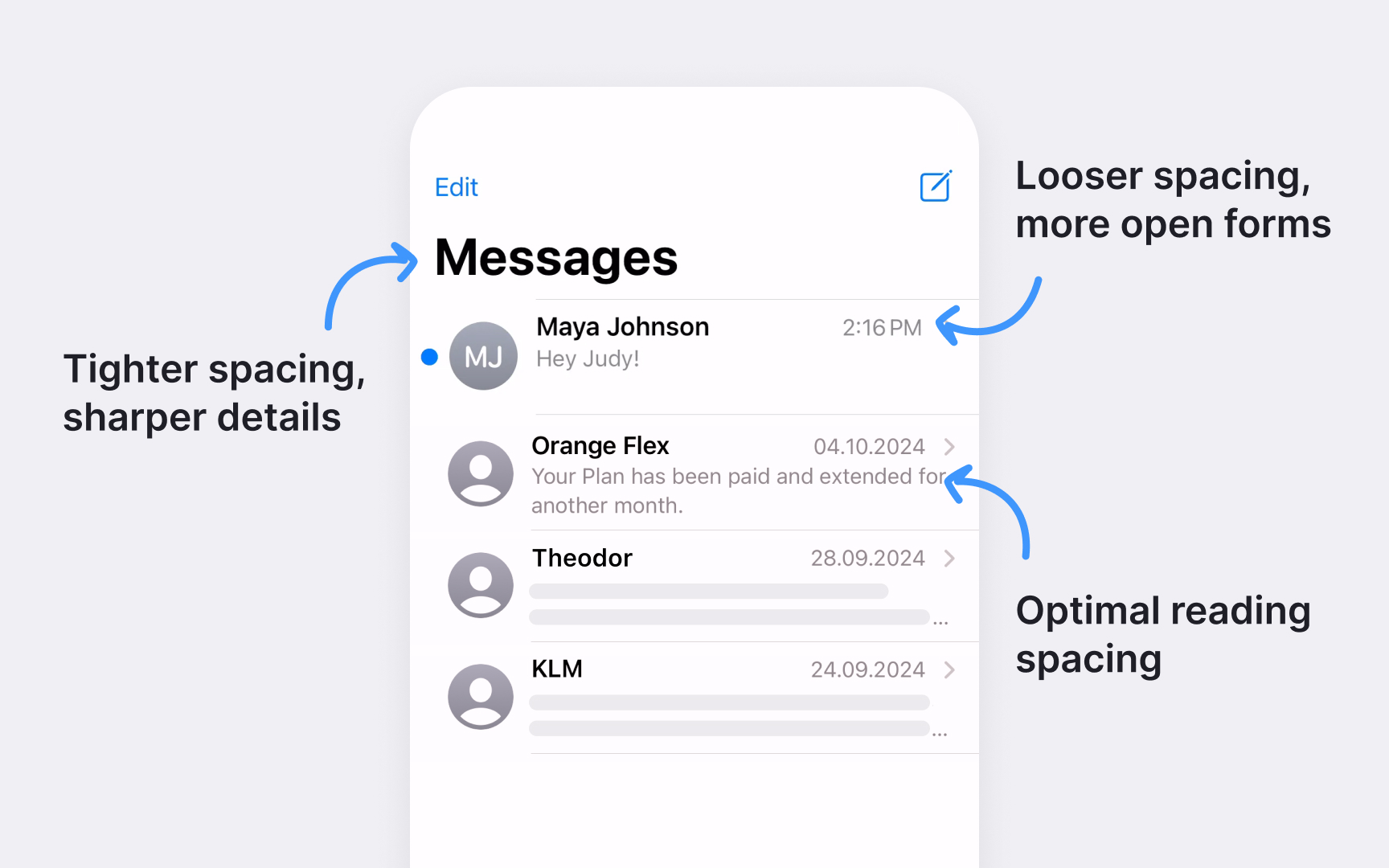
SF fonts automatically adjust their design as size changes. At smaller sizes, letters become slightly wider with more open shapes and looser spacing. Larger sizes get more condensed forms with tighter fit and sharper details.
Two optical size families handle different ranges:
- SF Pro Text optimizes shapes for sizes 19pt and below
- SF Pro Display refines details for 20pt and above
Automatic optical sizing shows in action across interfaces. Compare how SF appears in different contexts:
- Crisp small labels in the Control Center
- Sharp app names on the Home Screen
- Clean body text in Messages
- Bold headlines in the News app
The system handles these adjustments seamlessly. Rounded corners become more pronounced at display sizes, while text sizes maintain clear shapes and consistent stroke contrast. This helps maintain legibility without manual tweaking.
