Visual balance
Apple's design system relies on thoughtful visual balance to create clear interfaces. In system apps, every element's size, position, and visual weight work together to guide users' attention naturally through the interface. The careful distribution of these elements creates stable, easy-to-scan layouts.
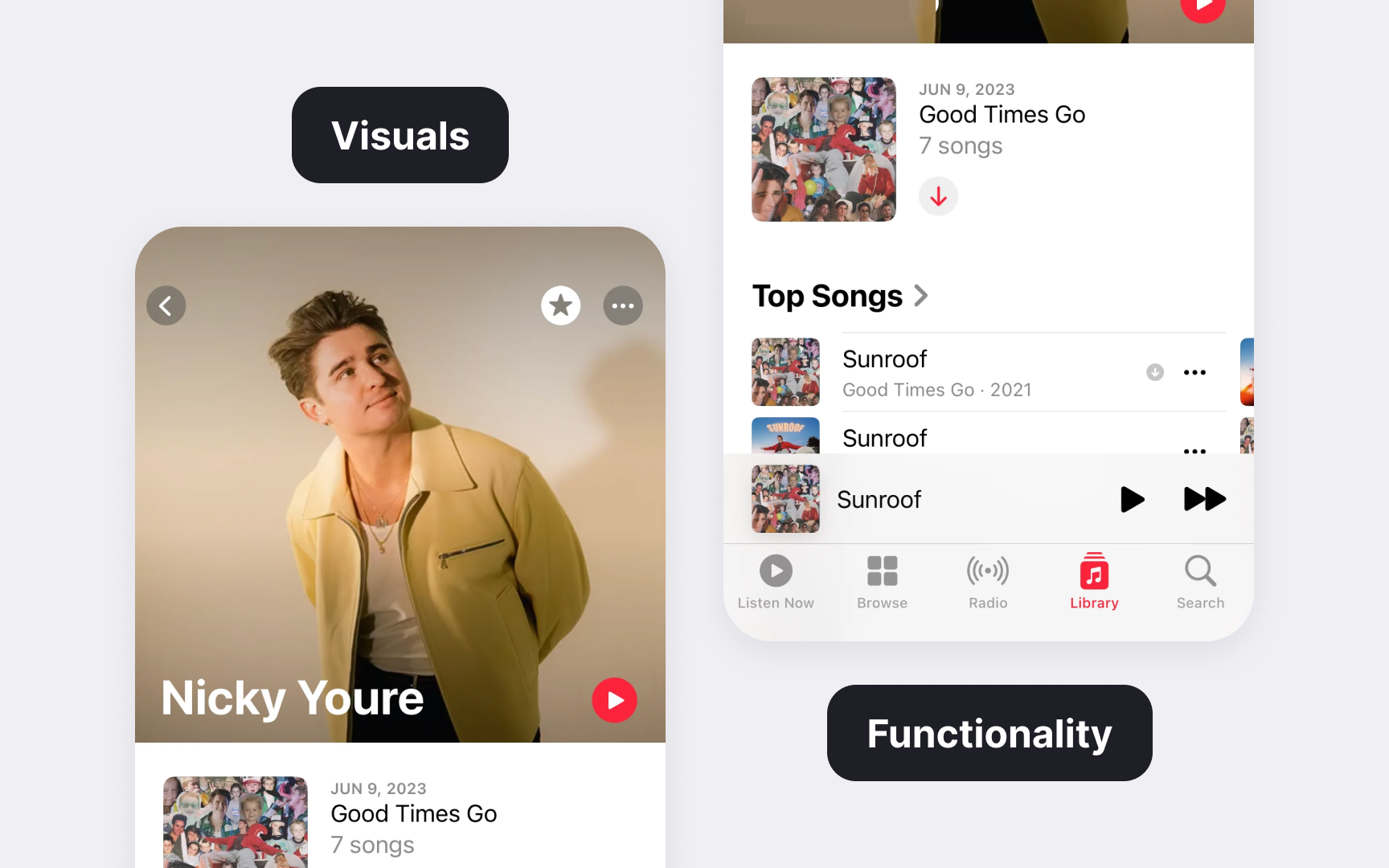
The Apple Music artist page balances strong visuals with functional elements. A prominent hero image leads to smaller album artworks, while navigation controls frame the edges without competing with the main content. This thoughtful arrangement keeps the interface both visually appealing and functional.
Different interface types need different balance approaches. Navigation bars balance titles with key actions, while content areas might use asymmetrical layouts to highlight important information. This flexibility in balance helps create interfaces that feel both stable and dynamic.
Pro Tip: Study Apple's built-in apps to understand how they balance different-sized elements while maintaining visual stability.
