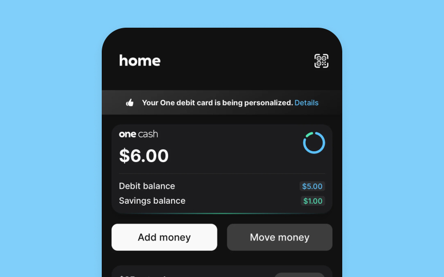
Buttons
Buttons in the Apple interface combine visual style, content, and predefined roles to make actions clear and discoverable.
Every interface needs a clear hierarchy of actions. Apple's button system helps create this hierarchy through distinct attributes:
- Style elements: Buttons can use filled backgrounds, tinted outlines, or plain text styles. Each style signals different levels of importance — filled buttons grab attention for primary actions, while plain ones work well for secondary tasks
- Content options: Buttons display either text labels ("Add to Cart"), system icons (share symbol), or both together. The text starts with a verb and uses a title case. Icons work best for universally recognized actions
- Button roles: Each button serves a specific purpose — normal for standard actions, primary for default choices, cancel for dismissing views, and destructive for permanent changes. The system automatically applies appropriate colors and text weights based on these roles
Apple suggests using visible backgrounds only for key actions and keeping prominent buttons to a minimum. This thoughtful restraint helps users focus on what matters most in each view.[1]
Pro Tip: Never use a primary button style for destructive actions — even if they're the most likely choice. This helps prevent accidental data loss.
References
- Buttons | Apple Developer Documentation | Apple Developer Documentation

