Vibrancy and materials
Materials in Apple's interfaces create depth through translucency and vibrancy effects. Each platform provides specific materials optimized for its environment and use cases.
Best practices for materials:
- Choose materials by purpose, not appearance. Materials can change based on system settings, so select them for their intended use like menus or interactive components
- Match content to material thickness. Use thicker materials behind the text and detailed UI elements to ensure readability, thinner materials for simple interactive components
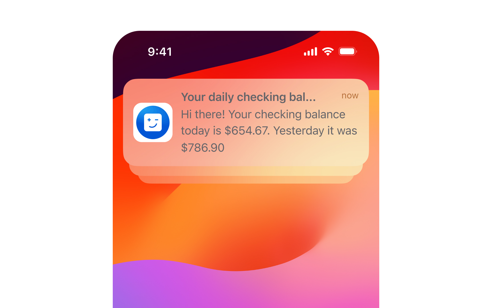
- Use system-defined vibrant colors. When placing text or icons on materials, prefer system vibrant colors that automatically adjust for contrast and legibility across contexts
- Consider background impact. Translucency helps maintain context by showing background content, but too much transparency can harm readability. Test your materials against various backgrounds
- Combine with proper contrast. When using blur and vibrancy effects, ensure foreground elements maintain clear visual separation. Avoid non-vibrant colors that might become illegible.[1]
References
- Materials | Apple Developer Documentation | Apple Developer Documentation
