Yado - POS system

When designing the Sign-In page for our POS SaaS project, the goal was clear: reduce friction and make it as easy as possible for new businesses to start using the system.
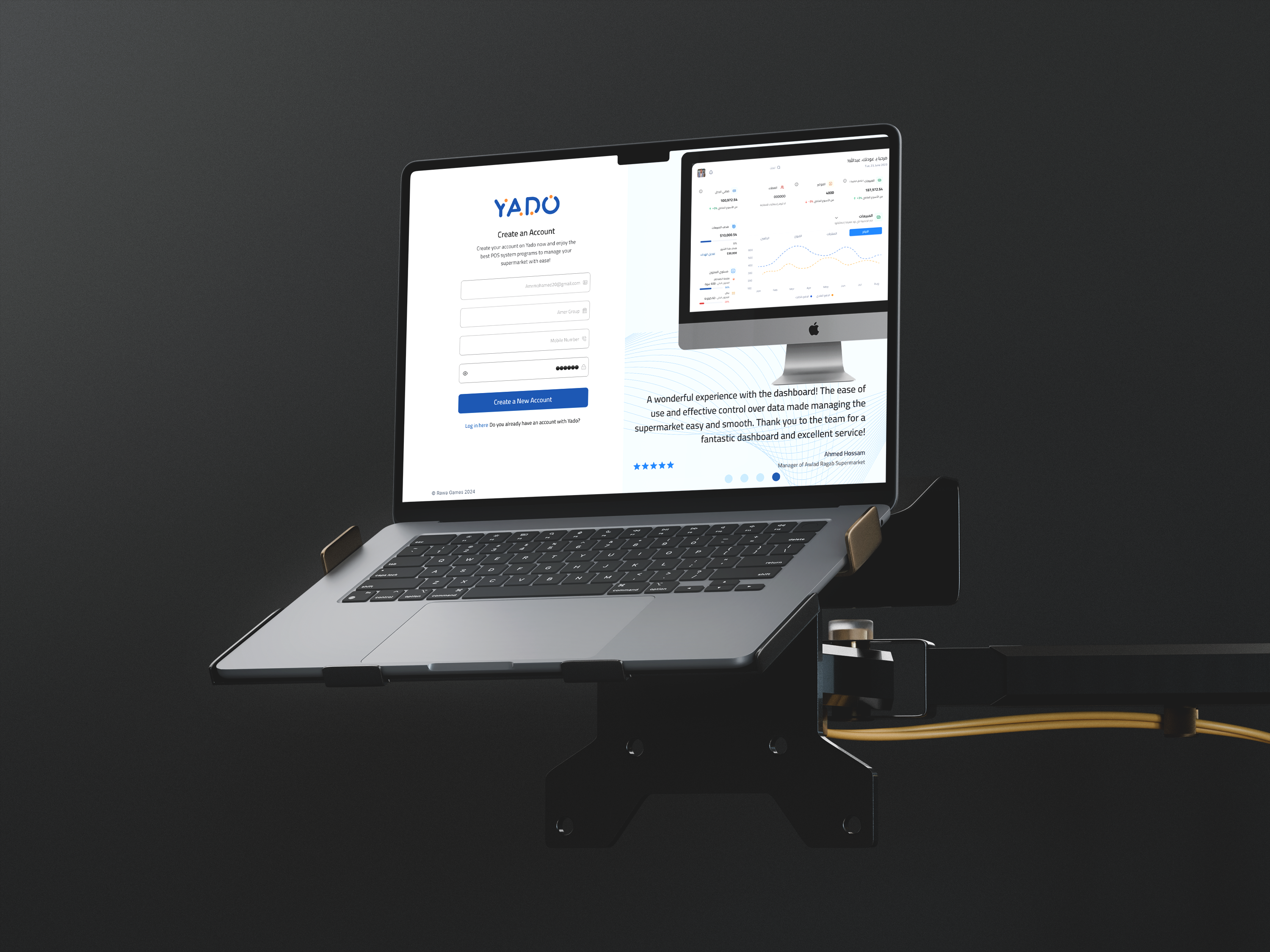
We decided to collect only three pieces of information up front:
- Company name
- Email address
- Phone number
Once the user provides these, they can create a password and access the platform. Why keep it so simple? Because we offer a 14-day free trial, and we don’t want to overwhelm users with too many steps before they even decide if the system is right for them.
Asking for things like tax ID numbers and commercial registration documents at this stage would slow everything down — and frankly, it’s too early. The company hasn’t even committed to buying the service yet. Adding extra verification and legal data checks too soon would just add friction and discourage sign-ups.
Instead, we request the tax and registration details only after the company decides to become a paying customer. At that point, the system runs checks to confirm the business is legitimate. This is especially important for e-invoicing and tax compliance, but it doesn’t need to get in the way of trying the product.
By streamlining the sign-in process, we make it easy for potential customers to explore the platform and focus on what really matters: seeing if our system fits their needs.
Tools used
From brief

Topics
Share
Reviews
1 review

Hey Abdullah 👋,
Great job on your “Yado” POS sign-up experience! 🎉
I liked your clear focus on minimizing friction, reducing the form to just three fields for initial access is a smart move, especially with a free trial offering.
I was hoping to see a clearer view of the final design. Be sure to include a link to the final shot, as it’s not obvious in the current mockup.
A few suggestions to push it even further:
Ensure each form field has a corresponding visible label, not just placeholders, for accessibility and clarity.
For the login text, consider either rephrasing it as a full sentence (e.g., “Already have an account? Log in here.”) or placing the question first for better flow.
Your rationale for delaying business verification makes sense. To enhance transparency, consider adding a microcopy note like: “You’ll be asked for legal information later.”
Excellent storytelling, you clearly explained the reasoning behind your design decisions. To strengthen your presentation, you could annotate your mockups to highlight how specific UI elements meet WCAG standards.
If the sign-up form is left-to-right (in English), make sure the input fields and placeholders also follow the LTR direction. Right now, they appear RTL, which can cause confusion.
You’re thinking like a product strategist, exactly the kind of mindset UX needs. Keep it up, Abdullah! 🚀
You might also like

Pulse — Music Streaming App with Accessible Light & Dark Mode


Islamic E-Learning Platfrom Dashboard

SiteScope - Progress Tracking App


FlexPay


Mobile Button System


CJM for Co-Working Space - WeWork

Visual Design Courses

UX Design Foundations


Introduction to Figma

Design Terminology
